Gamers have had a lot to be unhappy about in recent years. From price hikes to the ever-delayed release date of GTA 6 to the use of AI in games, it seems there's been no end of things to complain about in 2026. Even the Mario Kart logo is rubbing gamers up the wrong way.
A gamer recently took to Reddit to lament changes to the franchise's logo – changes, that is, that took place over twenty years ago. Some scars take a look time to heal it seems.
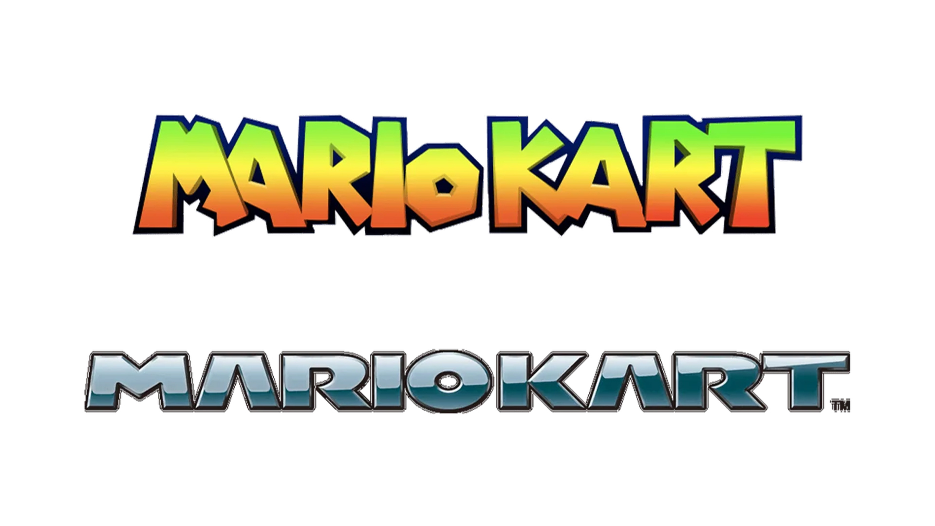
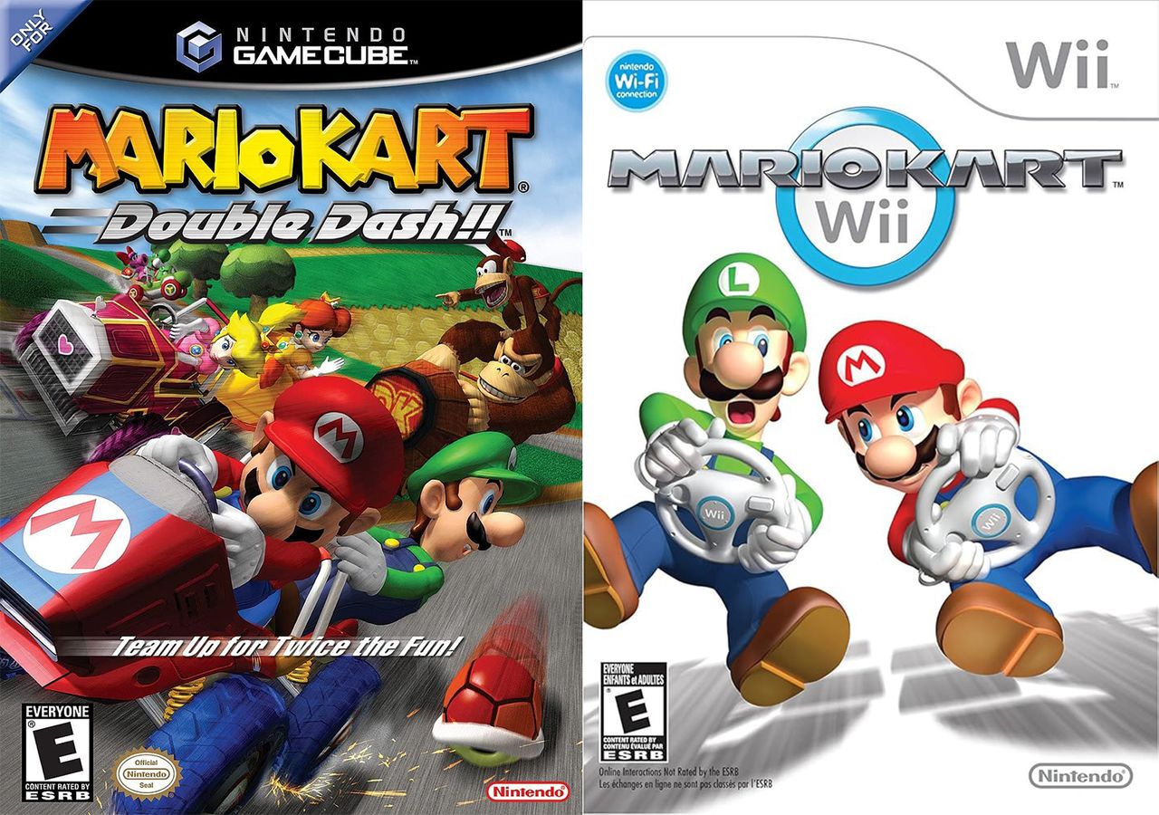
For context, up until Mario Kart Double Dash, released for the GameCube in 2003, the Mario Kart franchise used the same typeface as the rest of the series – a colourful and angular font that looked straight out of the Mushroom Kingdom. Hardly one of the best logos of all time, but just the right amount of fun for Mario.
20 years later and it still bothers me just how much of a huge downgrade this logo change was from r/Mario
But from 2025's Mario Kart DS onwards, the series switched to a much more racing-inspired font, a Grand Prix-esque affair with smooth lines and a chrome texture. Less fun, more Formula 1.
"20 years later and it still bothers me just how much of a huge downgrade this logo change was," one Redditor comments, while another adds, "Hard agree. While the new one represents racing and cars better, the old one just had so much joy and whimsy."
But lots of gamers have come to the defence of the new design. "I like the modern logo more too. It looks like real motor-brands emblem and this is showing it's racing game better," one user puts it. Another adds, "I much prefer the newer logo. It's slick and more in line with what you would expect for a racing game. And it made sense to change the logo, given that Mario Kart is now more than just a Super Mario spin-off, but its own franchise now. It should have different branding."
As for my own opinion on this hugely important and divisive issue: I like them both.