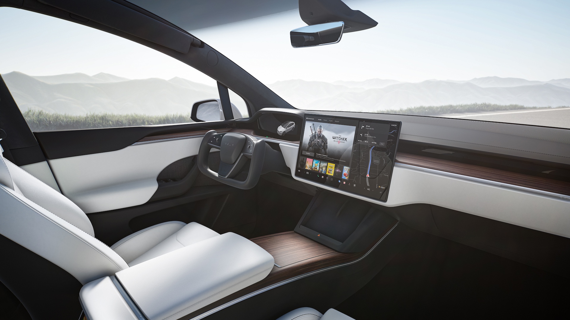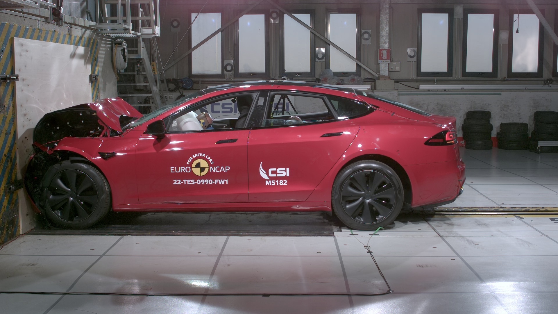
Arguably the most influential car safety assessment programme in Europe has announced that it is to "incentivise" manufacturers to refrain from mapping key car functionality to touchscreens, with an onus on reverting back to physical controls.
It's a gripe that many motorists have with modern vehicles, as recent trends in automotive design have seen car interiors wiped of nearly all physical controls, with even important functions now buried deep within menus on a touchscreen display.
Volkswagen, for example, came under fire for its infotainment in the ID range, with many owners and reviewers stating that its UX was beyond frustrating and in some cases, distracting, as locating even the simplest function proved a fiddly process. VW has since said it is reverting back to physical buttons in future models and has updated its infotainment offering in recent cars.
According to Auto Express, the Technical Director of Euro NCAP (which stands for the European New Car Assessment Program), Richard Schram, stated: "Euro NCAP will indeed incentivise OEMs to have physical, easy-to-use, and tactile controls of the main driving features like wipers, warning lights, and indicators."

Schram went on to reveal that testing protocol would change in 2026, where the safety programme will award points in its 'Safe Driving' category for those vehicles that have "intuitive, easy-to-use vehicle controls".
Although Euro NCAP has no powers to alter legislation, it is one of the most widely recognised safety bodies and the full five star safety rating is coveted by most manufacturers, as it helps bolster buyer confidence in the vehicle's performance in a crash situation.
That said, it is now clearly cracking down on any infotainment uses that avert the driver’s eyes from the road ahead.
Matthew Avery, director of strategic development at Euro NCAP, told Hagerty: "The overuse of touchscreens is an industry-wide problem, with almost every vehicle-maker moving key controls onto central touchscreens, obliging drivers to take their eyes off the road and raising the risk of distraction crashes."
Tesla, for example, recently removed traditional indicator (turn signal) stalks on Model S and Model X updates, as well as the new Model 3, relocating them to force feedback buttons on the steering wheels.
But some users have stated that they are awkward and unnatural to locate, while operating them when the wheel is in a full-lock position (when navigating a roundabout, for example) is much harder than it needs to be.
In fact, driving schools in Norway have reportedly banned the use of any Tesla model that lacks indicator stalks for this very reason.
Playing it safe

Euro NCAP is a hugely influential figure in the automotive space, with many of the parameters it has introduced over the years directly influencing the sort of safety tech we now find in modern vehicles.
While I am all for physical buttons controlling key car functionality, we’ve also experienced first-hand how annoying and nannying many modern safety systems can be. The likes of Lane Keep Assist, Lane Departure Warnings. Forward Collision Warning and Driver Drowsiness Monitoring are all celebrated by Euro NCAP but can also be some of the most annoying and distracting features on a modern vehicle.
Lane Keep Assist might work well on a perfectly marked motorway or autobahn, but it can also physically intervene when not required on a tight country road, for example.
Kia’s much celebrated EV9 received the full five-star Euro NCAP rating but it was the most annoying car I’ve driven in recent years. The endless bonging, beeping and vibrating drove me around the bend.
What’s worse is that to achieve the full Euro NCAP rating, these features have to reactivate every time you restart the vehicle, which means the irritating menu-diving to turn off the unwanted and distracting features is distracting in itself.
It is clear that Euro NCAP’s intentions are nearly always good, but it has to be careful that loading on ever-more safety features doesn’t have the opposite effect.


