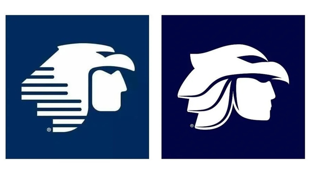
We've covered a lot of airline rebrands here at Creative Bloq, and new logos in the sector tend to generate strong opinions, especially when it's a country's flag carrier that's involved. The Air India and Air Croatia rebrands were two recent ones. But we've seen few examples that have been torn apart as harshly as the new Aeroméxico logo.
Mexico's biggest airline is rolling out a rebrand that aims to modernize its identity and visual language with tweaks to both its logotype and its icon Aztec eagle warrior symbol. But some people are making unfortunate comparisons, suggesting that it's ditched a proud warrior for Birdman, a sensuous cowboy, or even worse.... El Chavo del 8. One of the best airline logos it ain't.