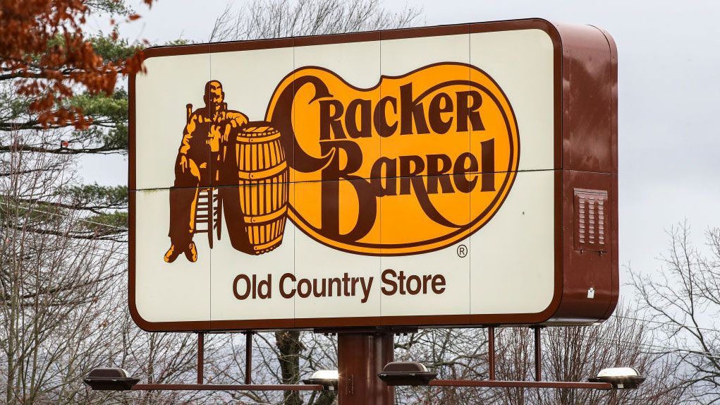
If you haven't read about Cracker Barrel's rebrand kerfuffle yet, where have you been? Even mainstream news sites are picking up on the outpouring of disbelief over the logo's stripped back new appearance. Vintage Americana is no more, it seems, as the intricate logo has been replaced by a bland orange blob. And with Cracker Barrel already apologising, the brand is only too aware of the issue.
Naturally Reddit is awash with chatter, and there's even one designer who had "a crack" at redesigning the logo themselves. The design is being applauded in the comments, and I have to say I'm quite a fan of the concept – it definitely . See the design below and decide if you agree.