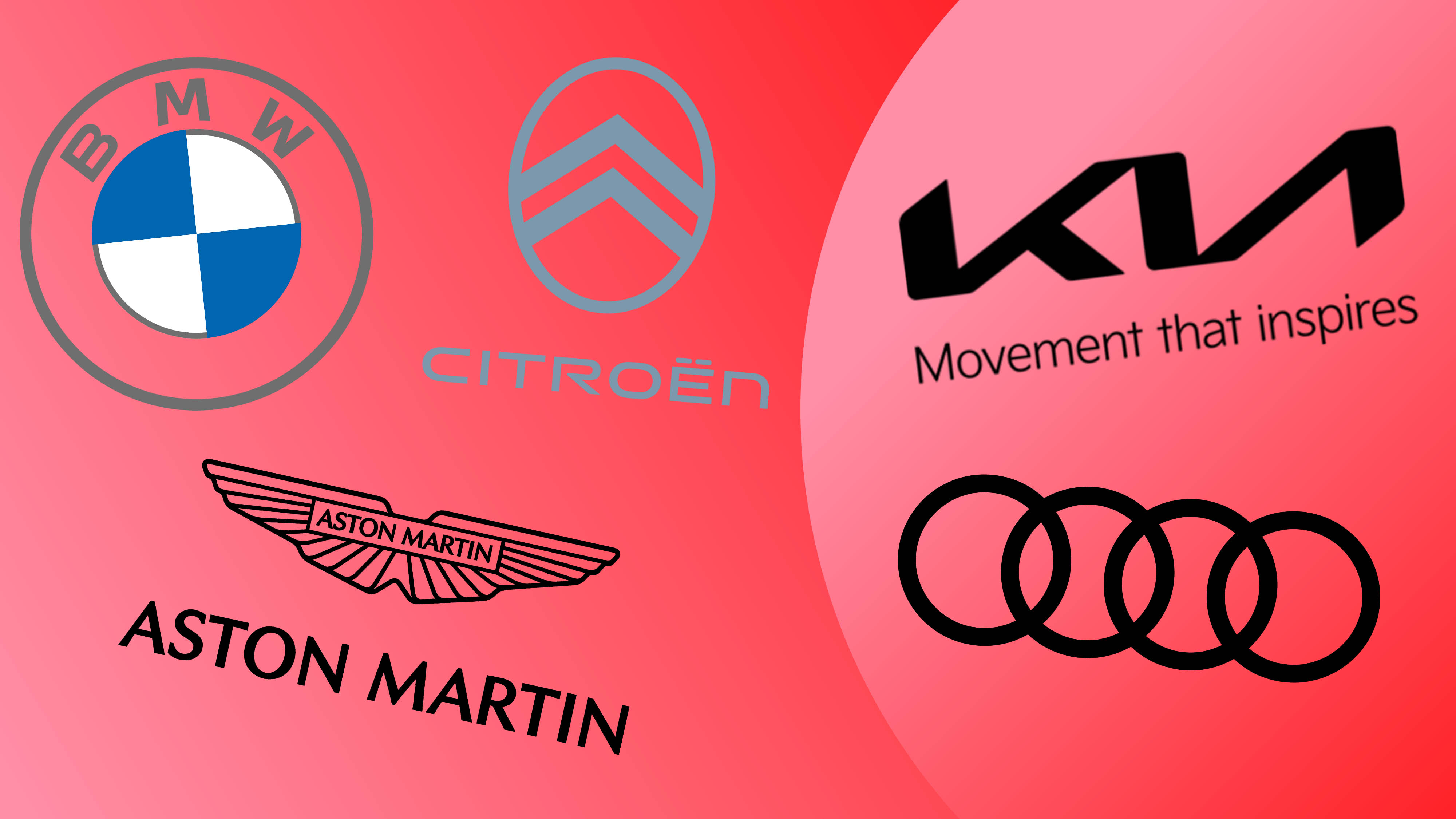
Car logo rebrands have come in thick and fast over the last couple of years with almost every major manufacturer jumping on the flat design trend. In almost every case, the car logos were made simpler and flatter for a more modern look, but also to make them easier to render in smaller digital applications.
When the main application of a car logo was the badge on the front of the vehicle, 3D designs with bevels, shadows and fussy details worked fine. That's not so much the case when car manufacturers now have apps and in-audio media systems that require the use of the logo. But recent car logo rebrands have not always been received the way they companies might have hoped. While some manage to modernise while maintaining brand heritage, others are illegible or just plain ugly.