Countless brands have been resurrecting old logos and assets in recent years, marking a move away from homogenous flat design. From Pepsi to Burberry, we've seen huge companies take a leaf out of their own history books when it comes to approaching 'new' designs. But vodka brand Absolut has arguably never forgotten its design roots in the first place.
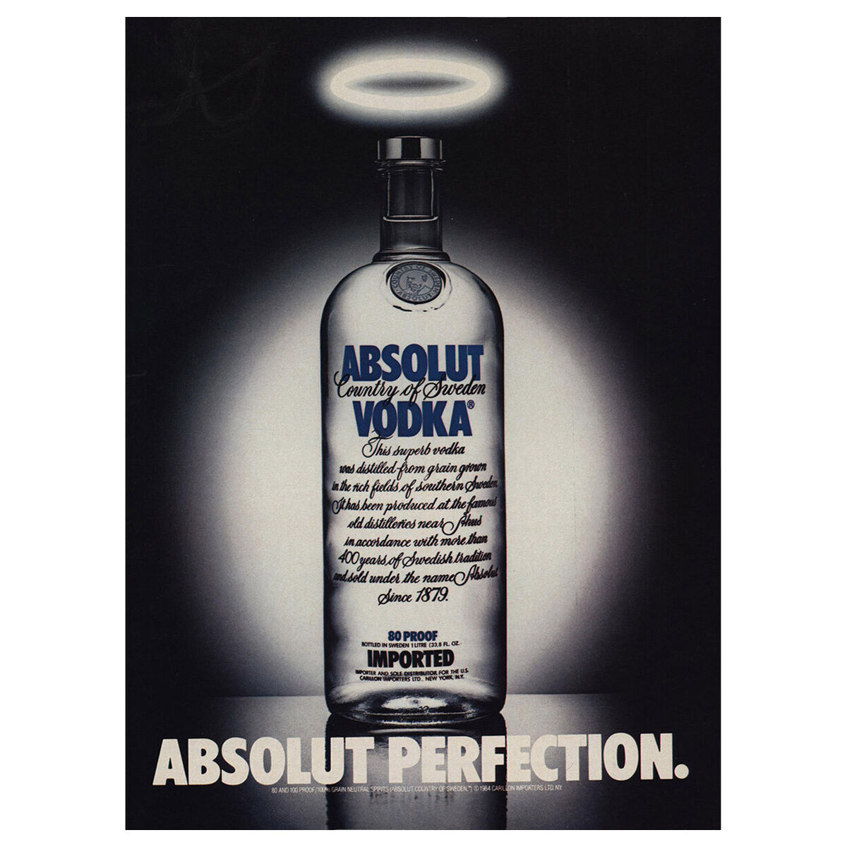
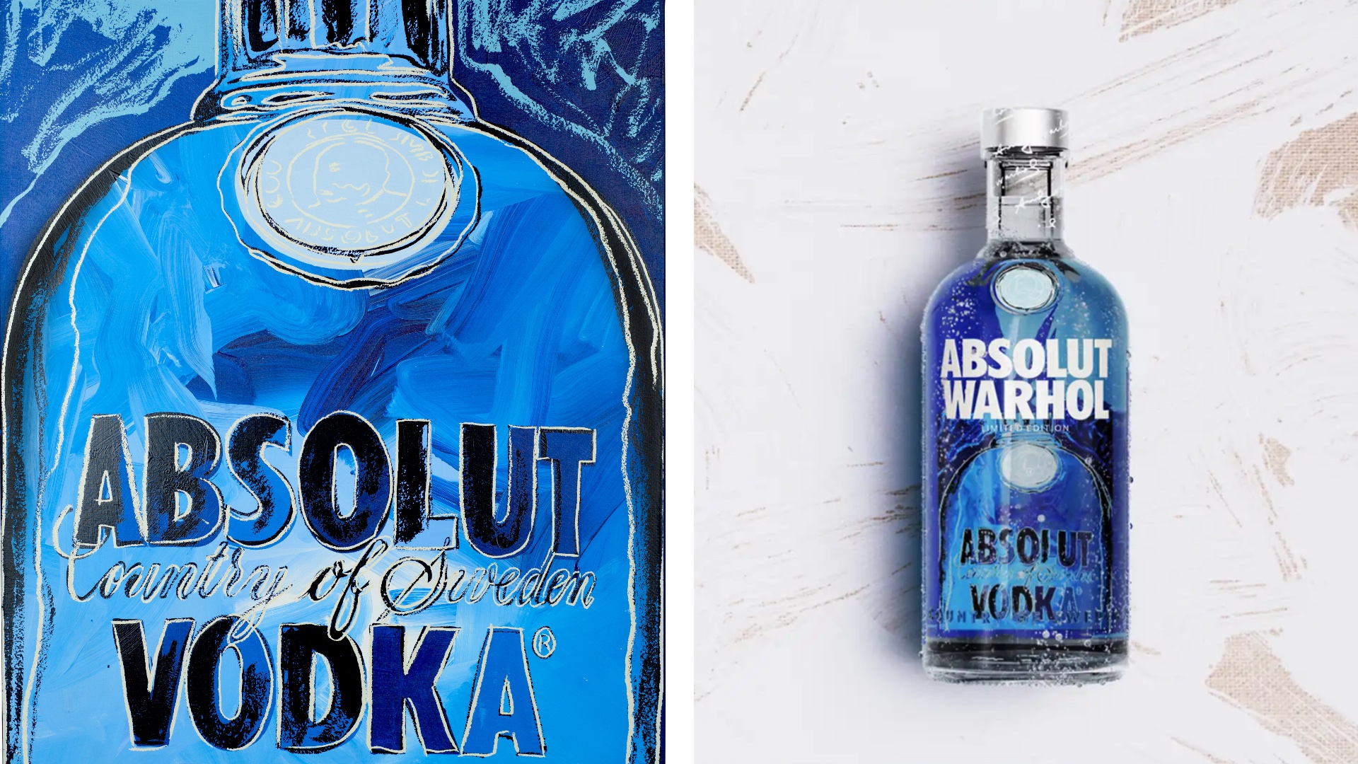
As well as its famous bottle and bold sans-serif wordmark, Absolut is famous for its iconic print ads and artist collaborations. We recently attended the launch of the brand's new limited edition Andy Warhol, featuring a long-lost painting that was only recently rediscovered. Here, we caught up with Deb Dasgupta, Global VP of Marketing for Absolut, to discuss Absolut's approach to heritage branding and artist collaborations.
We're seeing a movement towards heritage branding and design right now. What's Absolut's perspective on this trend?
Lots of brands have brought back old logos and heritage design. Flat design was the big thing, and it now it’s heritage and nostalgia. Especially in fashion, everybody went flat. But now there are so many bringing back distinctive assets. But for us, they've been there all along – we never got rid of them.
The Absolut wordmark is one of our distinctive assets. We did some research to understand what were our distinctive assets. Another is the straight bottle, because it’s so iconic, and there are very few bottles with that kind of bold type. These are things that we don’t mess with or move around.
Absolut is famous for its artist collaborations. How does the brand approach these?
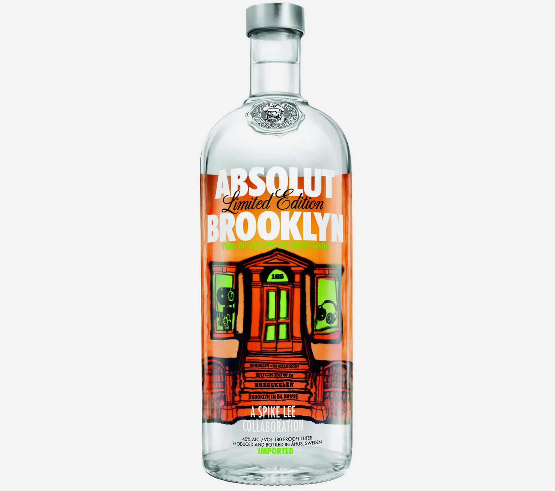
Absolut has been a pioneer in collabs, and has done it in such a clever way. For example, we did a collaboration with Spike Lee, which was ‘Absolut Brooklyn’, and it was so beautiful because there was so much of an intelligent humour and a provocative ‘if you know, you know’ vibe. An example of this is that we did an ad featuring the stairs to Spike Lee's home. Some would have spotted the reference, but for others, it’s still Brooklyn.
There can be a danger of ‘collaboration fatigue’, so we often think about how to keep our collabs distinctive and differentiated from the rest. I think we started this cultural revolution in the industry, but for us it’s deeper than just, say, ‘art on a bottle’. We think about the story behind it. How is it relevant today? People ask, Why? Why now? There’s always a 360 story about it. Like with the new Absolut Warhol bottle – the story of how it started, how the painting got stolen, and then the story of the rediscovery. And missing paintings always have a story.
What sets Absolut apart from its competitors from a design perspective?
I think the simplicity of the bottle for one. I think it's so pure, it's so simple, which also makes it a canvas for creativity and imagination, and also because the purity and transparency of the liquid in it. We've done so many limited editions and powerful collaborations using the bottle, many of which are hugely important, dealing with love, free speech, the LGBT community. So it’s not just about supporting art and culture, but also community, We don’t do anything if we don’t mean it – and if we do it, we go the whole distance.
What are the challenges when it comes to keeping a decades-old brand fresh?
This is always a challenge. All iconic brands go through cycles of highs and lows, and it’s difficult to keep doing what you’ve always done consistently. With heritage like Absolut’s we’re always standing on the shoulders of our predecessors and carrying the responsibility of taking the brand to a better place.
But it’s important to look back to look forward, because you need to know your roots and embrace them and see how that can help you catapult into the future. With everything we do, even today, we’re keeping those distinctive assets; the bottle, the silhouette, the wordmark. Brands cannot disconnect from their past because it’s so inherent to who they are; their values, their personality. And I think that's what we're doing in Absolut.
