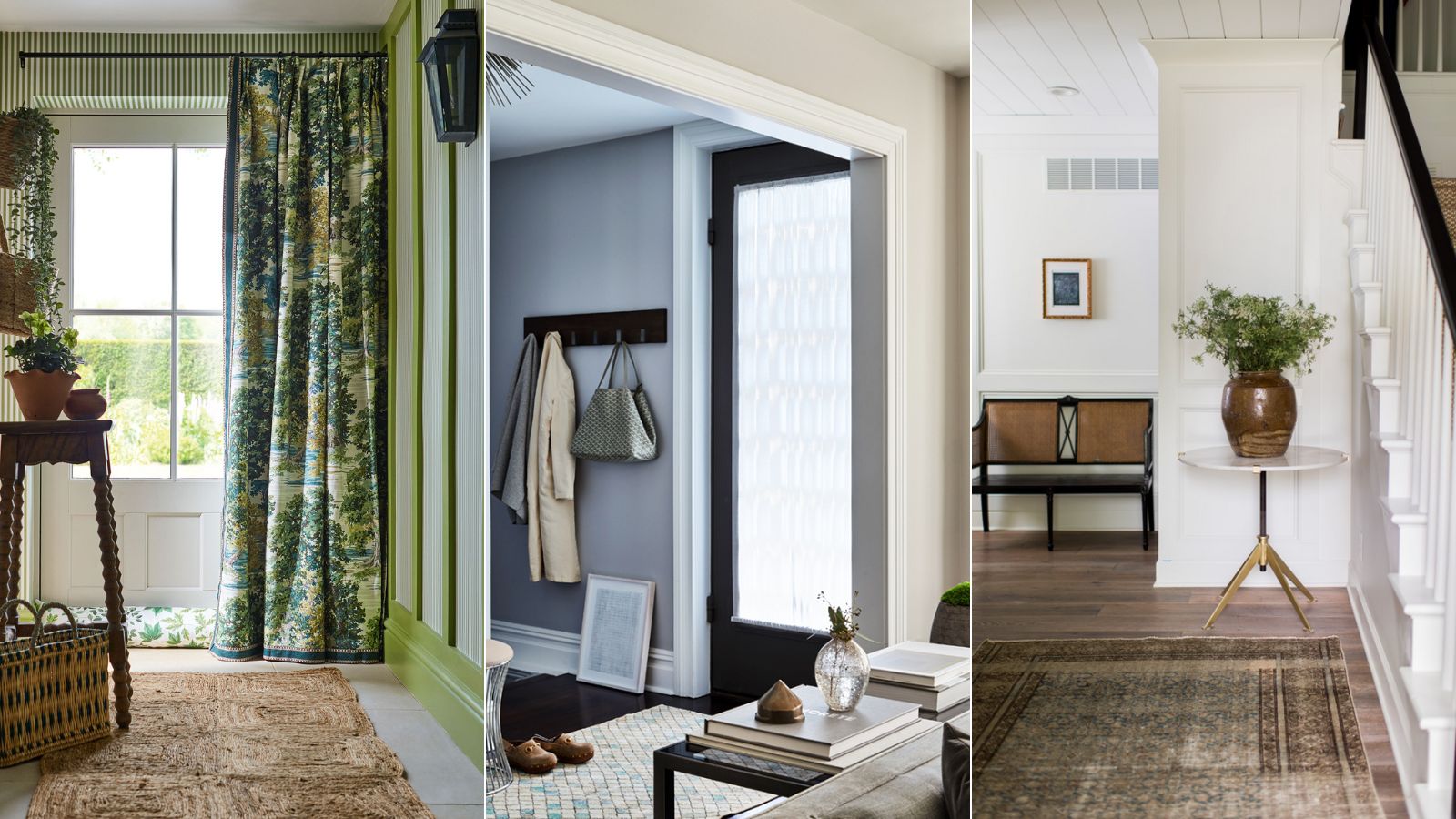
First impressions are everything in a small entryway, and bold and exciting color choices are often the easiest way to elevate this modest room, but when adding color to our homes, it’s all too easy to forget a small entryway; after all, it’s not as if we spend much time in this often tiny or narrow space.
As well as looking inviting in its own right, an entryway color scheme should set the tone for the rest of your home. Move it up on your decorating agenda – it's the perfect place to be bold and show your personality. Winning room color ideas and entryway paint ideas pay attention to the mood, size, and natural light, so whether you go for something playful or serene, here are some small entryway color rules to get you started.
Best colors for small entryways
Color is a remarkable decorating medium and is an easy way to make your entryway more inviting. What could be easier – or more impactful than adding color to a modest or narrow entryway? The entryway is a room of its own and should be treated as such with a bold design that will sing.
1. Beige – to channel the trend for 'quiet luxury'
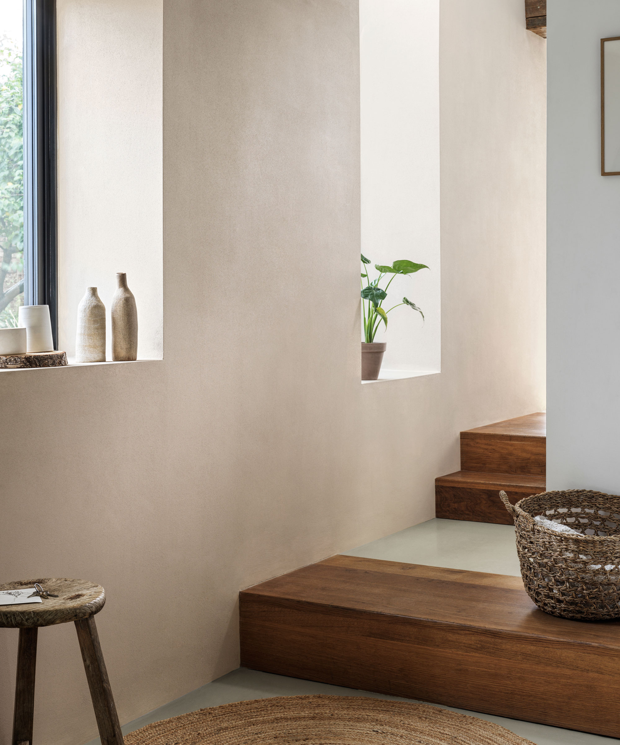
Beige room ideas, along with the trend for 'quiet luxury' are having something of a moment this year. Elegant and timeless in their simplicity, beige schemes have become a stalwart in the world of interiors, and are the perfect color addition to modest spaces.
This 'new neutral' color palette is of the most versatile shades in all of design – it instantly brightens while evoking a sense of calm and lawlessness. But while some designers instinctively lean towards pale yellows, and others where green meets gray, many agree that new neutrals are largely inspired by colors emanating from the natural world, which help us to feel grounded in our homes.
If you are going for a beige color scheme for your small entryway, be sure to add depth and contrast in different layers and textures. 'For a warmer aesthetic, consider a red-based neutral shade such as Wimborne White or Dimity by Farrow & Ball,' recommends Louise Wicksteed, design director at Sims Hilditch.
2. White – for serenity and calm
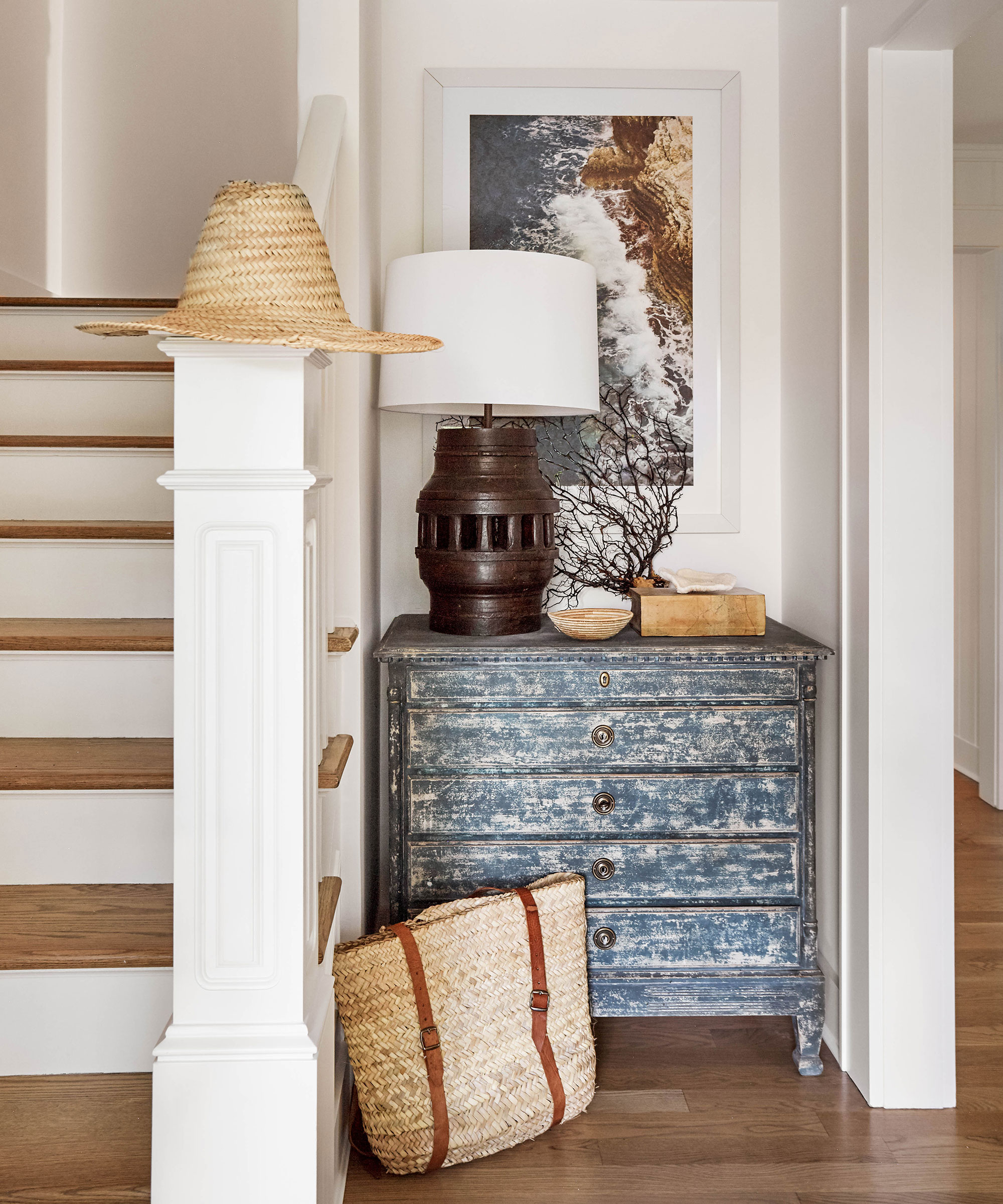
While beige is growing in popularity, that doesn't mean designers are completely shunning white – quite the opposite, in fact. White has been given a much-needed makeover.
'The search for the ideal neutral is not as easy as it would initially appear,' says interior designer, Becca Casey. 'Pure white can be too stark, while trying to warm it up means possibly straying into the magnolia territory. Instead opt for a softer, warmer white that grounds and lifts at the same time.'
White rooms prove ever-popular in interior design, often creating grounding and relaxing designs that reference the beauty and colors found in the natural world.
The color wheel is your oyster when it comes to choosing accompanying shades. For a soothing feel, sage or olive are perfect partners, soft browns and whites add elegance, while a punchy orange or coral will bring vibrancy.
3. Orange – warm up with this earthy color
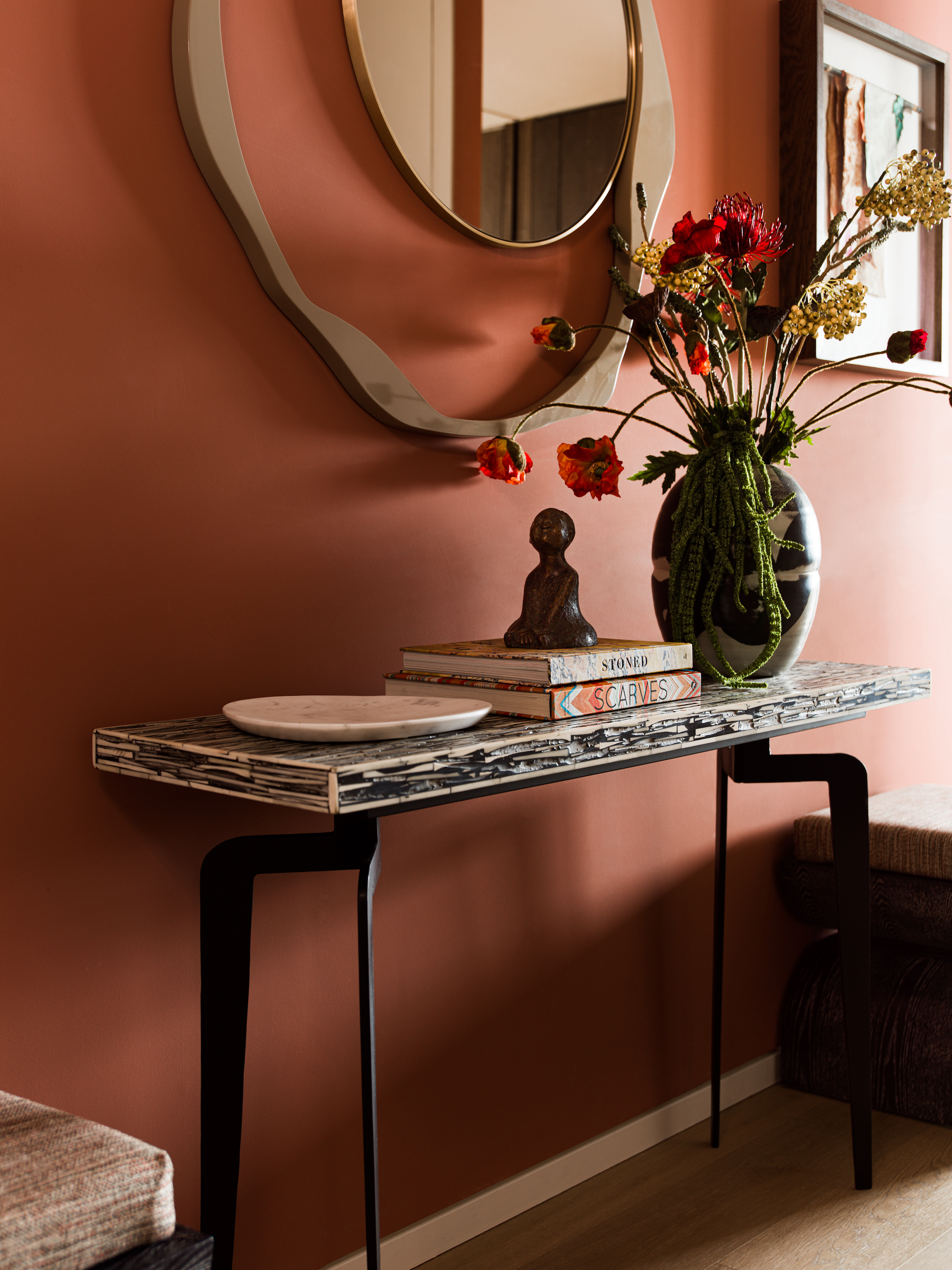
Orange is one of those colors that many people love to hate, but used in a small room, orange is sophisticated and versatile, and the new burnt oranges gracing interiors are rich and radiant.
‘For me, the home should be filled with bright colors and bold patterns as they add personality to a space,' says Emma Deterding, founder, of Kelling Designs. 'Orange shades are a great choice for small entrances as they introduce a burst of energy on entrance – they also bring an uplifting feel during the day and can help create a cozy, relaxed atmosphere in the evening, showing how versatile this color is in a different light.’
4. Green – to introduce an element of nature indoors
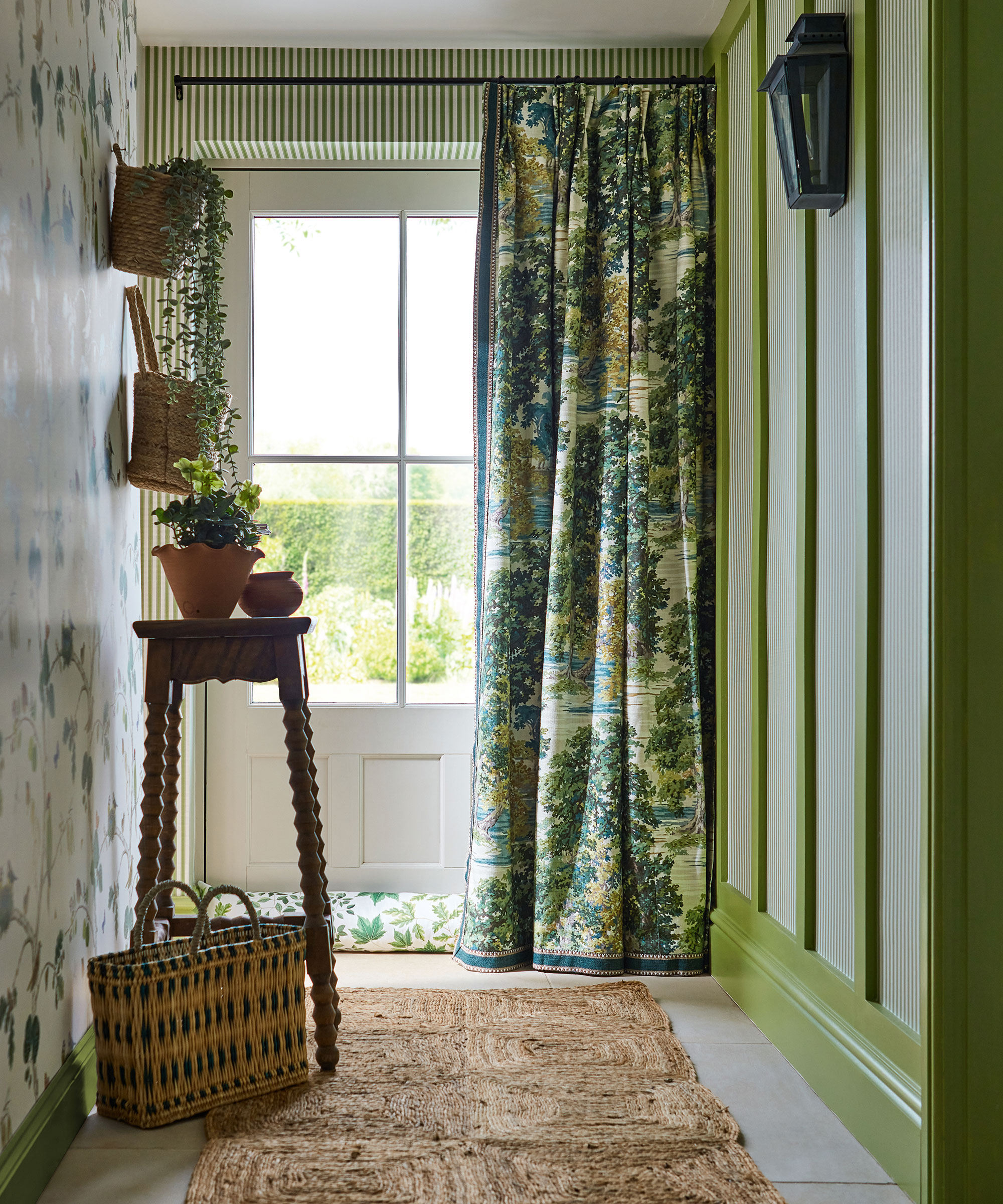
Creating a warm welcome can be a challenge in a rural or country home, but this is where green room ideas truly shine.
Inspired by the natural world, sage green is restful with a touch of heritage. Strong yet soothing, it brings an enveloping feel but can also sit quietly and allow bold furniture to shine.
‘This is a wonderful color that works well all through the year and is ideal if you are trying to bring an element of nature or heritage feel into a more contemporary city home. It’s a restful and calming shade which not only works well on cabinetry but also looks great on walls,’ says Emma Sims-Hilditch, founder and creative director, of Sims Hilditch.
Jessica Clayworth, lead designer at Morris & Co. agrees: ‘Sage green is really having its time in the spotlight in 2023. It’s a soothing, tranquil tone that speaks to the senses of being earthy and wholesome. Throughout Morris & Co’s history, it was the colors, alongside the designs, that were inspired by nature. We see greens that reflect nature’s verdant beauty and vitality in our archive.’
The color also acts as an effective bridge between the outdoors and inside when used in threshold spaces, such as the entrance. When seen in enclosed rooms on wallpapers or furnishings, the color brings relief and reassurance and elegantly reminds us of the living world beyond our four walls.
5. Blue – for a moodier aesthetic
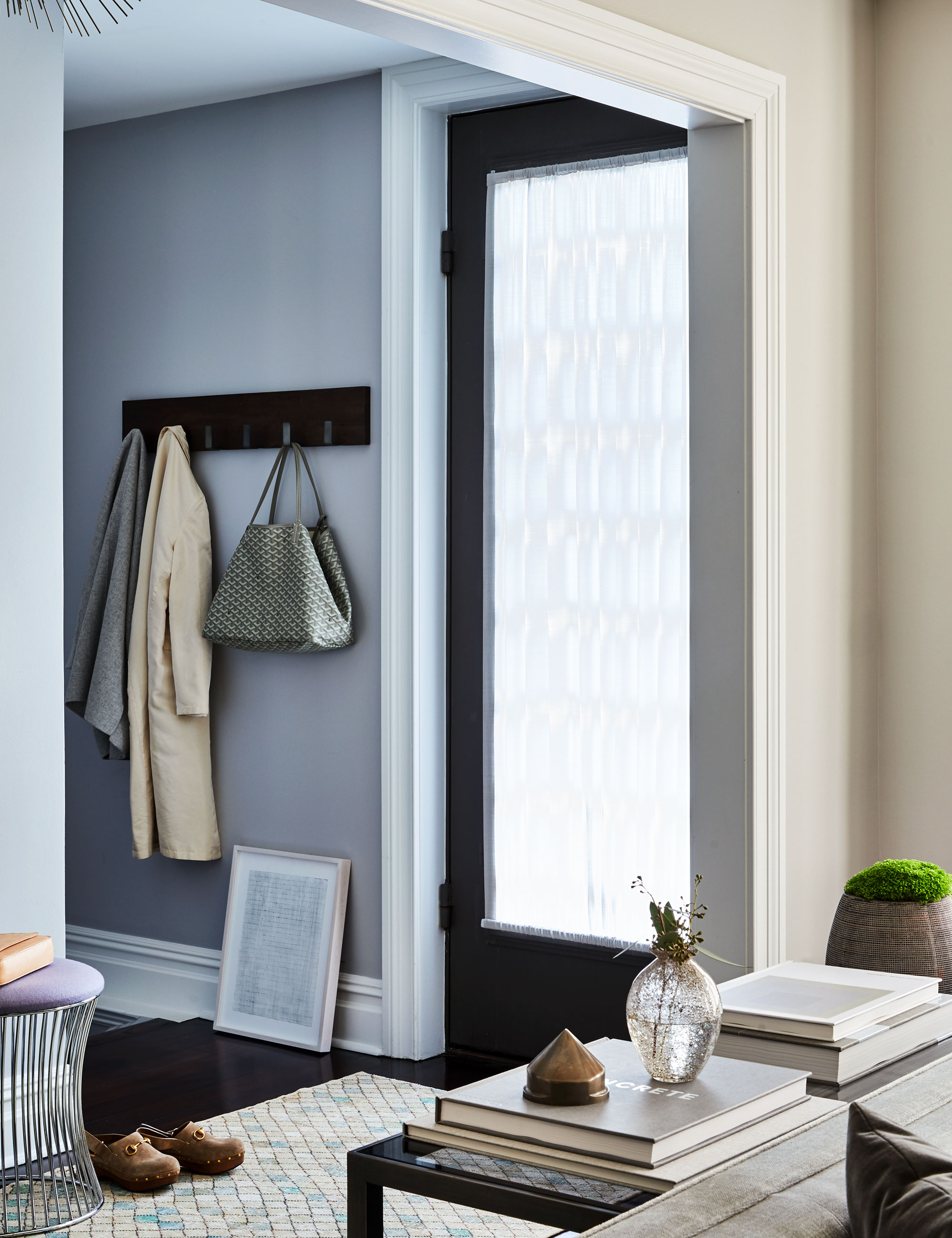
Blue is one of the most popular colors in interior design for a good reason. Conjuring endless skies and infinite seas, pale blue is the color of the moment. Embrace myriad shades to create uplifting and optimistic spaces that soothe the soul.
Fresh, airy and imbued with the restorative power of nature, light sky blues have this year been tipped by interiors experts as the perfect backdrop to modern living.
Naturally soothing, but equally energizing and hopeful, a cool blue shade promises to bring the outside in to enhance well-being, making it perfect for a small entryway. Pair it with neutrals such as white and cream for classic calm, or with stronger tones of mustard, olive, sienna and navy for a unique, head-turning scheme.
6. Gray – for a contemporary look
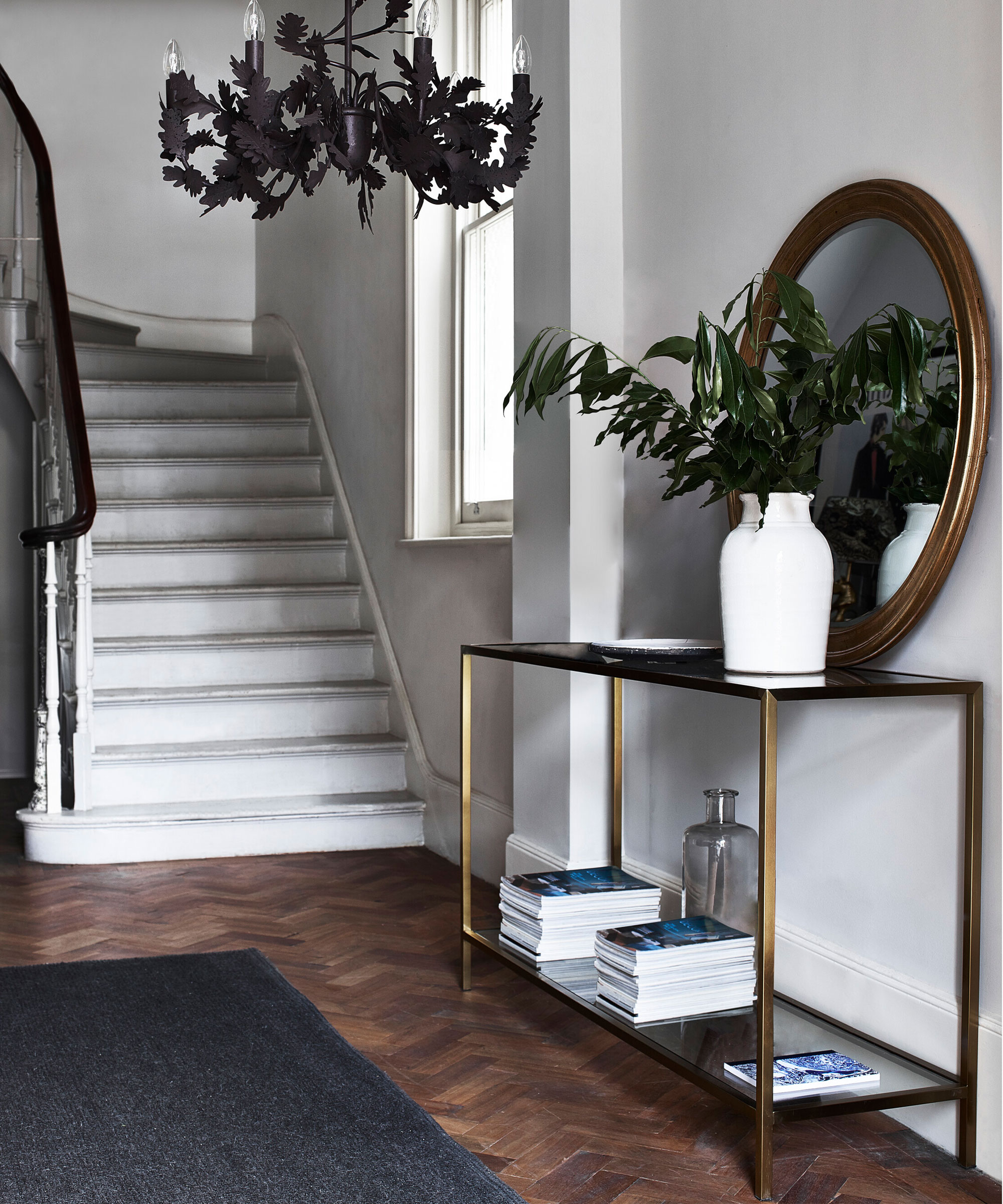
Gray may seem like an unusual choice for a small space, but you'd be mistaken. 'When it comes to decorating a small, dark entryway, many people make the mistake of thinking lots of bright or light colors will help to lift the space, says Nicole Salvesen, co-founder of Salvesen Graham. ‘The truth is that some battles are just not worth fighting. If you paint the hallway entirely white, it has the effect of highlighting the lack of natural light rather than disguising it.’ Do something unexpected.
However, if you would rather play it safe, go for a paler variation. Gray is a color that has its own weather system of light levels and hues. From the gentle grey morning rain of a bright wide sky to the breathtaking drama of dark storm clouds, the scope for creating beautiful interiors is endless. It is a shade with myriad subtle color notes that draws inspiration from beach pebbles and clay, as well as from slate and charcoal.
Mood is one consideration, but it is also helpful to consider how gray might affect the size of a room. ‘The paler the tone, the more it will reflect the available light. The darker the tone, the more light it will absorb,’ says Justyna.
Treat gray as a neutral and layer it with darker and lighter tones, including plenty of texture and some accent pattern. It makes a cozy and wonderfully dramatic statement at the darker end of the gray spectrum and at its lightest, it offers schemes a sanctuary of calm. Consider pairing it with contrasting colors, too. Designer Vanessa Arbuthnott believes ‘many yellows, softer pinks, and warm blues’ work well as complementary colors.
7. Yellow – for a heritage feel
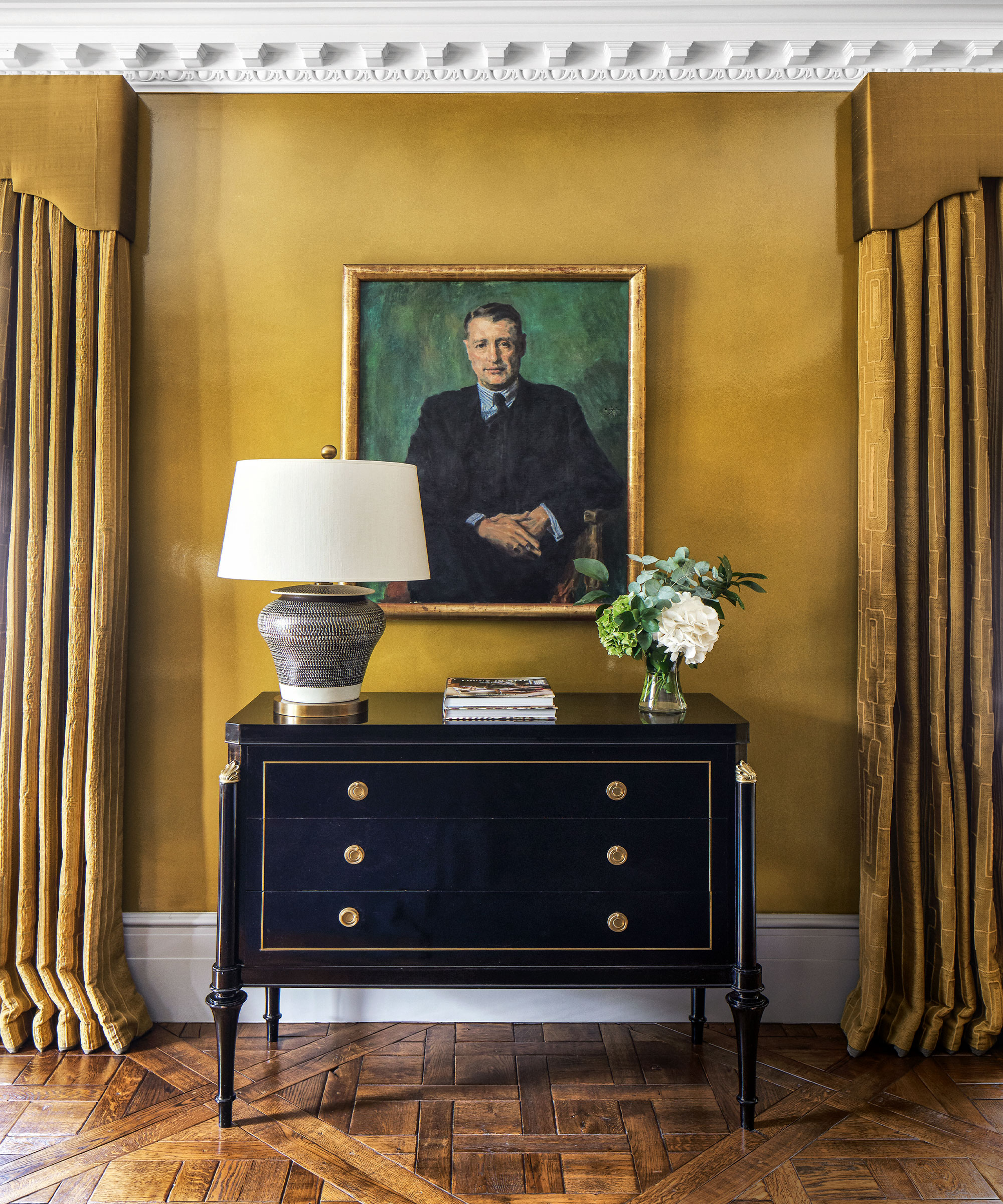
Be inspired to decorate with yellow in a modest entryway – the most cheerful color, guaranteed to inject warmth and creativity into any space, and one of the best colors to make a room feel happy.
Yellow is shining a spotlight on our homes this summer. As one of the most uplifting colors, it is not surprising that it is having a renaissance. From pretty primrose to zesty lemon, yellow brings warmth and sunshine to every surface it touches and works particularly well to uplift a small hall or entrance.
‘This cheery color imbues the room with optimism and is perfect for bringing a sense of positivity into the home,’ says Justyna Korczynska, senior designer at Crown.
As well as considering the style of the room you wish to decorate, you should also think about how you use the space and the energy you wish to evoke. Paler, gentler shades will create a calming atmosphere while stronger sunnier hues offer a more high-octane energy. Tweak that energy further by opting for alternative finishes like chalk or glossy lacquer.
8. Earthy pinks – welcome in warm summer evenings
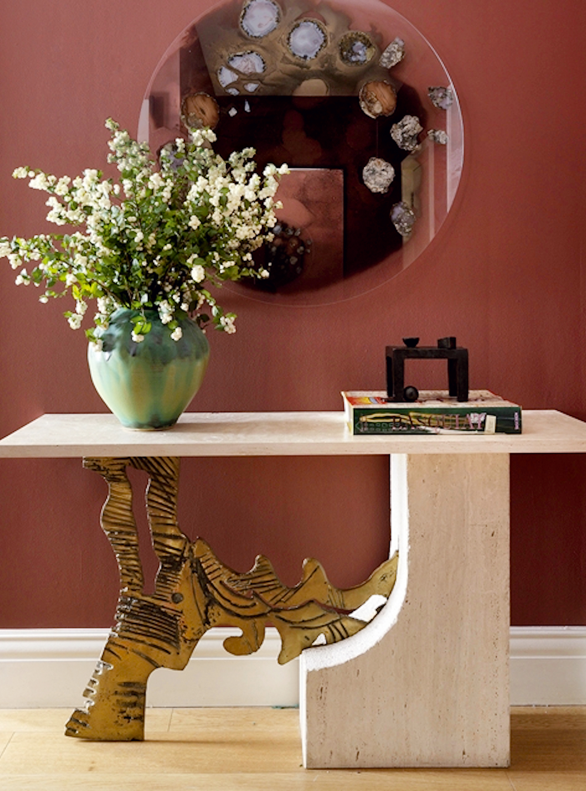
It’s inviting, uplifting, and effortless to decorate with, so it’s no surprise that pink rooms are now seen as an interiors neutral. But with choices from pastel to bubblegum, the right shade can prove a tricky quest – and that’s where a deep, earthy Pink comes in.
Rich and nuanced, an earthy pink has a depth that lends elegance and sophistication to a tiny entryway. A versatile hue, it can veer into burgundy or brighten into a deep coral.
‘This tone works perfectly in a scheme that is rather dark, or which suffers from a lack of natural light, making it perfect for a narrow entryway,' says Elizabeth Hay, founder, of Elizabeth Hay Design. 'Not only does it inject a space with brightness and cheer, but it will also bring out and highlight any accent colors in the room.’
FAQs
What is the best color for a small entryway?
In dark, narrow entrances, decorating choices make a big difference. ‘There are two approaches to small or narrow entryways,’ says Ruth Mottershead, creative director, Little Greene.
‘Embrace the size and go for deep dark colors and patterned wallpapers, or opt for a trick of the eye and elongate a long narrow space by using a lighter, warmer color at the end of the space, with a slightly darker shade of a similar tone on the walls to create depth.’
Ann Grafton, creative director of Mulberry Home also notes that, ‘using a large-scale design on all walls in an entrance can blur the illusion of where one wall stops and another one begins, making the space feel wider.
One color trend which is currently being adopted in entryways is color drenching. ‘This contemporary, cohesive approach delivers high impact by painting woodwork, radiators, the ceiling and doors the same color as the walls,’ says Ruth Mottershead, creative director, Little Greene. ‘This will create a complete scheme, treating each element similarly, and will deliver a design statement when entering or viewing the hallway from other rooms within your home.’


