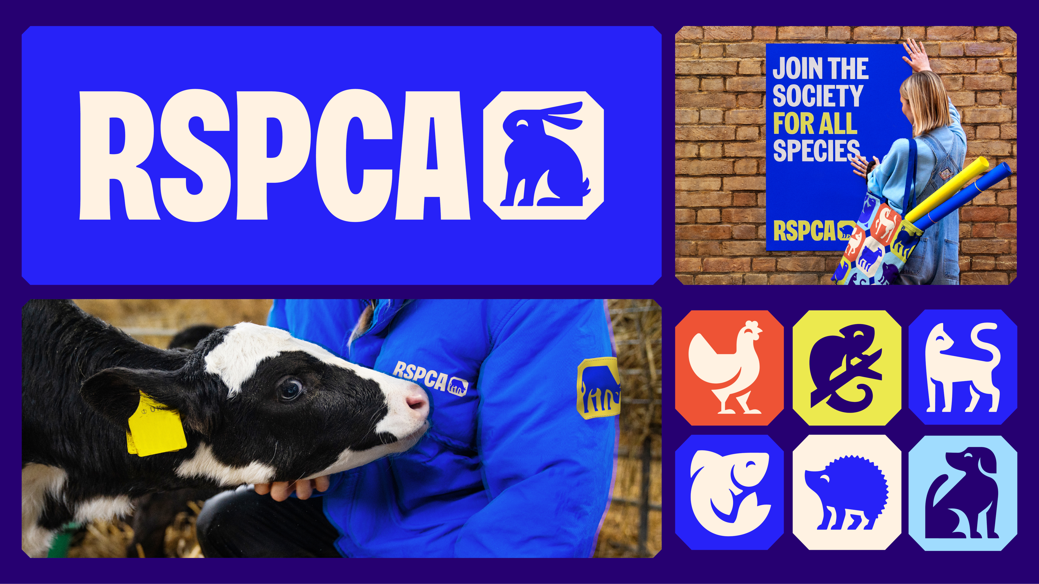
It’s always an event when a legacy brand embarks on a visual shake-up. Last week, the design world was aflutter when the RSPCA announced the first major redesign of its branding since the 1970s. As the organisation celebrates its 200th anniversary, it looks to the future with a modern, forward-facing brand identity that’s brimming with creative energy and purpose – reflecting the increased urgency of the charity’s mission as ecological destruction continues apace.
The RSPCA is, of course, a charity that advocates for the rights and welfare of animals, and as such, animals are the cornerstone of this rebrand. The central piece is a new logo, which is really multiple logos at once (not even the best logos can make that claim). An octagonal shape similar to a British postage stamp – a nod both to royal heritage and the charity’s previous logo – is used to enclose a series of simple and distinctive illustrations of different kinds of animals.