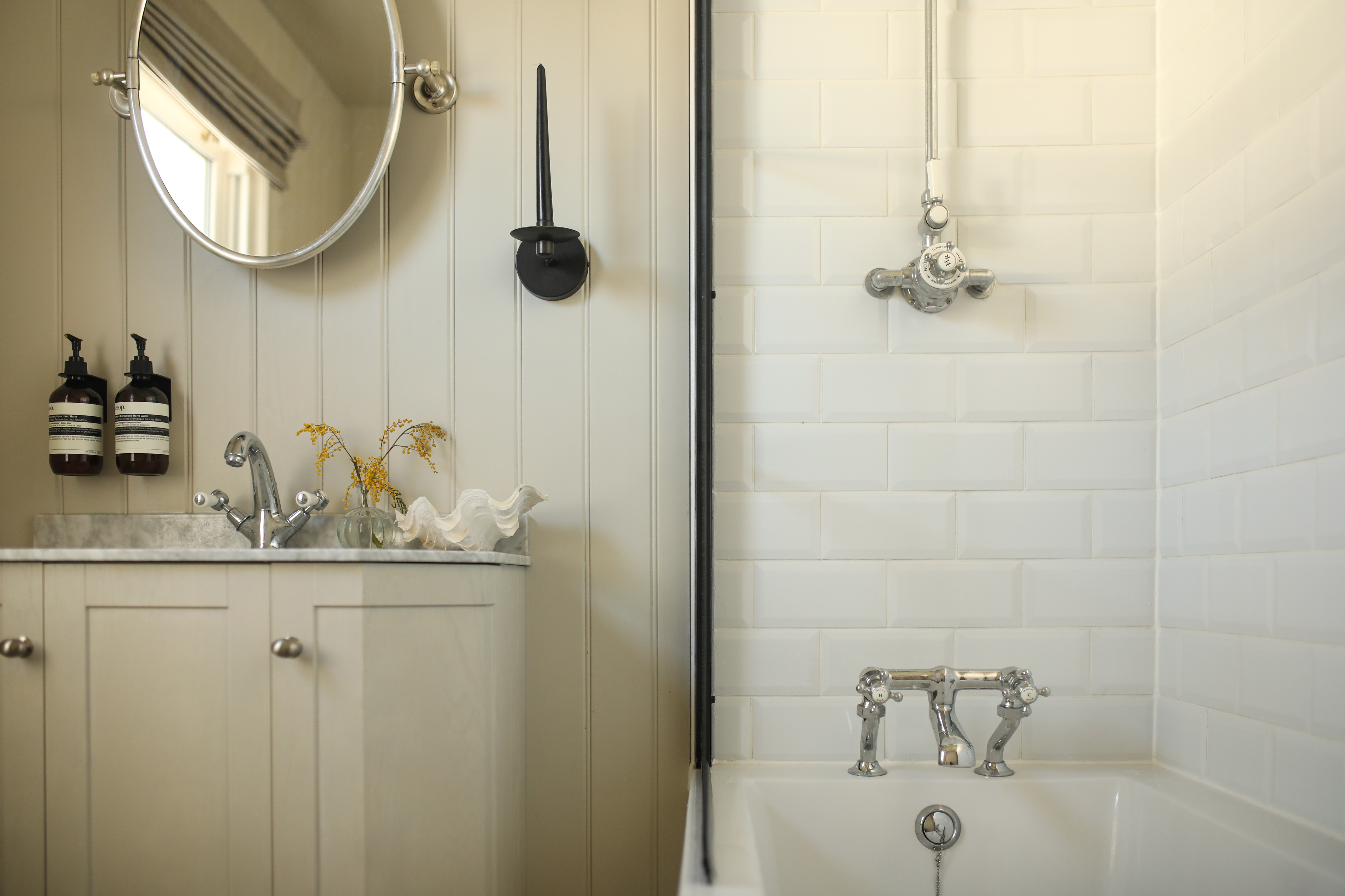
There's no avoiding the fact that renovation projects come at a cost, but with bathrooms and kitchens where complex plumbing fixtures are involved, the price is often far greater. That's why it's important to cut back spending where you can, just as home renovator Hannah Crosskey has done in her beautiful bathroom refresh by making use of budget-friendly products that still result in a high-end look.
After moving into her coastal Victorian home, Hannah learned that the previous resident had been there for over 50 years. With no major decorating being done during that time, the family bathroom was decked out with a 70s interior, complete with an avocado suite and carpeted flooring. In a bid to overhaul her space on a budget, Hannah used affordable products from Wayfair, the destination for all things home, to give the space a modern update while still honoring the classic feel of her period property.
'Hannah has tapped into Wayfair's broad bathroom range and cleverly combined investment pieces, such as a statement marble-topped vanity unit, with more affordable finds to create her elegant bathroom scheme,' explains Wayfair's Resident Style Advisor, Dee Fontenot. 'This transformation is a testament to how cost-effective bathroom makeovers can still maintain a high-quality finish, which won't compromise on style.'
Here we take a closer look at how Hannah used these products to curate a neutral and serene bathroom that blends in seamlessly with the rest of her modern home.
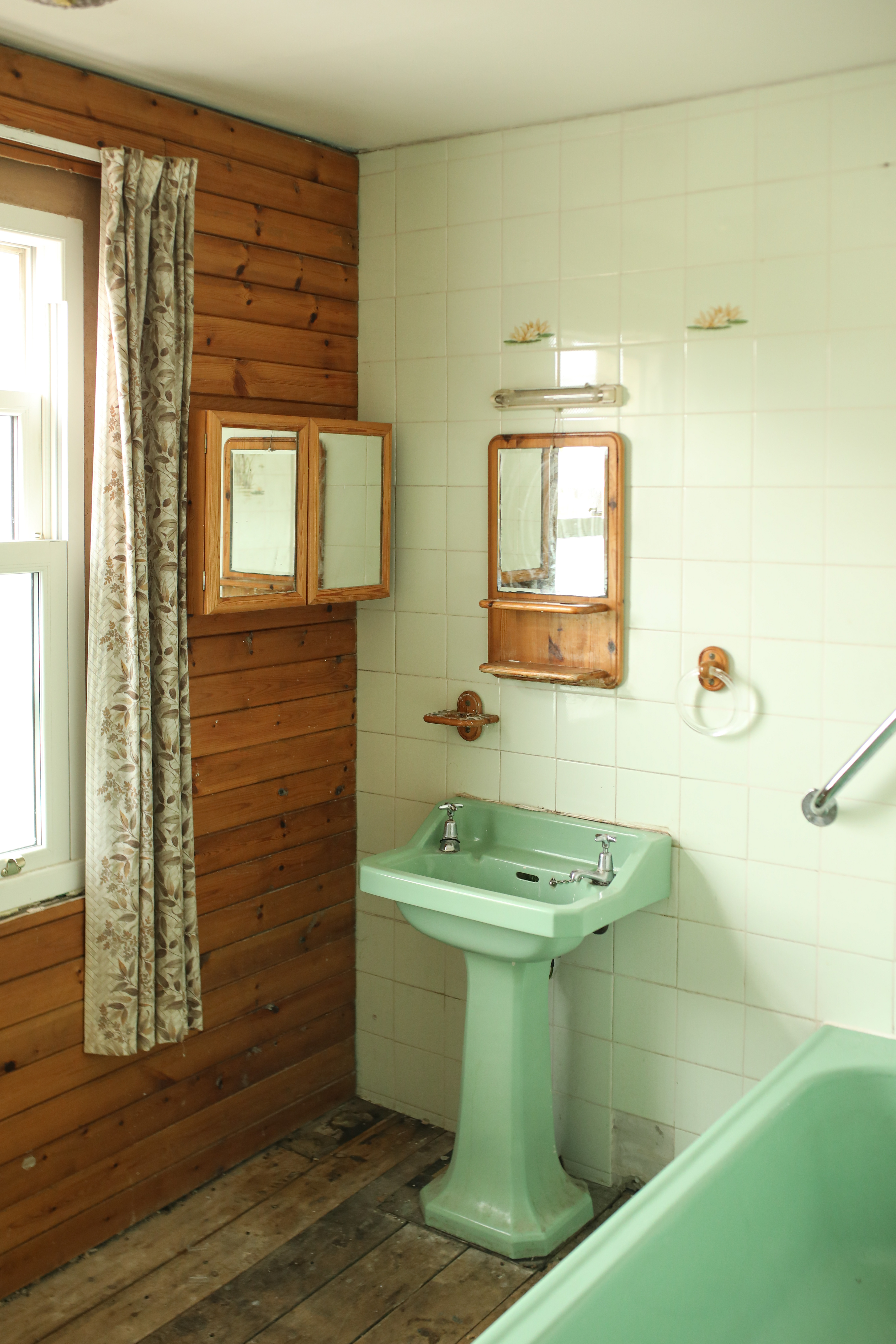
After purchasing her seaside semi in October 2020, Hannah - who documents her renovation on her Instagram, @nosixtyeight - set to work on transforming her modern bathroom during the peak of the pandemic meaning progress was slow. She was faced with a complete avocado suite, dated tiles, and carpeted floors, meaning a complete gutting was needed.
'The bathroom took about 12 weeks,' she says. 'To begin with, followers on Instagram thought I should keep the retro bathroom, but I wanted to make my own mark on it.' Besides making the job as swift as possible, Hannah was keen to keep costs down after starting a family. She decided to use a mix of premium and affordable decor from Wayfair, a homeware brand that offers a broad range of high-quality furniture and homewares for every style and budget, to transform the dated space into a calming and serene sanctuary.
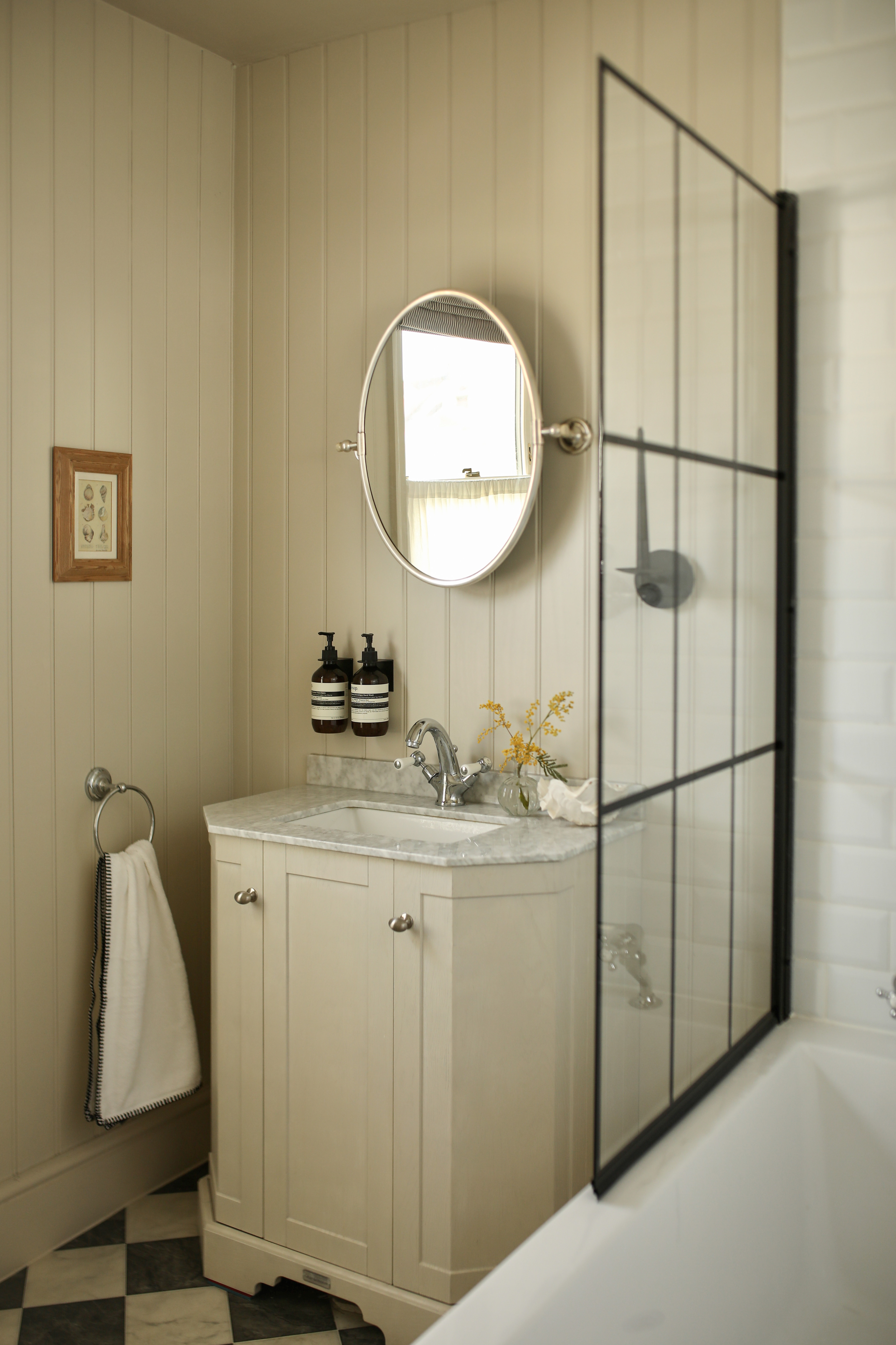
In keeping with the beachy setting, Hannah opted for tongue and groove paneling on her walls which helps to heighten the space. 'Being Victorian, the house is very traditional and we've actually got quite a lot of paneling elsewhere,' she says. 'It's also quite practical because it's moisture resistant, and I really how it envelopes the room, especially with the calming color.'
The color in question is Farrow & Ball's Shaded White, a soft hue with a grey undertone, which Hannah also painted on the ceiling. This color-drenching approach makes for a cocooning space, aided by the soothing shade, contrasting drastically with the harsh boldness of the previous decor. 'I love that it's relaxing to escape now,' says Hannah.
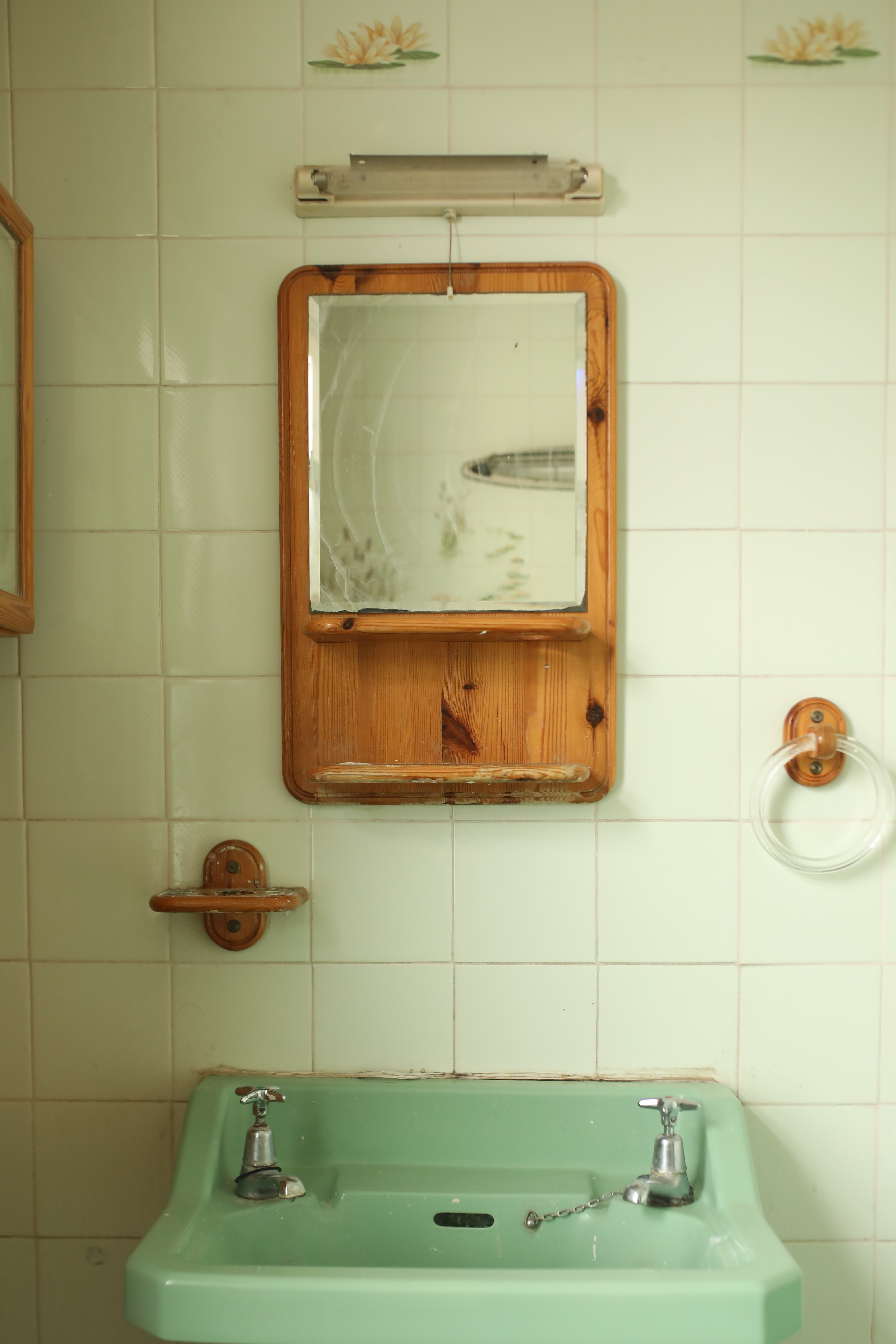
Prior to her renovation, dark wooden accents found in the mirror frame, the shower shelving, and the wall-mounted fixtures instantly dated and darkened Hannah's small bathroom. As a tiny space with limited natural light, she was keen to do away with these, instead opting for a more modern matt black soap dispenser and sconce from Wayfair.
'My other choices were very traditional, so I felt like the space needed something a bit industrial and modern,' Hannah explains. 'I just wanted a bit of black!' The bold accents in an otherwise neutral, serene space add a slight edge that feels contemporary and fresh.
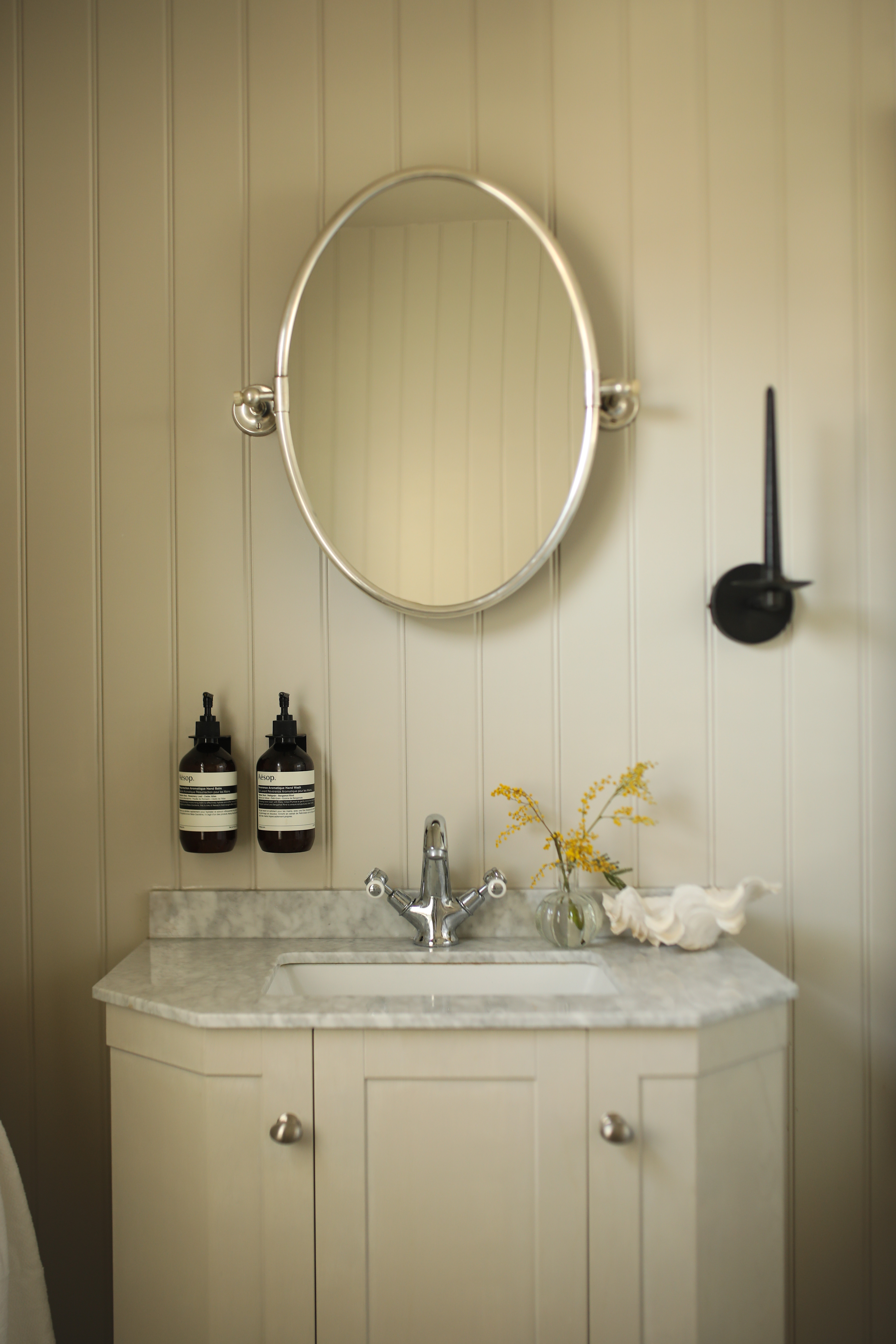
Mastering a transitional style, Hannah juxtaposed these more modern accents with timeless traditional features such as the chrome taps. Asked why she made this decision, she says, 'there was already chrome in the bathroom that we took out and I wanted to add it back to honor the property. I felt like the whole color scheme was just asking for it to be put back in'.
Another traditional influence is the built-in vanity which has a classic feel with the cabinet molding and heritage-style taps. 'I just love the house and how it has so much character about it,' Hannah says. 'I feel like as time goes by, choices like these will age nicely.'
To maximize space on top of her vanity, Hannah also stuck with some wall-mounted fittings. The addition of a glass soap dispenser is a small but effective touch that she suggests anyone with a smaller space takes the effort to include. 'It has a luxe, hotel-feel so it feels a bit fancy, but from an aesthetic point of view, a clean counter space just looks so much tidier.'
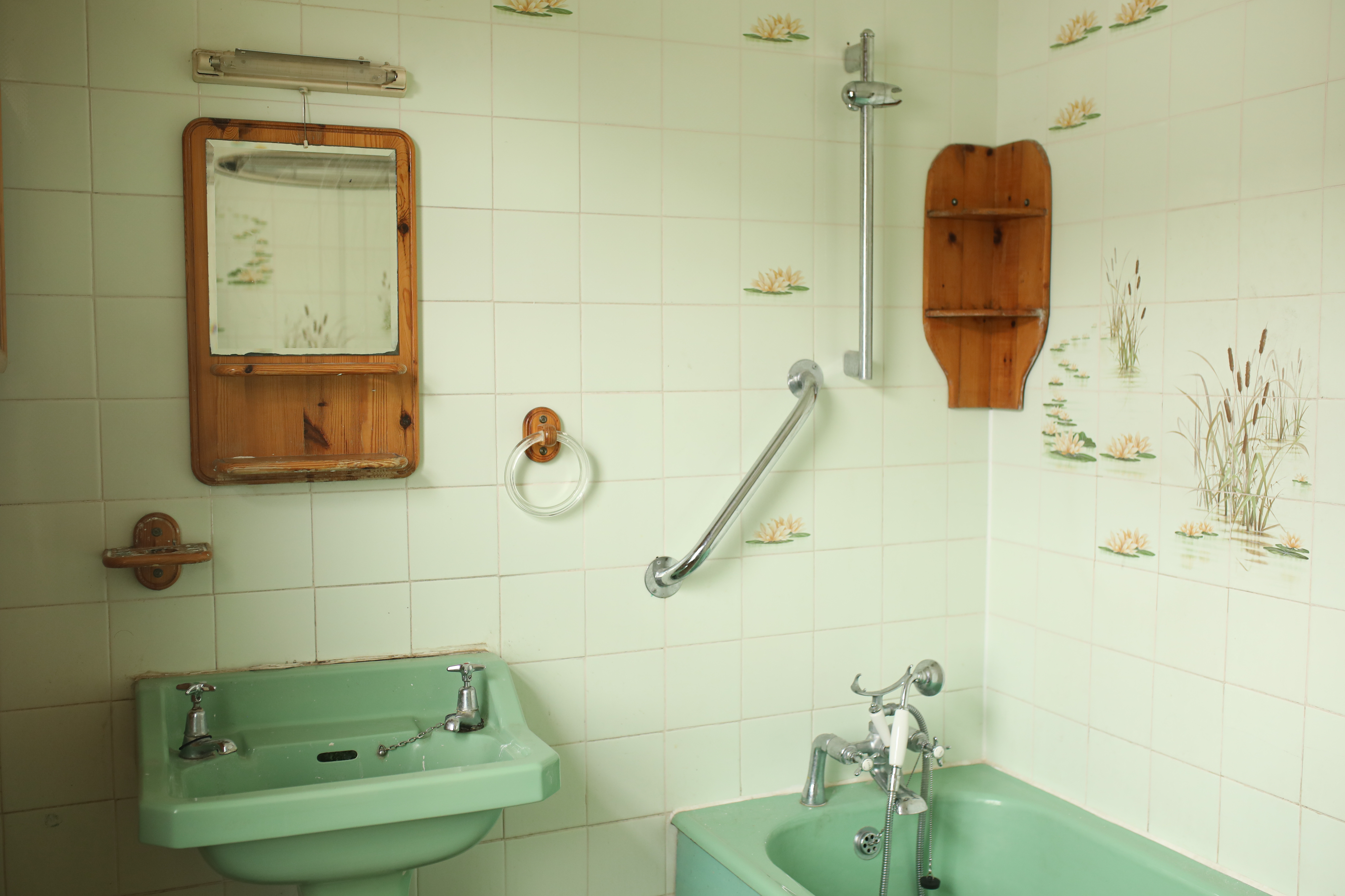
Before the renovation, the floor-to-ceiling bathroom tiles had riverbed motifs which, while quaint, were very much of their own era. Hannah, by contrast, decided not to buy into trends, instead opting for a classic white subway tile in a fuss-free design.
'I like the classic white brick stack,' she notes. 'I didn't want them to stand out or detract from the paneling and I like that the tile just blends in with the rest of the room.' Thanks to the lack of brilliant white elsewhere in the space, this white tile idea also avoids being too clinical.
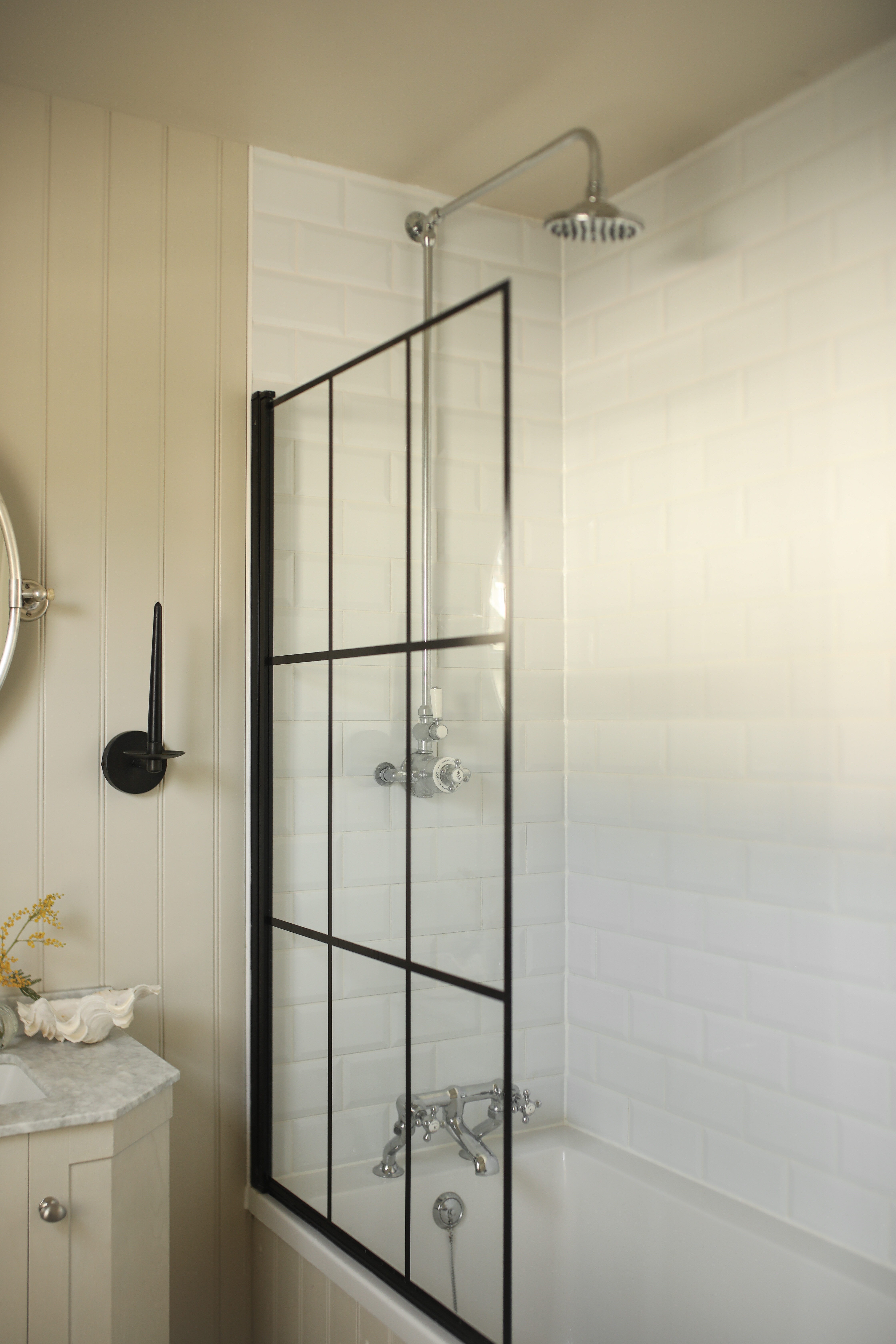
For her shower, Hannah installed an on-trend window-effect bath screen, the black border making a serious visual statement. Not only does it tie in with her other black fixtures, but it offers a refreshing contrast to the neutral tones throughout the rest of the space.
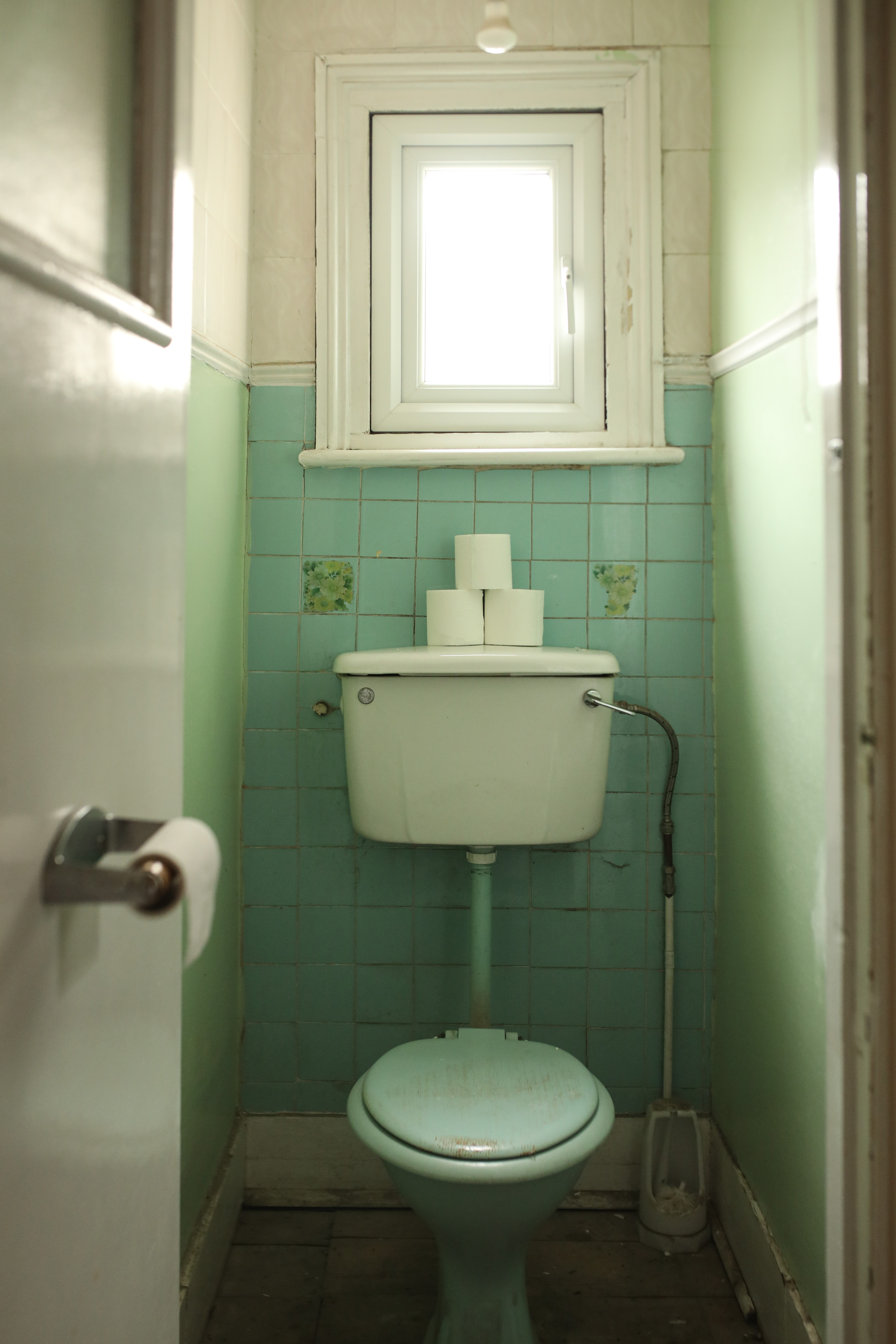
Possibly the most dated spot of all was the toilet itself. The overwhelming avocado shade made the space feel dark and closed-in, while exposed plumbing fixtures created a cluttered visual effect. For the sense of cohesion, Hannah decided to use the same panelling and off-white color she used in the main bathroom which creates the same fresh, airy feel.
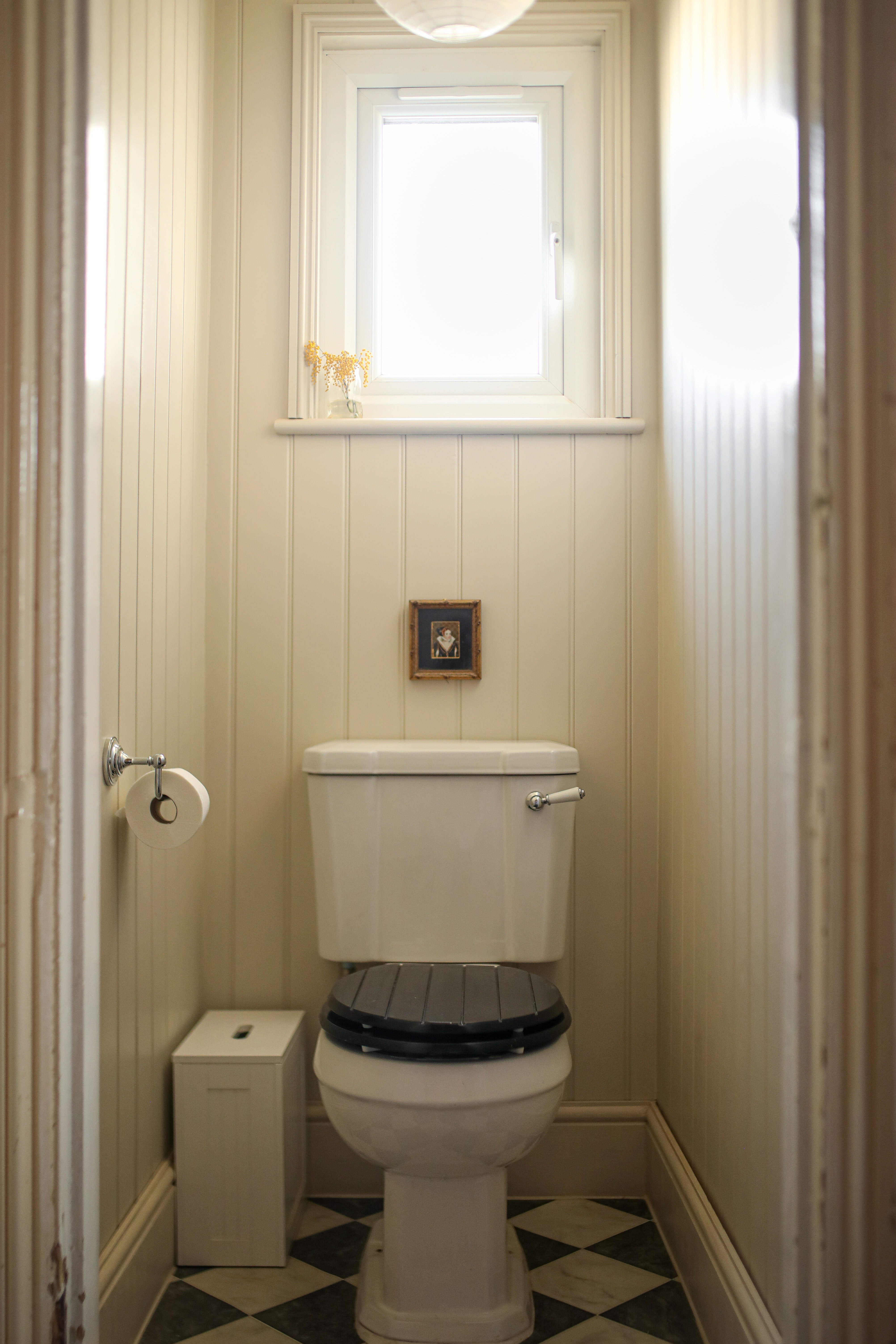
Hannah's main takeaway is to never be afraid to put your own stamp on your space. 'I DIYed the blind in the main window and found the perfect tiny portrait to go above the loo,' she says. 'Adding bits of personality like that makes all the difference.'


