Let's be honest: Abbey Clancy and Peter Crouch are undeniably the poster children for relationship goals. Abbey makes no secret of the fact that she often takes the lead for the interior design choices made in their home to avoid disputes. Well, we've got to hand it to her because we can't get enough of the pair's gorgeous kitchen, adorned with a marble slab backsplash and matching worktop.
Slab backsplashes are the kitchen trend to watch this year, and despite it only being February, it's becoming abundantly clear that they're a kitchen splashback idea showing no signs of losing steam anytime soon. One design trick commanding our attention as of late is matching splashbacks with kitchen worktops, making for a seamless and cohesive look. What if we told you that it works a treat for making a small kitchen look bigger, too?
'By combining these elements, you create a visual flow that seamlessly connects the different areas of the kitchen, bringing a sense of harmony that also makes the space feel larger,' assures Jen Nash, head of design at fitted kitchen specialists, Magnet. As a result, Abbey Clancy's kitchen feels even more open and inviting.
One of the biggest things to consider when designing a kitchen is ensuring that your worktops and backsplash complement each other in one way or another.
Simon Ribchester, head of design at home renovation platform, Beams explains to us that 'the two surfaces should never compete against each other, as this will result in a visually overwhelming space that looks overcrowded.' Take note, this is a kitchen design mistake to avoid where possible.
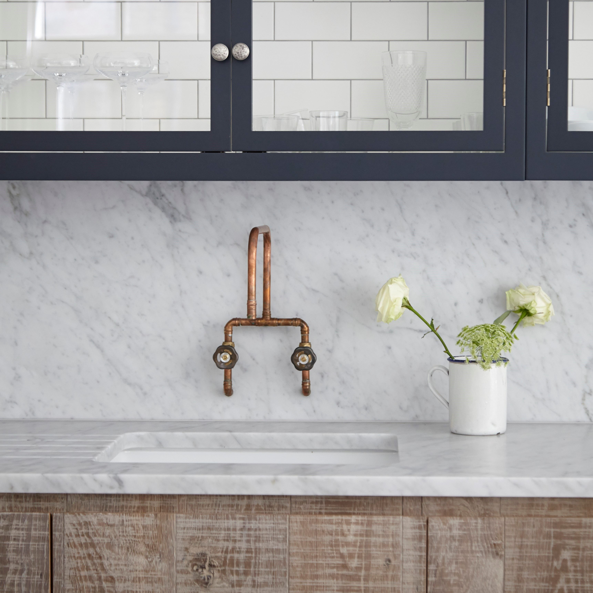
Keeping these design features complementary keeps everything balanced – and matching them simply takes this concept a step further. Simon assures that matching your backsplash and worktop is 'an easy way to add coherence and a streamlined look to your space' as well as making the overall design appear more 'intentional and well-coordinated'.
Little things like this are what make a kitchen look expensive, as that lack of attention to detail is often a tell-tale sign of a space that hasn't been well considered.
Of course, we know you're all as inquisitive as to how exactly employing this design trick makes a small kitchen sing as us, so we've got you covered there, too.
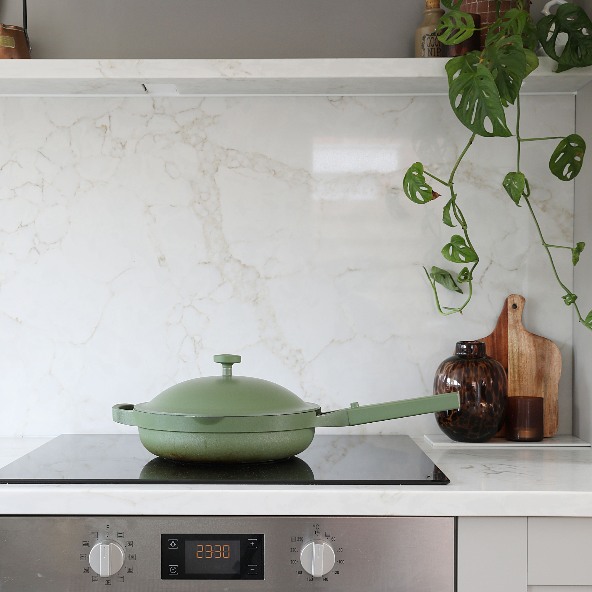
'Extending your countertop so that you have an extended upstand (or splashback) is a great way to increase the sense of space in your kitchen,' begins Ann Marie Cousins, interior designer and founder of AMC Design. 'By avoiding a hard line between the countertop and walls, it tricks the eye into being uncertain about where one ends and the other begins, enhancing the sense of space.'
Simon adds that 'the continuity of the materials makes the eye move seamlessly across the kitchen, making the space feel more expansive.'
How to get the look for less
In Abbey Clancy's kitchen, she's gone headfirst into the quiet luxury kitchen vibe with a full marble look. However, if you know marble then you know doing this can get costly very quickly.
Luckily, Jen assures us that there are cheaper alternatives available to get a cohesive and streamlined look for less.
- Quartz – Highly durable, non-porous, and available in many different colours and patterns to tie into your kitchen design and create a seamless appearance.
- Granite – Known for its durability and aesthetic appeal, offering a cohesive design with consistency across patterns and colours.
- Ceramic or porcelain tiles – Available in many different sizes, shapes, and colours whilst still being durable and resistant to stains.
Alternatively, Darren Watts, Wren Kitchens' showroom development and design director suggests opting for matching laminated worktops and backsplashes, inspired by the look of these natural materials, to nail the cohesive look for even less. 'It has the desired pattern and effect at a fraction of the price.'
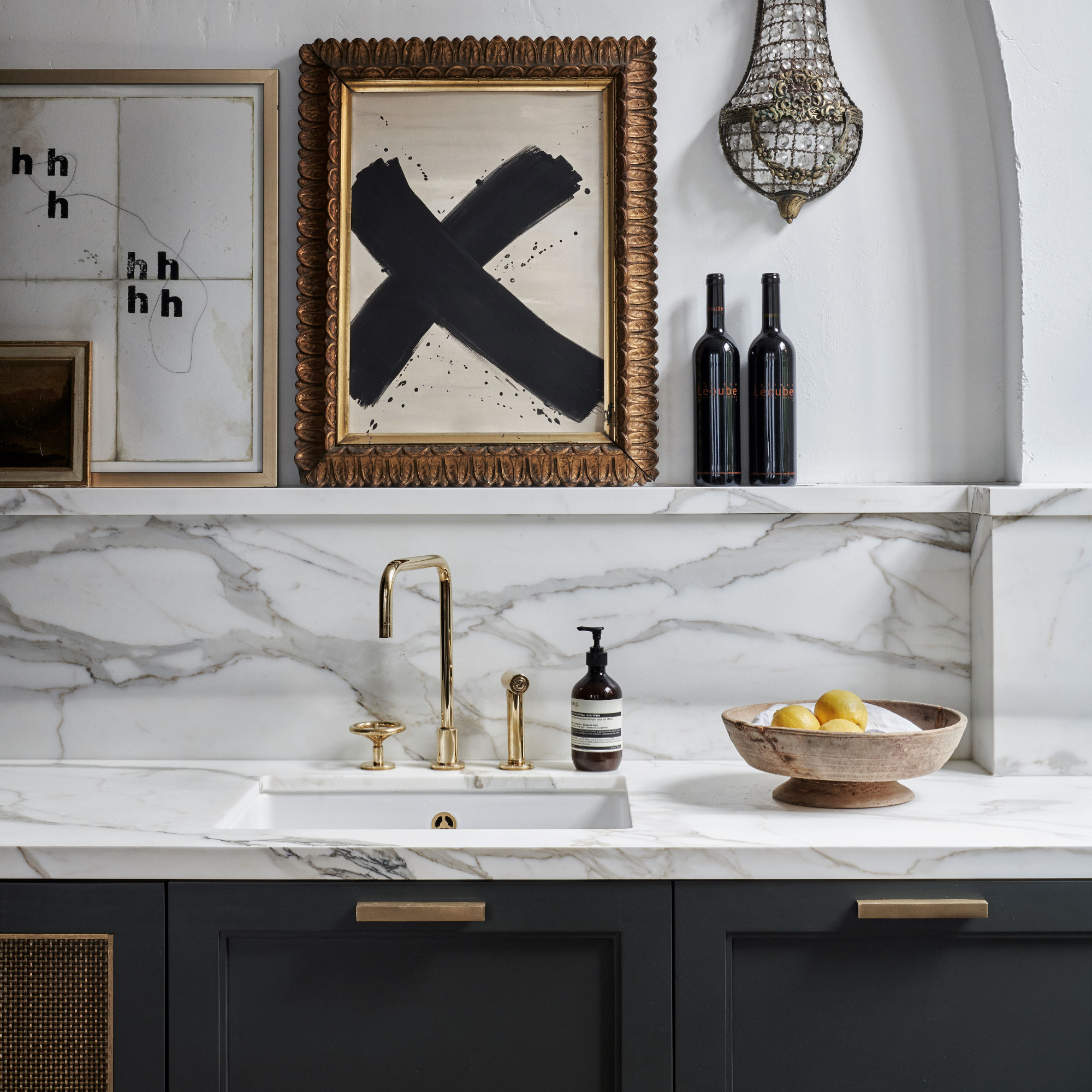
While you're considering material choices, it's also important to think about how you can incorporate your matching worktop and backsplash with your respective kitchen colour scheme.
Helen Joseph, interior designer at premium housebuilder, Redrow suggests 'opting for crisp white or earthy tones, as lighter colours will reflect more light and make the space feel brighter and more spacious.'
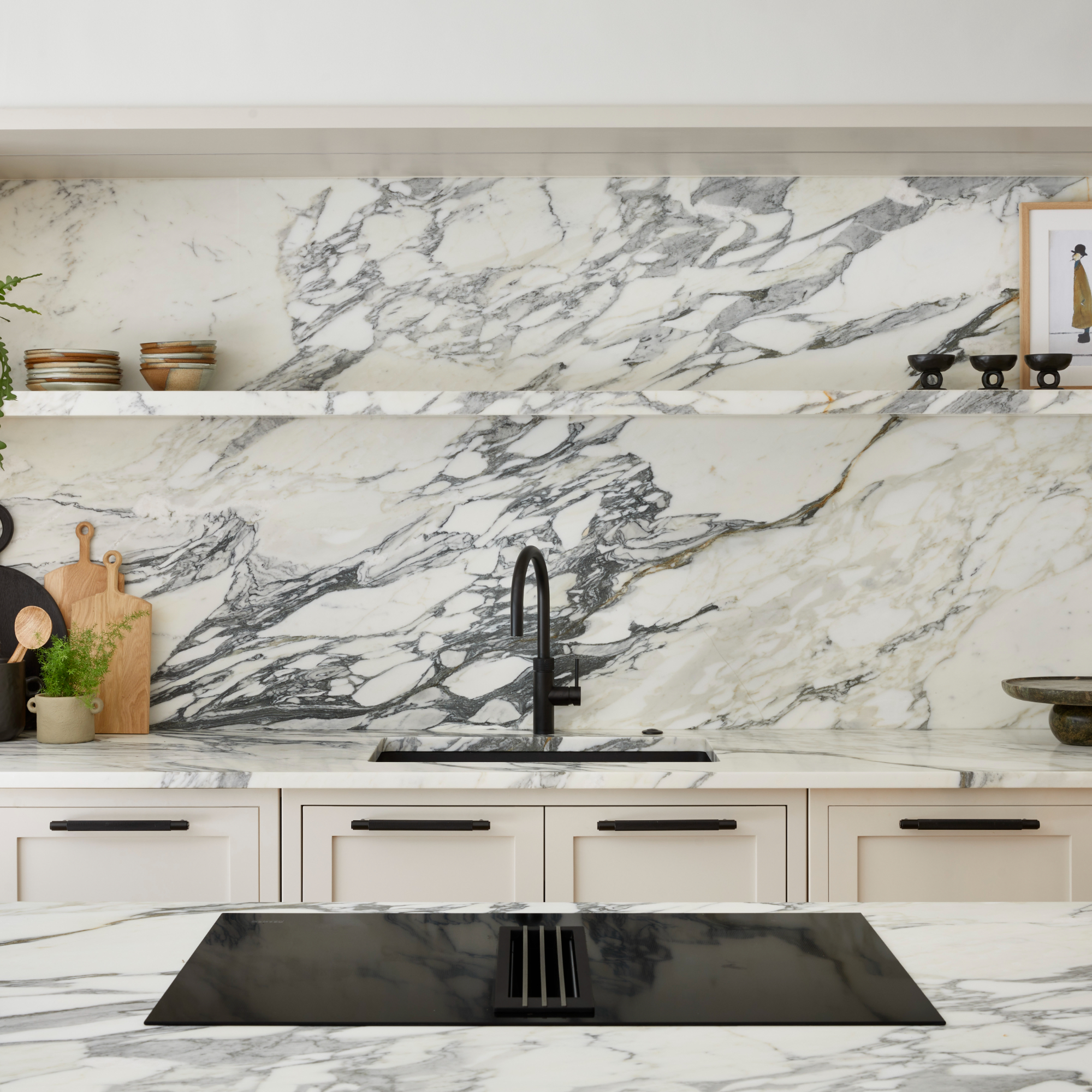
'Take it a step further by including one with a delicate veining in to add visual depth and interest. Or for a monochromatic look, you could even pair an off-white backsplash with grey quartz countertops,' she advises.
Helen concludes that the key thing to remember if you're looking for the 'wow factor' is to limit the number of materials you introduce across your kitchen. 'A limited, coordinated palette creates a luxury and timeless feel, regardless of which type of materials you've chosen.'
So, while we may not be able to mimic Abbey Clancy's stunning kitchen to a tee, it's certainly valuable knowledge to keep in our back pocket the next time we teeter new backsplash and worktop ideas.


