While the warm-toned palettes and maximalist tendencies of the 1990s were soon replaced by the minimalist wave of the 2000s that favored cleaner and more restrained palettes of neutrals, color trends are slowly but surely making way for this nostalgic decade once again.
From peach-tinted neutrals, hunter green, and dusky pinks, the most prominent color palettes of the '90s delivered comfort and warmth. In 2026, as fatigue from the overly stark neutral craze sets in, turning back to '90s color palettes brings back coziness, softness, and personality: something lots of us are craving.
That said, styling these nostalgic color trends is all about balance and a thoughtful approach to keep them from looking dated. Below, interior designers explain how to do just that – from cozy living rooms to colorful bedrooms.
1. Peach
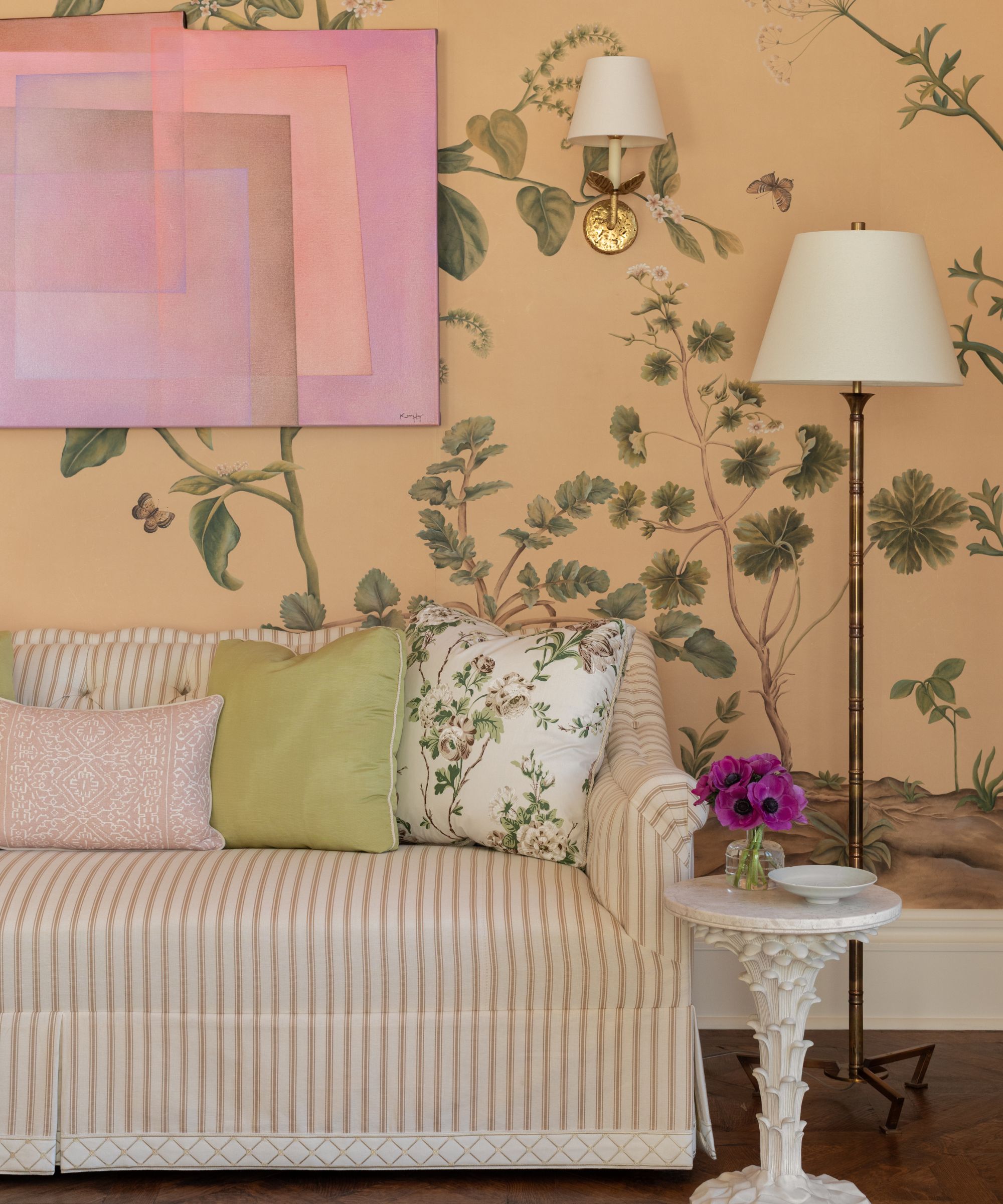
You don't have to look far into '90s interiors before you come across peach-washed walls and furniture. A hallmark of the pre-2000s, decorating with peach feels lighthearted and feminine, but in 2026, designers are giving it a modern edge.
Here, a peach tone was incorporated through wallpaper ideas, setting a comforting and uplifting backdrop, and was modernized through the room's artwork. 'I wanted this morning room to feel warm and inviting the moment you walk in,' explains the designer Paloma Contreras.
'Because the pattern is quite traditional, I balanced it with modern artwork, including the pink piece by Kerry Hays, to introduce contrast and prevent the room from feeling overly nostalgic,' says Paloma. 'The dialogue between the classic botanical wallpaper and contemporary art keeps it feeling current.'
'The overall mood of the palette is light, fresh, and uplifting,' she adds. 'It’s a space designed for morning light, intimate gatherings, and lingering over tea or brunch with close friends.'
Create a similar look with this peach-colored bird motif wallpaper.
Bring warming peach to your living room textiles with this cushion cover with a fringe edge.
For a smaller pop of peach, go for this floral wall art. The green backdrop keeps the warmer hues feeling balanced and timeless.
2. Fresh Green
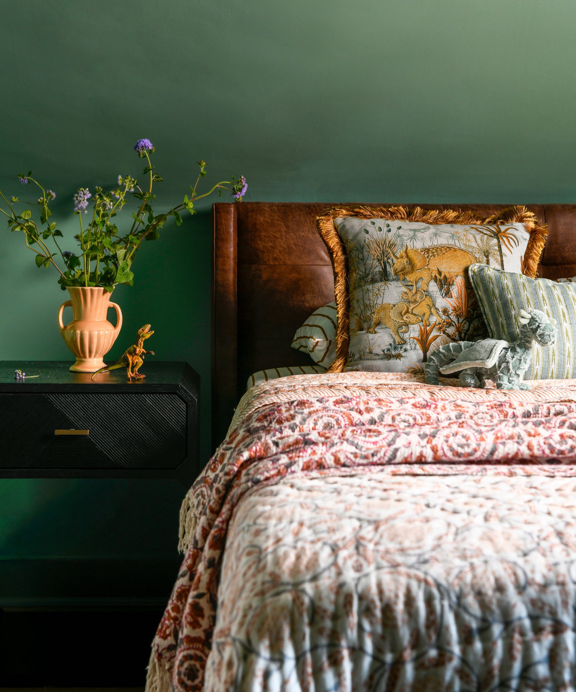
Green room ideas are timeless, but have adapted over the decades towards softer and lighter versions. In the '90s, hunter green was a staple – a rich and warming tone that makes a statement.
In this bedroom, the interior designer Michelle Gage put a fresh and contemporary twist on green with Benjamin Moore's Harrisburg Green – a cool and muted paint that feels fresh and livable. 'A medium green shade is perfect for a guest room or office,' says Michelle. 'It’s soothing but not too safe.'
'Green is a color that some consider a neutral, and others consider it to be a pop,' she adds. 'It’s a soothing, peaceful hue and pairs well with blues, browns, and oranges.'
Perfect for transitional interiors, this pillow cover is a modern take on green.
Ground your scheme with this green wool rug. Featuring a geometric pattern, it feels contemporary and fresh.
Bring this '90s color trend to your bedroom with this linen duvet cover set. The shade 'willowleaf' is a muddy brown that's muted enough to feel timeless.
3. Butter Yellow
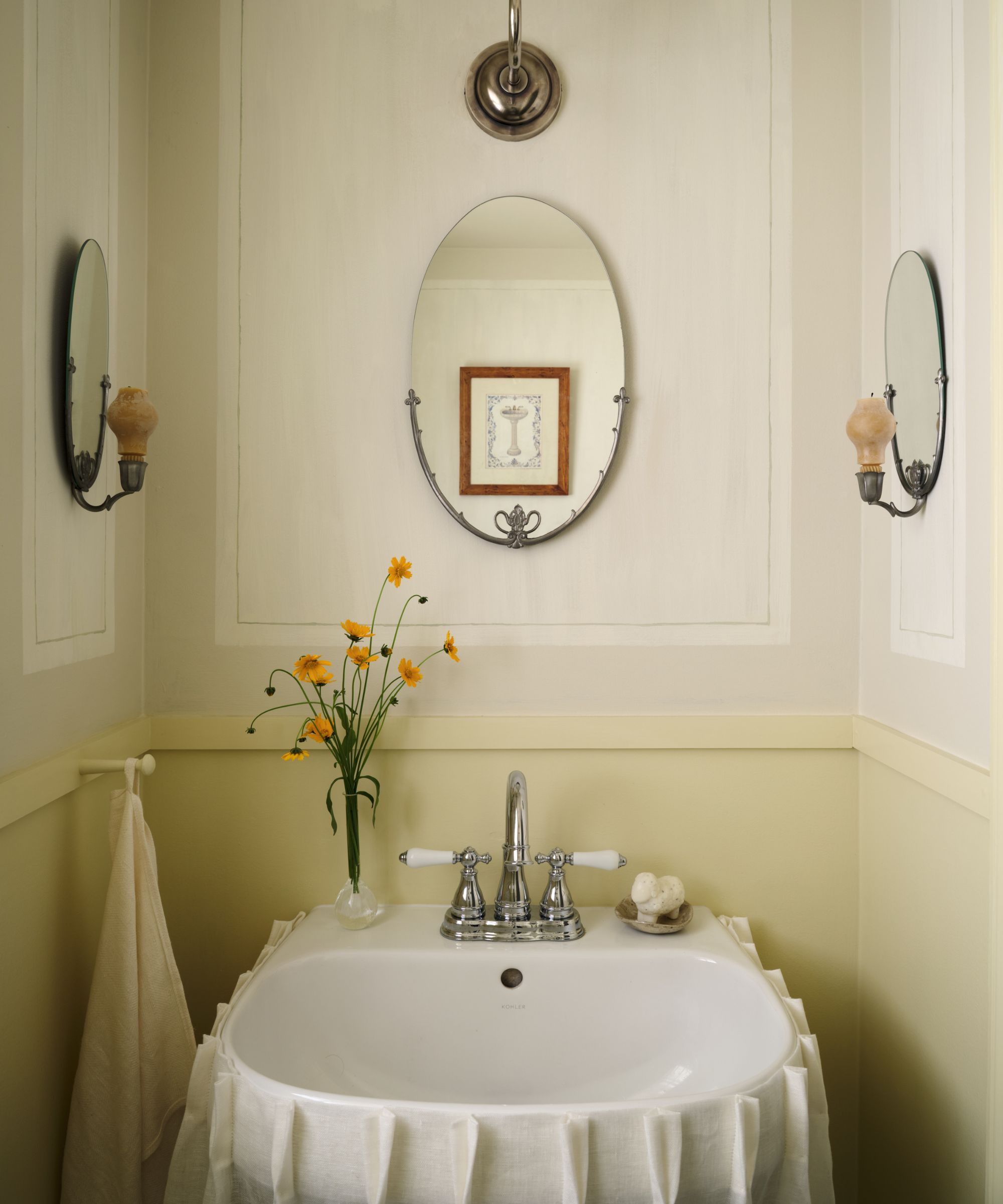
Decorating with yellow saw plenty of appeal in the '90s: think sunny spaces that took a confident approach to color. Today, yellow takes on a more muted look, not least with popular butter yellow bringing a touch of nostalgia with enough restraint to feel modern. Here, it was used on the lower walls of this powder room.
'This powder room was inspired by Swedish painted interiors,' says the designer Vivan Shao Chen. 'We went for hand-painted faux panels, influenced by some beautiful examples I saw at Drottningholm Palace near Stockholm, as well as more modest but equally charming examples from two favorite books: The Swedish Country House and Swedish Style.'
'Though the butter yellow is a distinctly nostalgic color, the detailing in the room is very simple and clean, which lends it a more modern interpretation,' says Vivian. 'The chair rail is a simple square profile, and the painted panels are done with muted, soft tones with a washed finish.'
A small touch of butter yellow can be all that's needed to uplift a neutral room, and this lampshade feels on-trend with the plaid design.
Complete your scheme with this happy yellow trinket dish with a floral print.
4. Dusky Pink
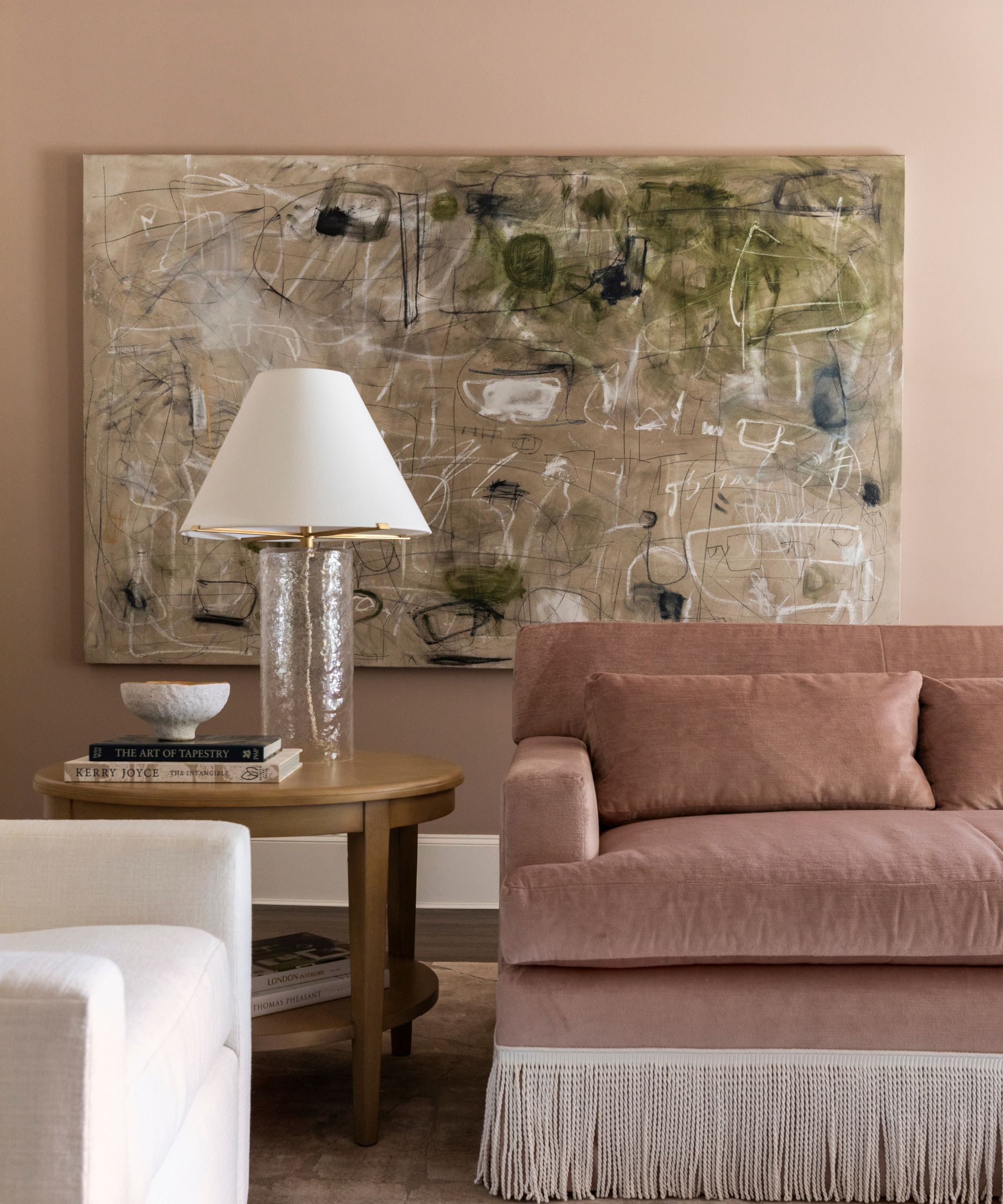
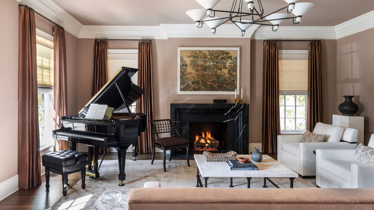
Pink room ideas from the '90s can soon conjure images of carpeted bathrooms and elaborate decor, but today, nods are made to this warming hue with dusky and mellow shades. Farrow & Ball's Dead Salmon, which was used in this living room, puts a modern spin on pink decor, with enough brown tones to exude sophistication.
'It carries the romance of a dusty pink yet reads as a complex neutral, which allowed us to honor the home’s traditional architecture while giving it a fresh point of view,' the designer Marie Flanigan says about this pink paint. 'We balanced its nostalgic undertone with crisp-lined case goods, an acrylic-framed antique tapestry, and tailored upholstery so the color felt intentional and current rather than sentimental. The overall palette is warm, nuanced, and quietly luminous, layered with soft neutrals and refined finishes that create a mood of understated elegance and modern classicism.'
The dusky hue of this pink pillow feels elevated, while the velvet fabric and ruffled edge add a touch of nostalgia.
With a rose-toned marble base, this lamp is a stylish way to add pink to your space.
Go for a lighter take on dusky pink with this rug, which would work almost as a neutral.
5. Deep Blue
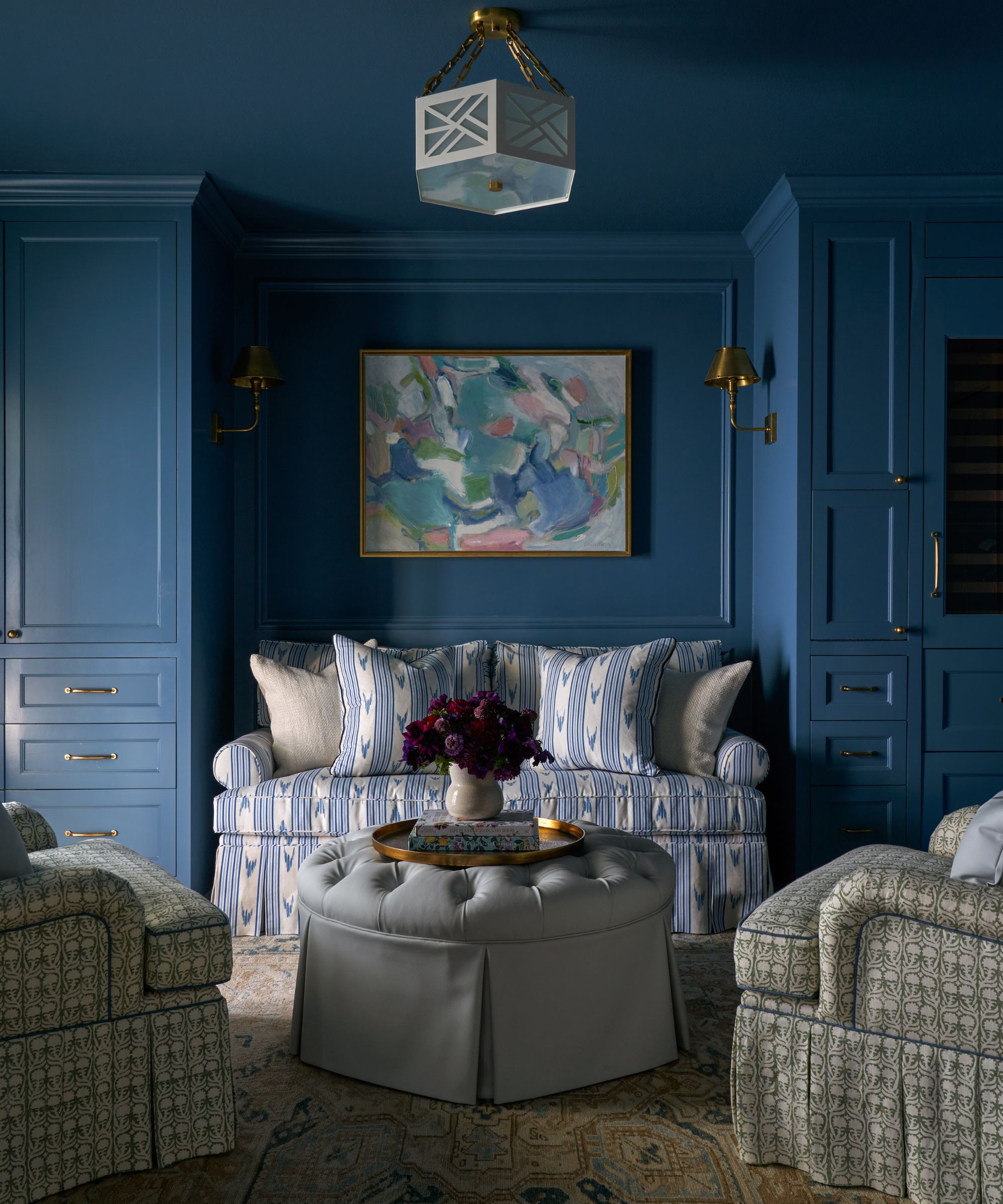
Navy blue was a popular color in the '90s, creating a cool and classic look alongside whites and creams. Today, designers are using similar deep blues, but with a slightly muted cast for a more modern feel. Used to drench a whole room, this color trend takes on a more contemporary look than the accent colors of previous decades.
'We wanted the lounge to feel like a jewel box – a true departure from the lighter rooms in the house – so we did a full dip in Benjamin Moore’s Mozart Blue,' says the designer Katie Davis. 'Blue naturally has a nostalgic quality, and I love that about it. But taking it across the walls, trim, and millwork makes it feel intentional and immersive rather than decorative. It becomes an experience instead of just a color choice.'
'To keep it from feeling dated, we were really thoughtful about how we layered it,' she adds. 'Instead of leaning into heavy finishes or overly traditional details, we kept the lines clean and the upholstery tailored. We mixed in pattern and texture for movement, and brought in brass accents and modern art to keep it feeling fresh. It’s about letting the color feel rich and saturated without tipping into that heavy 90s look.'
Bring a classic look to your home with this navy blue pillow cover with a floral print.
For a smaller touch of dark blue, go for this porcelain planter – a stylish choice for spring.
This ruffled tablecloth has Easter hosting covered, bringing a touch of '90s-inspired color in a fresh way.
If you want to bring more warmth to your home this year, these '90s-inspired shades are a good place to start. Whether you use them as inspiration for your next wall color or add them more subtly with decor, modern touches throughout your scheme will keep the room from looking dated.