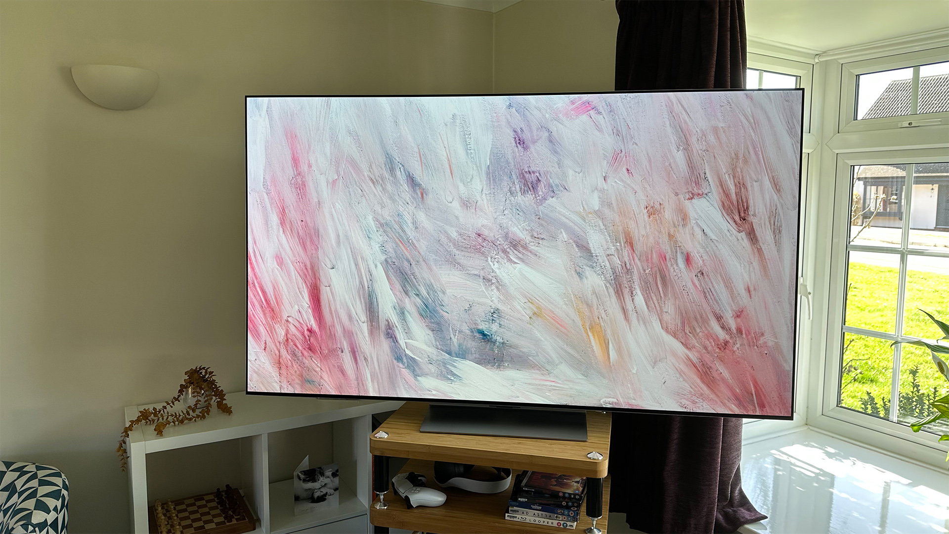
We’ve now been testing and living with the LG G3 for around two weeks, and it’s one of the best TVs ever made, as our exhaustive LG G3 review attests.
We figure that there are still lots of people out there who are weighing up whether to fork out for the new, full-price model or opt for an outgoing and therefore discounted G2 instead. This hopefully easy-to-digest summary of the ways in which it’s better – and the ways that it’s not – is for those people. Let’s get to it.
Upgrade #1: brighter highlights
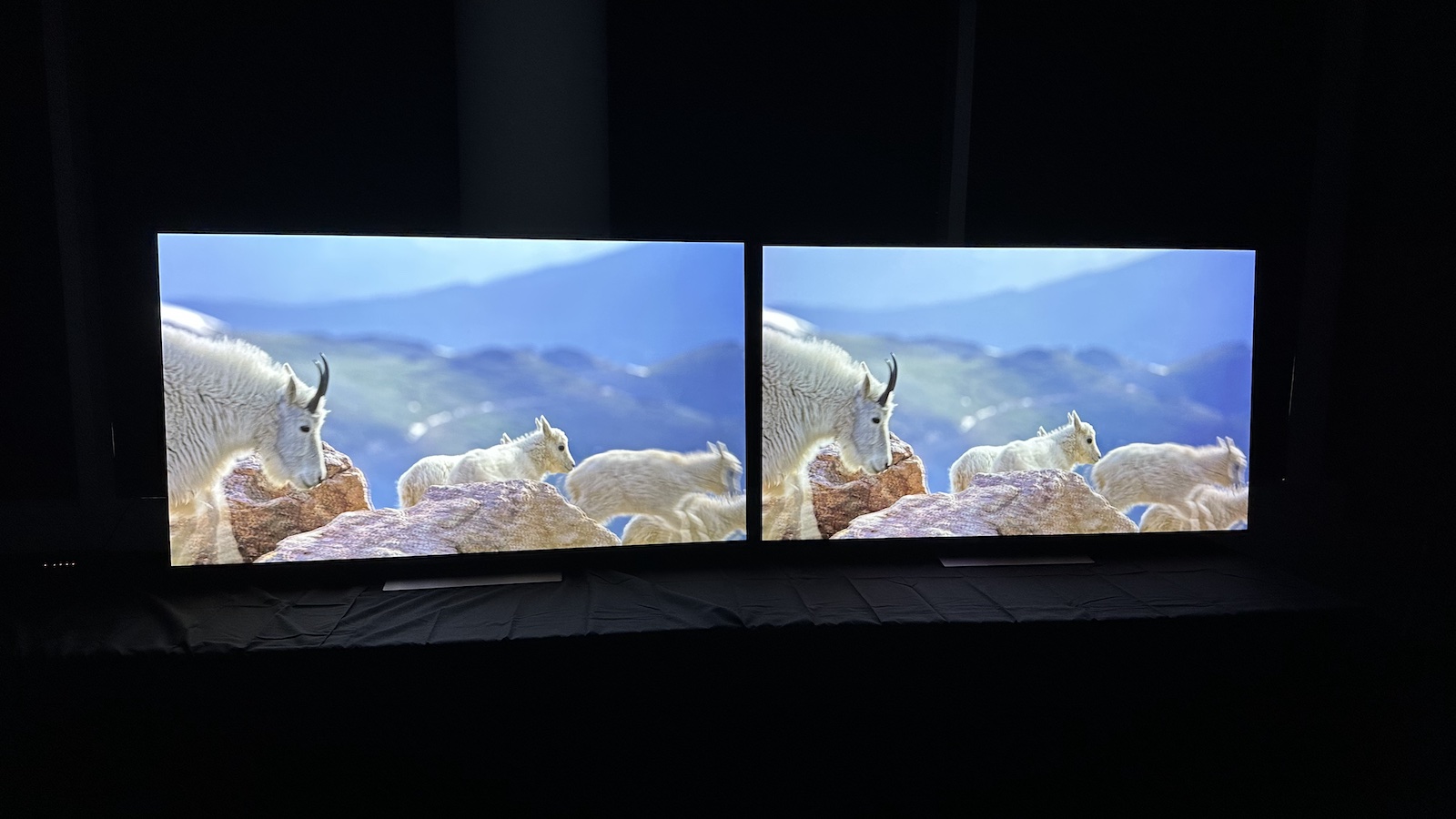
This is the big one. The main upgrade for the G3 is the addition of Micro Lens Array (MLA) technology, which involves a layer of microscopic lenses that focus the light of the OLEDs so that the screen can go brighter. Combined with a heatsink (something that the G2 also had), it allows the G3 to go vastly brighter than any OLED TV before it.
Admittedly, the 2000+ nit peaks of which the TV is ultimately capable will only be seen in the Vivid picture preset, which is best avoided on account of its over-processed and garish nature, but even in the more accurate HDR picture modes the TV can reach close to 1500 nits, whereas the G2 maxed out at under 1000 nits.
In action, the brightness increase is clear, with highlights sparkling like never before. And because the inky blacks and pixel-level contrast of OLED that we know and love still remain, it makes for a picture that’s significantly more impactful while also remaining true to the source material.
One extra note here: the 83-inch version of the G3 doesn’t have MLA technology so won’t go as bright as its 55-inch, 65-inch and 77-inch siblings.
Upgrade #2: more vibrant bright colours
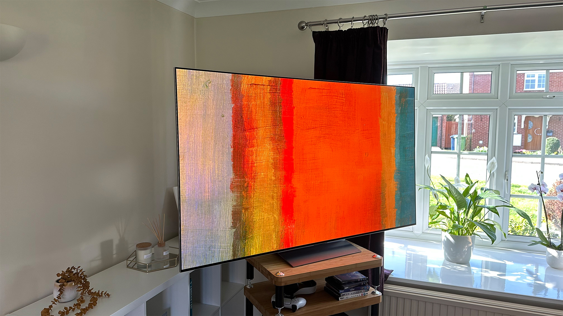
It had been suggested by some that traditional OLED TVs would struggle to recreate colours properly in the brightest parts of the picture, thanks to their use of a white sub-pixel (these models are sometimes referred to as ‘WOLED’ TVs, for ‘White OLED’). If correct, this could pose a big problem for the G3 – the brightest WOLED TV so far.
In fact, the G3 proves those suggestions to be wrong, and in an emphatic manner. Those highlights aren’t just brighter, they’re significantly more vibrant and full-bodied in terms of colours, too. Not in a garish, over-the-top way – subtle colours remain just that – but when the set is asked to deliver punch – bright sun pouring through a colourful stained glass window, for example – it delivers it in spectacular fashion.
Upgrade #3: fixed auto-dimming
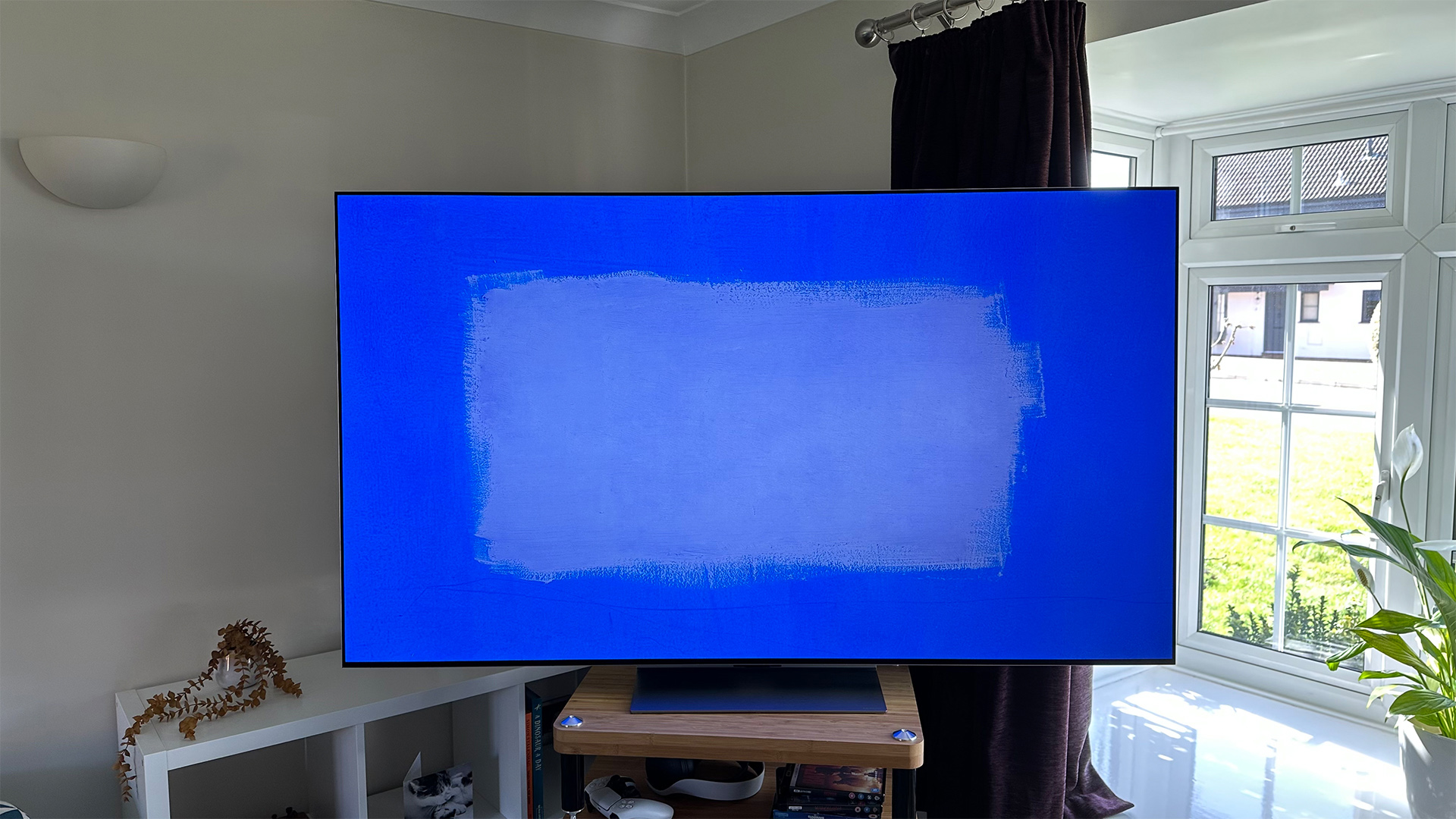
OLED TVs use organic materials that by their very nature will degrade over time. In order to make sure that doesn’t happen during the usual lifespan of the set, every manufacturer includes features that are designed to protect them. Most of these features are unobtrusive and can be turned off if the user prefers, but previous LG OLEDs, including the G2, have a secret auto-dimming feature that can, from time to time, prove bothersome, and that can only be turned off by delving into the Service Menu and invalidating your warranty.
This auto-dimming feature is rarely a problem, but in some prolonged dark scenes (think of the long desert section towards the end of Dune) it can get confused and dim the screen to the extent that it’s almost impossible to see what’s going on.
The good news is that this has been fixed for the G3 and those dark scenes remain consistent throughout. There are rumours that this fix might also be coming to last year’s sets, such as the G2, but this hasn’t been confirmed.
Upgrade #4: fewer reflections
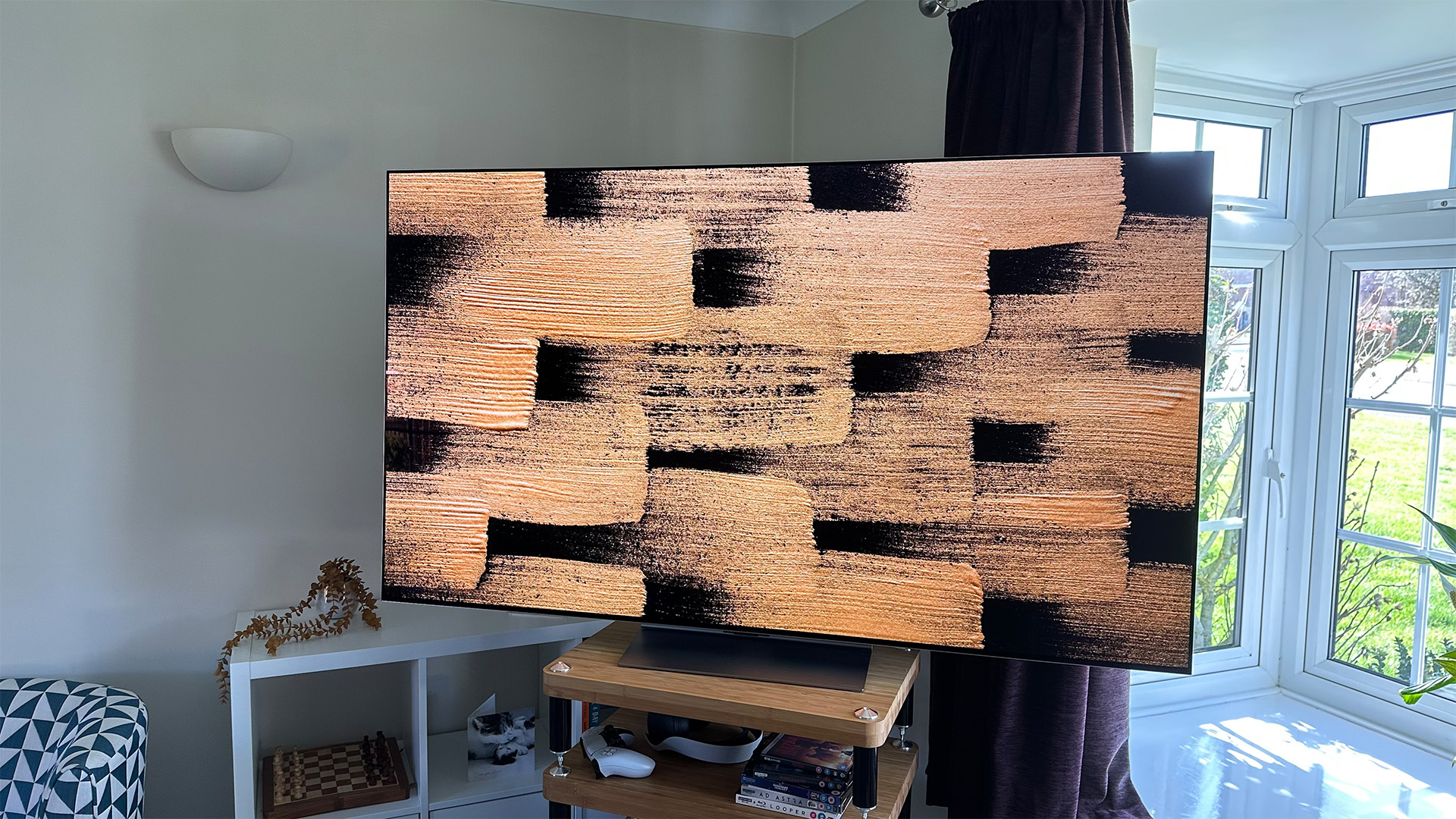
The G3 looks essentially identical to the G2 but with one exception: with both sets switched off, there’s a somewhat bronze tint to the G3’s screen. That, it turns out, is because it features a new anti-reflective coating – and it works brilliantly.
Yes, if you’ve got sunlight pouring in through a nearby window you will still see it reflected somewhat on the G3 if it’s switched off, but far less than on the G2, which itself was already pretty good at defeating reflections. When the screen’s on, it’s almost impossible to see any reflections at all.
Upgrade #5: more intuitive webOS
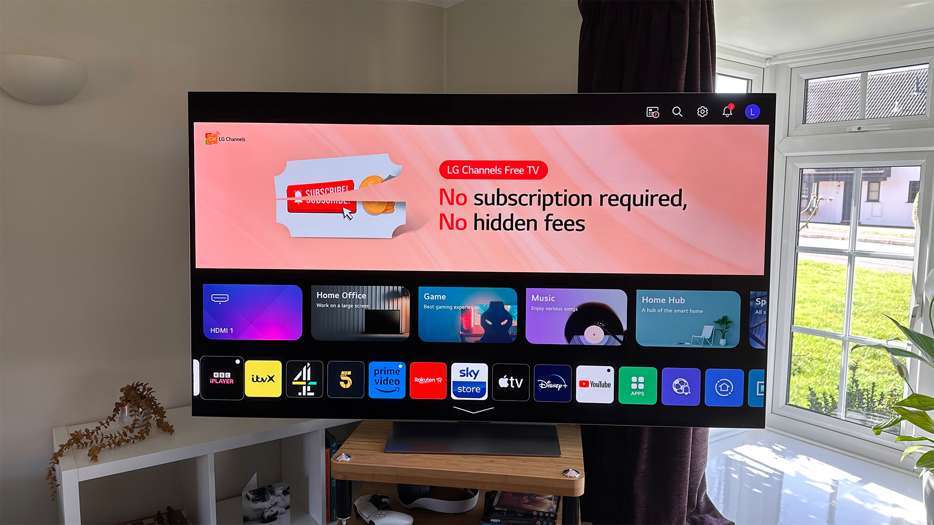
At first glance, the G3’s webOS 23 seems very similar to the G2’s webOS 22. Scroll down a few pages though and, well, you can’t. That’s because the multi-page layout of the G2, which could be a bit sluggish as you scrolled down, has been reduced to just two pages for the G3.
So where have all of the extra apps and features gone? Into folders, which LG calls ‘Quick Cards’. By grouping related bits and pieces into named folders, they don’t clog up the home screen but they are still easy to find when you want them, and the whole system is snappier and more responsive than before.
We rather wish that the row of Quick Cards was slightly less prominent than it is now and we’d like to see the home screen’s promotional banner at least reduced in size, but this is still a step in the right direction for webOS.
Downgrade #1: dull sound
Onto the ways in which the G3 is worse than the G2, and audio quality is the big one. LG appears to have set out to make the sound smoother than before, but it’s only really succeeded in making it dull. Detail and dynamics are roughly the same as before, but there’s no impact or punch to sound effects and that robs movie soundtracks of almost all excitement.
Adding to this dullness is a comparative reduction in bass weight and depth, yet despite this the woofers can still be provoked into distortion by loud, bassy soundtracks.
To be clear, the G3’s sound is perfectly passable for everyday TV content and dialogue clarity is decent, but this is still a peculiar misstep on the part of LG.
Downgrade #2: pale colours in low light
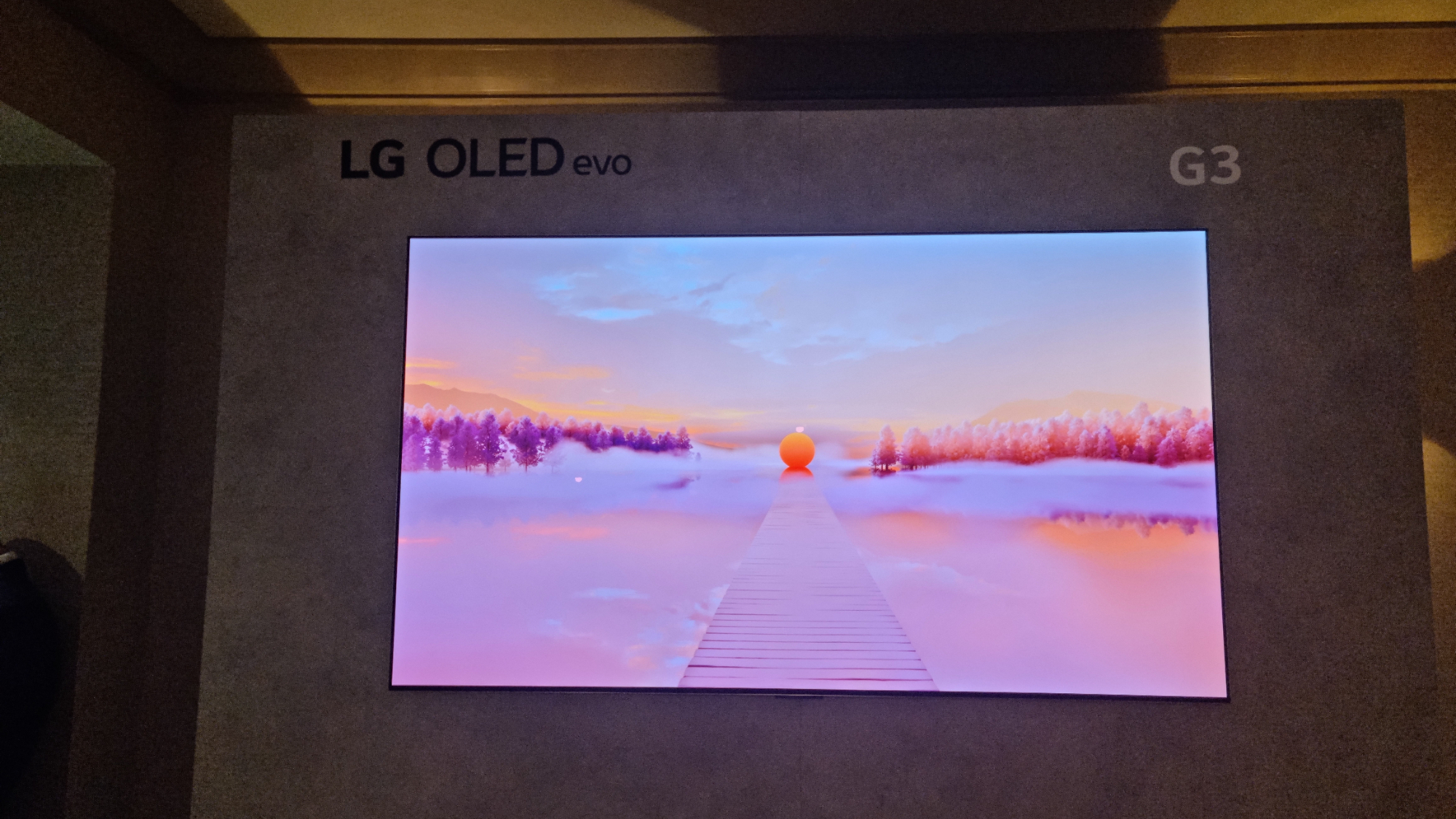
While the G3 has surprised a lot of people by providing bright colours with lovely punch and vibrancy, it somewhat ironically produces colours in darker areas in a slightly pale fashion. This is most noticeable in (though not unique to) skin tones: as a character moves from light to dark, their face takes on a rather pallid complexion.
You might think that that sounds logical, and of course shadowy colours should be less vibrant than bright ones, but the slight greyness the G3 exhibits looks unnatural at times, particularly next to the G2, which looks more consistent through different lighting conditions (very bright areas notwithstanding).
Downgrade #3: it's more expensive
An obvious one but one we can’t help but point out: the G3 is more expensive than the G2.
That’s not simply because the G3 is brand new and the G2 has been out for a year (though that is obviously true), but because the G3 has launched at a higher price than the G2 did. That isn’t to say that over course of its life the G3 won’t hit the same sort of prices that the G2’s available for right now, but there’s certainly a chance that it won’t.
Those looking for a new TV right now have a much more obvious value decision to make. To help, you’ll find the latest, lowest prices for both models below.
MORE:
Here's the full LG G3 review
What about the C3? Check out this LG C3 vs G3 comparison
Find out if the G3 appears in our list of the best TVs you can buy right now


