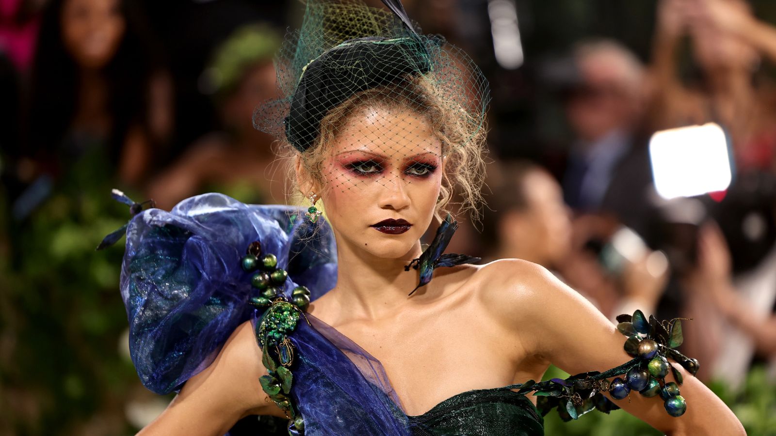
Of course, 2024's 'Queen of the Met Gala' has a residence overlooking the city that (pretty much) everybody is talking about this week. However, while the Dune actress may have made waves on Manhattan's red carpet, she has chosen an apartment across the water in Brooklyn – and the entire space is a designer lovers delight.
We may have already taken a moment for the statement slab backsplash in Zendaya's kitchen and her use of the 'unexpected red theory' in the living room – but the latter space also plays host to her curated coffee table styling that showcases the rule of three.
The 'rule of three' principle is certainly no new phenomenon, but Zendaya's contemporary styling brings a modern yet personal twist to the tried-and-tested rule. As seen in the sixth photo of the carousel below, she gathered three books alongside three art pieces that bring a sense of personality to her table. The actress also tied the two sets of three objects together with a statement vase and flowers – for a look that is contemporary, curated, and effortlessly timeless. But what makes this rule so powerful?
'The rule of three is a powerful principle in design, especially in interior design. It's all about creating balance, harmony, and visual interest by arranging elements in groups of three. Whether it’s three books on a coffee table or three mirrors on the dining room wall, this arrangement tends to be more appealing to the eye compared to an even number of items,' begins New York-based designer Emily Shron of Shron Design.
'It is thought that humans process information better in smaller, odd-numbered sets, which creates a sense of rhythm and makes the space feel cohesive.'
Zendaya's home offers the ultimate coffee table inspiration, but the rule works on surfaces beyond the living room. In previous projects, Shron has styled a kitchen table with three vases for a balanced aesthetic that brings a sense of cohesion to the busiest room of the home. Similarly, she decorated an entryway table (below) with three books and three vases to make a first impression that counts.
Plus, Shron is not exclusive in her admiration for the rule. New York-based designer Isy Runsewe from Isy's Interiors also uses it to 'create balance, rhythm, and visual interest' in her projects.
'The eye wants to create a rhythmic pattern, and by grouping things in threes, you're purposefully drawing the eye's attention but avoiding the feel of clutter, allowing the eye to span the space with a sense of cohesiveness,' Runsewe explains.
'At the same time, odd number groupings, particularly three, add visual interest with a hint of asymmetry, specifically when you start to add height to the arrangement. If you can create a focal point with three, then you automatically start to distribute the visual weight, again creating balance and rhythm.'
Shop H&G's coffee table edit
'[This rule] is a simple yet powerful guideline that can be adapted to suit different design styles and scenarios. The eye seeks this harmony and it's quite a pleasing result when implemented,' Runsewe adds. And if Zendaya is an advocate, we're not about to disagree.


