What you need to know
- YouTube Music's new Cast menu no longer appears in the middle of your display.
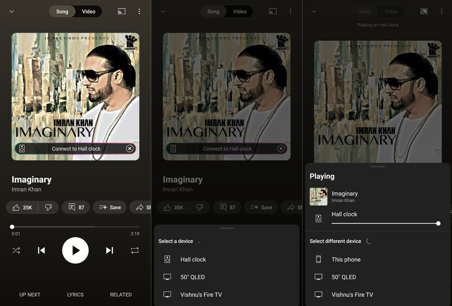
- With the latest change, the menu slides up from the bottom with sections for the current cast device, Suggested devices, and Other devices.
- Interestingly, the "stop casting" and "play/pause" buttons from the previous interface are omitted.
YouTube Music is rolling out a new minor design change for the Cast menu on the music platform for Android devices.
As spotted by 9to5Google, Google is finally ditching the pop-up Cast menu design on the YouTube Music app in favor of a new interface that slides up from the bottom of the screen. The music streaming platform started testing the "Cast to device" redesign in February this year. It appears the rollout is now official.

On the YouTube Music app for Android phones, the Cast button is at the top right end of the interface or on the minimized "Now Playing" view at the bottom. When tapped, both trigger a new pop-up that showcases the compatible devices available to stream. The new UI also does the same, but instead of popping up in the center of the screen, it slides up from the bottom with a much smoother animation.
The other nifty change in the new sheet is the introduction of two new sections dubbed "Suggested" and "Other devices." Also, if something's being played, there is even a shorter preview of the new sheet.
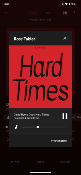
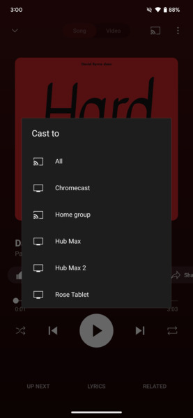
For comparison, this is what the old cast menu looked like.


Another interesting thing about the new interface is the omission of "Stop Casting" and the play/pause button, as seen on the previous pop-up interface. Alternatively, to stop casting from the selected device, users must choose "This phone" to get back to the audio streaming on their phone instead of the casted device.
9to5 further notes that the new Cast UI already went live for the iOS version of the YouTube Music app, and as for Android, the new UI can be seen on the app version 6.49 and above. Users have to bear in mind that it is a server-side update from YouTube, so it could soon show up on your screens, and it should be an interesting change for those who rely on streaming music across multiple devices.


