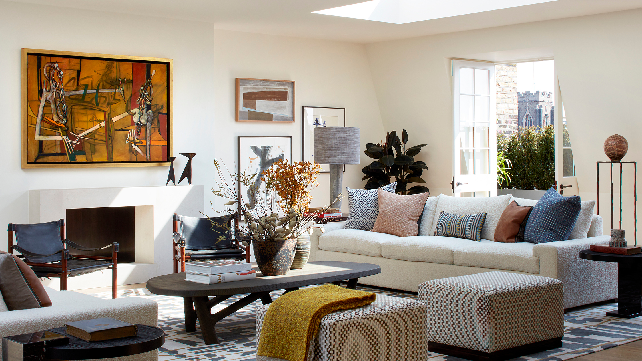
Even compared to negotiating a layout or creating a balanced palette in a scheme, figuring out how to coordinate wall art in a room can be one of the trickiest tasks of interior design. No one wants a ready-made gallery wall that lacks personality and style – but if you have a well-curated collection of artwork that doesn't necessarily have a thread that ties it all together, making these pieces work together in one space can be a challenge.
Whether you're browsing for living room wall decor ideas or just want to know how to style your favorite pieces together, we've chatted to interior designers to get their advice on curating a cohesive look.
Why should you coordinate your wall art?
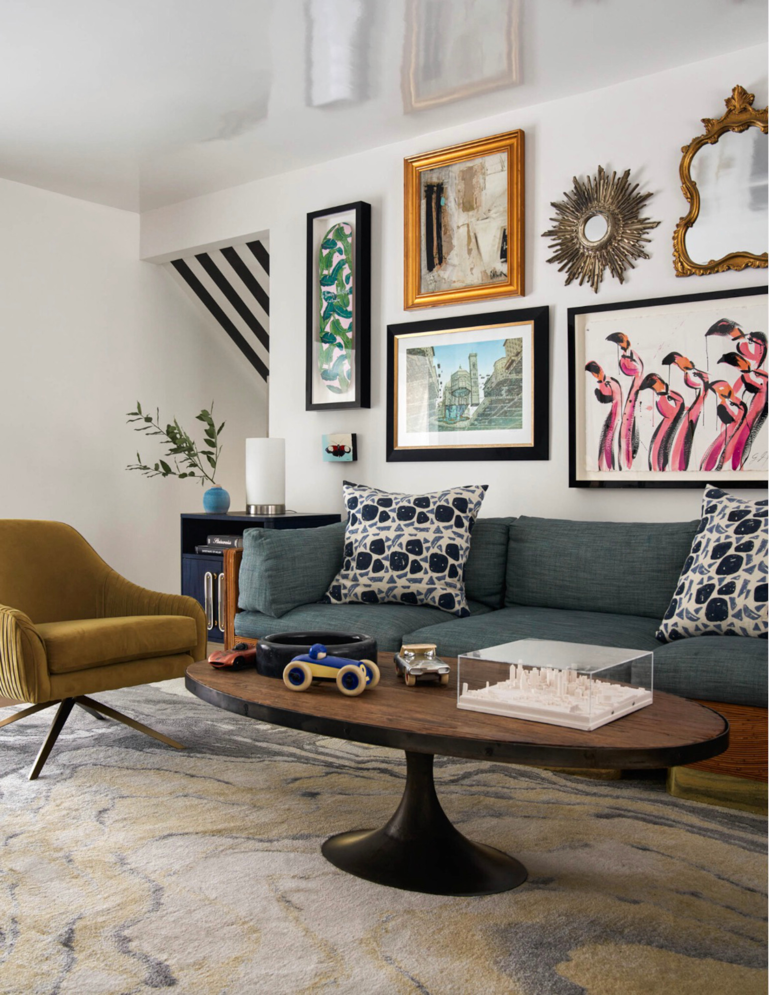
Of course, any scheme should look like it's been created with some thought, but can an art collection feel too matchy-matchy – or too disordered? The designers we spoke to agreed that there's a balance to strike here to achieve a wall art display that feels curated, but still has personality.
'I like to think that artworks that are paired in the same room have a “conversation” with each other,' says Liz Lidgett, a Des Moines-based art gallery owner. 'I am never worried about matching my artwork because, just as with two different people, the conversation becomes more interesting when there are differences. When I am curating, however, I like to have a common thread – maybe it’s a similar color, energy or style that's carried throughout.'
The best coordinated wall art will take time to achieve, too, says California-based interior designer Pat Del Gavio. 'An art collection should take a long time to curate: when art feels too put together, it can be a result of buying art all at once that is all similar,' she says. 'Working with a gallery that showcases art with your style is a great place to start: they can guide you to other artists and help create a beautiful collection.'
'Personally, I love to have a variety of styles and mediums of art in a room,' adds Ashley Macuga, principal designer of Californian practice Collected Interiors. 'I think that an abstract painting gets more attention if it is balanced by photography or vice versa. A vintage piece of art can feel new again when placed adjacent to a more modern piece. Some of the greatest museums in the world celebrate all genres of art – and so can your home.'
How to coordinate wall art in a room
First things first: there are no hard and fast rules when it comes to coordinating artwork, says Beverly Hills-based interior designer Victoria Holly. However, 'Our rule of thumb is to stick to at least one common ground to keep the look cohesive – frame finish and style, art medium, art colors, or art style.' Here are our designers' top tips on tying your pieces together.
1. Curate by color
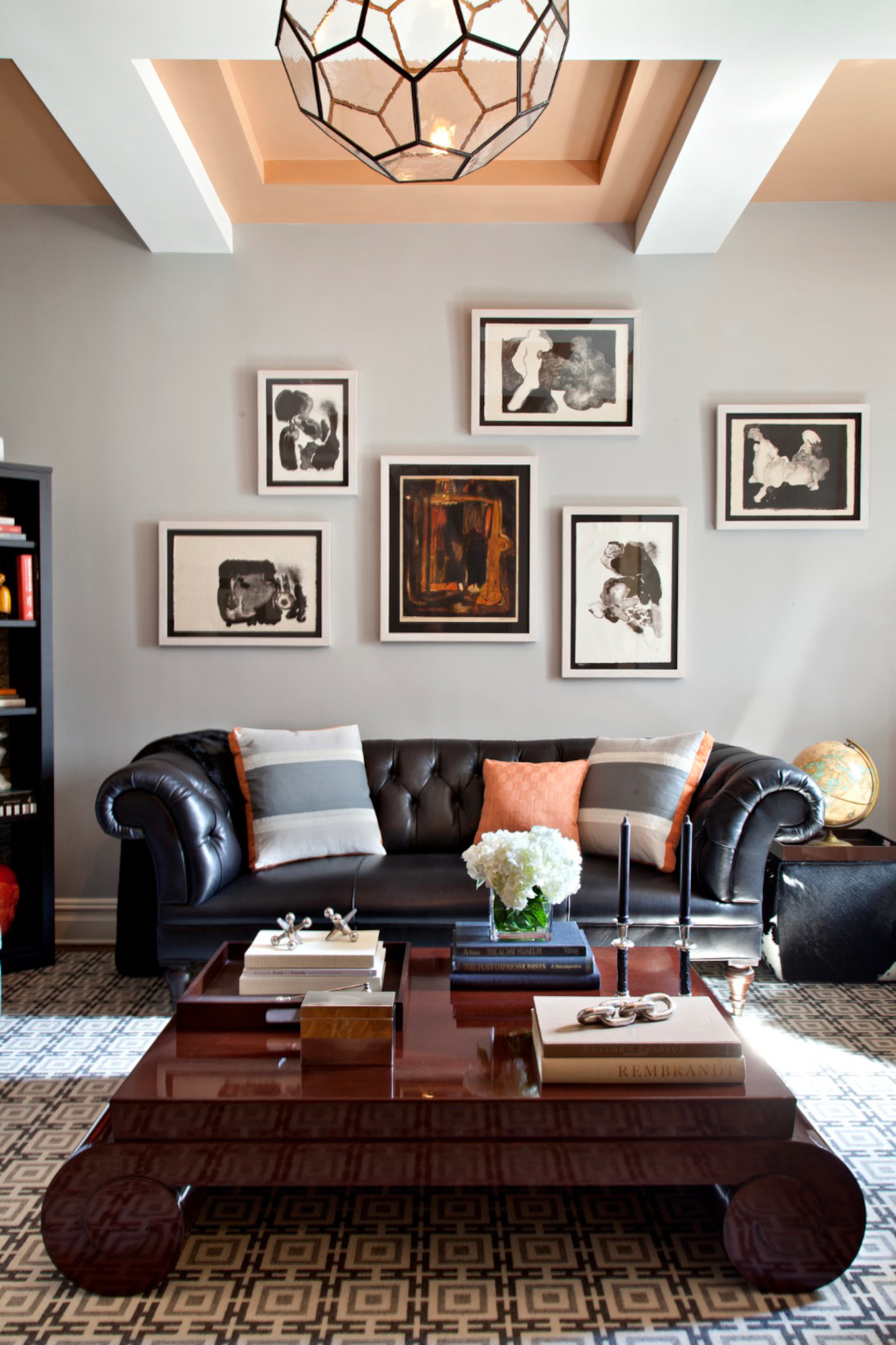
Coordinating your wall art by deciding on a palette is one of the easiest ways to start your scheme. 'A color palette is a good place to start,' says Toronto interior designer Gillian Gilles. 'For example, a past client had several pieces with sentimental value that had been in different rooms in her old home. We reimagined them together and all looked amazing. Several have a gorgeous hit of salmon pink and so all work well even if the content and sizes are quite varied.'
'At a minimum the artwork in a room should speak to one of the colors in a room,' agrees Sarah Kruse of Storie Designs. 'Even if it's just a pop of color pulled in from small accent pieces – a throw, pillows, or a sculpture – there should be some connection with the art and the space it resides in.'
Even in a colorful living room, a limited palette for your art can help pieces visually relate to each other, says New York-based designer Rebecca Robertson. 'One of our favorites is what we call a “color neutral” palette,' she adds. 'It has a strong base of creams, tans, and browns, but also includes cinnamon and army green.'
2. Work within a theme
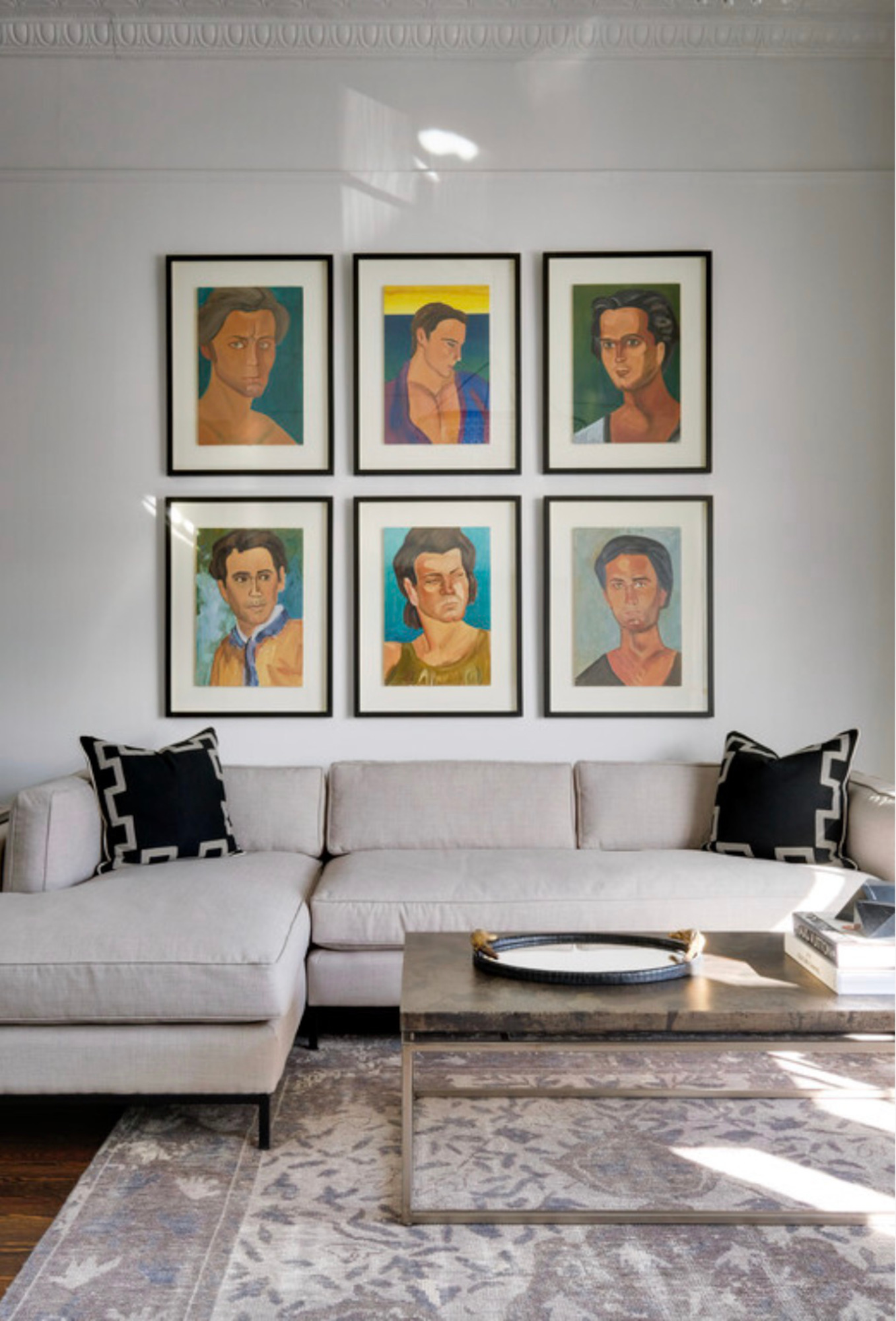
Pieces with disparate colors can coordinate if they're united by a theme. 'I always like to keep a theme in mind when creating a scheme for a client – something to lead the direction of the room,' says London-based interior designer Natalia Miyar. 'It can be something as simple as calm colors or something splashy like pop art, but as long as you lead your design with that in mind, the final look will be cohesive and edited.'
'I do love a subtle theme as well,' says Liz Lidgett. 'I had clients who collected artwork that had the number two represented in various ways (two canvases, two objects in the pieces, etc.) and then when they had their first child they started collection artwork with number three represented. The best collections are naturally cohesive because it’s artwork that was special to that particular client. The client becomes the tie that binds it all together.'
3. Mix and match frames
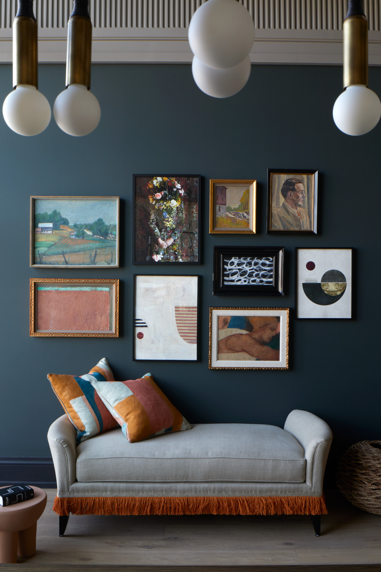
Whether or not the art itself feels coordinated, the choosing a picture frame can make all the difference in creating a united scheme. 'Cohesive framing can really elevate a room,' says Liz Lidgett. '“Intentional” is the word I love to use — I want a collection to feel like someone thought about it and coordinating frame can help you achieve that. I try to stick to around three styles. Lately, I have been seeing a trend in patterned or painted matts and I think that can be a fun way to help coordinate as well.'
You can use the same frames for every piece – it all depends on the room, the artwork, and what you feel works best. 'There are projects where I prefer uniform framing and there are others where an eclectic group of frames works best,' adds Natalia Miyar. 'I love to source beautiful frames both new and vintage. Layers can be added through the framing and really help finalize a designed space.'
4. Play with scale
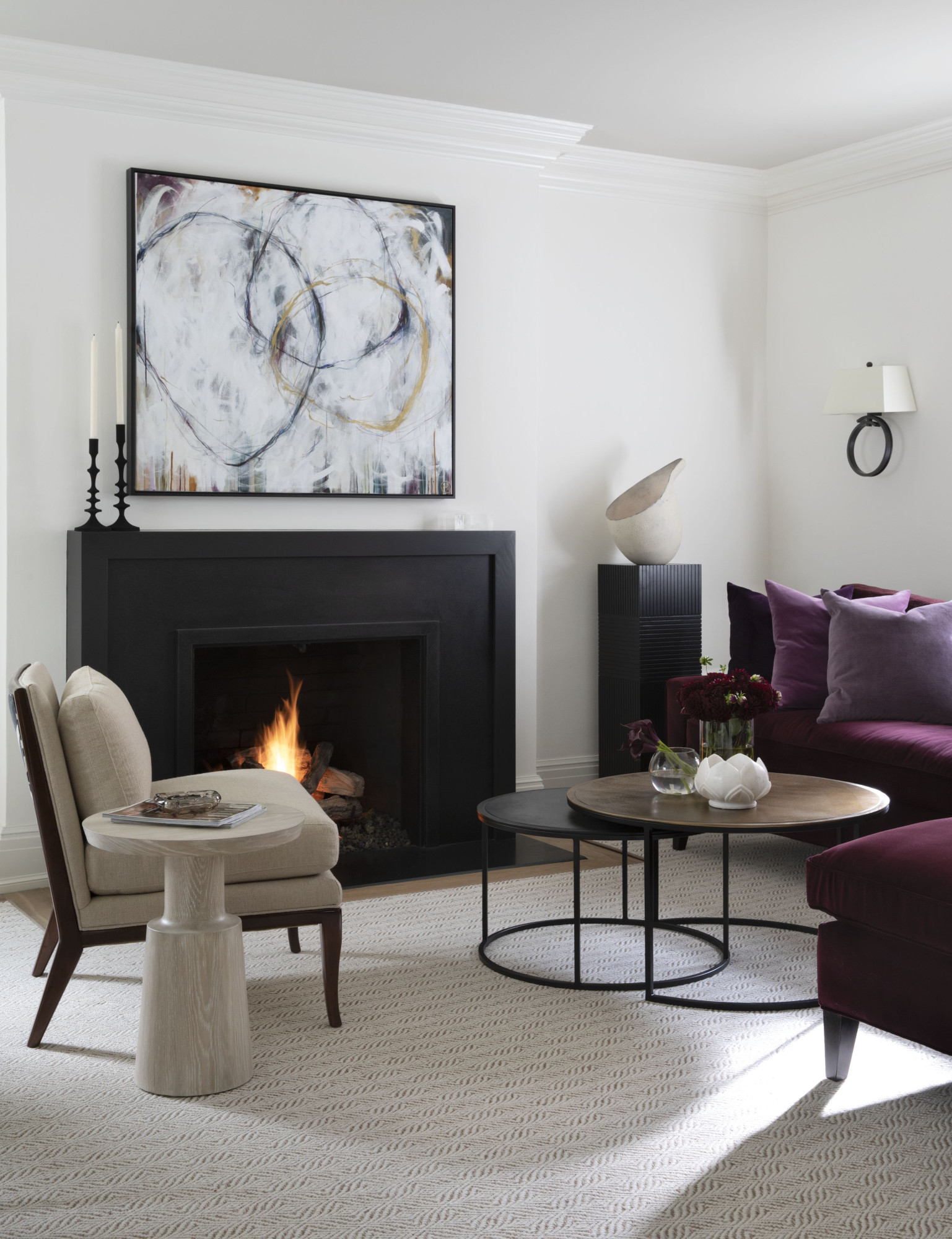
Experimenting with size and scale can help provide a point of difference for artwork united in theme or color, making a scheme feel far more interesting and layered. 'I love having different scaled art; groupings and large canvases, framed art, and just pulled canvases,’ says Susan Spath, principal designer at Kern & Co.
Using scale also draws on a key element of interior design: working with the white space in between pieces. 'It is important to consider how each piece works in concert and mixing size, scale and mediums is crucial,' adds Santa Monica-based designer Sarah Rosenhaus. 'It’s OK to mix different styles of art in the same space as long as each piece has its own space. Negative space with art is just as critical as groupings: many pieces are more striking when hung solo.'
How to position coordinating wall art within a room
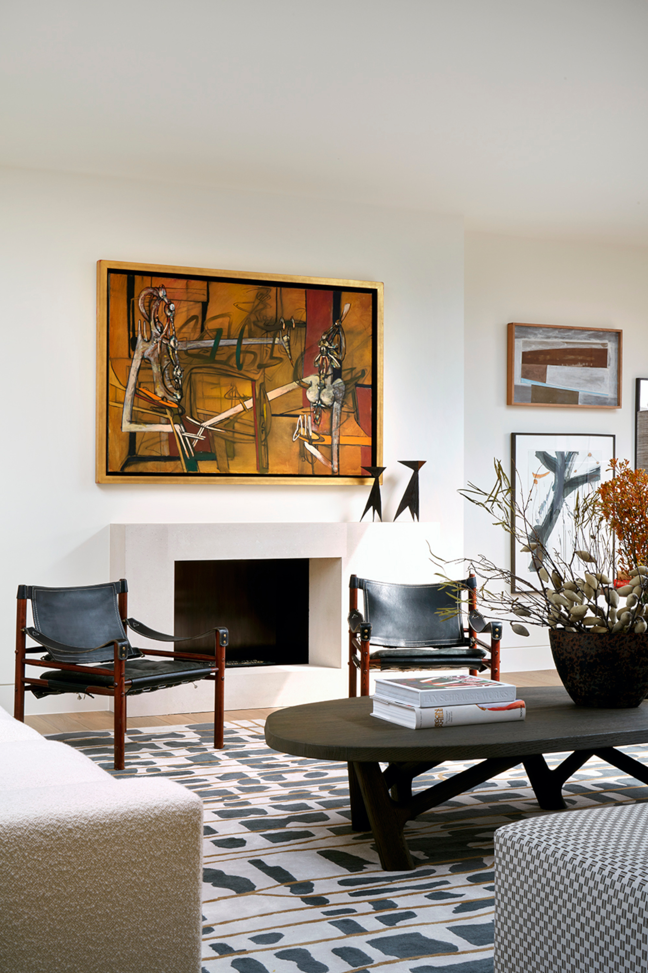
Of course, where you place your wall art can have a huge bearing on how coordinated pieces feel. 'Clever positioning can take your art coordination to new heights,' says Lina Galvao of Cos Cob, Connecticut studio Curated Nest. 'Use a bold piece as the main attraction, surround it with complementary works, arrange pieces symmetrically on opposite walls or around a center point, and thoughtfully place artwork to guide the viewer's eye, creating a sense of connection.'
Aside from creating a gallery wall (more on that later), there are other ways to display living room wall art that feel interesting and even a little out of the box. 'I think it’s all about the room and your style,' says Liz Lidgett. 'You can go for large art or you can artfully play with negative space. I am a true believer in learning the rules so you can break them. It’s fun to think outside of the box on art placement like on a window frame or above a door. If you have an art buying obsession, like me, it’s also handy to look to these unusual spots as you start to run out of wall space!'
If you prefer a more traditional approach to displaying wall art, you can use the height of your pieces to create coordination, says Rebecca Robertson. 'The mistake we see the most often is artwork hung way too high,' she explains. '57”-60” from the floor to the center of the piece is ideal – it’s a rule of thumb we learned from galleries and museums and is based on the standard eye height of the average person. If you hang your pieces at the same height, you can create a datum (or horizon line) that remains consistent to make the space feel naturally more considered.'
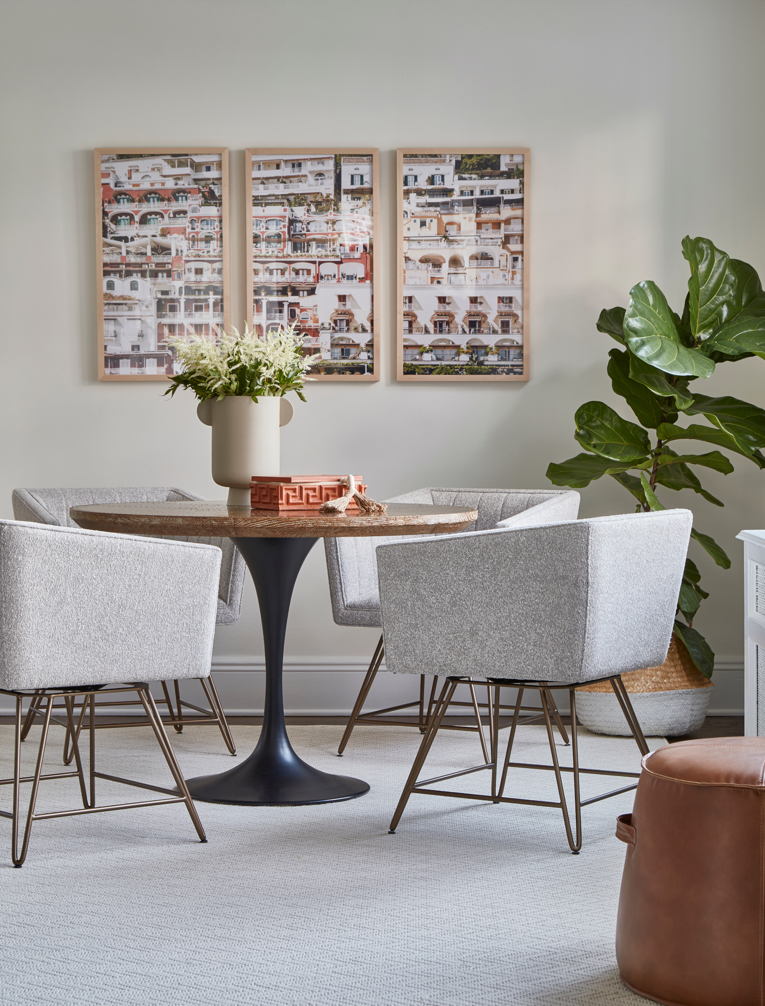
Though many gallery walls ideas feel a little overworked by now, they can still play an important part in a scheme – and are particularly handy if you have a larger collection. They can also help with the positioning of other art: the opposite wall might be a good place for a larger standalone piece, for example.
'A gallery wall is largely about trial and error, but there are a few rules of thumb,' says Sarah Kruse. 'I would suggest having no more than three types of frames for the same gallery wall, and keep the same distance between all the pieces of art, usually somewhere between 1"-2". Try to alternate large pieces with small ones, and mix and match the pieces that have different frames throughout. Ultimately, you want to think about balance – two small pieces can balance one large, or two large pieces on the ends with smaller pieces in the middle can create simple symmetry.'
'When a gallery wall is placed above a piece of furniture, it's helpful to use its height and color as a reference point for starting,' says Gillian Gilles. 'You want some connection in color between what is on the wall and what is anchoring it; you also want your eye to be guided to where it's supposed to be led. You need a blend of starring roles and understudies: some pieces are simply there as fillers and not as statements. A mix of photography, oil, and watercolors all blend beautifully, as does a mix of frames.'


