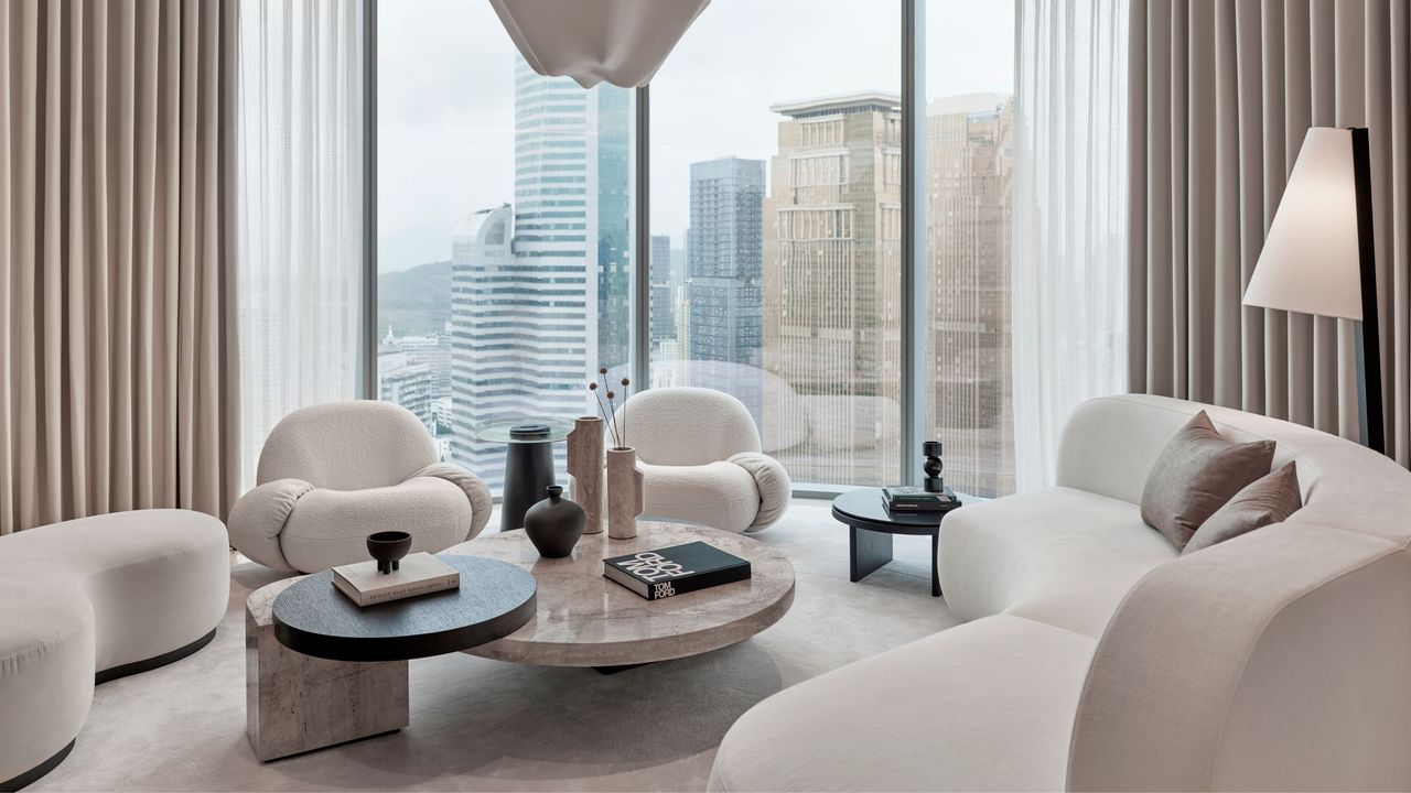
The color wheel is a tool strapped onto the belt of many a home-updater, but the neutral color wheel flies a little more under the radar. There are, I’m afraid, no prizes for guessing its USP; yes, it’s a toned-down version of its more pigmented cousin. Built around a spectrum of neutrals arranged by undertone, the neutral color wheel is a visual guide for those trying to pair their greiges with their grays, their creams with their chalks, and their mochas with their mushrooms.
What makes a space sing when decorating with neutrals is the delicacy with which they all pull together — the way one tone quietly lends warmth while another oh-so-similar shade somehow introduces a cool, refreshing counterpoint. It’s this subtlety that gives neutrals their lasting appeal. When adeptly curated, they create depth, cohesion, and a sense of calm without vying for attention, and the neutral color wheel is key in decoding the minute differences that can make or break a scheme.