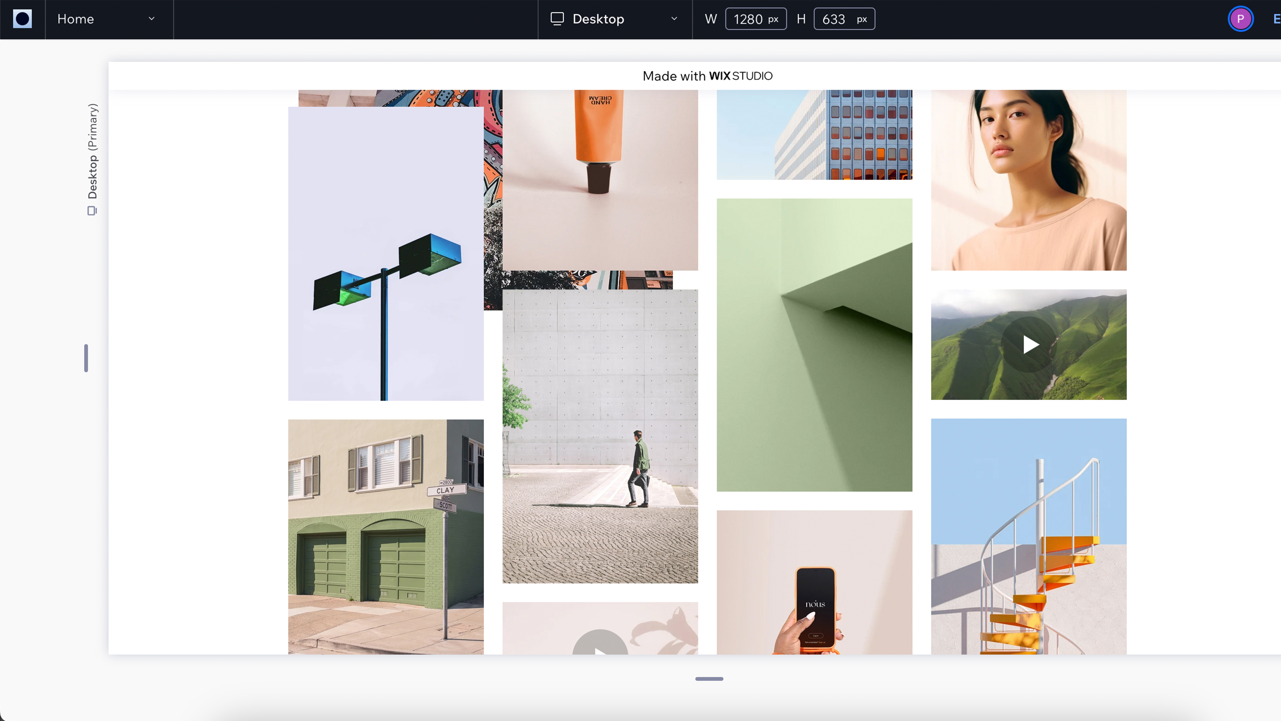
Website builders let people who know nothing about website design build up amazing websites and portfolios. SmugMug and Format act as online galleries whereas the likes of Weebly and Wix Studio are more comprehensive website editors that also offer portfolio presenting functionality. To compare all the best options, check out our best website builders for photographers guide.
Wix Studio offers advanced web design layouts without having to know CSS. Through its drag-and-drop interface, creatives can control the position, size, and design elements when it comes to text, photos, graphics, and headers. It's possible to choose the font, font color, and font size, add containers, galleries, and grid layouts, and embed your social media news feed.
This platform really is all things to all people. It also offers a wide range of eCommerce tools for those wanting to sell photo prints.
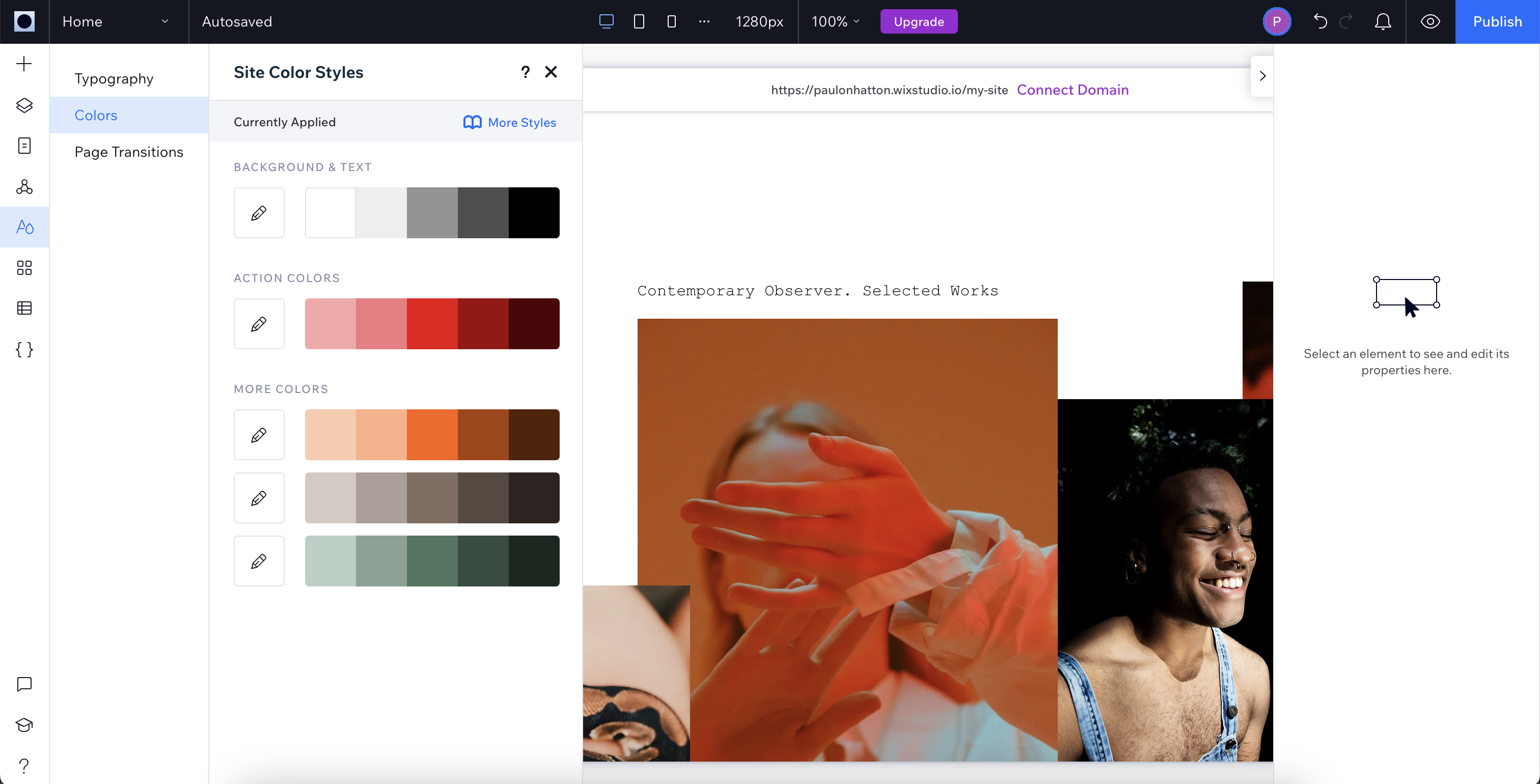
Wix: Who is it for?
Wix Studio, like Weebly and Squarespace, is really for everyone. It includes all the tools that creatives need to present their work in attractive layouts while also providing a wide range of website tools for customized website design.
As Wix isn't specifically for portfolio builders, I would say that the gallery tools are a little bit more cumbersome than something like SmugMug or Format. That being said, Wix Studio has a huge amount of functionality, as long as you're prepared to find it in the complex interface.
Wix: Price
Wix Studio offers four packages with the two middle options likely to be the most popular to photographers and videographers. The Core package costs $16 / £14 per month and includes a custom domain as well as 50GB of storage. This should be more than enough for most photographers and videographers can always choose to host their videos somewhere else and embed them on Wix without losing storage capacity.
This package only includes basic eCommerce so if you want more extensive tools then you'll need to upgrade to the Business package for $27 / £20 per month. This does have the added benefit of 100GB storage for those with much bigger portfolios.
Wix: Key Features
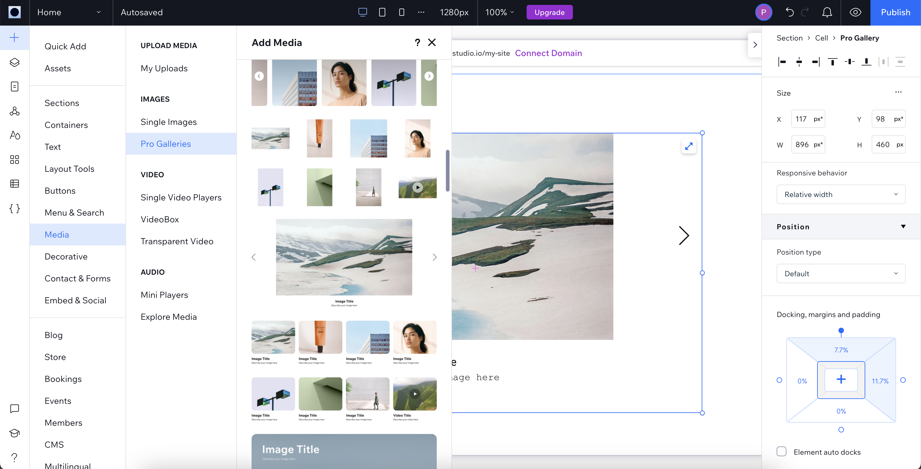
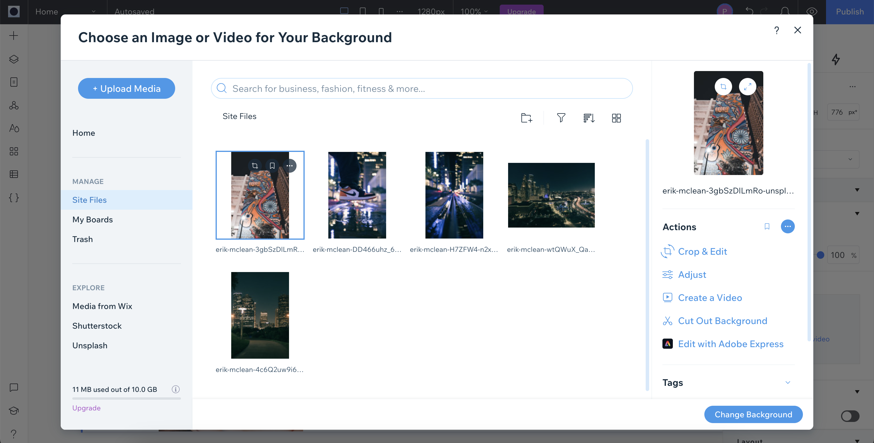
Photos - after uploading media it is then possible to make a range of changes which is ideal for last-minute refinements. Images can be cropped, edited, and adjusted with the option of creating videos from a collection of photos. This maximizes the possibilities for presenting work to a public audience. I wasn't terribly pleased with the upload speed which lagged behind all its major competitors.
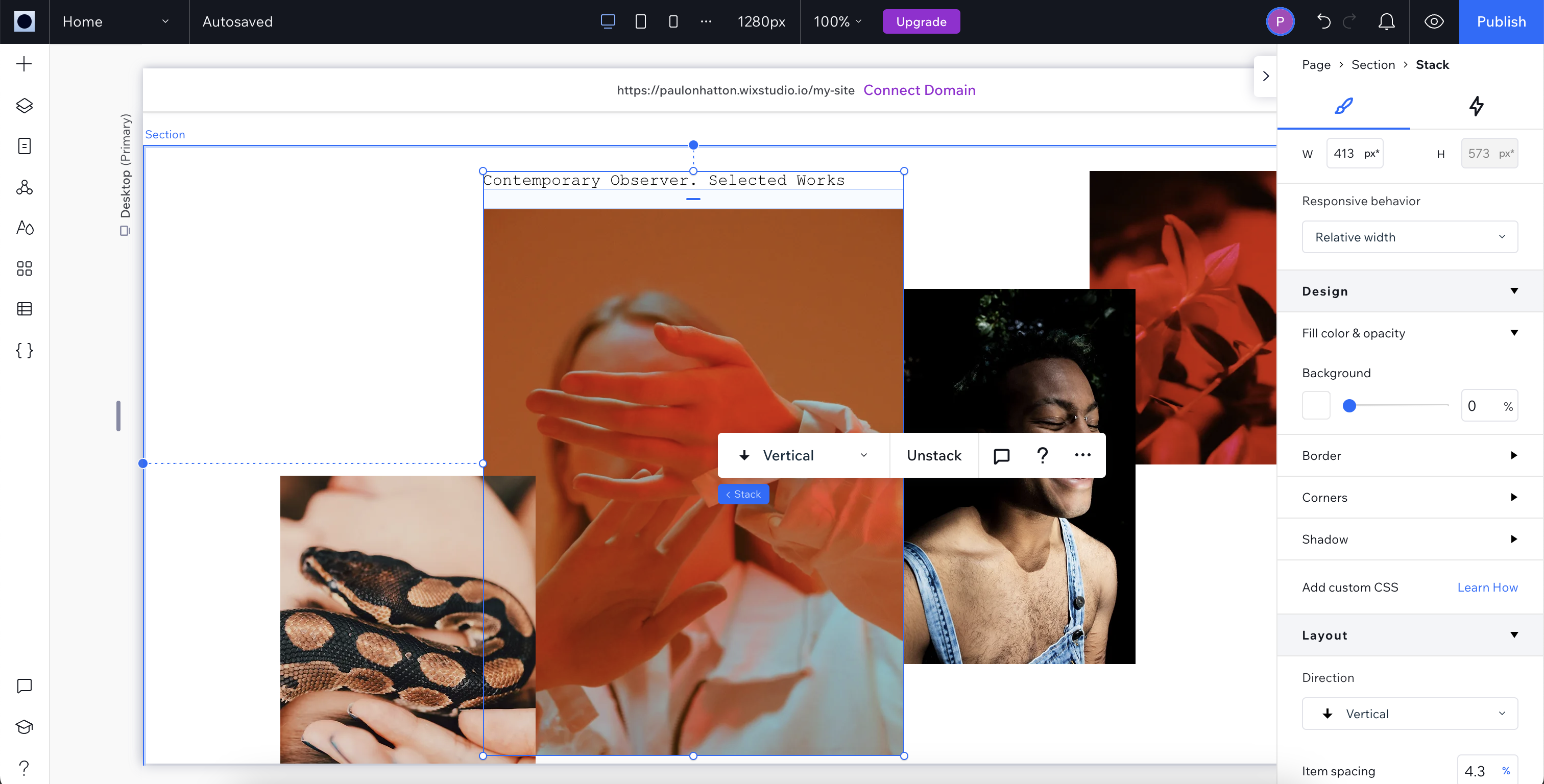
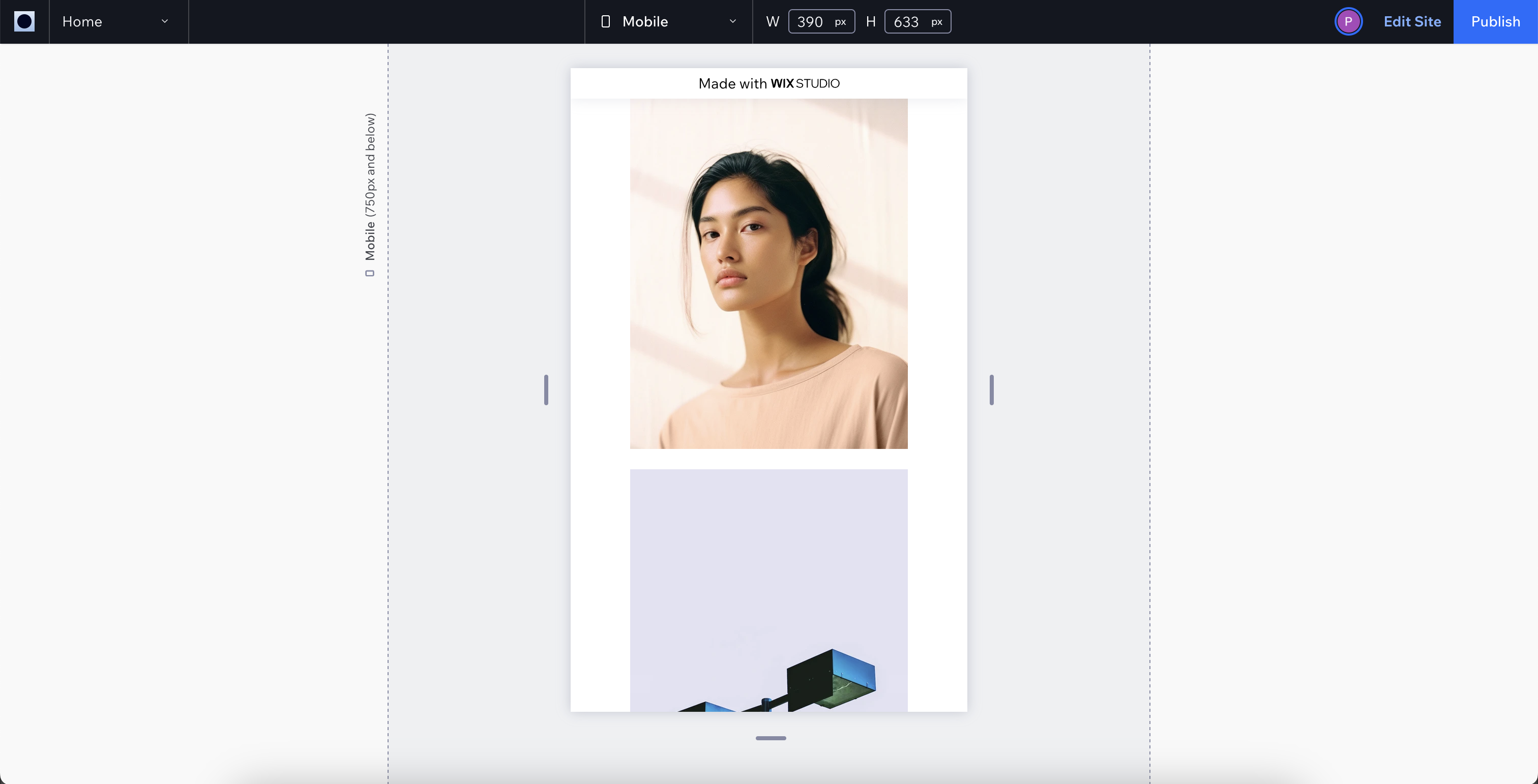
Layout tools - After uploading photos it is then possible to create a range of intricate layouts that respond intuitively to different devices including desktop browsers and mobile phones. This does have the downside of putting some level of creative control in the hands of Wix Studio but on the whole it does a great job. Photos can be stacked and ordered with a wide range of different layout options available. Driving these layouts from image galleries is super simple and straight-forward with image order changes as simple as dragging images around. This is perfect for making sure your hero shots take centre stage.
Interactions and effects - As well as static presentation of media it is also possible to introduce a rudimentary level of movement too. Through transitions and animations it is possible to engage viewers in new ways. Personally, I find these types of effects embaressingly off-putting and basic reminding me of the poor options available in something like Microsoft PowerPoint.
Wix: Design & Ease of Use
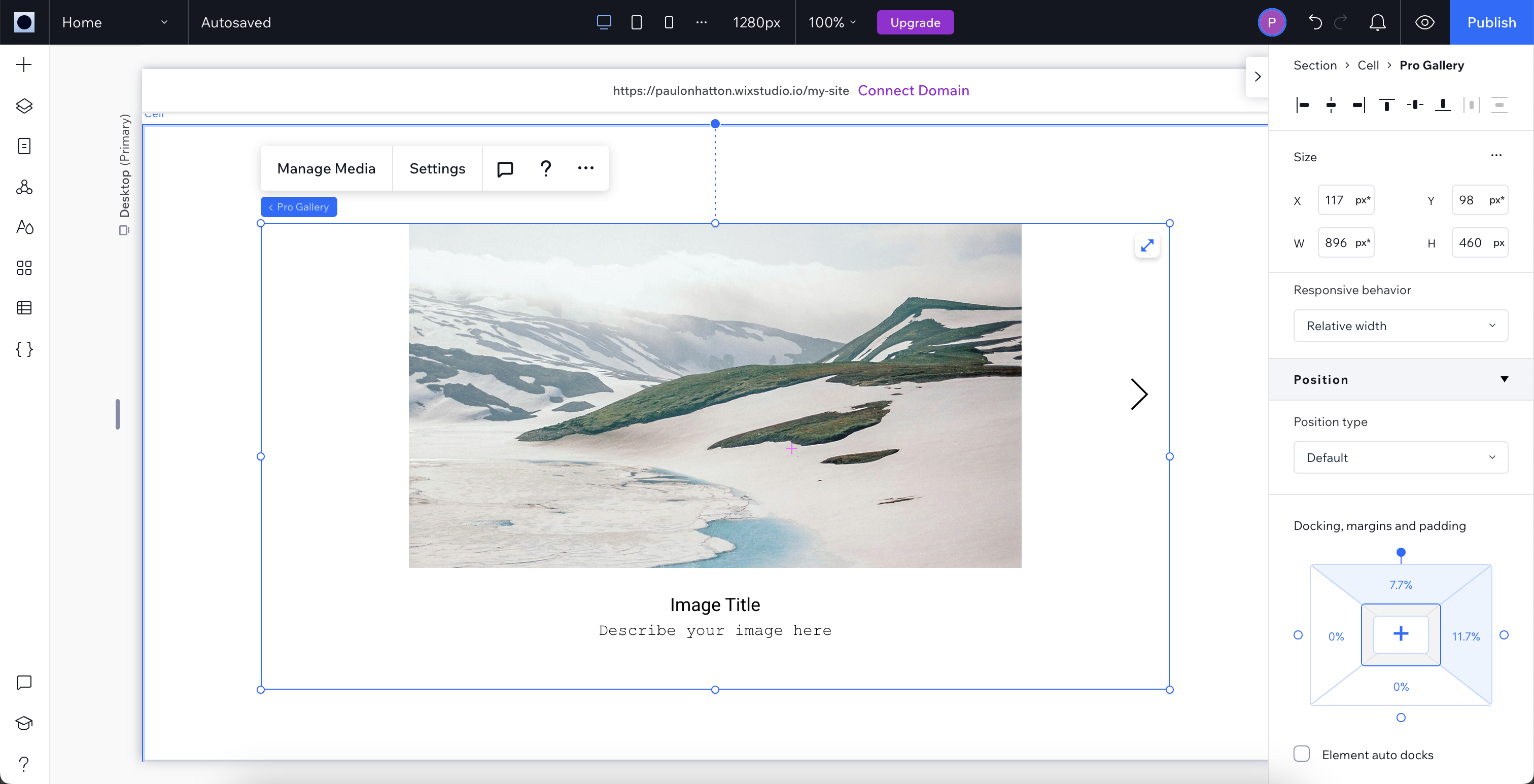
Wix Studio follows the same interface principles as both Weebly and Squarespace. The website builder contains all the page tools in one menu on the left-hand side and the properties in another menu on the right-hand side. The interface and its workflow were relatively easy to follow although settings and tools were not always, to me, in the most obvious of places. This issue was compounded by the fact that the page tools menu minimizes to a single icon bar when not being used. This means it takes longer to get to what you need and is a nightmare for new users unfamiliar with where everything is.
The responsive and customizable nature of the builder is very impressive with the ability to place any bit of content wherever you want on the page. Gone are the days of being limited to a static grid. This functionality is great for creatives who want absolute control over how their work is presented but does come at the cost of a more complex interface.
One of the most important features for photographers is the upload speed when adding media and, compared to all other competitors, I found Wix Studio annoyingly slow. 2MB images were taking around 10-15 seconds to upload, a frustratingly slow speed when needing to upload lots of images.
Wix: Results
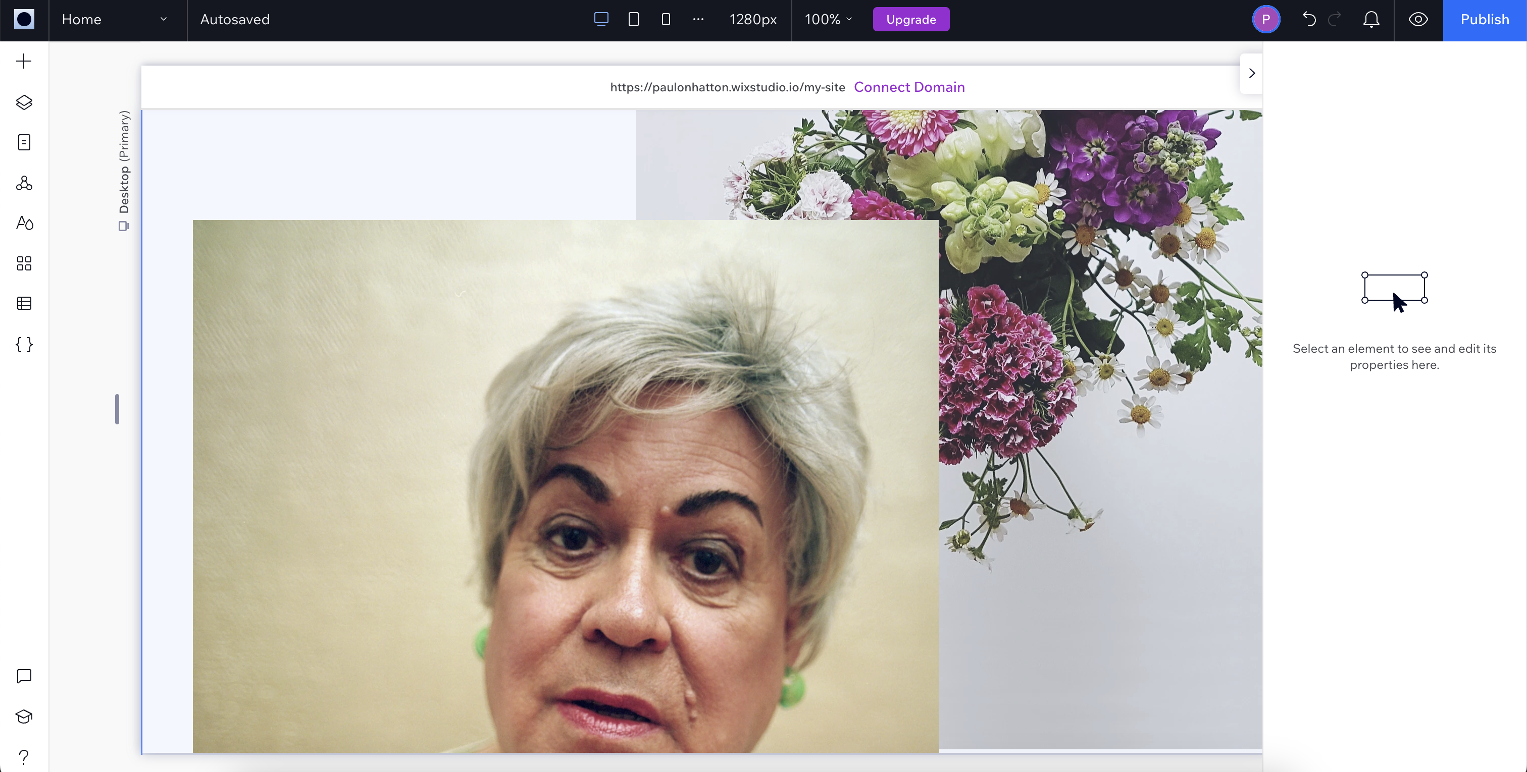
The finished product that I was able to create with Wix Studio is second to none with a huge level of customization possible through the range of tools. There are much simpler tools for photographers who just want a simple gallery with eCommerce capabilities but creatives who want to go beyond that will have everything they need with this platform.

Wix Alternatives
Direct competitors to Wix Studio would be Weebly and Squarespace. Both follow the same principles and offer the same level of extensive functionality. Format and SmugMug are far better for purely presenting photographic work but lack the more advanced tools offered by the others.


