Solely focusing on brand compliance and consistency tethers a brand to a world of creative complacency. A mooring to the boring, as it were.
It typically starts so well. With the brand idea acting as a North Star, a refreshed visual identity ensures it looks dapper while standing out from the crowd. Everyone’s on board, enthused. Colours follow orders, fonts awash with obedience, logo is in shipshape fashion, photography in focus.
Yes, consistency provides reassuring stability – at first. But the real test of even the best rebrands begins when the tightly-wound anchor rope starts creaking under the waves of innovation, tripping up the onboarding teams and tying campaigns up in knots. Suddenly that anchor is feeling a little too heavy, and more like a set of constraints and restraints.
Why? Well, the very rules that are designed to help a brand succeed can at times pull you under. Do you cut the rope to save yourself from the rising tide of opinions? Or maybe it just slowly frays and dissolves in the murky waters in which creative teams thrive. And before long, the brand identity drifts all over the place.
All to say that if a brand isn’t built in the right way, the fractured media world in which we live can – and will – push a structured brand to its absolute limits.
If that sounds familiar, you’re not alone. Fortunately, there are a few tips and tricks that you can use to steady the ship.
Test your assets
First thing’s first, forget consistency in itself. It’s the classic trap. Instead, use your fixed stylistic assets and flexible emotional assets to create coherence, two things we lovingly refer to as 'fix and flex'. The ropes that anchor your brand should be agile enough for the whole ship to flow naturally around your distinct positioning.
It may sound cliche, but your fixed stylistic assets are vital. Whether they’re nomenclature, core colours and logos or stand-alone icons, typefaces, memorable end-lines, sonic branding, textural – all of these assets are examples of non-negotiable principles that ground your brand.
Rigorously testing these assets enables you to implement them with ease. After all, the more complex the rules, the more likely it is that your team stops following them and hopes you don’t notice. Best-in-class brands understand that their fixed stylistic assets need to be meaningful and memorable enough to carry equity – be it through existing legacy or incoming meaning poured-in through emotional principles.
Think about emotional principles

Speaking of which, emotional principles can be difficult to land. The process requires time and effort – but the reward is worth it, suggesting a brand that stands for something beyond colour or logo recall.
They attract and grow internal and external audiences with meaningful depth. Think about the last 20 years of Dove, and you’ll realise full well that, ultimately, a brand’s 'identity' can be driven by powerful stories that pour emotion into those fixed stylistic assets.
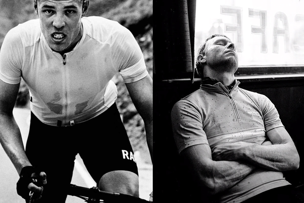
Need more? Admire how the suffering within cycling is embraced and often captured in Rapha’s photography. Or how, in an overcrowded skincare category, Starface is seriously playful in combining empathy and self-expression. One of the many impressive aspects of the Girlfriend Collective is how they address two of fashion’s most elusive 'must-haves': sustainability and inclusion. It is at the heart of who they are – and the visual identity system further serves their beliefs.
All hands on deck

So what do you get when you’re confident and clear on your flexible emotional principles and combine them with the fixed stylistic assets?
Once you begin to master the surrounding waters is when things get really exciting. The brands that do it well speak to us on an almost instinctive level – and we both feel and sense it. One of our favourite measures of success is when we wonder how we knew something was Airbnb, Google, or IBM – well before we saw any colours, typefaces or logos.
Such effortless power is seldom without powerful effort. But the brands that know exactly what they stand for, what role they play in their customers’ lives, and their role in the wider world can tap into core human truths. And that’s how a brand wins.
Yes, finding the courage to question why a brand exists can be intimidating. The past has deep waters, and the horizon is daunting. But that’s exactly why brand teams avoid the bigger questions and focus on consistency. Accurate colours, clean fonts, smiling photos, and consistent logo placement will weather any storm – right?!
For more on branding, see our logos of the decade series.


