For decades, a chrome badge was all a car needed to identify itself. An arrow, a lion, a lightning bolt, or an oval could make a brand instantly recognizable. Today, though, more and more automakers are choosing to spell out their full names instead.
It’s not just a small styling detail or a simple graphic choice. Lettering is becoming a bigger part of the vehicle’s design, helping define the shape of the rear—and increasingly the front, too. It’s also becoming part of both traditional and digital brand communication.
It’s one of the more interesting shifts happening in automotive design right now.
This story originally appeared on Motor1 Italy
When The Badge Becomes A Word
The European Skoda Elroq is a good example of this trend. The Skoda name replaces the traditional emblem at both the front and rear, becoming a key part of the brand's "Modern Solid" design language that defines its latest generation of vehicles.
It’s more than just swapping one logo for another. The change affects how the car is visually read. The lettering takes up more space, follows the lines of the body, and becomes a graphic element that helps balance the overall design, much like a light bar or a sharp crease in the sheet metal.
It’s Not Just About Marketing
Spelling out a brand name on the body isn’t entirely new. Porsche has used its full name across the rear of the 911 for decades, while Volvo has often favored its full name over a traditional badge. But today, the idea has taken on a slightly different role. The name is no longer just an identifier; it’s becoming an integral part of the vehicle’s design.
The brand name immediately tells you what you’re looking at, regardless of where the car is sold. But it also gives designers another element to work with. A word takes up horizontal space, interacts with the taillights, follows the light bar, and can help establish the visual rhythm of the rear much more than a small badge in the center of the trunk.
Lancia and DS Automobiles interpret the idea in very different ways. The typefaces, proportions, and spacing vary, but the basic idea is the same: The brand name isn’t simply stuck onto the bodywork. It becomes part of the composition.
Typography As Part Of The Design
Graphics have long played an important role in a brand’s advertising, brochures, and other marketing materials. Today, though, typography is becoming much more closely integrated into the vehicle itself—and, more broadly, into the brand’s overall visual identity.
Letters are being designed with the same attention to detail as headlights, wheels, and body surfaces, while still maintaining recognizable traits across the lineup.
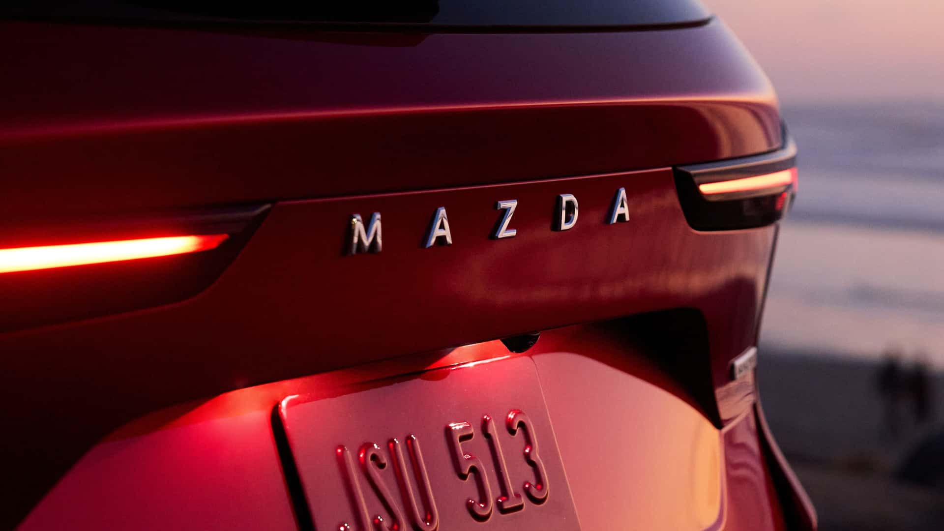
Mazda and Peugeot are two interesting examples. Mazda uses simple, clean lettering, while Peugeot takes things a step further by integrating the brand name into the rear light bar and even illuminating it. Typography, in other words, is no longer an afterthought. It’s becoming part of the car’s architecture.
More Words, Fewer Symbols
It’s hard to imagine traditional badges disappearing completely. They remain some of the strongest symbols of a brand’s identity and history, and they still play an important role in the electric era. Even so, the full written name is becoming increasingly prominent, particularly on newer vehicles.
The shift says a lot about where automotive design is headed. Surfaces are getting cleaner, details are being simplified, and every element has to do more to make a vehicle recognizable. That’s especially important as the number of automakers around the world continues to grow, particularly in Asia.
Today, even a simple word can help shape the look of a car, just like a headlight, beltline, or rear pillar.