The Paris 2024 Olympic Games are now underway, and so is the controversy. A spectacular opening ceremony on the Seine on Friday raised eyebrows with scenes of library goers forming trios and a debauched take on the Last Supper. But the Olympic design controversy began long before that, with Paris 2024 making headlines long before the sporting action began.
First there's the Paris 2024 logo, which continues to mystify people. Then there was the peculiarly anatomical-looking mascots, not to forget the Olympic pictograms. We'll recap below on the biggest Olympic design controversies, and why they were actually great design. Also see our round ups of the best Olympic logos and the best Olympics posters of all time.
01. The Paris 2024 Olympic Games logo
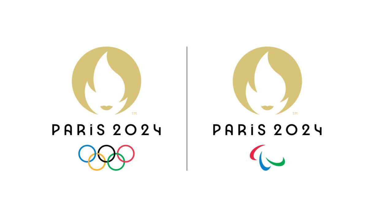
Five years after it was first revealed, the Paris 2024 Olympic Games logo is still raising eyebrows as the Games get underway. What does Rachel from Friends have to do with sporting achievement? Did someone confuse the world's greatest sporting event with an international hairdressing conference? We've seen the Paris 2024 logo compared to everyone from Victoria Beckham to Gail Platt from 'Corrie', but it does have a meaning, and it will be remembered.
What's the meaning of the Paris 2024 logo?
The logo is a optical illusion designed to resemble both the Olympic torch and a woman's face. The face is intended to represent Marianne, the personification of French Republic.
Sure, there's an argument that an Olympics logo should ideally be universal, and a lot of people are not going to get the relatively obscure reference. But I actually think the design is successful. It's strangeness makes it immediately recognisable. It gives the Games a softer face, and it's a delightfully subtle way to include a national reference and promote the host city without recourse to tired symbols or obvious colours. And when was the last time an Olympic Games logo made you chuckle? That alone will ensure this logo is remembered.
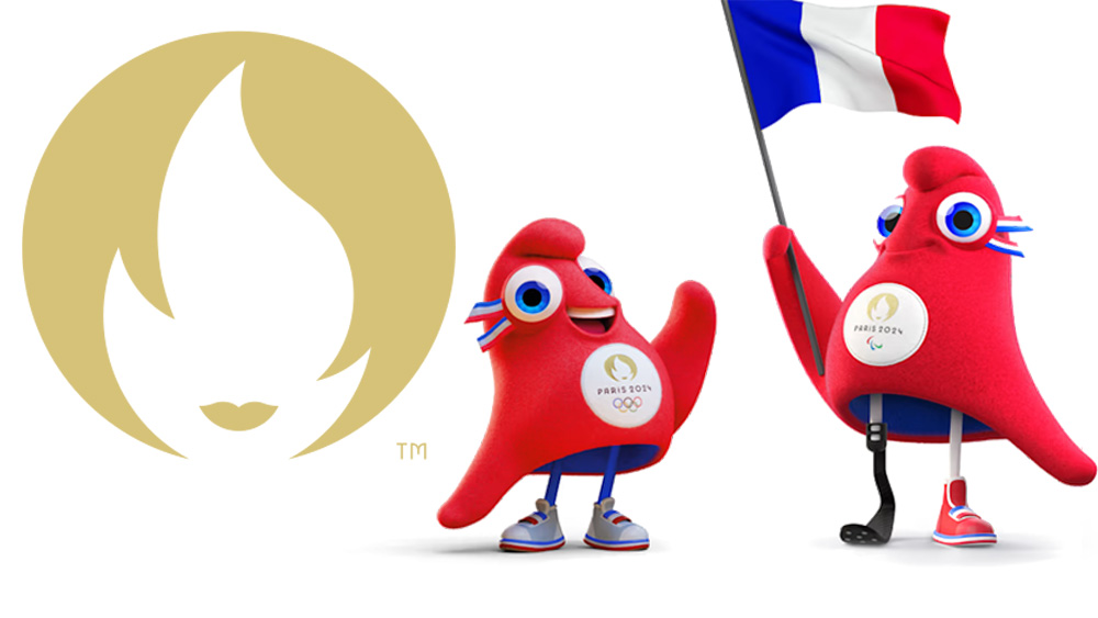
02. The Phyrges: the Paris 2024 mascots
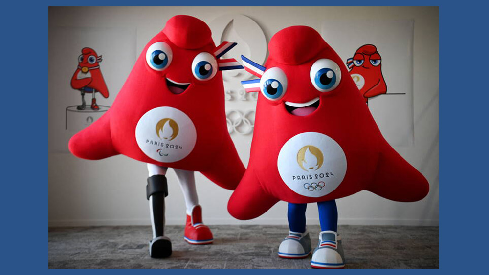
Some assumed that Paris 2024 was taking its tribute to Marianne a little too far when it unveiled the Phyrges as the Paris Olympic mascots. The Games have seen some some weird and wonderful character design over the years, but walking clitorises?
Of course that's not what the Phyrges are supposed to look like. Like the logo, the Paris 2024 Olympics mascots are also inspired by a symbol of the French Revolution, and one that's likely to be a little obscure to a lot of people who aren't French. They're based on the shape of floppy red conical hats or Phrygian caps, or 'liberty caps'. Not exactly everyday garments in 2024, sure, but they do feature in the Argentine coat of arms and the seal of the US senate. And they're worn by the Smurfs.
Unsurprisingly, the design received a bit of a backlash, with some suggesting the mascots aren't appropriate for a family event. "We could have had a beret, a baguette or even an Eiffel Tower. No, we chose a Phrygian cap that looks like a clit," one person complained on X. But that's a glorious thing. As the Paris organising committee said, the Phyrges are "fun, sporty and they love to party" – everything you want from an Olympic mascot.
03. The Olympic pictograms
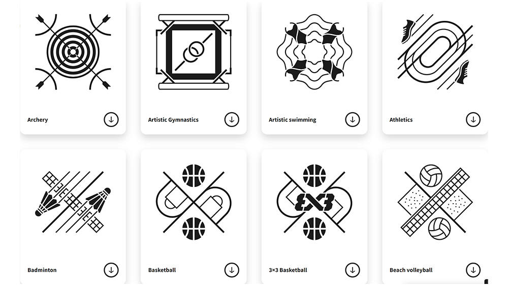
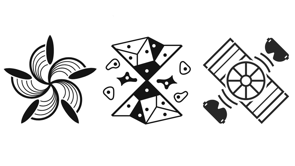
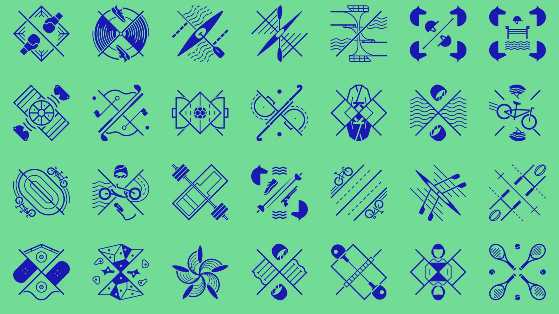
Finally, this year's Olympic Games has seen the International Olympic Committee set out to reinvent the 64 Olympic icons for each sporting event. While traditional Olympic pictograms were literal representations of athletes performing each sport, the new designs look more like tarot cards with their reflected symmetry and arcane-looking symbolism. There was a minor outcry when they were released, with some saying it was impossible to tell which sport some of them represent.
I admit that the icons for some of the lesser known events are a little cryptic. The pictogram for goalball looks like Trivial Pursuit, and the design for climbing looks like origami in space. But the icons are also very striking, and it's refreshing to see a move away from the typical stick man approach. Each icon includes a tool from the sport it represents, for example an arrow for archery, plus a depiction of the playing field combined in designs with an axis of symmetry to give them a coat-of-arms-like aspect.
This gives an identity to the sports themselves, more like a logo or club badge than a mere visual aid, and I expect they'll mainly be used in combination with the name of the sport rather than as the sole identifier of what's being played (You can see all of the designs and what they mean on the Paris 2024 website).
04. The Team GB rebrand
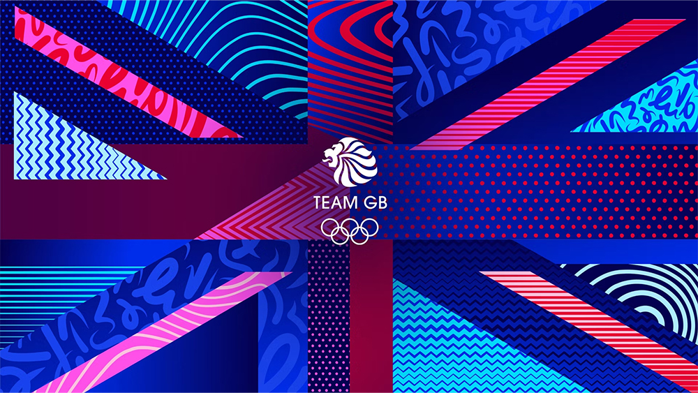
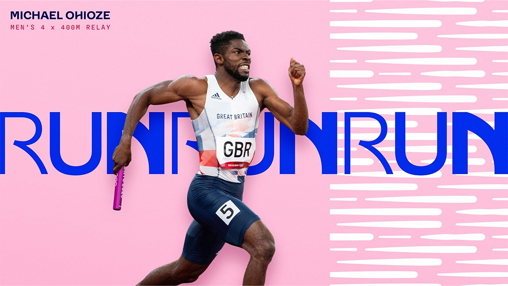
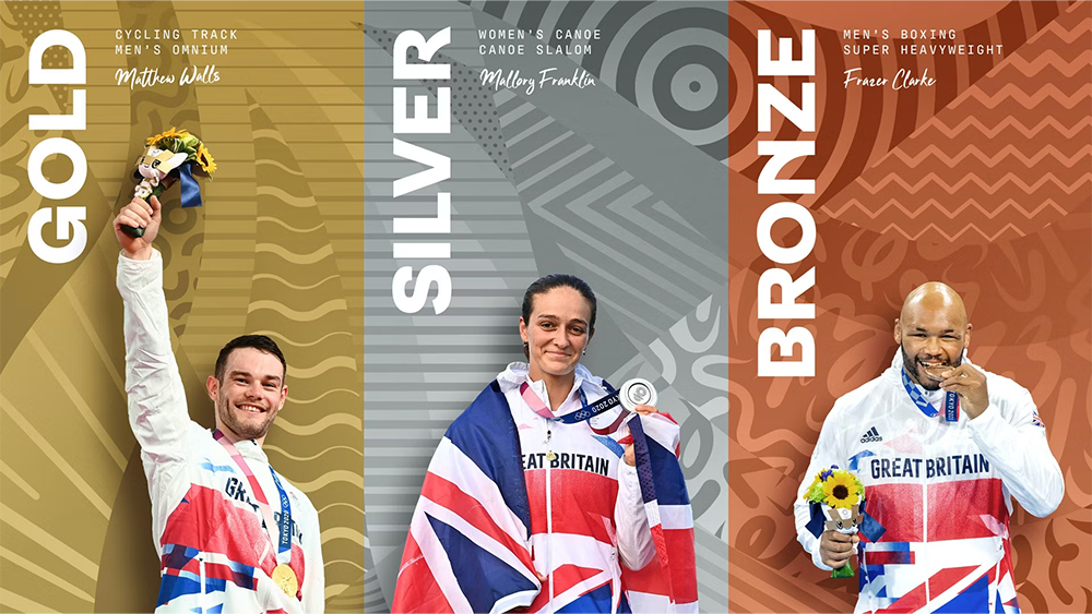
It's not just the Games themselves that have generated design controversy. The Team GB rebrand by the British Olympic Association with Bath-based branding agency Thisaway was seen as too radical by some. It includes a range of patterns that can be used as general graphic devices, capturing the dynamism of the various Olympics sports. The bespoke typeface, Team GB Sans from Lewis McGuffie was inspired by everything from sports grounds and equipment to athletes’ movements for its bends, curves and arcs.
Despite the complaints, the colour palette clearly references the colours of the British flag, but pushes the traditional red, white, and blue as far as they will go, adding a range of less usual alternative shades as well as neutral tones referencing gold, silver, and bronze medals. It was a winner for me. Red, white and blue are hardly unique to Great Britain: the same colours represent countries as diverse as France, the USA and Russia. Thisaway found a way to refresh the colour palette in a way that's "flexible and ownable".
For more on Olympic design, see the Olympic Rings history and the first Olympics logo.