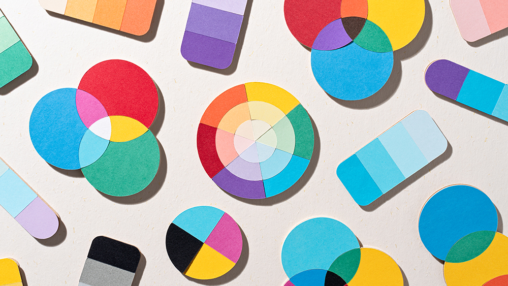
As a digital designer who's been working in the tech industry for more than 10 years, I understand that colour is more than just a visual element; it's a powerful tool that shapes user experience. In this article, we'll explore the crucial role colour plays in digital products, diving into the psychology behind colour associations and how they influence user behaviour. We'll examine how colour evokes emotions, strengthens brand identity, and impacts readability and accessibility. I'll be using examples from well-known brands to illustrate how strategic colour choices contribute to a product's success, from calming blues in meditation apps to the energetic reds that drive conversions for limited-time offers.
This exploration will cover key concepts like colour theory, including hue, saturation, and brightness, and how these attributes work together to create impactful designs. We'll also delve into practical application, outlining a framework for applying colour psychology in UX design, including defining your brand and target audience, selecting primary and accent colours, and considering cultural differences. Finally, we'll discuss the importance of consistency in colour usage and how the 60-30-10 rule can help create balanced and visually appealing colour palettes, ensuring your digital product is not only beautiful but also user-friendly and effective.