Get all your news in one place.
100's of premium titles.
One app.
Start reading
Creative Bloq
Creative Bloq
Technology
Daniel John

Why Coca-Cola's bold new logo campaign was both uncomfortable and rewarding for the brand

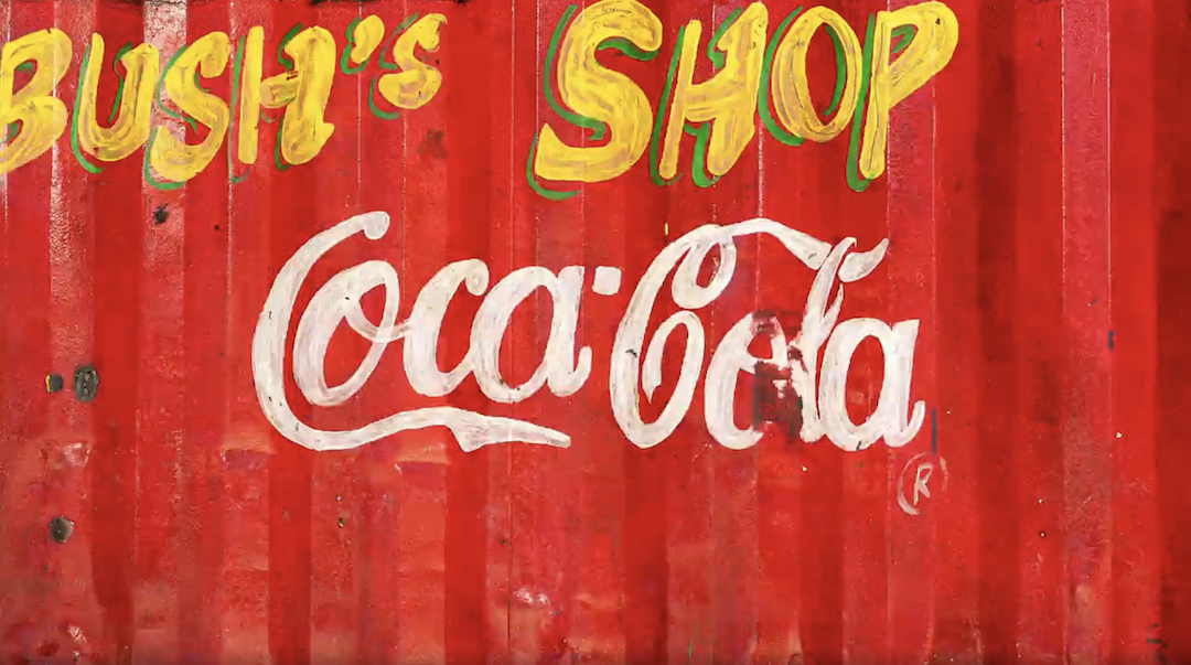
Hand-drawn Coca-Cola logo.

The Coca-Cola logo is one of the most recognisable designs in the world, but it certainly isn't one of the simplest. While many of the best logos are clean, minimal affairs, the Coca-Cola wordmark is a flowing, cursive delight. Which means it isn't the easiest design to replicate.

In a wholesome new campaign, Coca-Cola is embracing the imperfection of recreated Coca-Cola logos from across the world – and it's even slapping some of the dupes on the cans themselves. (If you're looking for more design inspiration, check out the best cursive fonts.)
Sign up to read this article
Read news from 100's of titles, curated specifically for you.
Already a member? Sign in here
Related Stories
Top stories on inkl right now
One subscription that gives you access to news from hundreds of sites
Already a member? Sign in here
Our Picks
Fourteen days free
Download the app
One app. One membership.
100+ trusted global sources.