There's been a flurry of rebrands in the soft drinks space of late. The likes of 7UP, Sprite, Pepsi, Fanta and Minute Maid have all had new looks. In the midst of a cost of living crisis, you might think that expensive rebranding projects would be put on hold, but not so for the world's leading soft drinks companies, it seems.
To find out what's going on in this FMCG (fast-moving consumer goods) sector, we spoke to Patrick Llewellyn, CEO of 99designs by Vista, who offered his insight.
"For FMCG brands in particular there has never been a more critical time to stand out from the crowds" says Llewellyn. "Against a backdrop of economic uncertainty, consumers are still willing to spend on small treats."
With that in mind, investing in new trend-forward visual identities is key. "In a saturated market – and one largely controlled by two competing global players – staying relevant and connecting with new audiences and generations is crucial."
Let's take a look at the main players who've opted for new looks recently:
01. 7UP
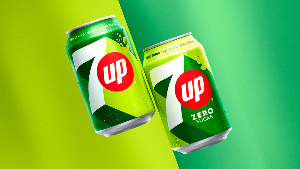
"7UP, which is distributed globally by PepsiCo, introduced a striking brand refresh at the start of the year – leaning into one of the year’s biggest colour trends by focusing on acidic hues that scream confidence and demand attention," says Llewellyn. "The almost neon shade complements a simpler, bolder design while the shape and drop shadow maintains depth."
02. Sprite
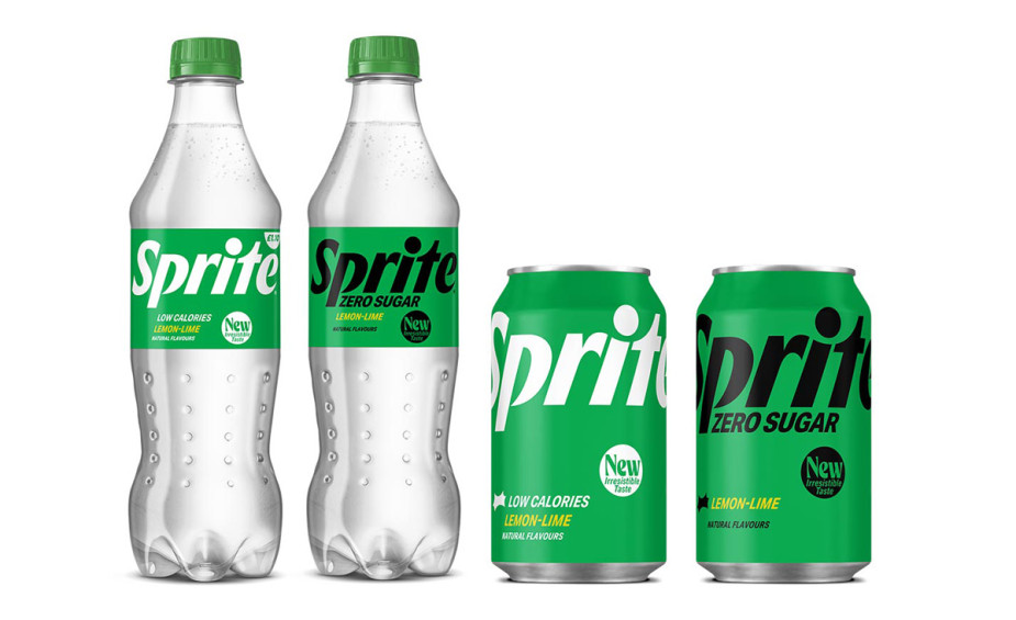
Coca-Cola owned competitor, Sprite was next to rebrand in March, with a bold new can design to match its new taste. "This drastically simplified packaging design focuses on typography and offers consumers a pared back, sleek look that is a little more grown up, contrasting with the loud can design of 7UP," says Llewellyn.
03. Pepsi

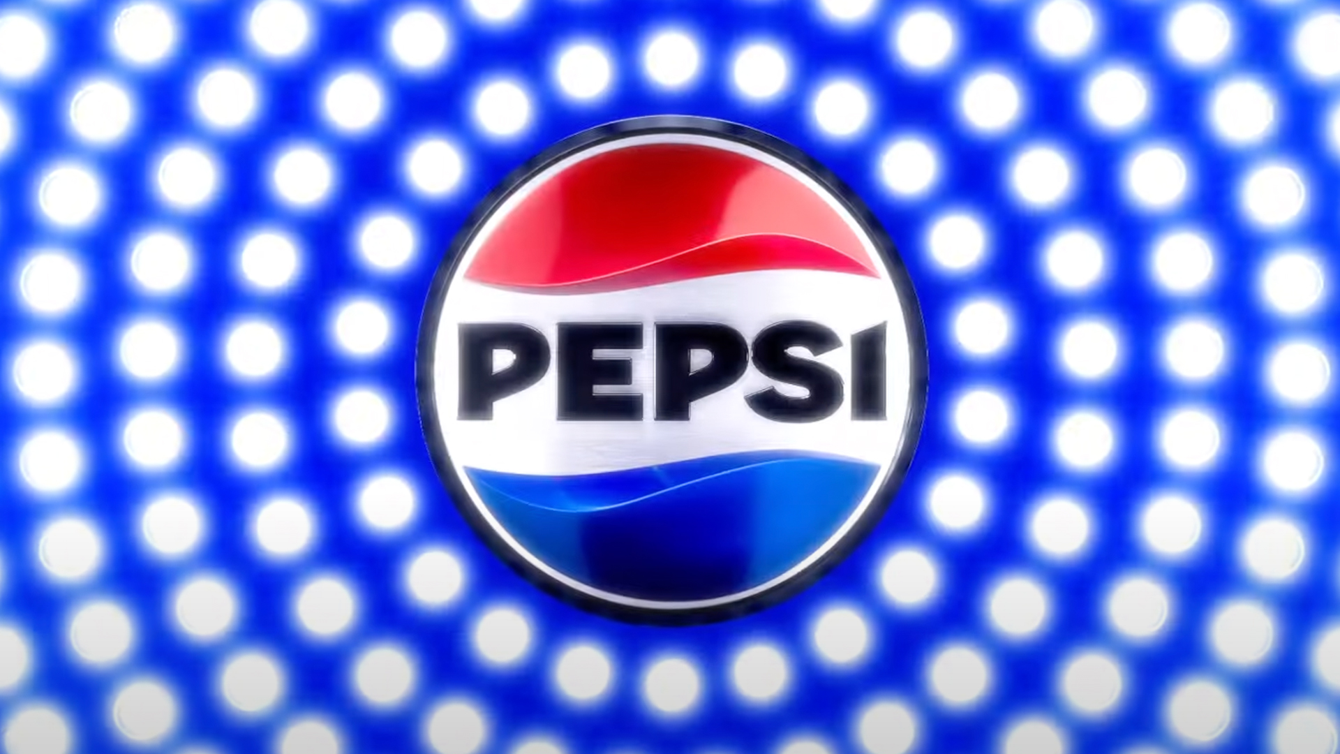
"Pepsi itself, unveiled a new logo that has been largely celebrated thanks to its unapologetically retro design that doesn’t feel dated thanks to the deep, saturated colours and bold typeface," says Llewellyn. "Drawing heavily on the brand’s heritage and capturing a look reminiscent of its iconic 1990s style, Pepsi made its new legacy-infused branding feel both incredibly fresh, but familiar at the same time."
04. Fanta
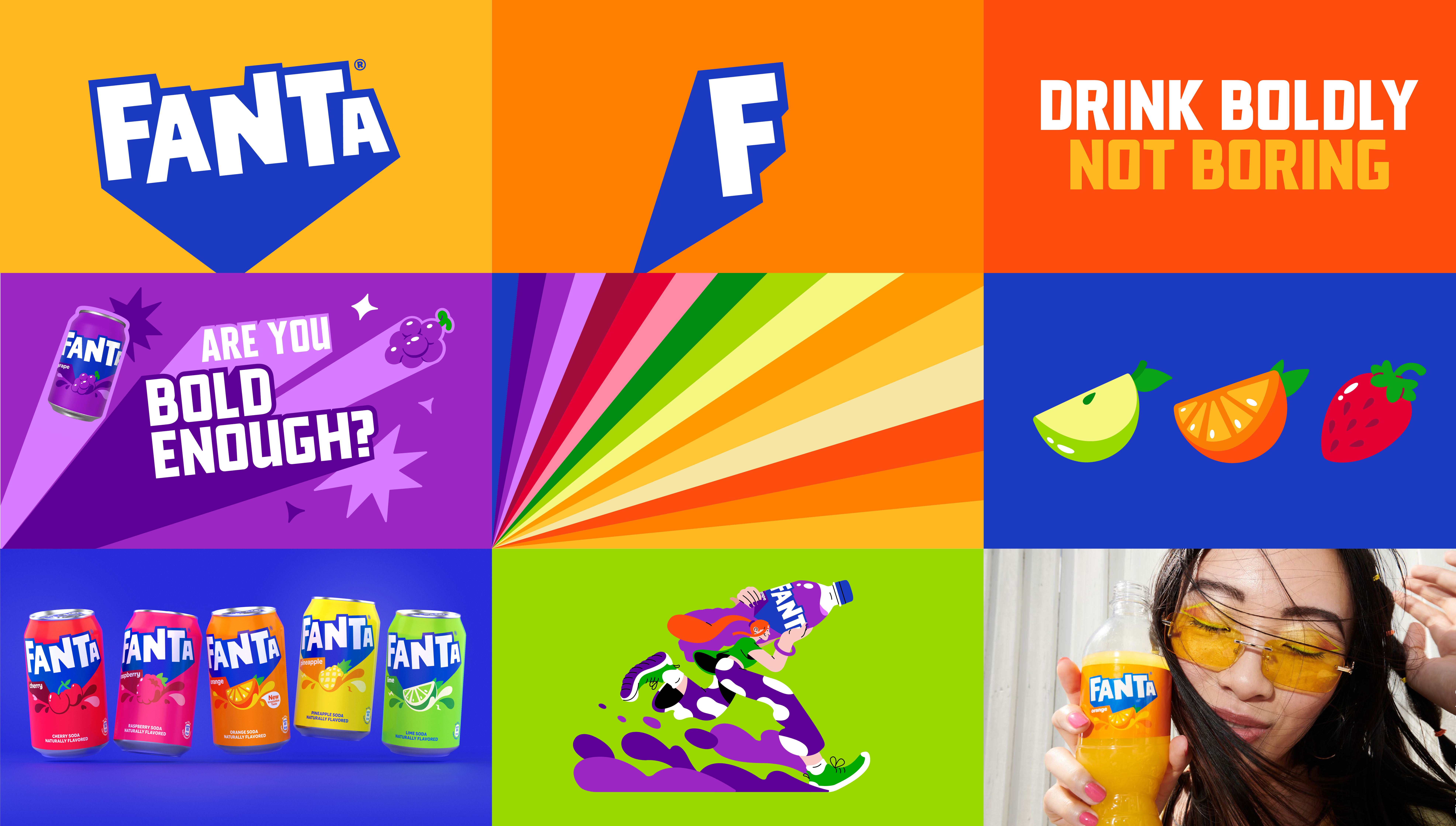
"Back to competitor Coca-Cola, whose launch of a global visual brand for Fanta, including renaming the much-loved UK brand Lilt, has gained a significant amount of attention," notes Llewellyn. "While the orange has been dropped, the consistency achieved by retaining a very similar word mark goes a long way in maintaining consumer recognition of a much loved product.
"The new can designs are unapologetically bright, landing with a splash of vibrant colour and tapping into a dynamic design trend currently taking the packaging world by storm. By putting the ingredients front and centre of the design, the branding stands out in a sea of competing products, and is attention grabbing while also adding a transparency that appeals in markets around the world."
05. Minute Maid
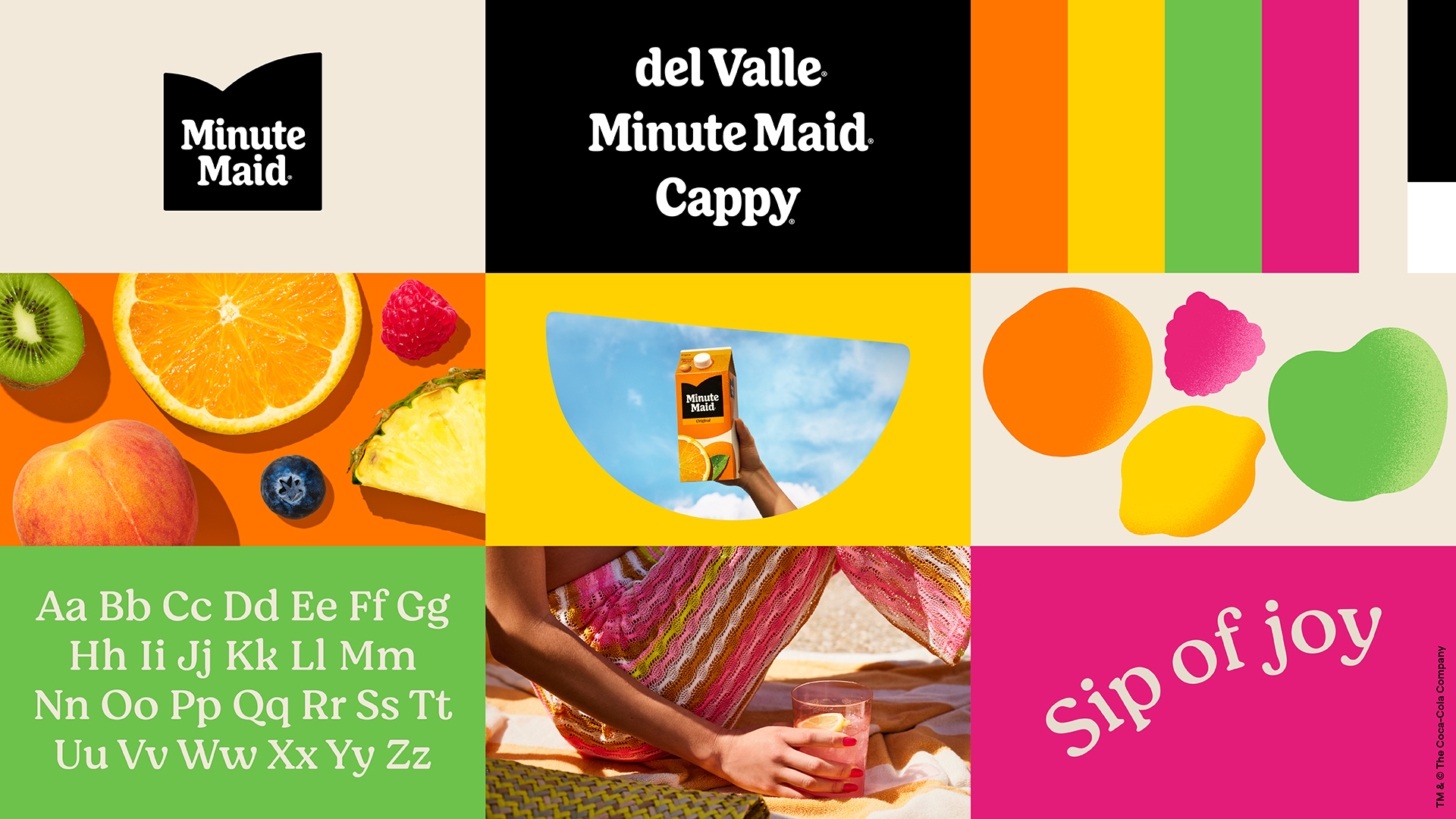
It's not just fizzy drinks that are rebranding. Minute Maid – also owned by the Coca-Cola Company – has also got on the bandwagon. "This brand refresh is fun-loving and retro in a subtle way: and it’s very 2023," says Llewellyn. "The repeating fruit pattern reflects a broader move towards more modern, botanical patterns, but from the grainy textures to the youthful ecstatic colour palette, Minute Maid has it all when it comes to current design trends."
.jpg?w=600)


