Farrow & Ball is known for its richly pigmented paint colors that bring a timeless, elevated feel to a space, from its subtly nuanced neutrals to its much richer tones. But with each of its stylish shades, the trick to creating a balanced room is to find the right pairings — or as we like to call them, 'room recipes'.
Since many of the most popular Farrow & Ball paint colors have a subtly darkened, earthy quality, they tend to all feel incredibly livable, which means the options when it comes to Farrow & Ball paint pairings are vast, depending on how bold (or pared back) you want your room to look.
To make it easy, I asked interior designers to share their favorite paint duos from Farrow & Ball, which you can use to gain some inspiration for your own home — whether you're looking for similar hues to create a tonal scheme or something much more contrasting for a color-confident look. Here's what to look at first.
1. Porphyry Pink and Dyrehaven
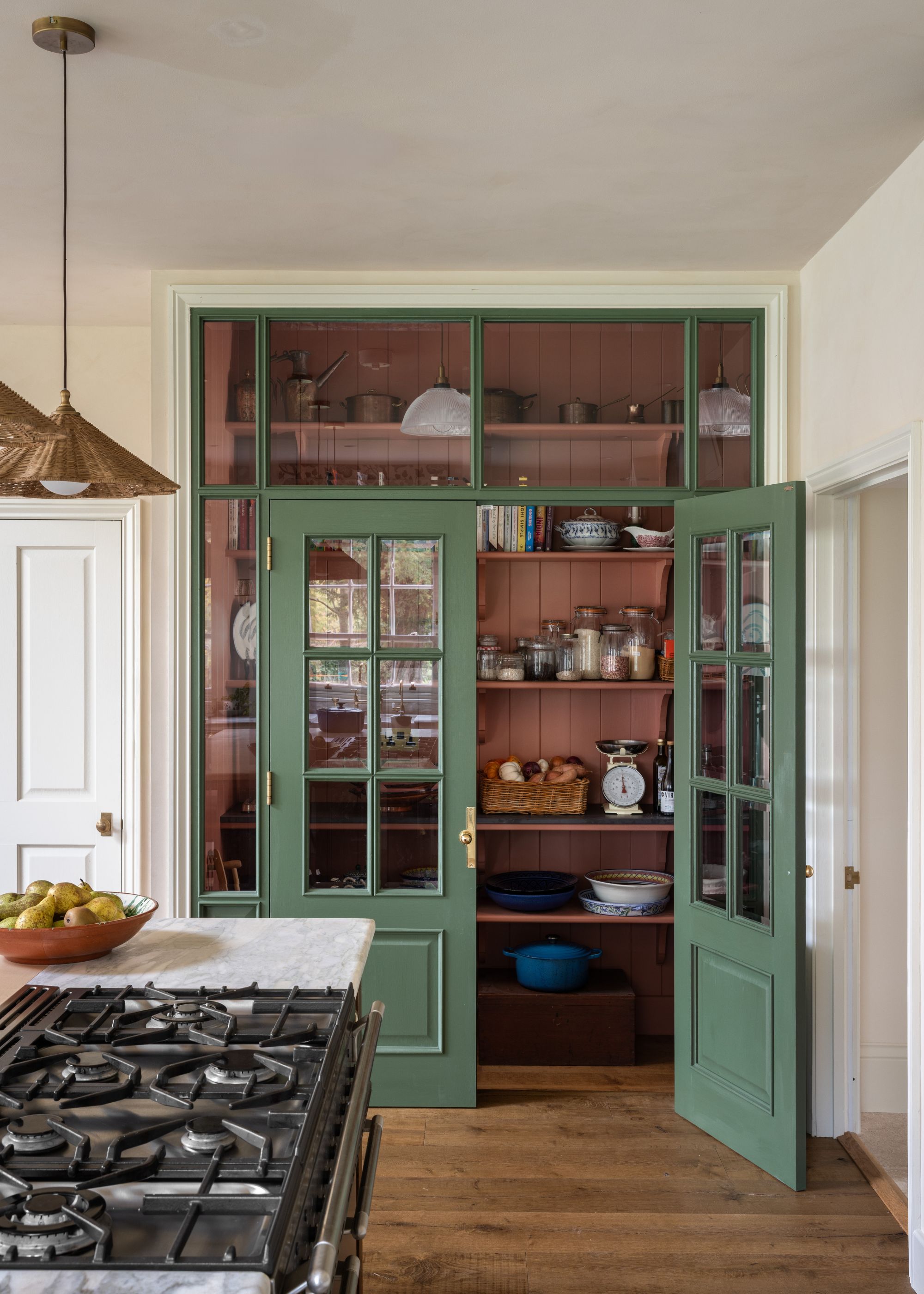
It's well known that pink and green go together — not least because they sit opposite each other on the color wheel, making it a balanced, harmonious pairing. In the pantry pictured above, this color combination was created using Farrow & Ball's Porphyry Pink, a muted terracotta-esque pink, along with Dyrehaven, a dark green paint.
"The contrast between these two colors as opposites on the color wheel allows them to stand out against each other, making the pantry feel distinctive yet still cohesive within the kitchen,” explains Cath Beckett, co-founder of Yellow London.
2. Charlotte's Locks and School House White
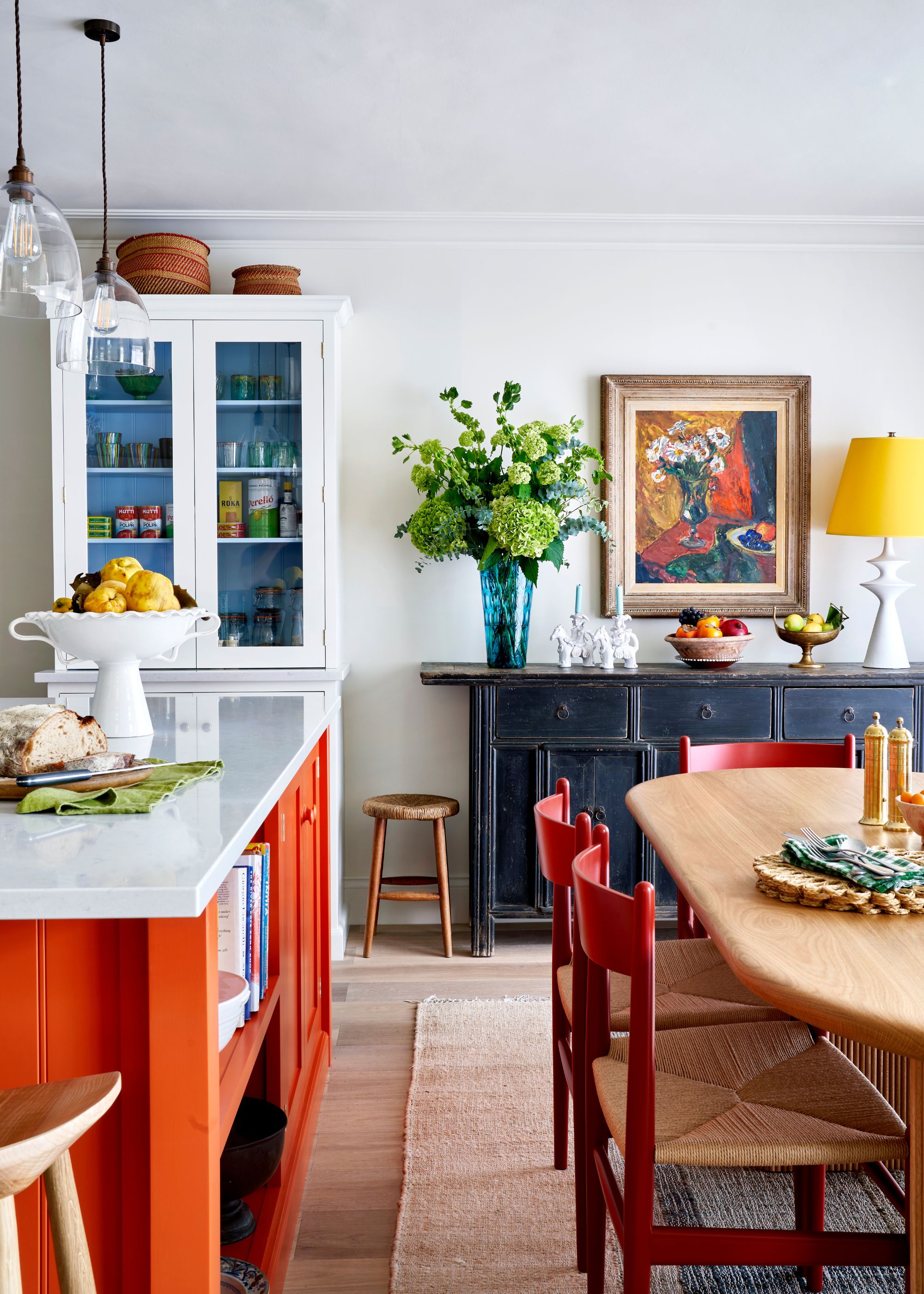
Often, the best pairing when it comes to the brightest paint colors, such as Farrow & Ball's Charlotte's Locks, a saturated and vivid orange paint, is pared-back neutrals that allow a room to breathe.
"In this open-plan kitchen and dining space, Charlotte’s Locks on the kitchen island creates a warm focal point, while School House White on the walls keeps things soft and balanced," explains the London-based designer Lonika Chande. "Together, they feel both lively and grounded."
3. Smoked Trout and Etruscan Red
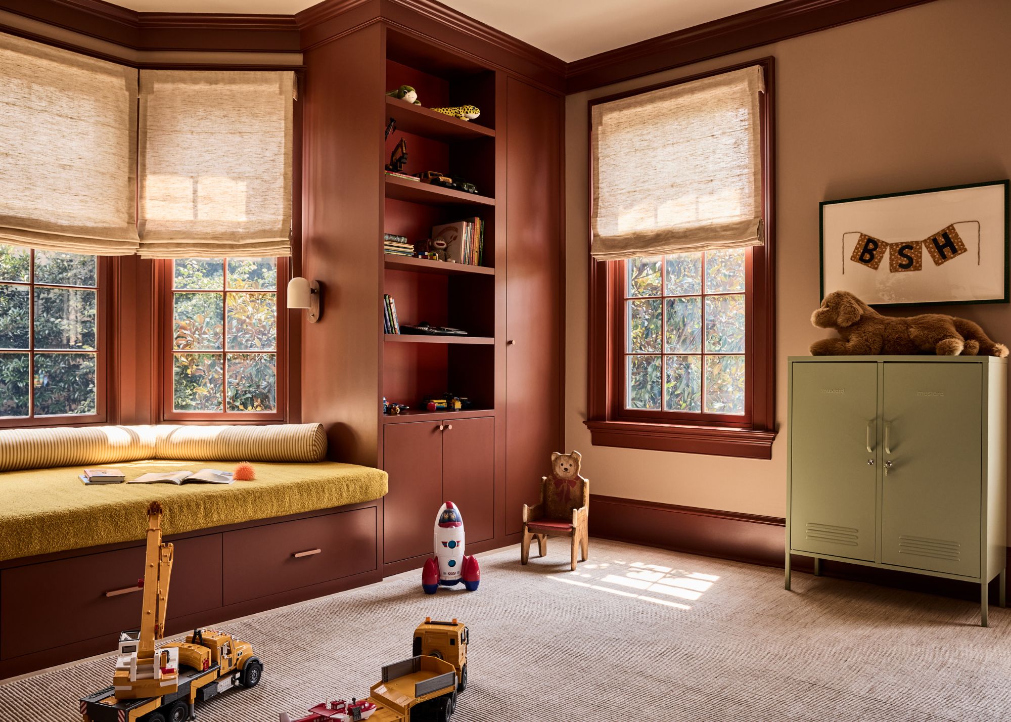
"Farrow & Ball’s Smoked Trout and Etruscan Red work beautifully together because they share a certain earthy sophistication: one feels grounding and enveloping, while the other introduces warmth and a sense of richness that keeps the palette from feeling too serious," explains designer Zoë Feldman, who opted for this Farrow & Ball color pairing in this kids' room.
"It’s a pairing that plays with contrast in a very intentional way, creating a room that feels layered, cocooning, and full of character rather than overly composed," she adds.
4. Oval Room Blue and Inchyra Blue
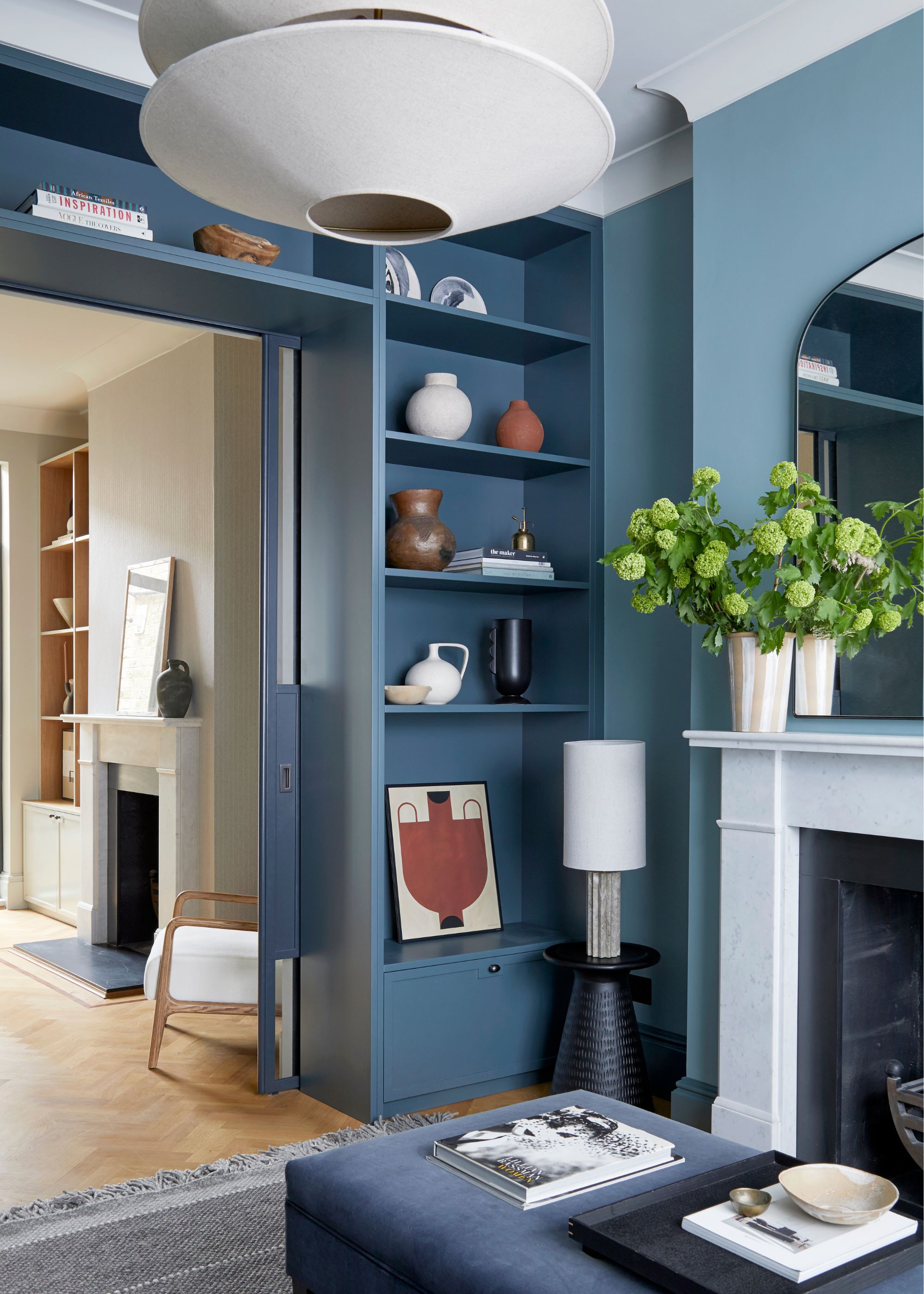
Blue on blue is a failsafe way to create a calm color palette, while the use of lighter and darker tones adds depth and dimension to a room. "We painted the walls of this south-facing sitting room in Oval Room Blue, with the woodwork and joinery in Inchyra Blue, a deeper tone within the same color family," explains designer Gemma Tucker of Balance Interior Design.
"The result is cohesive and subtly layered, with enough contrast to give the joinery definition without breaking the calm," she adds.
5. Pink Ground and Verdigris Green
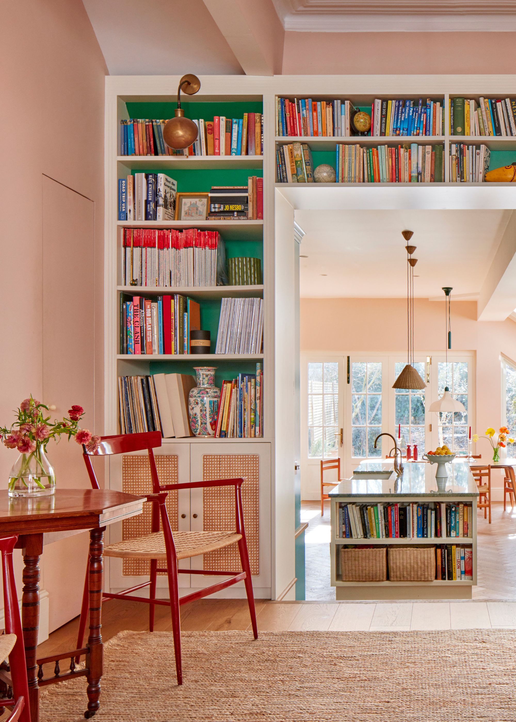
Another pink-and-green Farrow & Ball color pairing that is designer-approved is Pink Ground with Verdigris Green, which feels happy and slightly playful. Since the green paint is fairly rich, using it as an accent color keeps the room feeling grounded while still exciting.
"It’s a punchy shade, so it holds its own beautifully at the back of the bookcase rather than fading into shadow," says designer Sophie Garland of the brighter green. "The contrast between the two colors brings a sense of depth and quiet drama to the room," she adds.
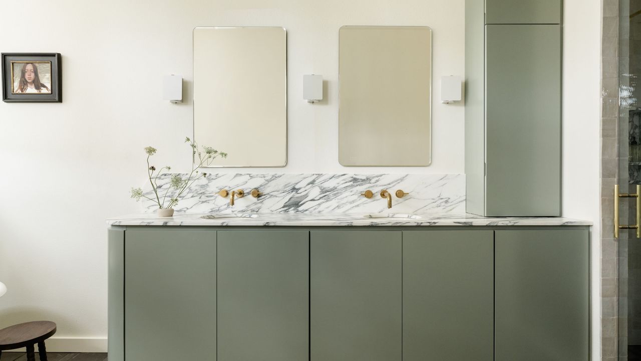
6. Card Room Green and Pointing
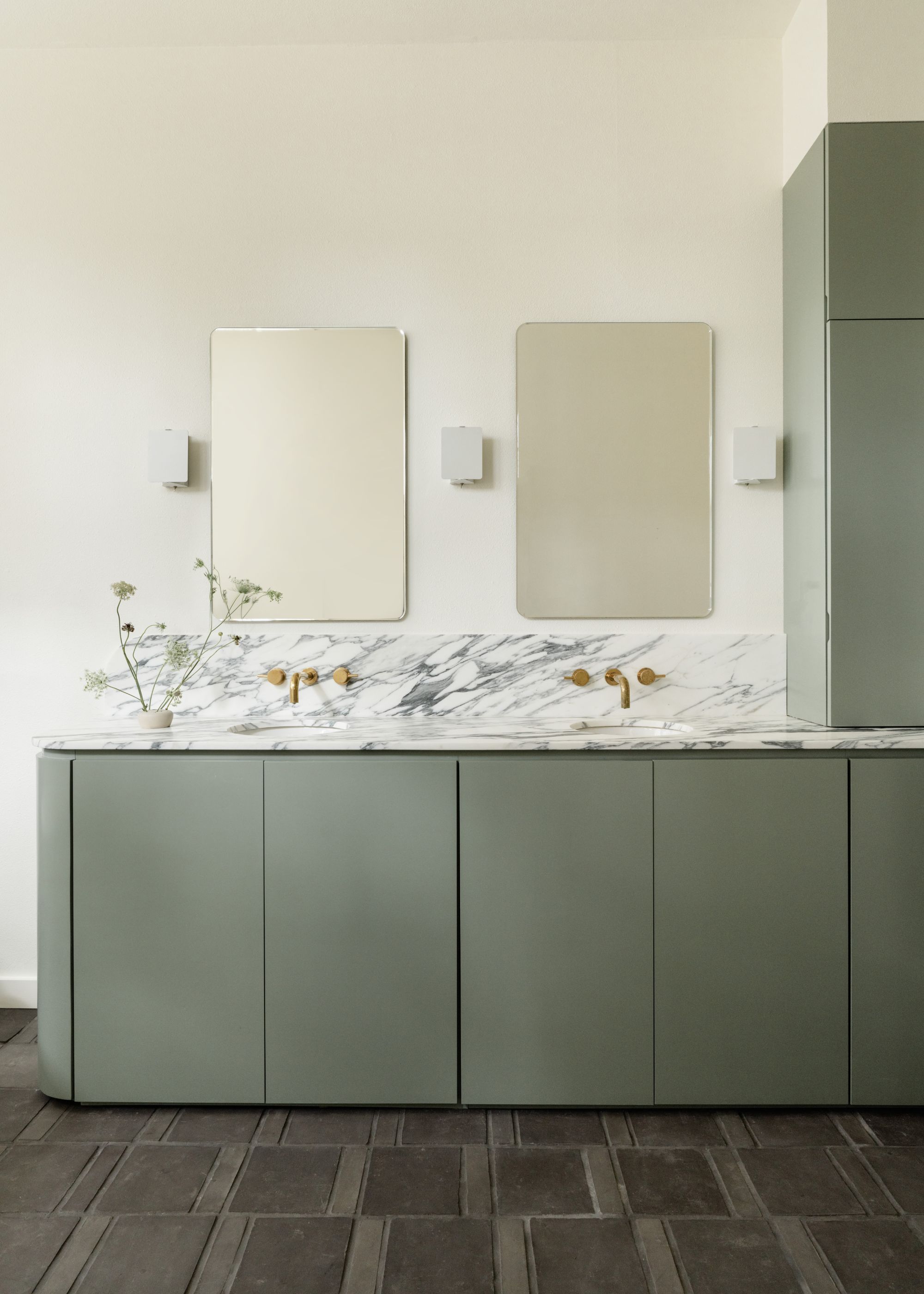
Card Room Green is a popular green paint from Farrow & Ball, which feels soft and easy to decorate with due to its slightly muted, gray tone. Here, it was used on the vanity, alongside walls painted with Pointing to create a relaxing bathroom.
"Our client wanted to bring the outdoors in through color, while still maintaining a sense of calm," says Emily Brown, founder of House Franc. "We landed on Pointing, which is a soft, warm off-white that responds beautifully to natural light. Its subtle warmth pairs effortlessly with Card Room Green, gently tempering the depth of the green and lending it a more grounded, earthy quality without feeling overly saturated."
7. New White and Fowler Pink
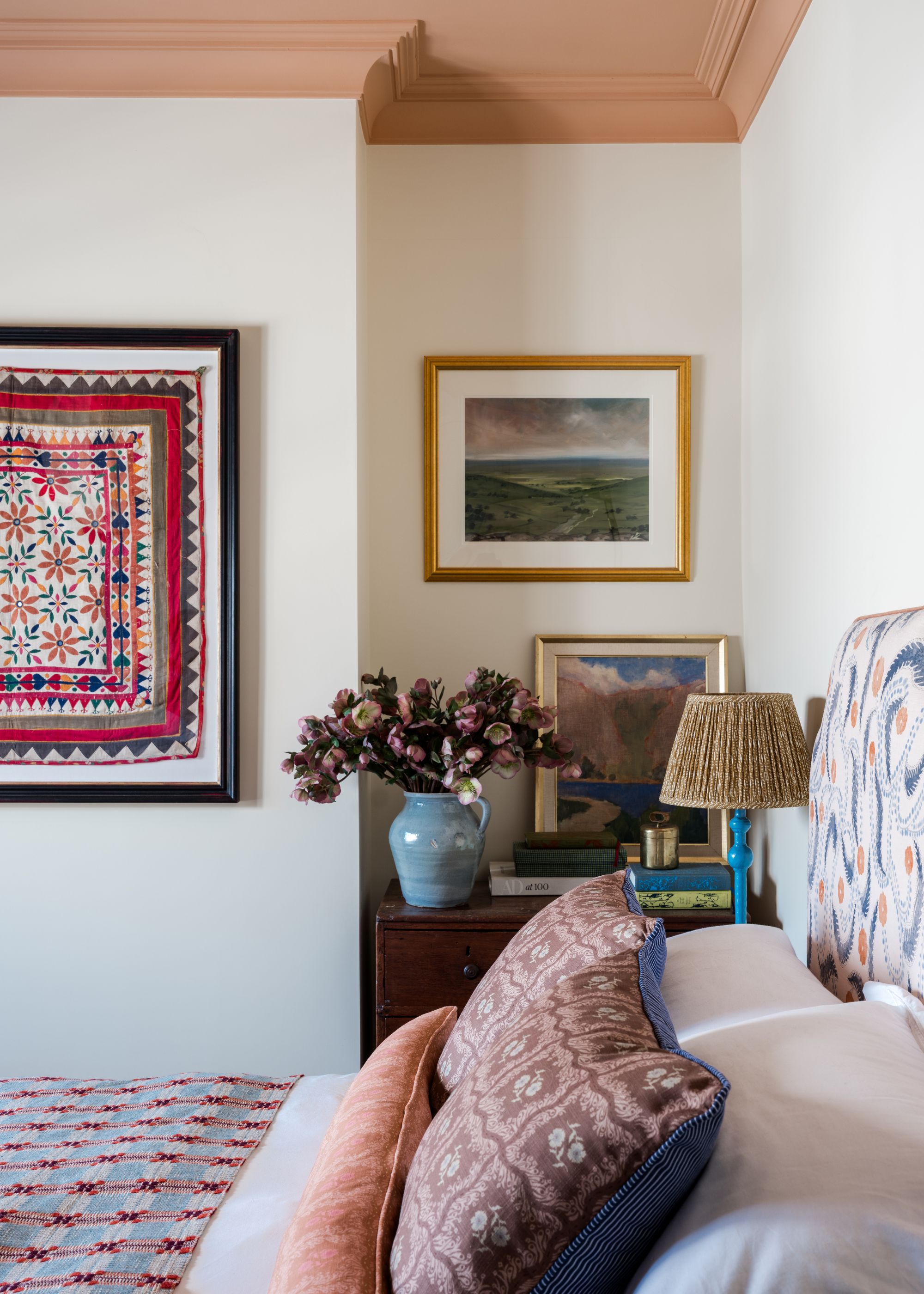
This cozy bedroom teams white walls with a pink paint on the ceiling: New White and Fowler Pink. Since they're both warm colors, they feel balanced alongside one another, and limiting the pink to the ceiling allows the room to feel colorful and exciting, while still being light and airy.
"New White has a softness to it that doesn’t feel too stark, and the pink on the ceiling adds a gentle warmth without it feeling overly colorful," explains designer Laura Stephens. "It’s that slightly earthy terracotta tone in Fowler Pink that keeps everything feeling calm, relaxed, and easy to live with."
8. Oval Room Blue and Jitney
If you're looking for more pairings for the much-loved Oval Room Blue, try it with a warm, grounding neutral paint such as Jitney. This combination works as a stylish hallway paint idea here, adding coziness to the lower-light space.
"I love the depth of color in these two Farrow & Ball shades — they have the complete opposite undertones but complement one another beautifully," explains London-based designer Jenny Luck. "The warmer hues of the Jitney on the ceiling and cornicing enhance the depth of the Oval Room Blue, which was used on the walls. The strength of both colors adds balance and proportion, creating a cocooning feel in the large entrance hall."
9. Setting Plaster and Eating Room Red
Pink and red are emerging as a fun, happy color combination that feels like a bolder take on decorating with pink. In this living room, the soft Setting Plaster takes the lead, while a shade most similar to Eating Room Red, used on the woodwork, offers vibrancy and energy.
"We wanted a scheme that felt warm and defined," explains Lonika Chande. "Setting Plaster brings a soft, chalky warmth to the walls, while the Eating Room Red adds depth and richness."
10. Cromarty and Mizzle
Cromarty and Mizzle are similar shades of gray-green, but Mizzle is slightly darker. Used alongside one another, they create a harmonious scheme while the subtle difference in richness brings movement.
"In our Notting Hill project, we used Cromarty on the walls with Mizzle on the woodwork, creating a soft layering of green tones," says Sophie Pringle, founder of Pringle & Pringle. "In a south-facing sitting room with lots of natural light, this approach adds depth and character while still reading as a neutral."
"Farrow & Ball’s color chart is particularly helpful, as it is organized into families, making it intuitive to build tonal schemes," adds Gemma Tucker, perfect for if you're looking to create a low-contrast, subtly nuanced scheme.
Or, if you're feeling inspired to bring more color into your home, these stylish spring color palettes will no doubt help you on your way.
For more design inspiration, be sure to subscribe to Livingetc's newsletter.