One of the most remarked-upon things about St Ives is its beautiful light. A mecca for creatives, every year thousands of people flock to this coastal town to enjoy its beautiful beaches and scenery. However, an occasional visit wasn’t enough for Paul O’Leary and his partner Helen Parker, who, in 2019, decided to put down roots in the fishing port.
The 200-year-old fisherman’s cottage is typical of the area, made from a reconstituted stone that is a mix of concrete and ash residue, which gives the exterior a rustic, weathered look. While perfect in some spaces, the couple had to rely on all their kitchen ideas to transform its compact cookspace.
Maximising a small coastal kitchen
Paul is the co-founder of kitchen company deVOL, and his partner, Helen Parker, is its creative director – this meant they had very clear ideas for the kitchen's layout.
The first challenge the couple had to overcome was the cottage’s size. ‘The ground floor was made up of a living room, which was 10ft by 10ft, and a 10ft by 8ft kitchen,’ says Paul. ‘It was clear that we needed to knock down the partition wall and turn
the small kitchen into a large, single space.’
They also decided to build on the courtyard area at the back to increase the kitchen’s square footage, creating a large room complete with French doors and sea views. ‘As soon as we stepped inside we knew what was needed.’
New floorplan
While designing the new floorplan was relatively straightforward, a more significant hurdle was the budget. ‘We didn’t want to spend lots of money on the furniture. The house was a pricey purchase so we tried to do everything as cost-effectively as possible,’ says Paul.
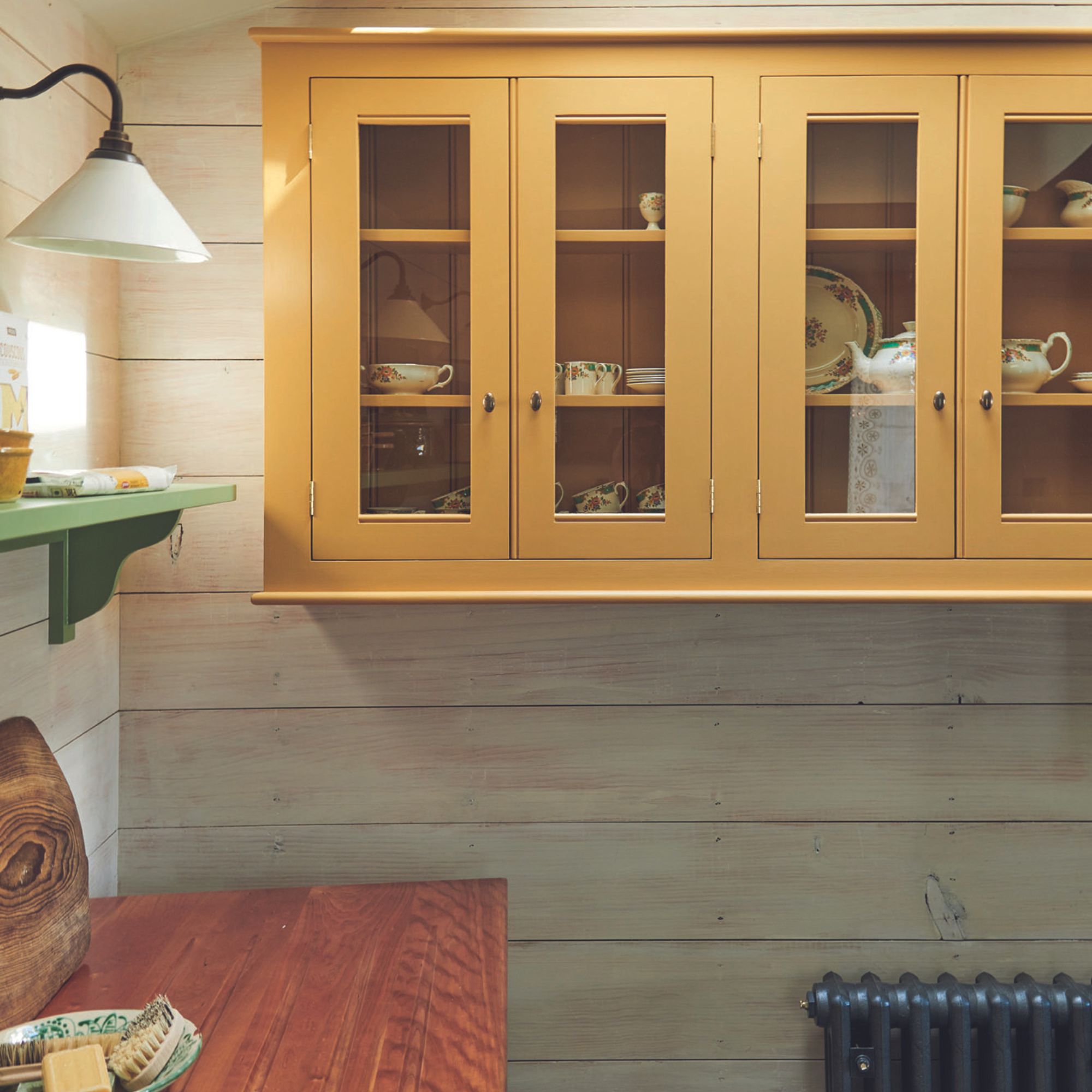
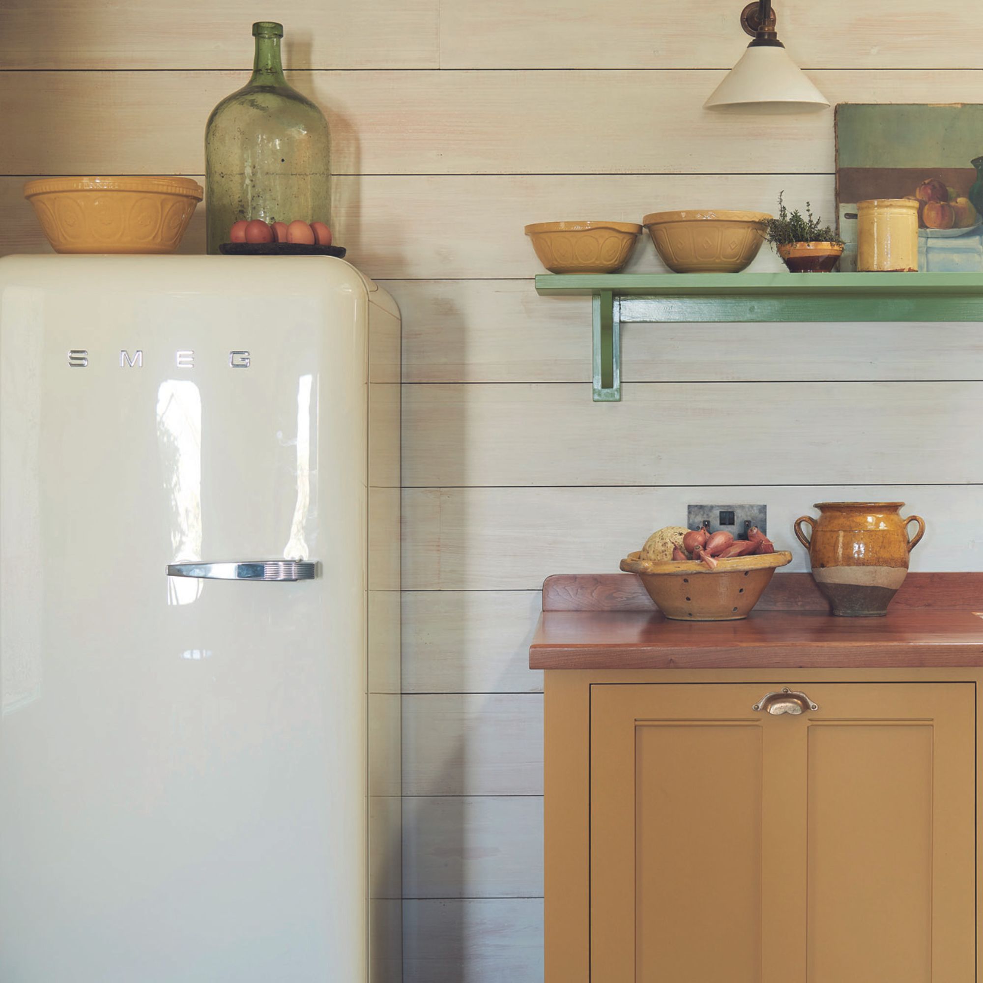
However, one of the perks of owning a kitchen company is that you have access to a lot of kitchens. ‘We decided to recycle furniture that was coming out of an old showroom. It was a little out of date but we gave it a new lease of life.’
Freestanding furniture

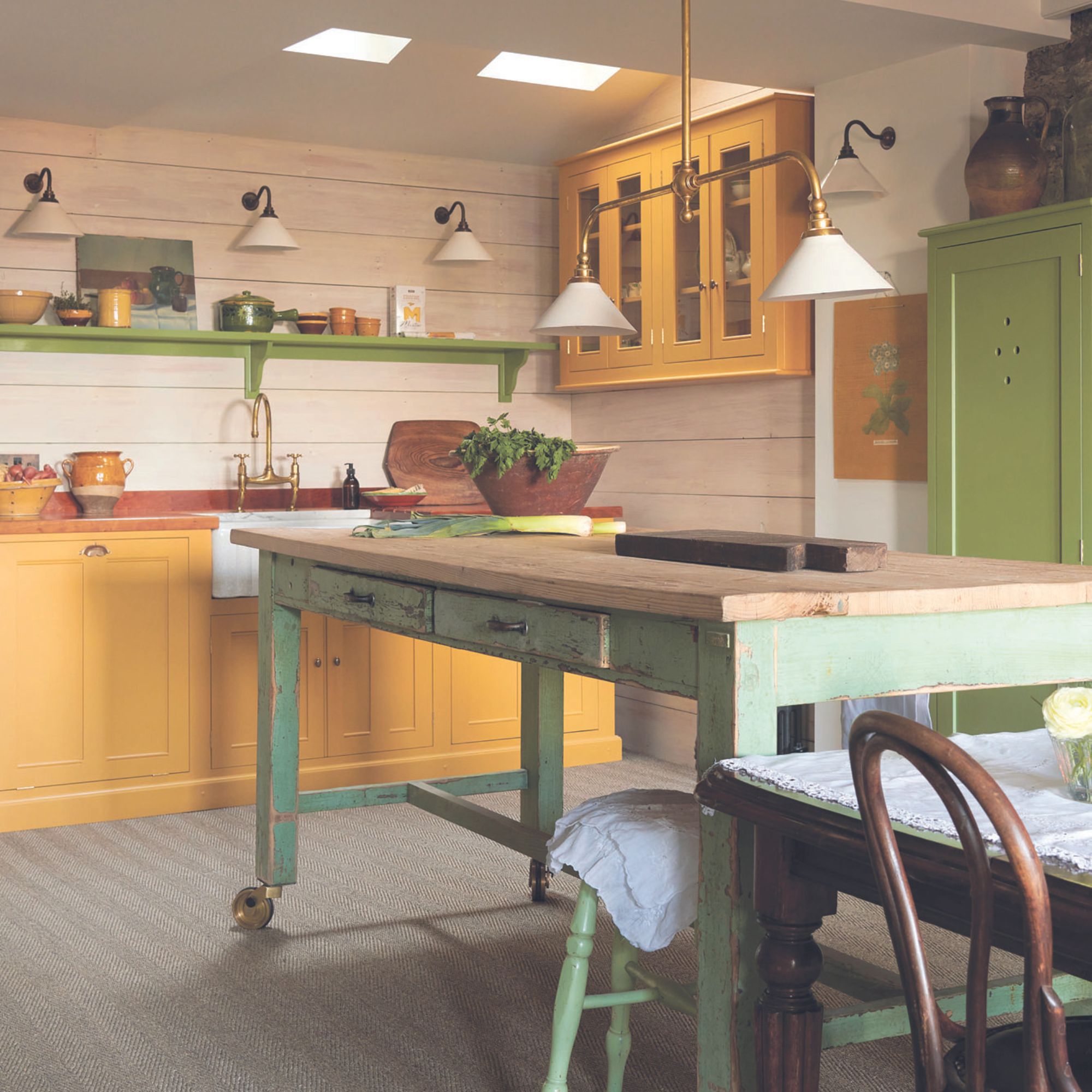
Freestanding furniture was always on the cards. ‘I’ve been banging the drum for freestanding kitchens for as long as I can remember – I love how it can move and grow with you,’ says Paul.
‘We designed the space around two pieces – the sink and the kitchen island. Everything else was odds from the showroom that we repainted so everything works together harmoniously,’ explains Paul.
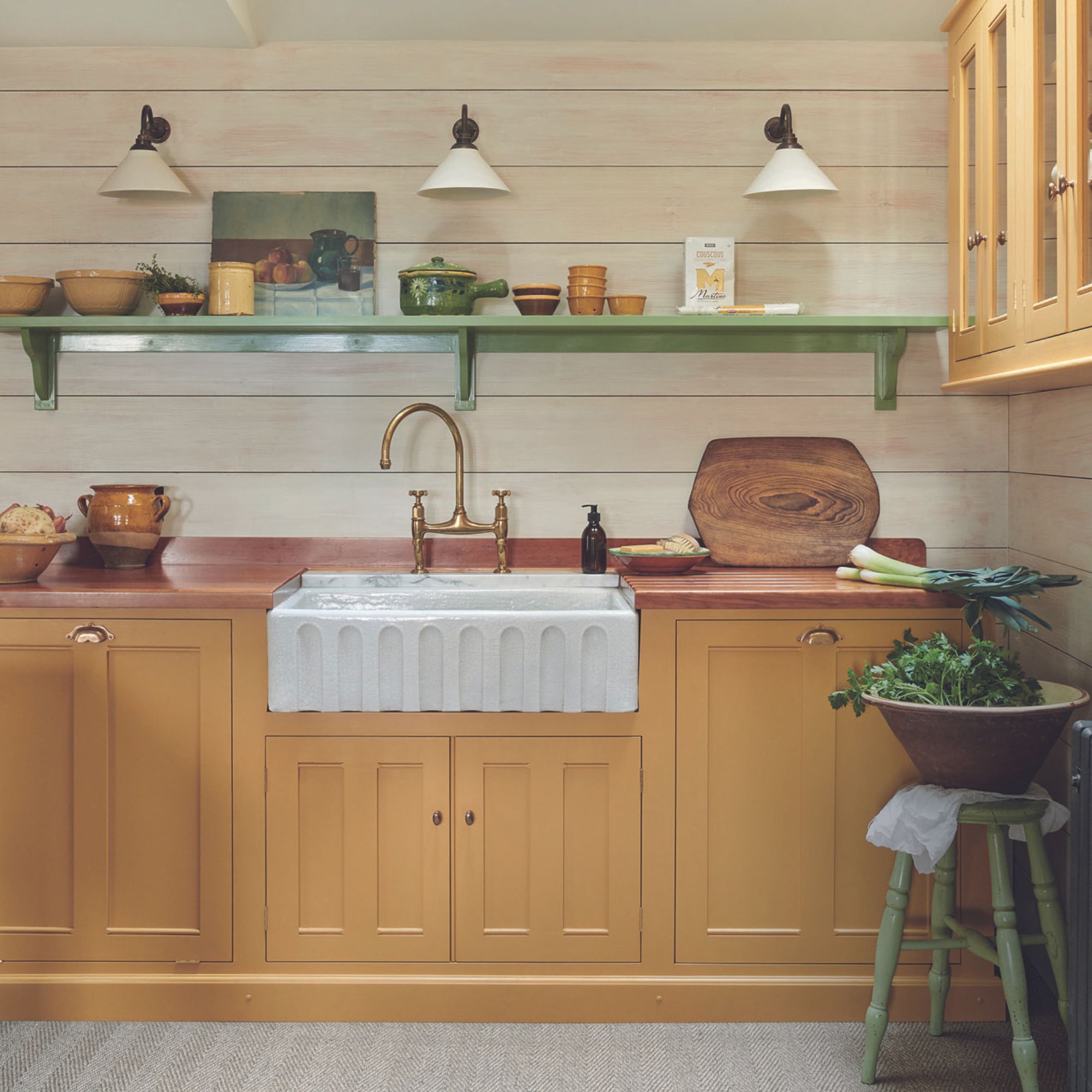
Yellow and green colour scheme
When you think of coastal interior decorating ideas, your first thoughts will be of a blue-and-white colour scheme – however, this doesn't have to be the case, as proven by the use of yellow kitchen ideas in this beautiful space.
The colour scheme was Helen’s vision. ‘Helen has a way of knowing what the next popular colours are going to be. She chose a traditional green that perfectly matched the chippy paint finish of the vintage kitchen prep table, and paired it with Devol's Scullery Yellow furniture paint – it was a stroke of genius,’ says Paul.
‘It’s a beautiful shade of yellow, not too bright and “buttercuppy” – it’s the sort of colour you’d find in the downstairs of a stately home.’
These bright pops of colour are expertly balanced by the walls in whitewashed exposed stone and white wooden wall panelling – a popular look in St Ives.
Adding traditional charm
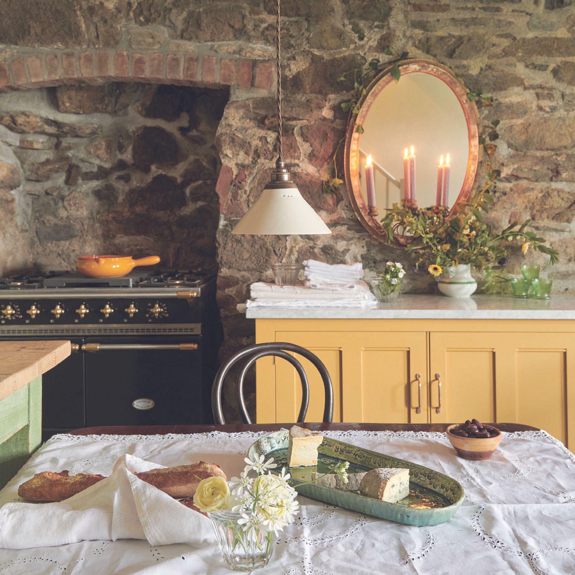
Continuing with the heritage theme, the couple opted for a more traditional kitchen lighting rather than the modern trend for spotlights – the star being deVOL’s own Gaselier design, which Paul describes as ‘the sort of thing you would find in a Victorian railway waiting room.’
This has been paired with a series of wall lights with creamware shades that create little pools of light, ensuring practical illumination over the worktops while giving a soft backdrop to the wider scheme.
Each piece works together harmoniously, unified by the traditional kitchen design. ‘Every one of our lights has been inspired by an original fitting that we have seen elsewhere, usually in a stately home,’ explains Paul.
‘When we start designing, we typically change a few things, not because we are trying to avoid creating a copy but because there is always something that doesn’t feel quite right and in changing this you create a completely new design.’
Favourite spot
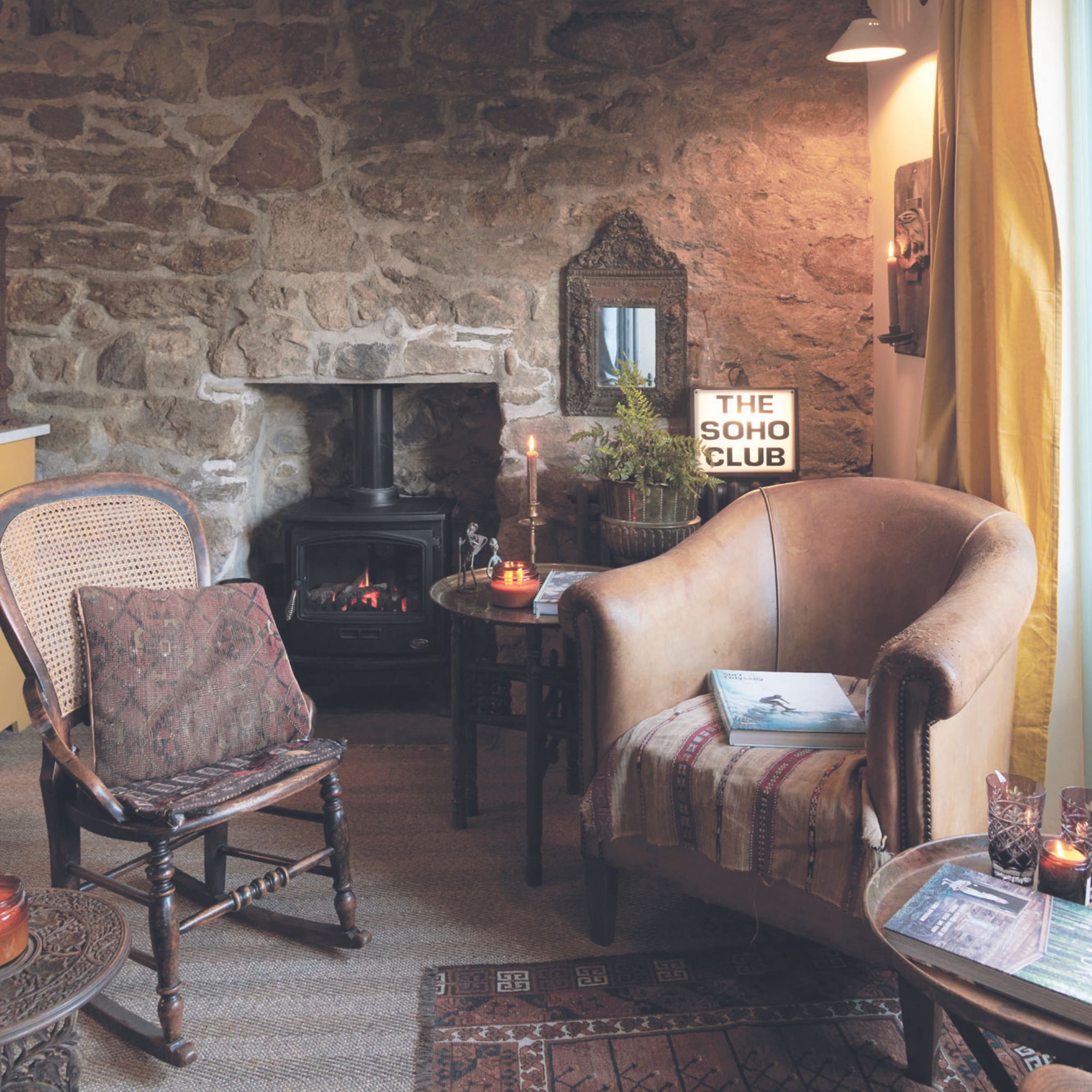
Paul’s favourite spot, however, is just beyond the functional part of the kitchen. ‘In the corner, just past the table and chairs is the cosiest seating area. Helen used her creativity to design a space that feels like you are in an old-fashioned club.'
'When you’re sat here, looking out to the sea – you wouldn’t want to be anywhere else in the world.’
Get the look
This dimmable wall light is perfect for even a hectic kitchen as it's been created to be safe for bathrooms.


