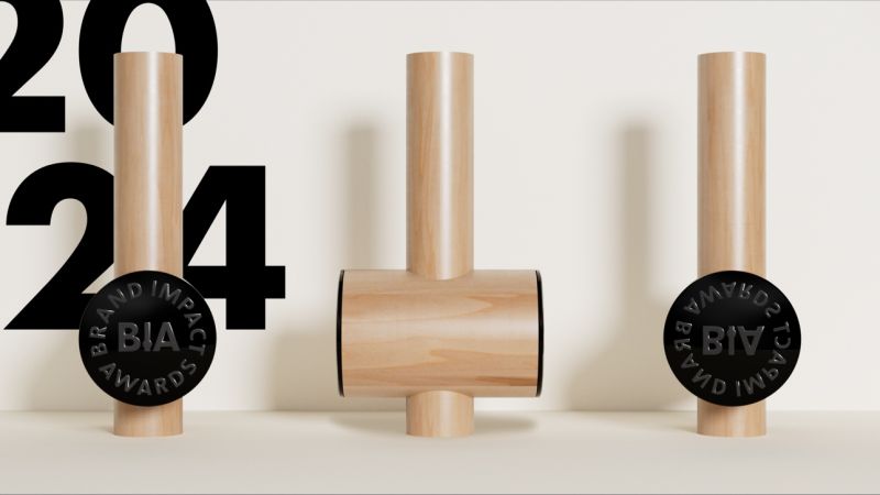
Over the past decade, the Brand Impact Awards (BIA) has established itself as one of the most prestigious branding award schemes in the world. To usher in a new era for the BIA, Taxi Studio has created the covetable BIA Mallet matched with a stunning new identity, centered around idea of 'impact'.
To delve into the creation of this beautiful new object, I spoke to Taxi Studio's founder and chief creative officer Spencer Buck, as well as Ross Amor, workshop manager of Creative Awards London, and chair of the BIA jury, Nick Carson. To be in with a chance of winning an iconic BIA Mallet, enter the Brand Impact Awards. Entries close at midnight (BST) 19 July.
The brief
Spencer Buck: The brief was to help the Brand Impact Awards create a more future-proofed identity system, including the trophy, to help increase and protect the relevance of the awards scheme. The reality is that the competition business is a competitive business, and design agencies and designers are inundated year upon year with opportunities to enter our work into various global schemes.
The birth of the BIA Mallet
SB: When looking at the competition, the interesting observation from our perspective was that the most iconic of those trophies and schemes are things. So if you look on our Taxi award shelf we've got fruit bowls, we've got Bullets, we've got Pencils, we've got Light Bulbs, we've got Lions, we've got plinths. And it felt that with the Brand Impact Awards, there was an opportunity to visually and emotionally encapsulate what brand impact is about in an iconic and familiar form.
The really lovely thing is that mallets are associated with craft
Spencer Buck
We considered what impact is metaphorically – if you punch it into Google, typically you get a heavy object, like a hammer, but a hammer in itself isn't attractive as a visual form. So the next step was to consider other forms. The thing that was really interesting with mallets is that aesthetically, they are quite beautiful, especially traditional mallets. And the really lovely thing is that mallets are associated with craft. So you would typically see stonemasons using mallets with chisels, or woodworkers using mallets on very fine detailed work. Even in engineering, people are using mallets because it's more of a precision tool, and that felt like it was a really lovely connection with the essence of what great branding and brand design is about, because it is about craft.
In the absence of craft, design work can be very mediocre, because craft is typically the differentiator between great work and mediocre work. So when we looked at the mallet, we thought it was a beautiful form, and the idea was to – as simplistically as we could – create a trophy from that. It was an exercise in restraint because it would have been far too tempting to do other things to it. But much like we've learned over the years with the likes of iPhone and other successful innovations, the simpler things are, the more permanent they become.
Manufacturing the Mallet
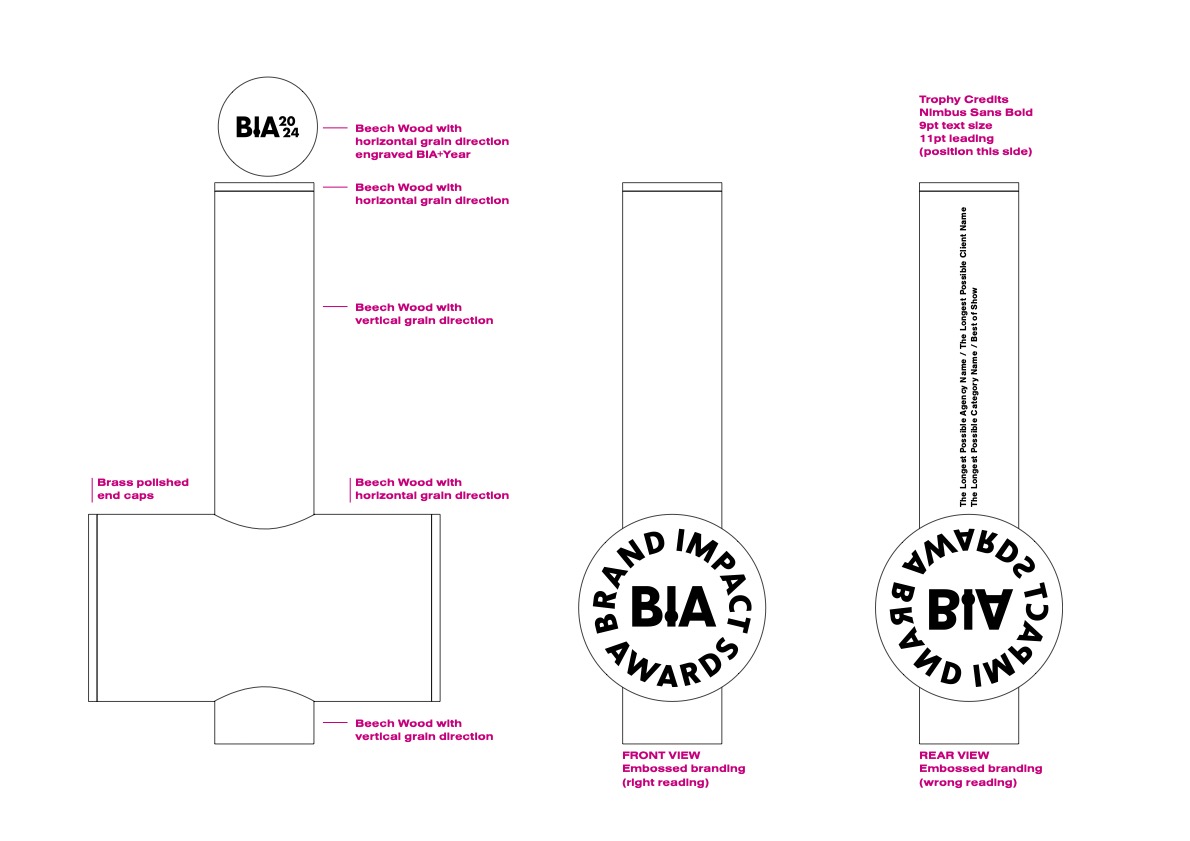
SB: Having guessed the proportions based upon a vape and a Coke can, thinking about how it would feel, we created a (not very technical) line drawing in Illustrator. We looked around to see who could potentially produce a quality Mallet, and Creative Awards London had an exceptionally varied array of different forms and treatments and finishes on offer, and they make D&AD Pencils, which are very high quality. We commissioned a mockup to check technical feasibility, how much it would cost, and, more importantly, how it would feel.
We're a B Corp business so it had to be as sustainable as we could make it. You don't get much more sustainable than brass and wood I wouldn't have thought.
Ross Amor: The timber we use is all sourced from fully FSC and PEFC certified suppliers. We use European or domestic timber whenever we can, and the beech (fagus sylvatica) comes from European forests. Beech is a hard timber that finishes well and has a certain quiet beauty; the grain is generally regular, but there are occasional flashes of spectacular figure on quartersawn faces. Because it is resistant to splitting, it is the traditional wood for woodworkers' mallets and its working qualities, appearance and availability have also made it a mainstay of the English and European furniture industries. The tree itself is the dominant species in a large swathe of central Europe and there are also large populations in the UK, particularly in the South East.
I genuinely feel that when people have it in their hands, it could become their favourite trophy
Spencer Buck
Despite how it looks, the mallet has three major wooden parts. It would be usual for the shaft to be one piece and the head another, the shaft fixed into the head with a wedged tenon; with this design, because of the protrusion and the aesthetic requirements, that isn't possible. Instead, there are two mortises milled on opposite sides of the head, precisely aligned so that there is no apparent discontinuity. The main shaft is glued into one side, the smaller protrusion into the other. These two parts are cut from the same piece of wood, and the grain is carefully matched so that it all looks like one piece.
SB: It's beautiful. The weighting feels right, the quality feels right, the size feels right. I genuinely feel that when people have it in their hands, it could become their favourite trophy. And I'm sure people will use it and wield it as a mallet.
Embossing the Mallet
Because the trophy is a mallet, it felt like there was an opportunity to increase the fun and the engagement. That’s why on the side of the mallet that has the award details (the winner’s name etc), there’s an embossed reversed roundel. That’s the side that demonstrates the impact – the project that’s won a BIA – and it’s the side that people can play with creating their own Brand Impact mark with, using inks or plasticine or whatever they like. I’m looking forward to seeing the first photograph of someone with a Brand Impact mark on their forehead.
Smashing it
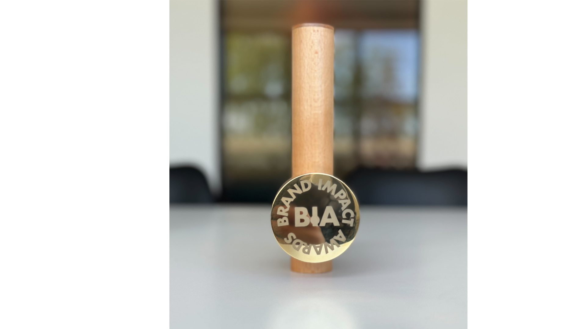
SB: This project has been about creating desirability, and creating something fun. We wanted to try to create something that had the chance to be covetable, that people wanted to have on display in their studios or at home, or to go show their mums. As an agency we’re all about creating unforgettable things, so it feels like the new trophy is living up to that as a physical thing, and then the branding system is another ‘thing’.
Nick Carson: It’s been a pleasure and a privilege to collaborate with Taxi Studio as we start the second decade of the BIA. I’ve been hearing very positive noises from the industry so far, particularly about our iconic new trophy. It’ll be exciting to see Mallets take pride of place alongside Pencils, Drums, Bullets and Lions on the shelves of the world’s top agencies.
Enter the Brand Impact Awards today for your chance to win a covetable BIA Mallet.


