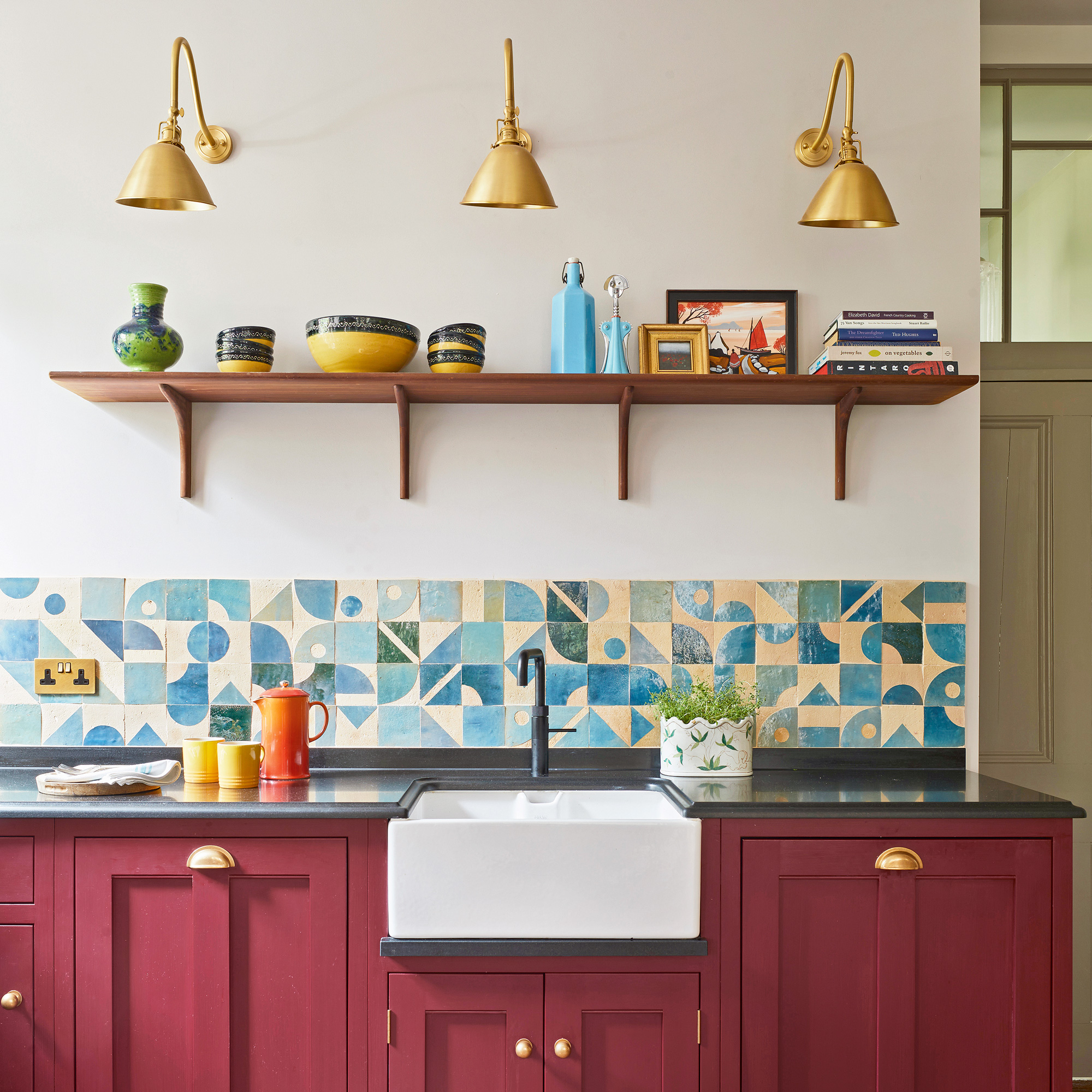
As kitchens are considered the heart of the home, it stands to reason that the way we decorate them should be a reflection of ourselves and our personal tastes. To that end, the trend for white kitchens is no longer king and colourful kitchens are becoming more and more popular. Green kitchen ideas have been hugely popular in the last year and are set to continue to grow in popularity. But other shades like blue and burgundy are set to give green a run for its money.
This kitchen is an excellent case in point and is filled with unusual design combinations - like blue with red or graphic tiles with traditional furniture. On paper, these may seem surprising but in execution, they create a stunning kitchen that is packed with personality.
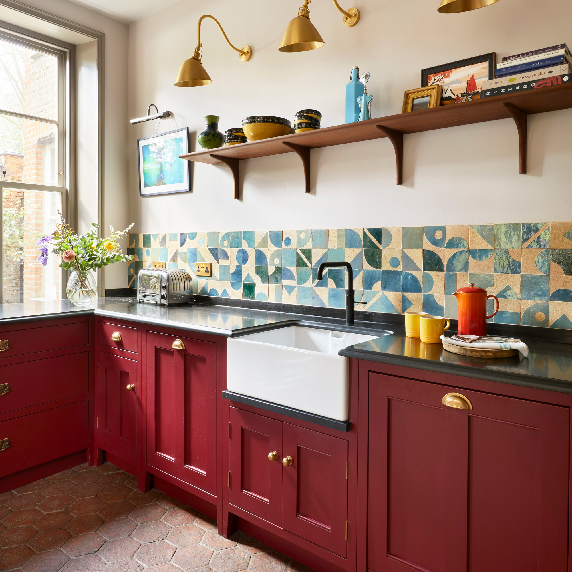
‘The term that sprang to mind when we first visited our new home was European apartment,' explains the owner of this mansion flat in north London. 'It had the high ceilings, parquet wood flooring and airy rooms that reminded us of flats we’d stayed in on trips to Paris and Rome'.
It was with this in mind that the owner and her husband planned their kitchen refurb, starting with a knock-through between the existing space and an adjacent bedroom.
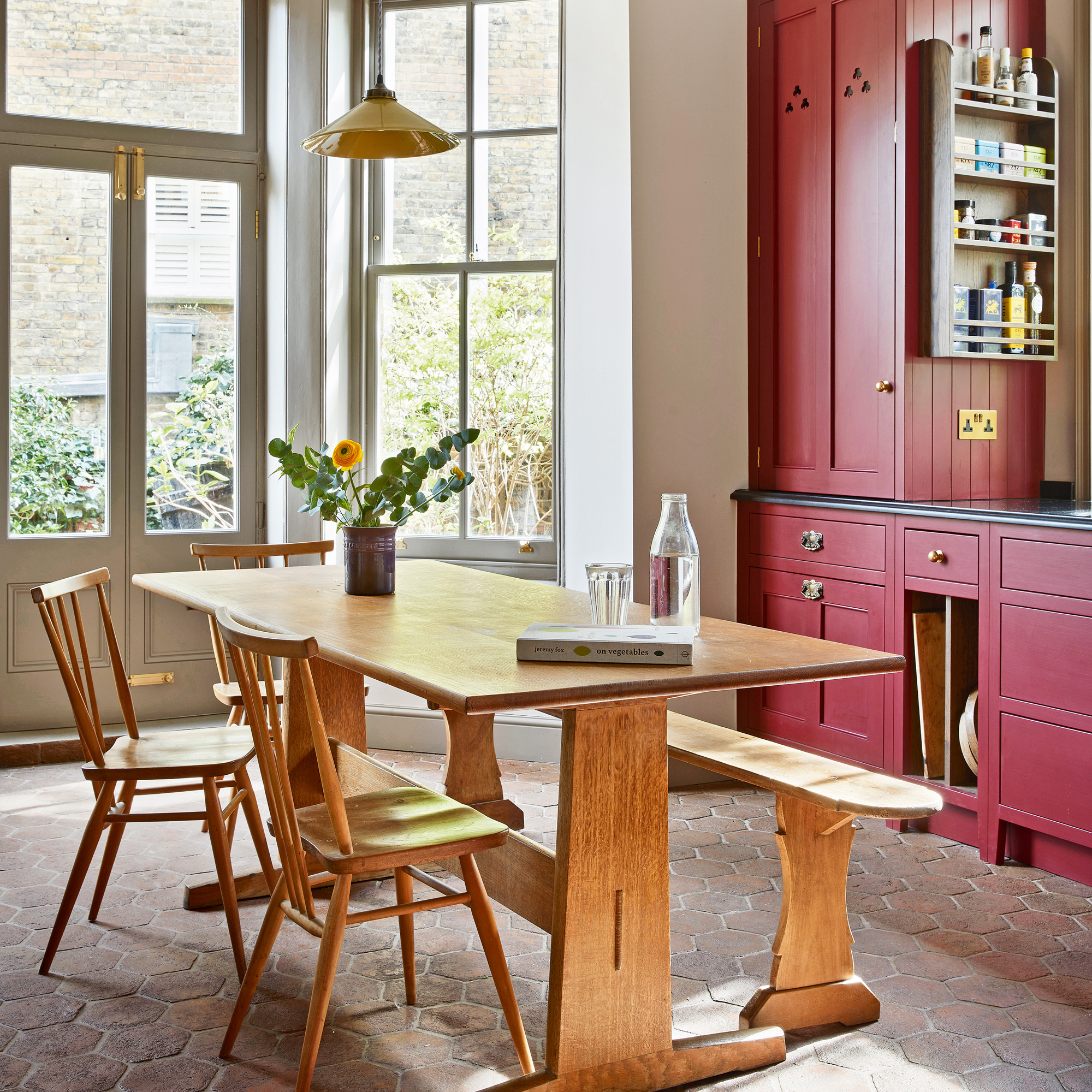
They enlisted the help of kitchen designer Rowena Sim of Bybrook Bespoke who was recommended to them by a friend. ‘We worked with Rowena in minute detail on every aspect of the design and she gamely took on all our demands! We oscillated over whether or not to have an island, before agreeing a kitchen table was more in keeping with our European vibe.
We debated fitted versus freestanding kitchen ideas before plumping for a combination of both, and we jettisoned spotlights entirely in favour of a flexible mix of wall, picture and pendant lights.’
Get the look
Brighten up your kitchen countertop with some classic task lighting like this brass beauty. use the rule of three like the owners of the kitchen have in order to get a good wash of light across your whole counter.
Make an impact in your space with this deep red shade. Dark red is traditionally the ideal shade to use in a dining room, this shade has hints of magenta and orange, wrapped in a deep hue.
This six-burner, two-oven and grill range cooker is the perfect set-up for any home cook, and the stylish shade will brighten up your kitchen beautifully.
The one element there was no debate about was colour. ‘I’d discovered this deep red Mylands paint shade for the cabinetry and wouldn’t be swayed. Against an earthy brown for the woodwork and a pale blush for the walls, it radiates warmth,’ says the owner.
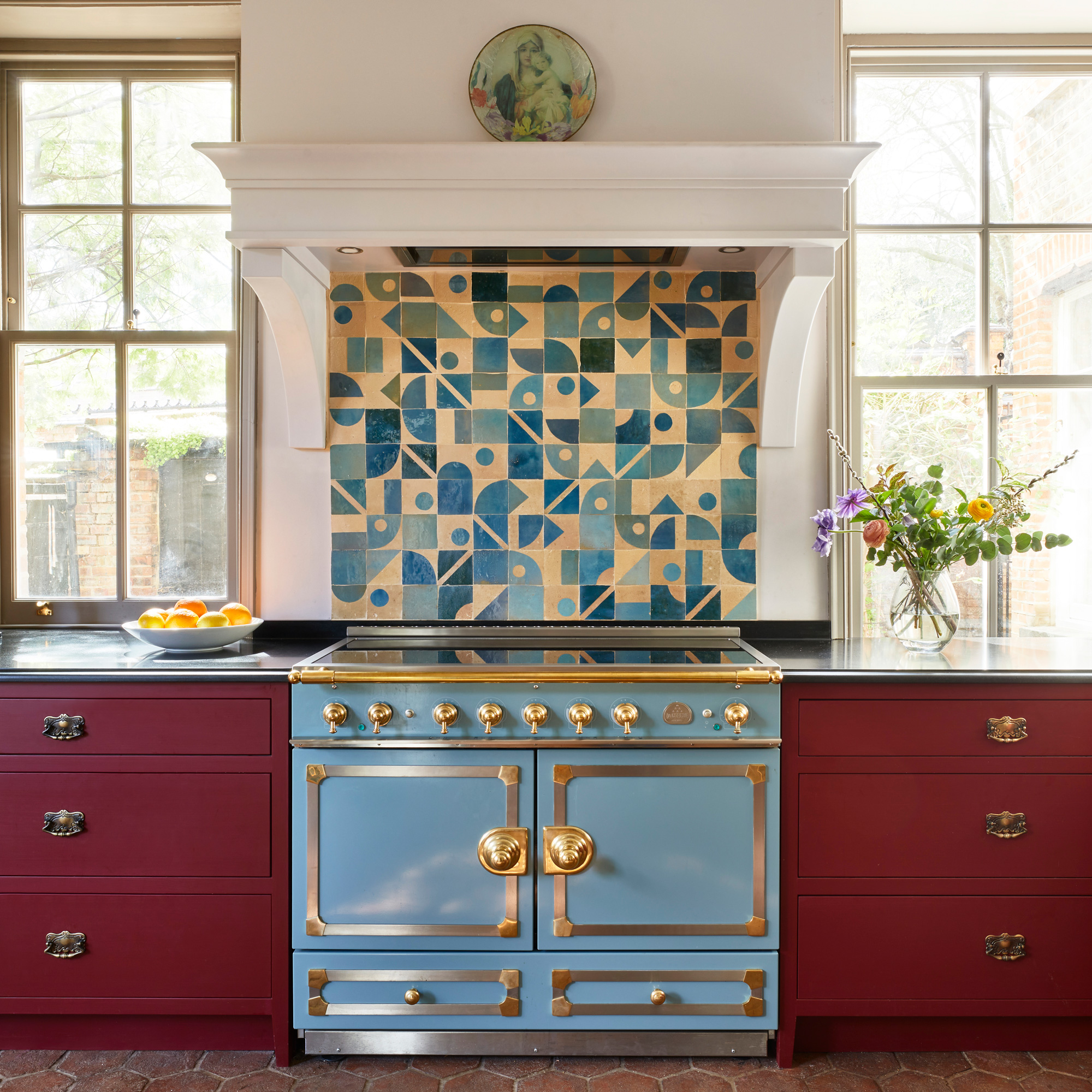
Black honed limestone worktops and a mix of new brass cup handles and pulls, alongside some fancy antique ones repurposed from an old chest of drawers, create a pleasingly eclectic materials mix, while the La Cornue range is a serious investment piece. ‘It’s a beauty, and the fact that the doors are solid rather than glass was a big plus for us, aesthetically. There’s a ‘configure your own design’ option too, which allowed us to pick colour, trim and hob preferences.’
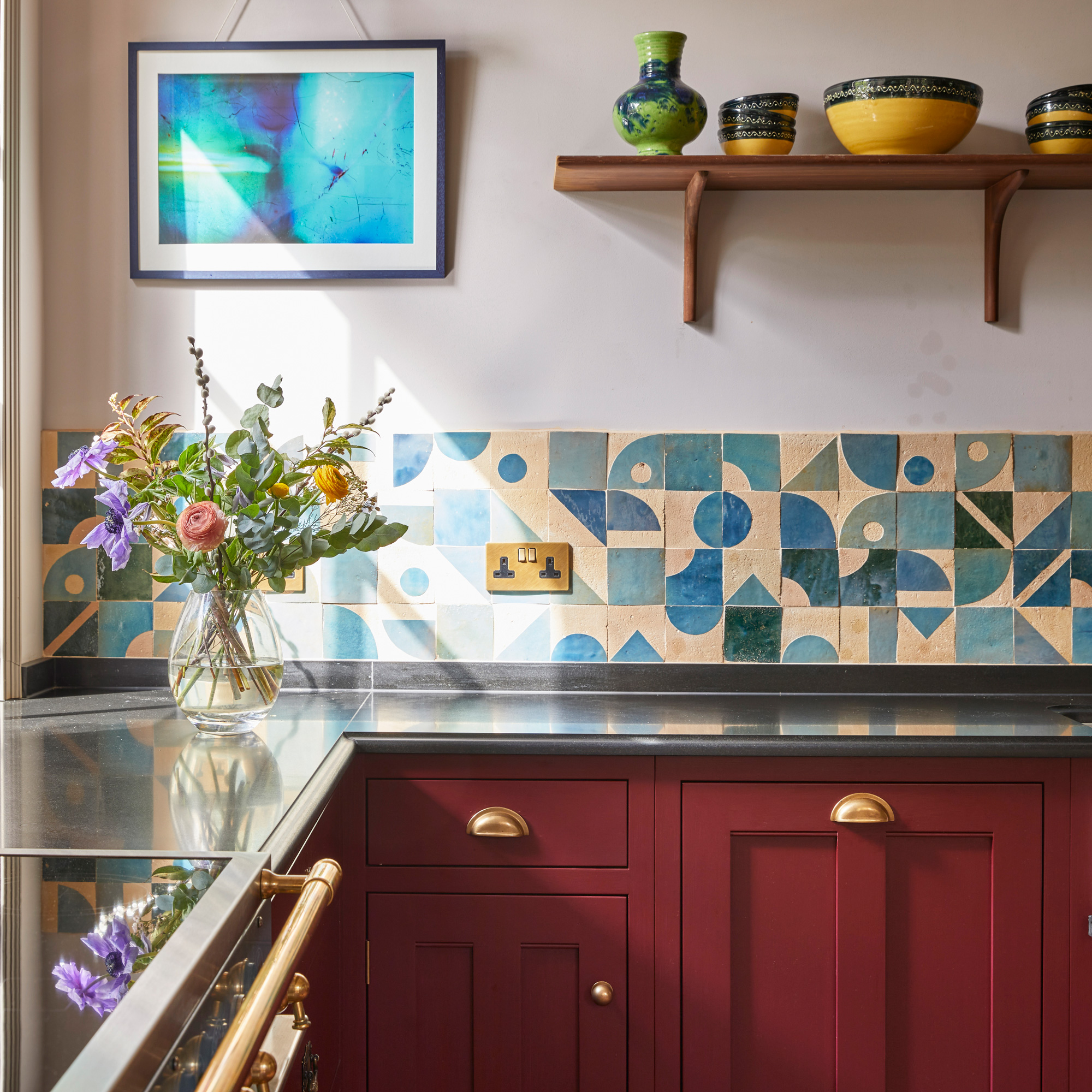
Hand-painted, natural clay Zellige wall tiles from Otto Tiles & Design were the last piece of the design jigsaw to come together. ‘They absolutely make the kitchen. We bought one-third solid blue tiles (in three different shades), to reduce the cost, to two-thirds in the pricier geometric pattern, and arranged them randomly behind the cooker and as a splashback. They put an individual stamp on the project that feels very us!’

‘The pantry cupboard has been built into what was a chimney breast. Fluted glass blurs the products within, but also looks pretty, especially when the interior light is on, adding an atmospheric glow in the evening.’
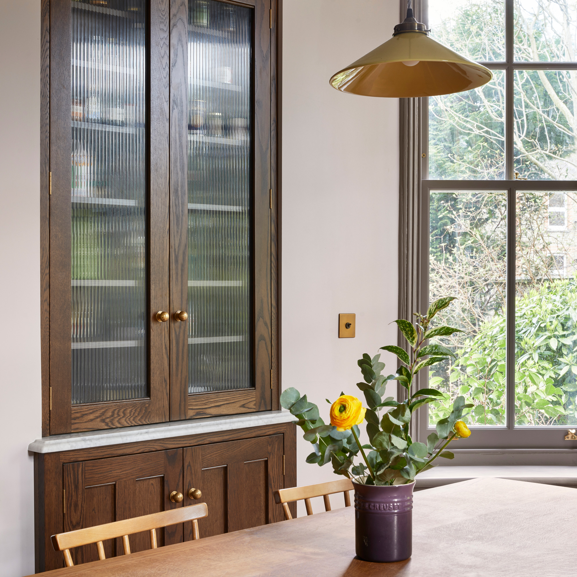
The finished kitchen is a triumph of colour and pattern. ‘It’s everything we dreamed of,' says the owner, 'right down to the antique brushed brass rocker switches!’


