Grey has long been regarded as the ultimate neutral and go-to wall color for your home. It's smart, sophisticated and unfussy, but as color trends come and go, grey is slowly falling out of favor.
Instead, homeowners are looking to use lighter colors within the home that bring a brighter and warmer feel than the moody, cool-toned greys that were ubiquitous in homes throughout the noughties. Traditional neutrals like beige, soft cream, and caramel tones are a popular base from which you can build a full and textured scheme, with a more warming tone to it that grey. Homeowners are also redefining what makes a neutral foundation, with more energetic and colorful tones coming to the fore in interior design trends.
'I feel the potential opposition may be less about 'grey', but more about the undertone of it being cool or warm,' says Karen L Williams, architect and designer at WILLIAMSCRAIG Design. 'Many greys have strong red/pink undertones which manifest into incredibly rich neutral wall colors. Farrow and Ball has Great White, which could be grey, could be beige, could be pale pink.
'Pale blue like F+B Blackened and Dimpse, are almost pale grey just on the cooler side. I feel like adding some depth to wall paint brings the surface to life while providing a perfect canvas for the room.'
To get to the bottom of the new neutrals that are making waves in the design world, we speak to the interior designers in the know to explore their paint color favorites.
1. Sandy beige

Beige is a popular color at the moment, as homeowners ditch the cold and often stark tones of grey for something that brings more warmth and life to a room. The undertones of beige might be yellows, pinks, or orange tones, all of which give a subtle golden tint to your room, and provide a great foundation from which to bring color in decorative pops.
Beige tones from the brown family also work in harmony with natural materials like rattan, wood or jute, textures and qualities which homeowners are recognizing as essential in the home for a cozy and tranquil feel. It's super versatile too, working with other pops of color. Its greatest strength is its tonal differences. Layering different depths of one color creates a beautiful, earthy effect.
'Greys are trending out after a good 10-year run - the pendulum swings again,' says interior designer Lina Galvao of Curated Nest . 'This gives rise to warmer tones overall. We're seeing a lot of these colors in upholstery via boucles, and warm whites, creams, and beiges have been really popular with Gen Z especially, often opting for a cozier feel in their interiors.'
'Beige is having a big moment,' agree designers, Jordan Slocum and Barry Bordelon from Brooklyn-based interior design practice, The Brownstone Boys. 'We love that beige is so popular at the moment because it has so many beautiful tones and pairs really beautifully with other neutral tones.'
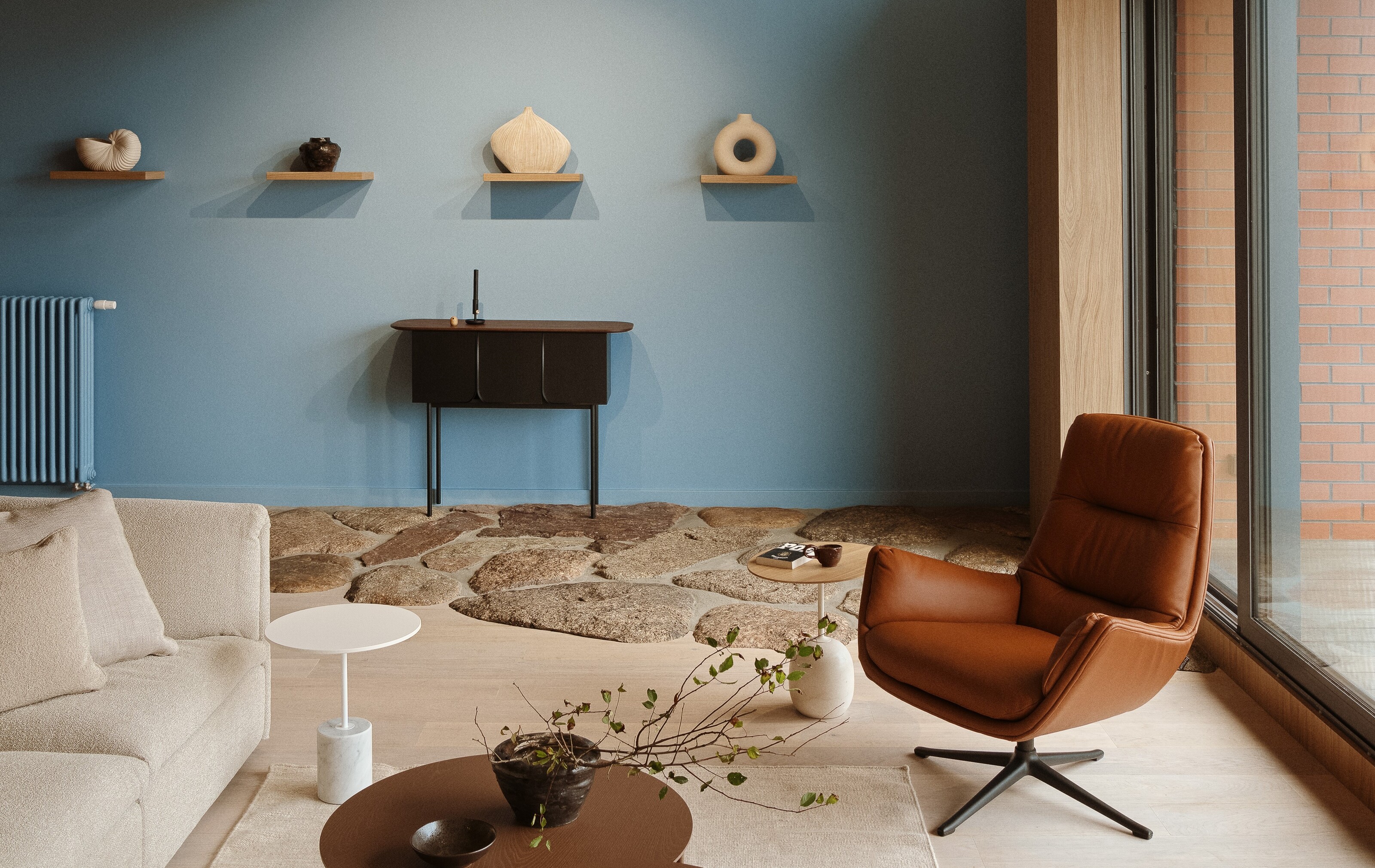
'A muted beige living room provides a subtle warmth and balances beautifully with natural stone and timber finishes, accented with crisp white trims,' agrees Mary Dewar Dutallis of boutique architecture practice Studio Dewar.
A soft neutral with undertones of orange that bring a sunny glow. Pair with a blue or layer with varying tones of pink for a considered finish.
One of Farrow & Ball's new 11 shades, this shade has an historic edge to it, suiting a period setting as well as a more contemporary scheme.
A warming beige from Benjamin Moore with touches of grey, this shade used on the wall will change depending on the light and the time of day.
2. Light blue

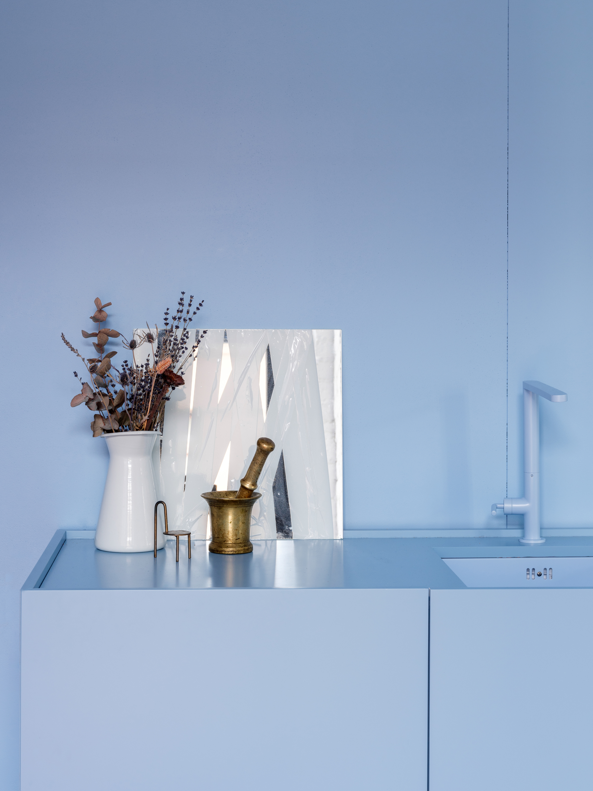
I'm thoroughly enjoying the use of blue across the home. Safe, serene and with connotations of nature and the ocean, blue has grown in popularity largely due to the coastal grandmother interior trend - brought to life in the likes of Reese Witherspoon’s powder blue kitchen.
Meanwhile, it's being used for a monochromatic color scheme in hallways, painting crown molding and ceiling roses for an all-encompassing, calming effect. In the living room, it brings a touch of color without being too overpowering. While blue has long been avoided for its cold connotations, used only, if at all in bathrooms, designers are embracing a brighter, paler shade of blue that brings an optimistic energy to a room.
'I have a very broad description of neutral paint,' says designer Amy Lau. 'You can refer to anything as neutral because there are so many iterations. It's about the imbalances with other colors that a specific color becomes a neutral in the sense that it is the base for a scheme.'
In this sense, a bright and warming blue can become a new neutral when used throughout the room in a monochromatic way, emphasizing other colors. Blue becomes a base.
This particular shade of blue is warm and positive, designed by Studio Crosby.
A light and quietly positive blue shade with a powdery, nostalgic quality, reminiscent of balmy summer skies.
With a bit more vibrancy, Blue 10 from Lick is soft and serene yet bright and positive. The crisp matt finish offers imperfection-free powder blue coverage.
Pool Deck is muted yet playful with a certain freshness to it. The shade is summery and bright and encourages light to bounce off the walls and around the room.
3. Plaster pink

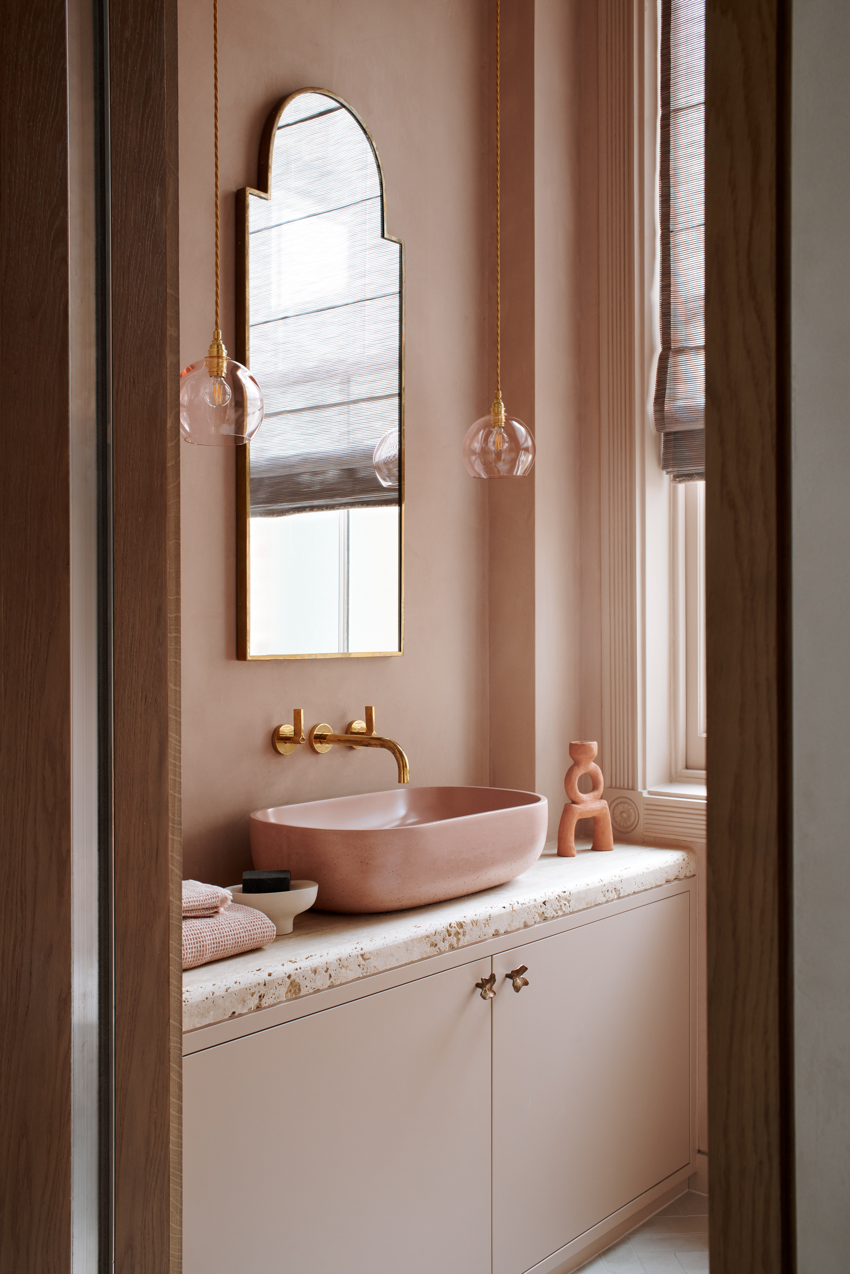
Pink is another color trend that has energy in the form of a tint of red, bringing warmth that glows in the right light. An incredibly inviting color, pink adds a subtle glow that radiates around a space bringing vibrancy and warmth. Think subtle in color, like freshly set plaster, to get pink into neutral territory.
'A color which is bang on trend for interiors, it calms, relaxes and comforts, helps us to escape from the stress of daily life and blends into the background with ease,' says interior designer Martin Waller, founder of Andrew Martin.
'Pink has always been one of my preferred colors to use,' says interior designer, Natalia Miyar. 'I designed the living room in my London apartment solely around this color. I love using pink as a neutral as it's more interesting that beige or taupe,' says Natalia.
'Lighter colors like a soft peach or pale pink will lift the space, creating a loftier and airy feel,' adds Emma Bestley, creative director and co-founder at paint brand YesColours.'


