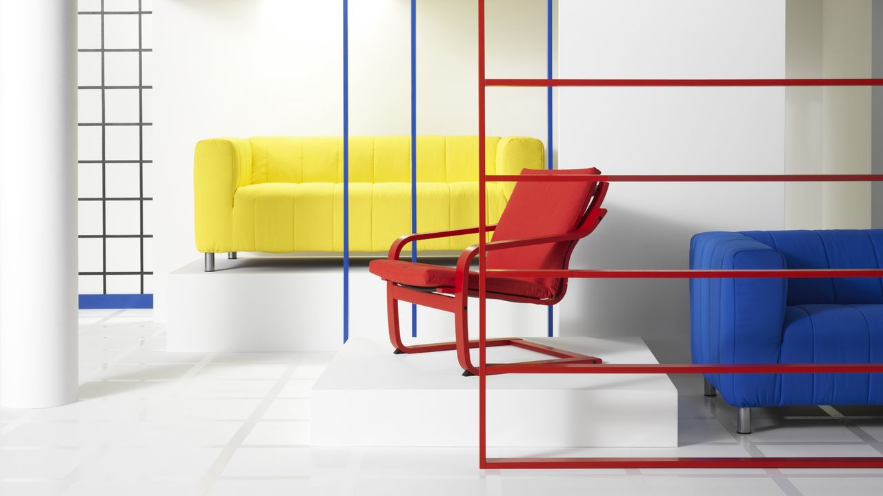
What comes to mind when you think of the Bauhaus movement in design? Sleek, modern spaces? Clean lines and geometric forms? Industrial influences? Simplicity without excess? Bauhaus design emerged in early 20th-century Germany as a revolutionary study in harmoniously blending art, purpose, and mass production. While all of these attributes are central to the movement's lasting influence, none stands out more than the Bauhaus color palette.
In true step with the core principles of the entire school of design, the Bauhaus approached color as a spatial tool for defining space, meaning it turned to shades that could be distinguished from one another quickly and easily: enter strong, simple, primary hues. Livingetc's color expert, Amy Moorea Wong, explains, "This is functional color, characterized by high contrast used for clarity, rather than beauty or aesthetics, and employed carefully to organize form and define space."