You may remember that Weight Watchers, the programme that aims to help people lose weight, rebranded in 2018. That's not that long ago in the branding world.
But it's recently revealed a brand new look, and it seems to mostly be about "embracing" the next chapter of innovation, which basically means weight loss drugs. The new Weight Watchers experience will now apparently involve access to board-certified physicians that have the ability to prescribe GLP-1s to eligible members, plus the usual behaviour change stuff and the community.
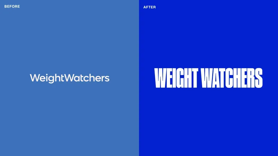
In terms of the new logo, the change feels functional rather than flashy or performative. The 2018 rebrand saw a move to WW and the new identity sticks with the WW but puts a line between them, meant to reflect a progress bar. I'm not sure it's going to jump to the top of our best logos or best rebrands lists, but it works.
The wordmark itself is now in capital letters, the new identity keeps the blue of the old look but updates it to a brighter hue.
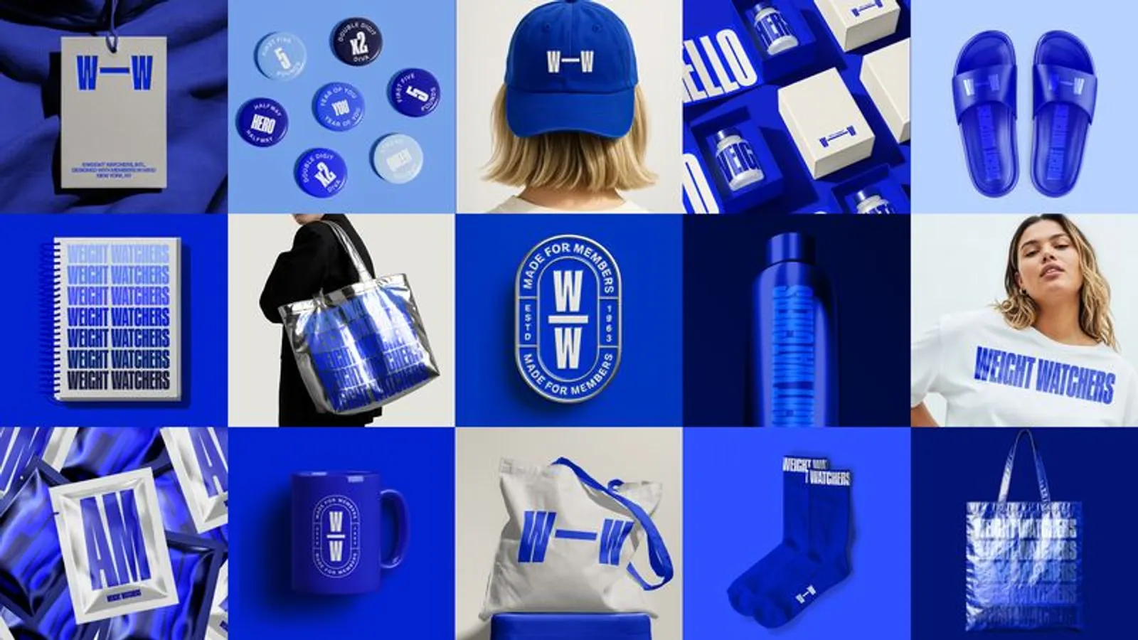
The new look is accompanied by the usual paraphernalia that comes with a new brand, there are Weight Watchers sandals, socks, water bottles, mugs and what quite frankly looks like condoms, I'm not sure what they are supposed to be.
It all feels quite fresh for Weight Watchers, which has traditionally not been associated with decent branding (2018 refresh aside). The colour scheme does remind me of Best of Show winning brand at the BIAs 2024, the RSPCA though.
The branding was led by Mrs&Mr.
In terms of photography, black and white images of real Weight Watchers members support the new brand.
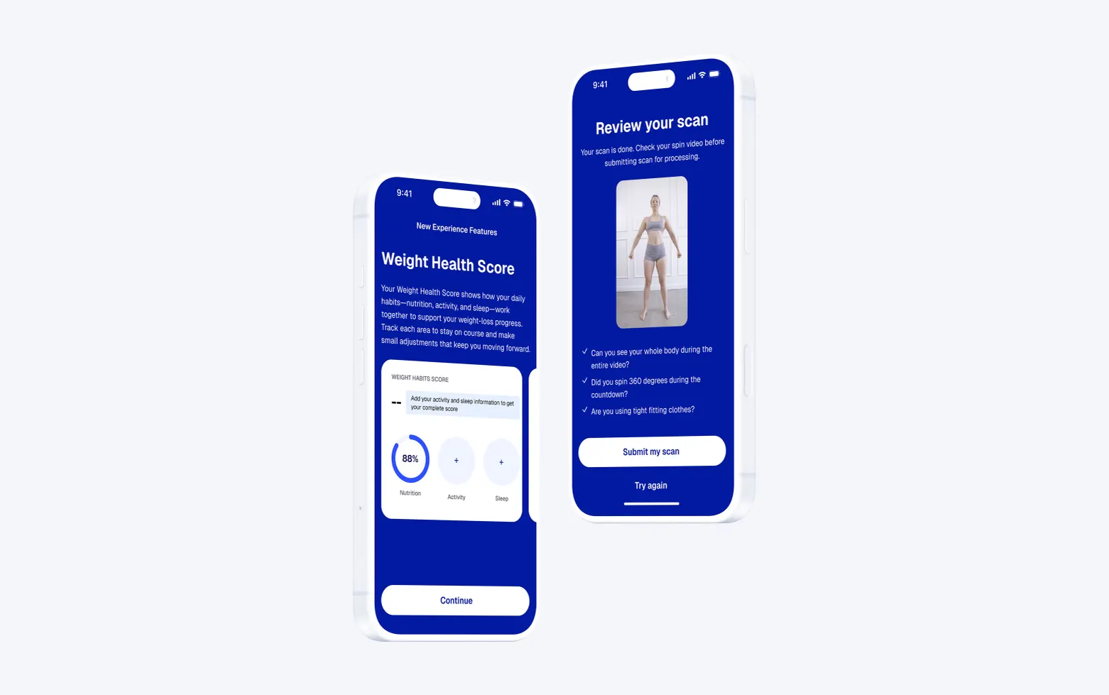
Digital offerings for the brand are also improved, with a new AI body scanner and new GLP-1 medical program among the new features.
Overall, this feels like a functional brand that will see Weight Watchers into this new era. Could it have gone further? Perhaps. But this look seems fit for purpose. Steering clear of actual pictures of food or needles was probably also a good idea.