If like us, you follow Nigella Lawson on Instagram, you'll be no stranger to her daily food posts that never fail to make our mouths water. Well, we think we may have just cracked the code to how on earth her food looks as appetising as it does – and it's all to do with colour theory.
If there's one area we can always count on the celebrity cook and author to deliver on, it's always being up to embrace colour. From pan to plate, Nigella has always been sure to make a statement – something we've previously seen with her choice of red air fryer and sunshine-yellow bakeware.
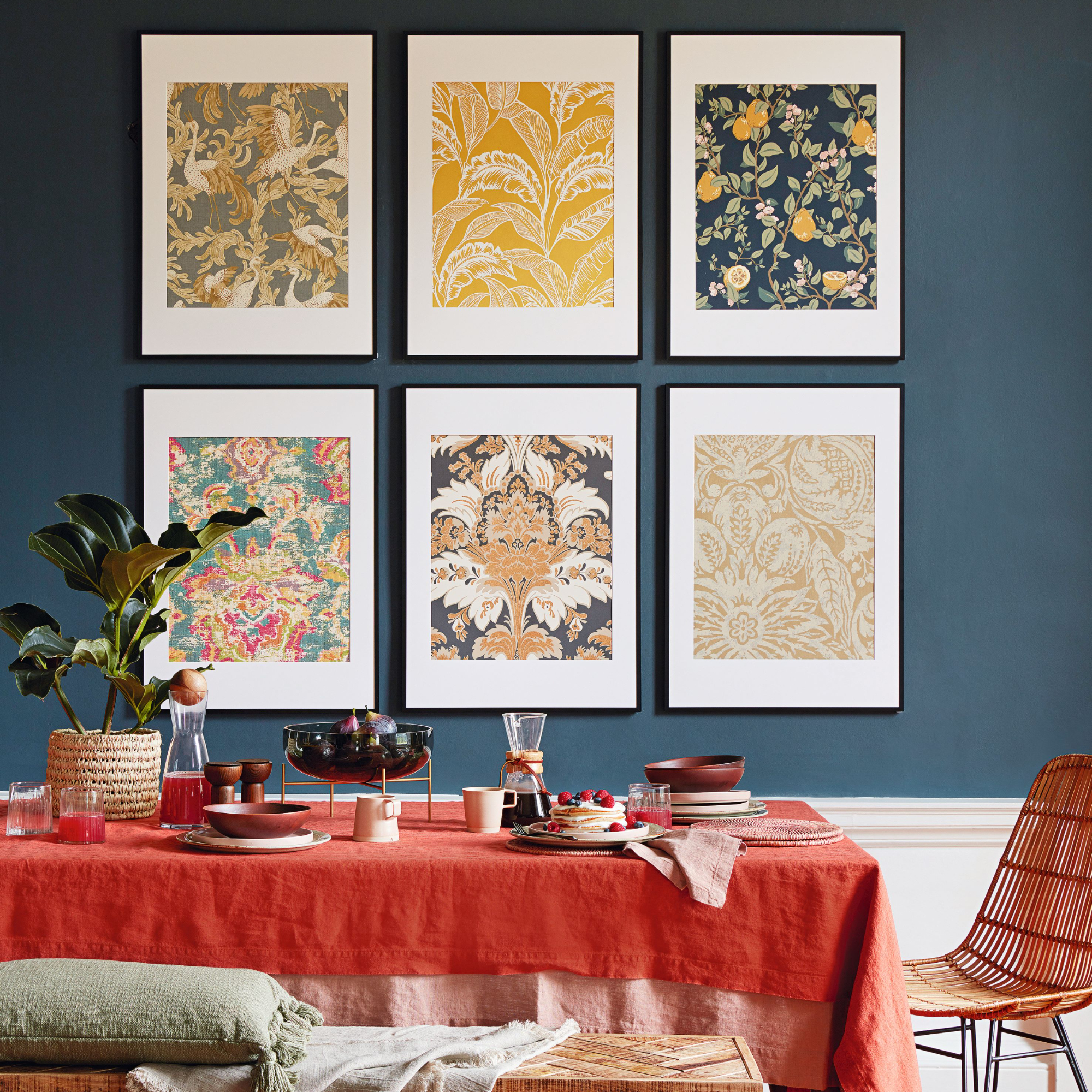
Turns out, her colourful array of crockery and cookware likely goes beyond just personal preference and is rather carefully curated to elevate the visual experience as a whole. In short: Nigella's food always complements her plating, and vice versa, making it a 'low-effort yet highly impactful way to create a feast for the eyes,' remarks Jess Martin, party planning expert at Ginger Ray.
Nigella Lawson's colour-coordinated plating
The tablescaping trend is one that saw a rise in popularity last year – and has no signs of dimming down anytime soon. When tablescaping comes to mind, many of us may often just think of arrangements and decorative ways to make a tablescape look expensive. However, these decisions are often made whilst the dishes are still empty.
'Nigella's secret is to take this a step further, considering the colours of the food themselves and how to include them in the visual experience,' explains Jess. 'Nigella allows the food and plates to work in harmony together, which in turn adds an extra wow factor for guests.'

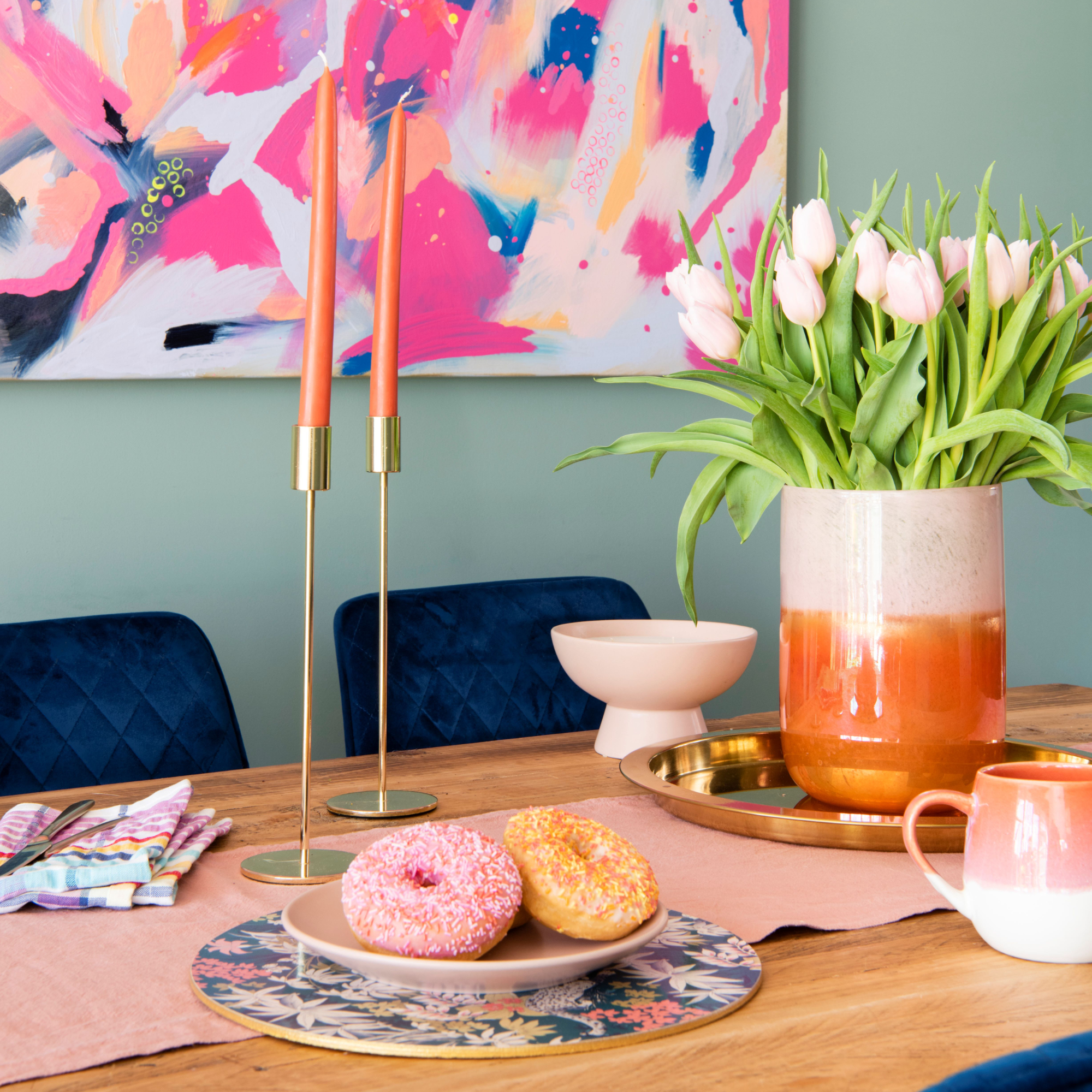
Better yet, you don't need to go out and spend an arm and a leg on whole matching dinnerware sets to achieve the look. You can simply mix and match and build your colourful, decorative collection through small one-off purchases here and there.
Even celebrities like Cameron Diaz are championing this mix-and-match tableware trend, namely for its 'playful yet coordinated look', says Jess.
Jess also reminds us of the importance of thinking about the size and shape of your dishes compared to the food you're serving, as these will ultimately 'act as a frame for your artwork'.

On top of that, rest assured you don't need to know how to use the colour wheel in a super extensive manner to achieve that same wow factor, either. Some examples of tried and tested colour combinations to start you off with are: red and green, blue and yellow, and pink and green – all of which have been used throughout the cook's Instagram page.
For extra food for thought, Jess adds that 'earthy tones look great with a vibrant blue and berry pinks and reds look gorgeous on plates of a similar shade'.
However, if worrying too heavily about harmonious or contrasting colours is causing you more trouble than it's worth, ditch the wheel, simply channel your inner Nigella, and just have fun with it. You'll get a feeling if it looks right or not (and if not, you still tried something new, which is a win in itself).
While we've placed a focus on colour-coordinating your food and plating, don't think that general tablescaping no longer plays a role, because it certainly still does.
'A dinner party ambience can be elevated easily with the right dimmed lighting and tablescaping,' begins Sarah Ross, co-founder of luxury home decor brand, Addison Ross. Consider the likes of coloured salt and pepper mills as an easy accessory to complement the food you're serving as well as placemats, for example.
'Placemats can act as a canvas or halo for each dish, so colour coordination is key.'

It doesn't take a genius to know that food that looks good also tastes better. So, by adopting Nigella's colour-coordinated plating trick you're not only elevating your tablescape but will also contribute to an unforgettable experience your guests will love, too.


