From the exterior, this elegant four-bedroomed Victorian terrace in east London looks pretty unassuming - like many terraced homes in the area - but go indoors and you'll discover a wealth of colour and pattern.
After welcoming two children into their family, this couple decoded to make the move from south London to a leafy borough on the east of the city where they discovered a period house for sale that hadn’t been touched for 35 years.
‘It was a very handsome property from the outside with lovely original windows with green panes,' the owner recalls. 'Inside was tired after being untouched for years by the family that had lived there, and still had the original Victorian layout. It had long corridors, the kitchen was too small for modern family life and it felt very dark - the lights were always on downstairs no matter what time of year.’
After moving in, the couple quickly had architect’s plans drawn up to extend the kitchen, but then life got in the way and their dream renovation stalled for three years.
'By chance, I was talking to a neighbour one day, who recommended interior designer Sophie Gunning,' recalls the owner. 'We clicked straight away and she set about helping us introduce colour and functionality to our home.'
'She changed the architect’s plans and made the living space bigger, which suits our family much better. Sophie was far more than just a designer and helped project-manage throughout.’
‘The work took seven months and we moved back in in September last year, ' the homeowner continues. 'The downstairs layout had changed to add plenty of light and use the space better. The open shelving ideas in the middle of the house breaks up the space and announces a new area without blocking any light.'
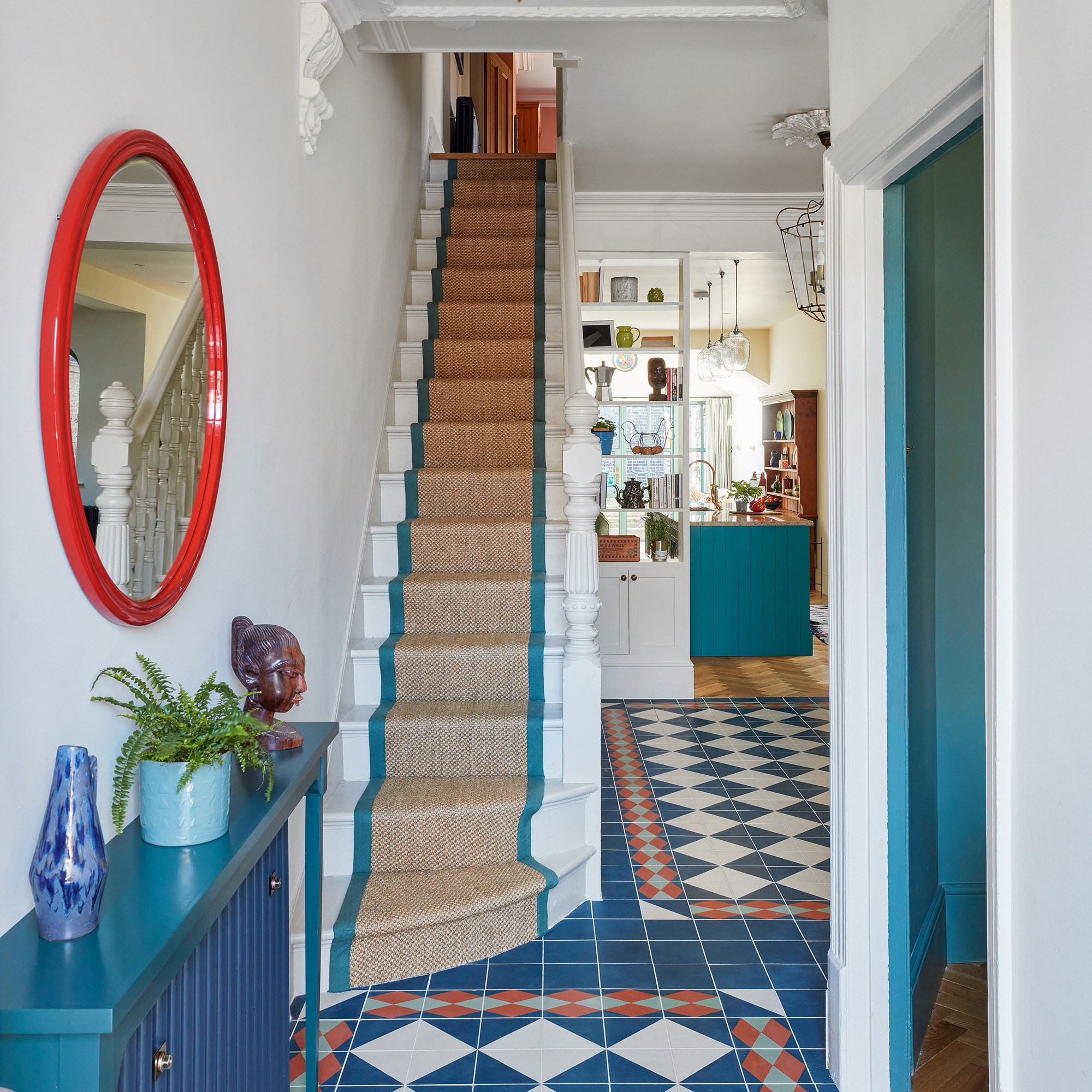
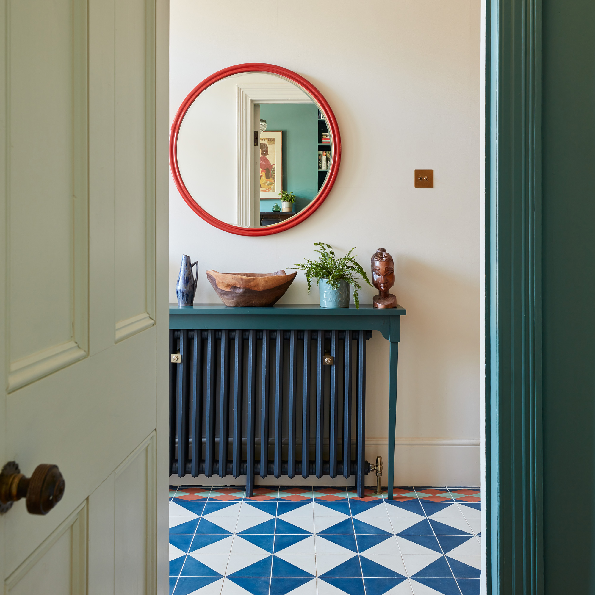
'Sophie taught me to use green as a neutral – it goes with everything and has become a unifying colour throughout. Even our window frames are a shade of green. It means you can then layer on more colours and make it as bold as you want without worrying whether things go together.’
The cosy living room

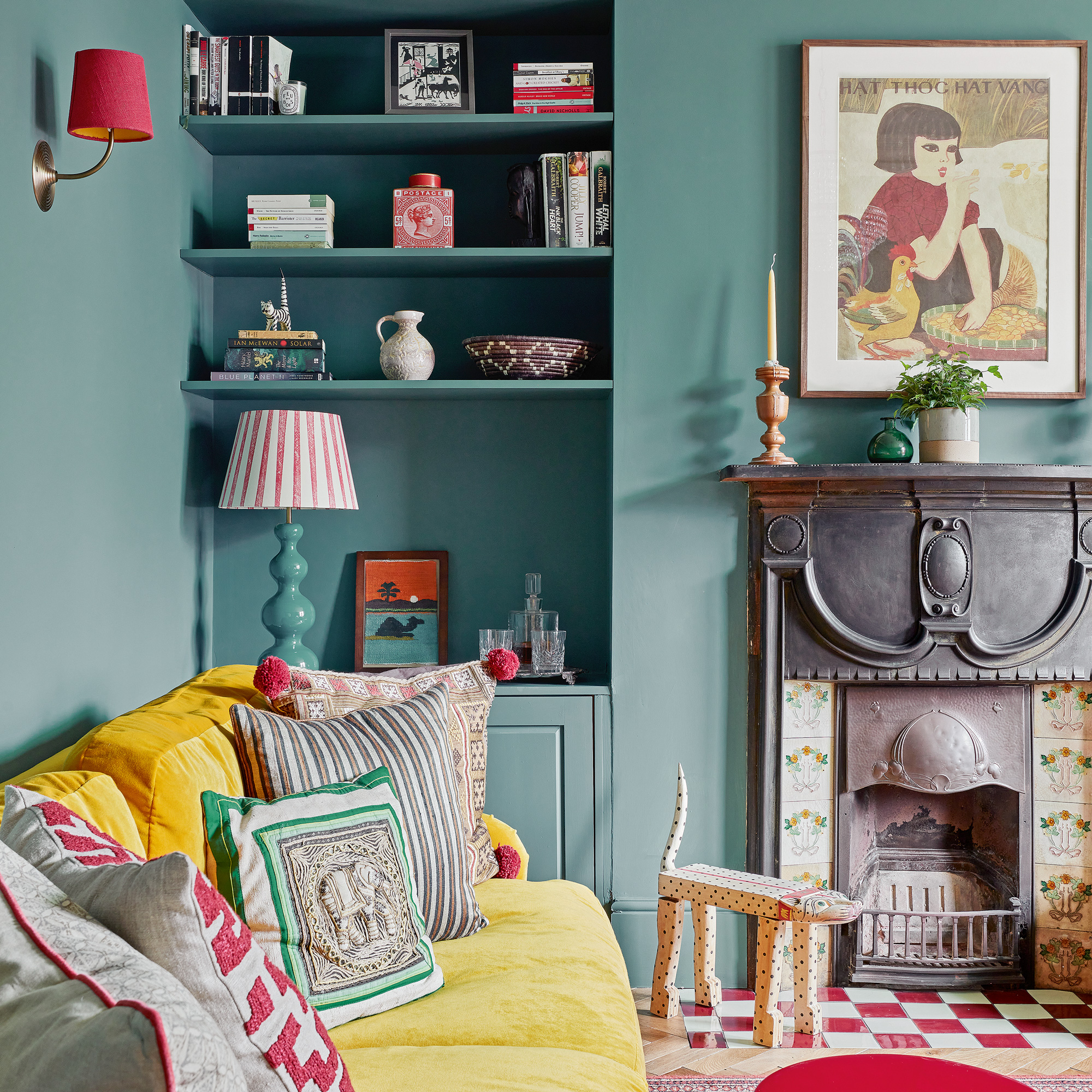
‘The living room is one of my favourite spaces,' explains the owner. 'I think it can take a bolder colour than the rest of the house because it’s got really high ceilings and is self-contained and gets plenty of light through the bay window.'
'I bought the yellow sofa before the house was even done up - I decided whatever we were doing needed to match because I loved them!’
Get the look – The perfect paint palette
Available in a wide range of finishes for walls and ceilings as well as woodwork and metal, this is the colour that the couple used in on the kitchen cabinets.
A jolly, sunshine yellow shade, this water-based paint is low odour and gives walls and ceilings a wipeable finish.
This deep, brown/red shade is the colour the couple used on the walls in their light-filled bedroom.
The colourful kitchen diner
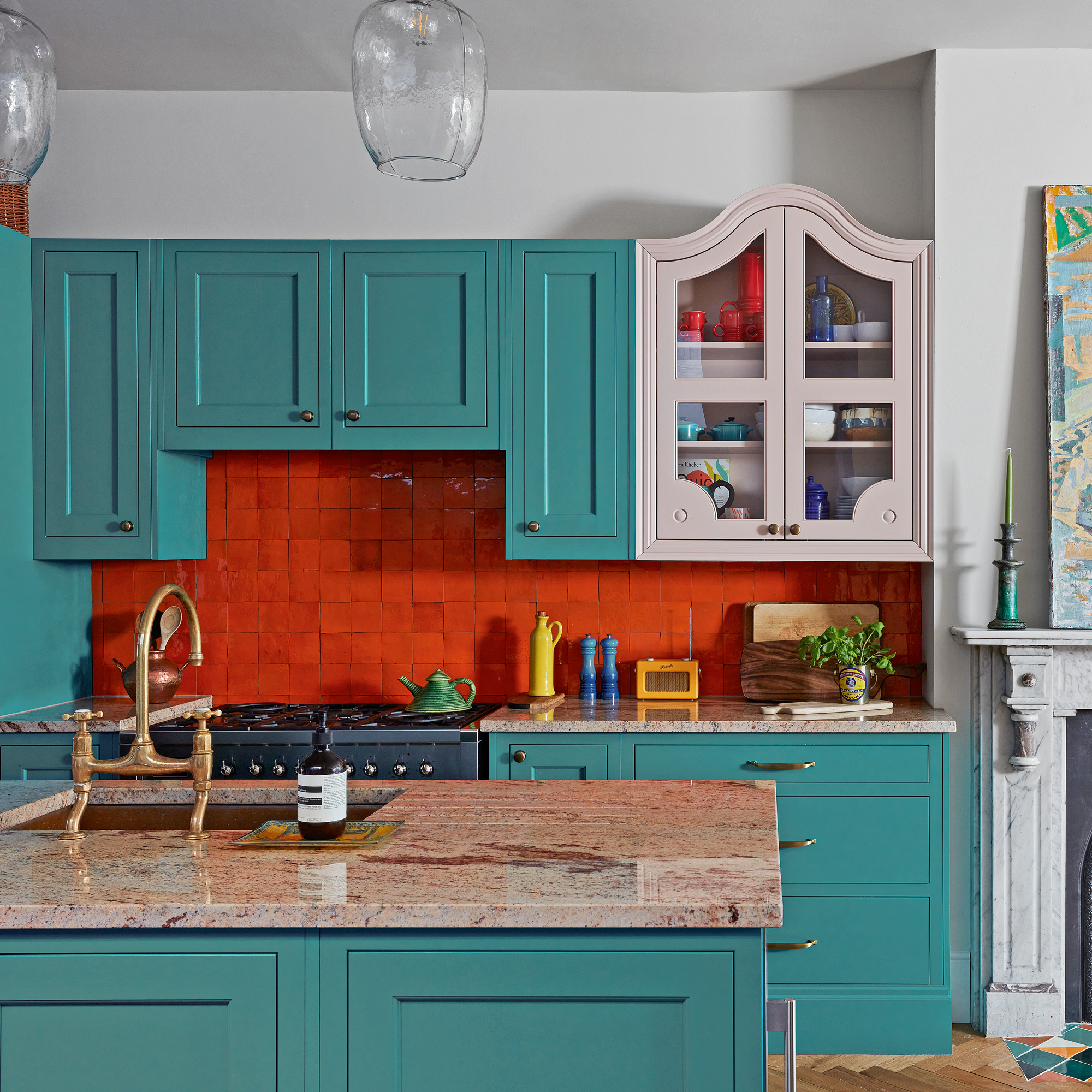
‘We saw an inspiration shot of a kitchen with an odd-one-out cupboard and I thought why not?' says the owner. 'This unit was bespoke, but the rest of the kitchen is off-the-shelf which felt like a good compromise for our kitchen budget.'
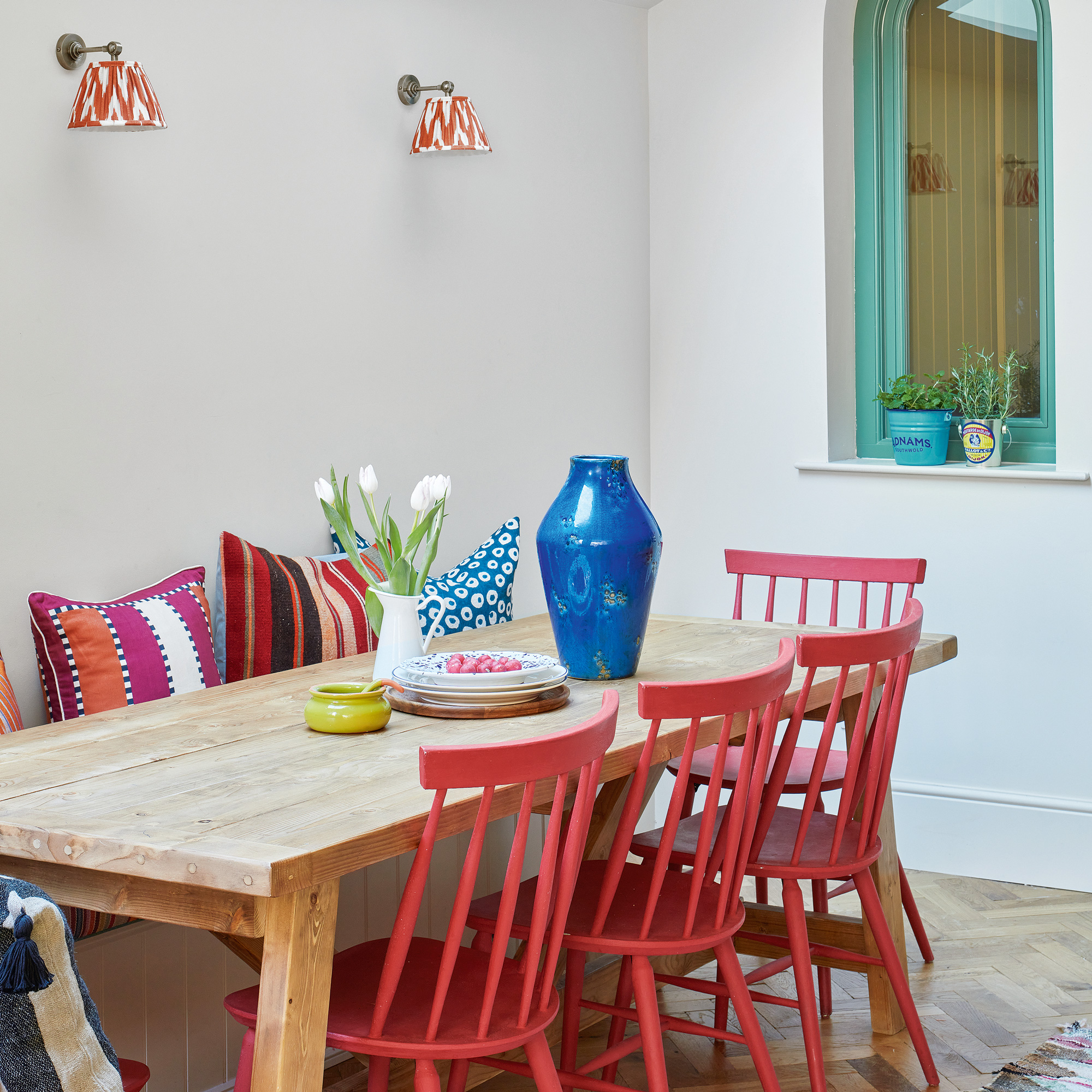
‘My parents always had a massive rough pine dining table when I was growing up so that’s what I always imagined we’d have. The bench at the back has hidden kitchen storage underneath and the chairs were nabbed when my brother-in-law was throwing them out of the hotel he works at and repainted. The wall lights add a lovely glow in the evenings, without having to have the main light on.'
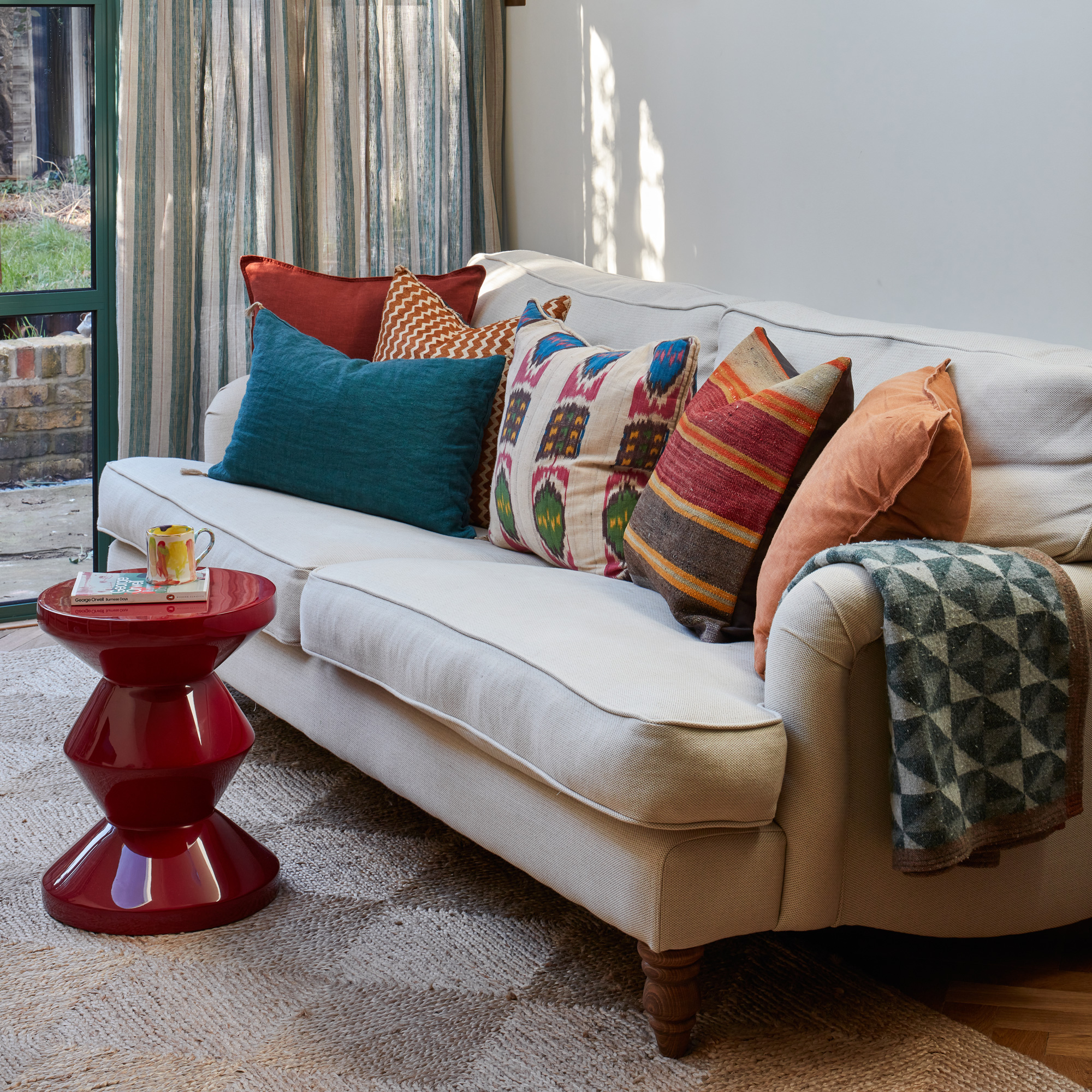
Near the back of the open-plan kitchen diner, near the patio doors that open out to the rear garden, there's a cosy seating area with plenty of colourful cushions. This offers the family an alternative space to relax in compared to the more formal living room.
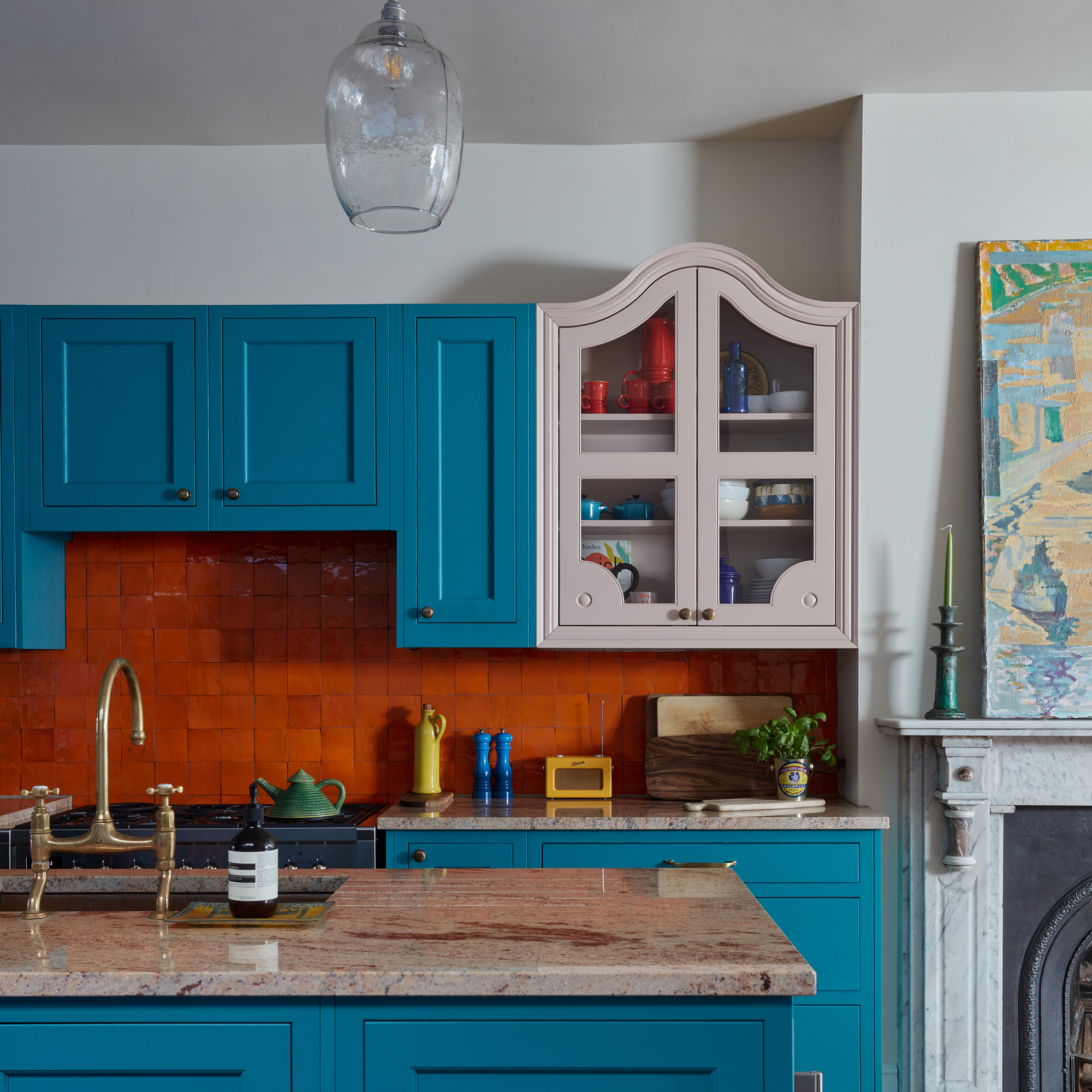
'I was unsure about having a kitchen island during the planning process because it takes up so much space,' says the owner. 'But it gives us such a huge amount of work surface and storage underneath, plus the pinky-coloured stone is a beautiful thing to look at.'
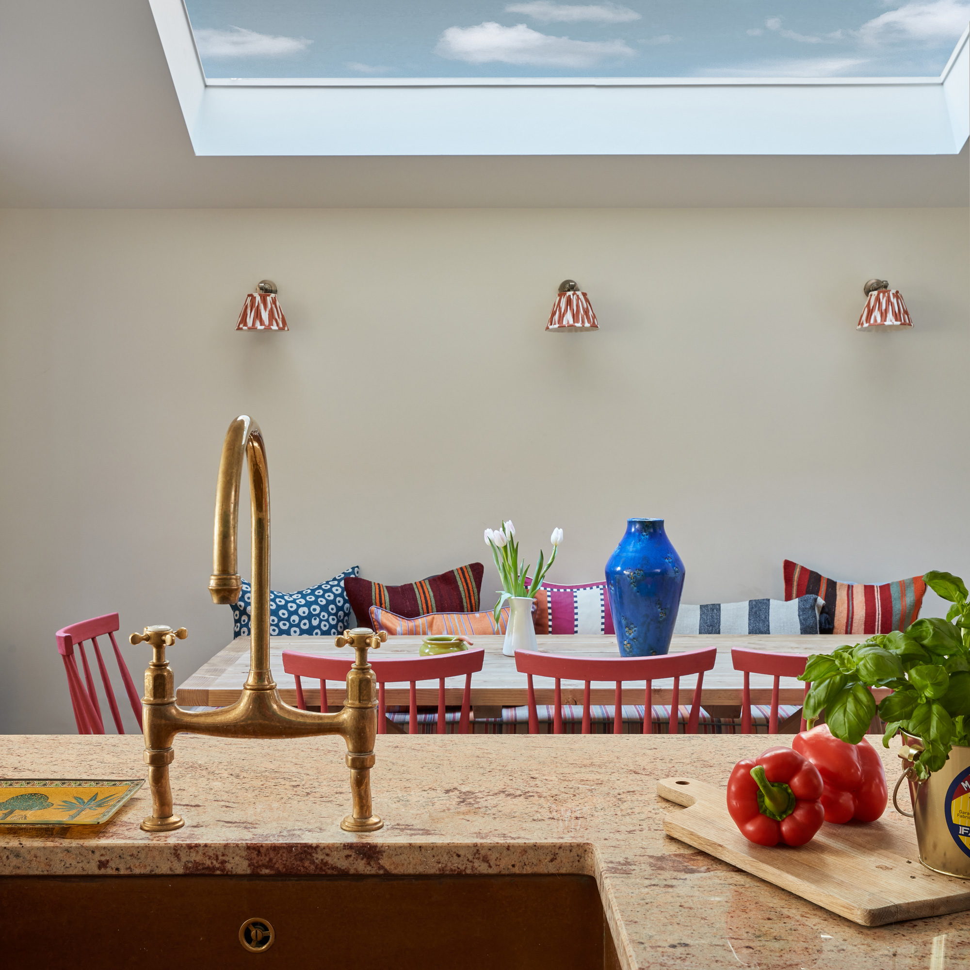
‘The new layout means there’s so much extra light, it feels really cheery now. We’ve added skylights, a pitched roof and internal glazing to let it flow throughout.’
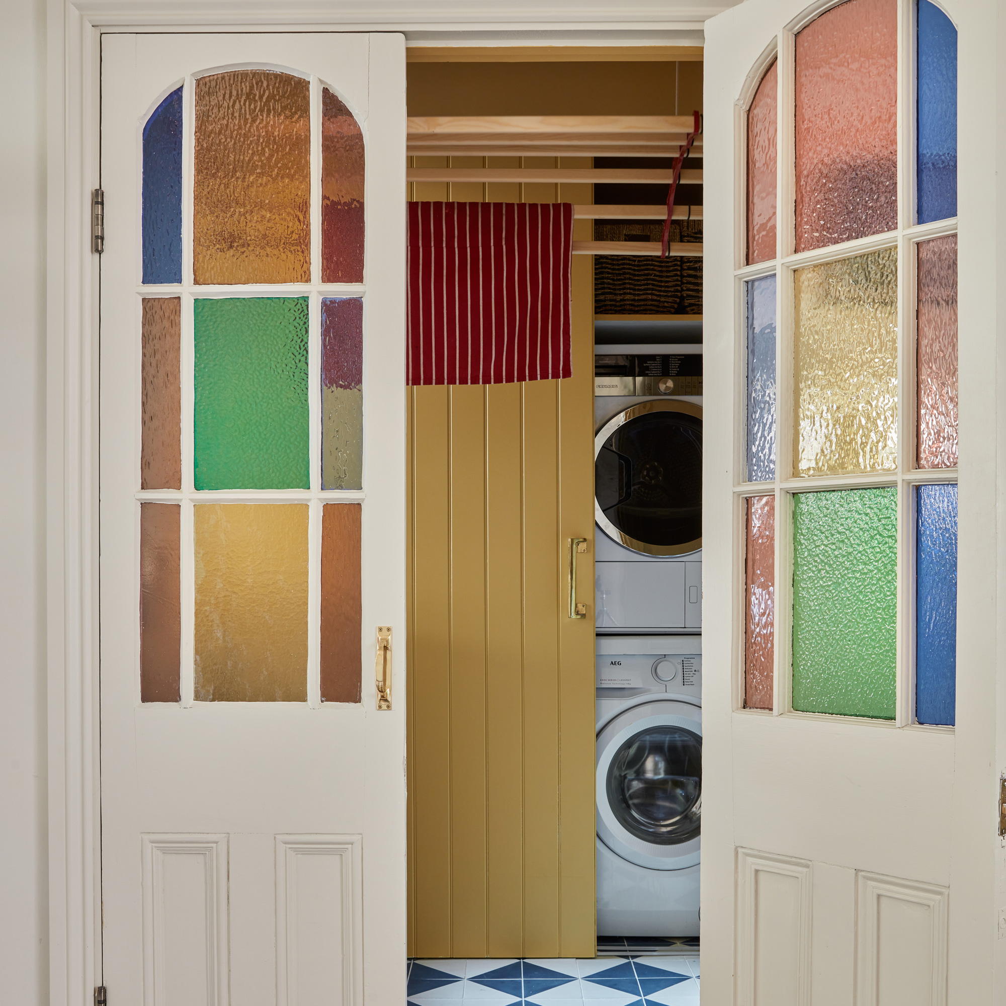
'The utility room has the best doors in the house!' says the owner. 'We found them on a reclamation website, and they were one of the first things we bought. The lovely arch in them because the inspiration for the arch windows we put in the side return extension. The pièce de résistance is the pull-down clothes dryer. I was a bit skeptical at first, but it’s brilliant.’
Get the Look - Colourful buys
Is it a stool? Is it a side table? It's anything you need it to be - the perfect multifunctional addition to your living room.
The ideal choice if you'd prefer to have a stove top kettle over a countertop electric version. Available in nine shades, too.
This home has a wealth of Pooky lamps and wall lights scattered throughout - here's just one of them, just the thing for adding a splash of colour.
The elegant main bedroom
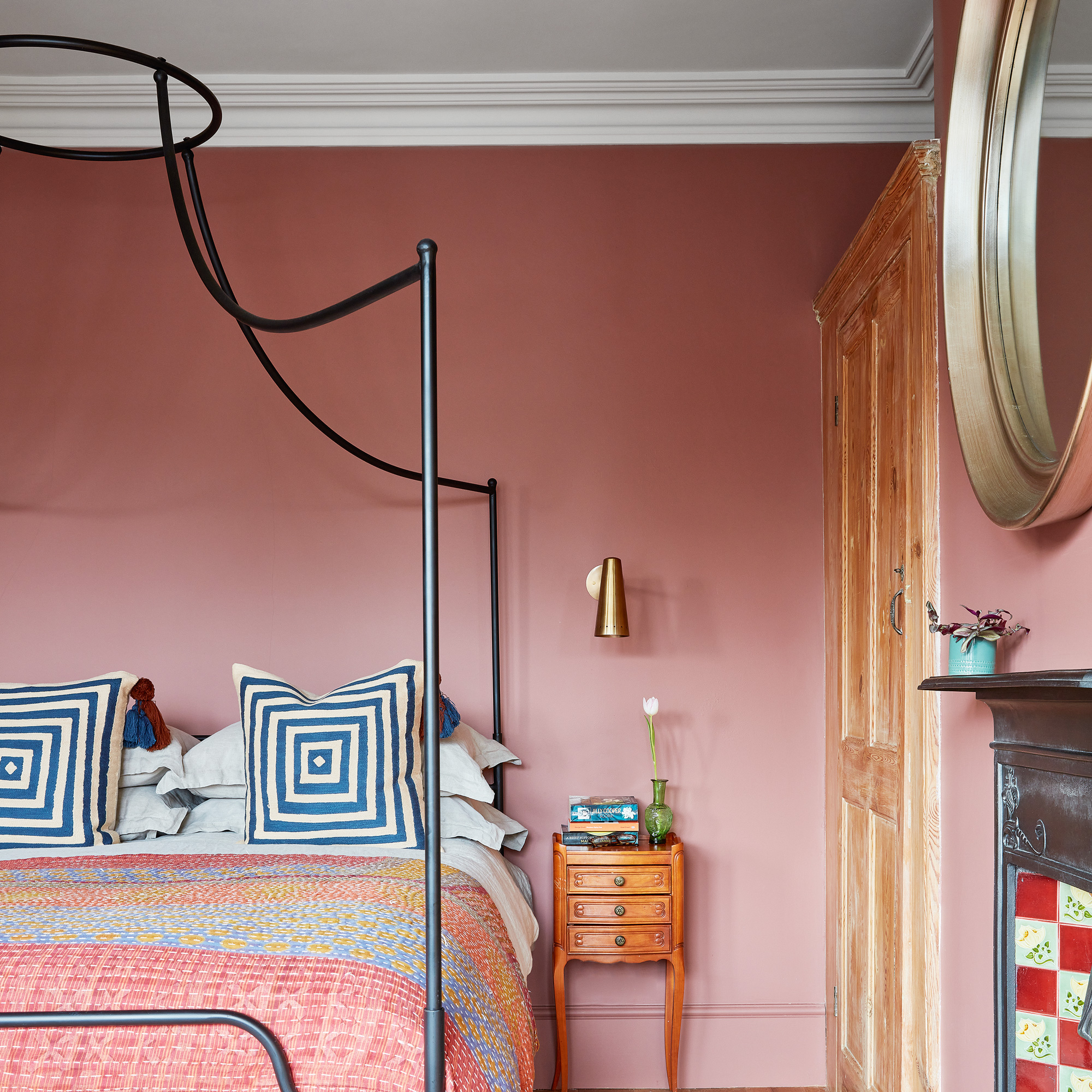
'Our bedroom is the whole width of the house, with windows across the front, so it was another room that felt like it could take a deeper colour.'
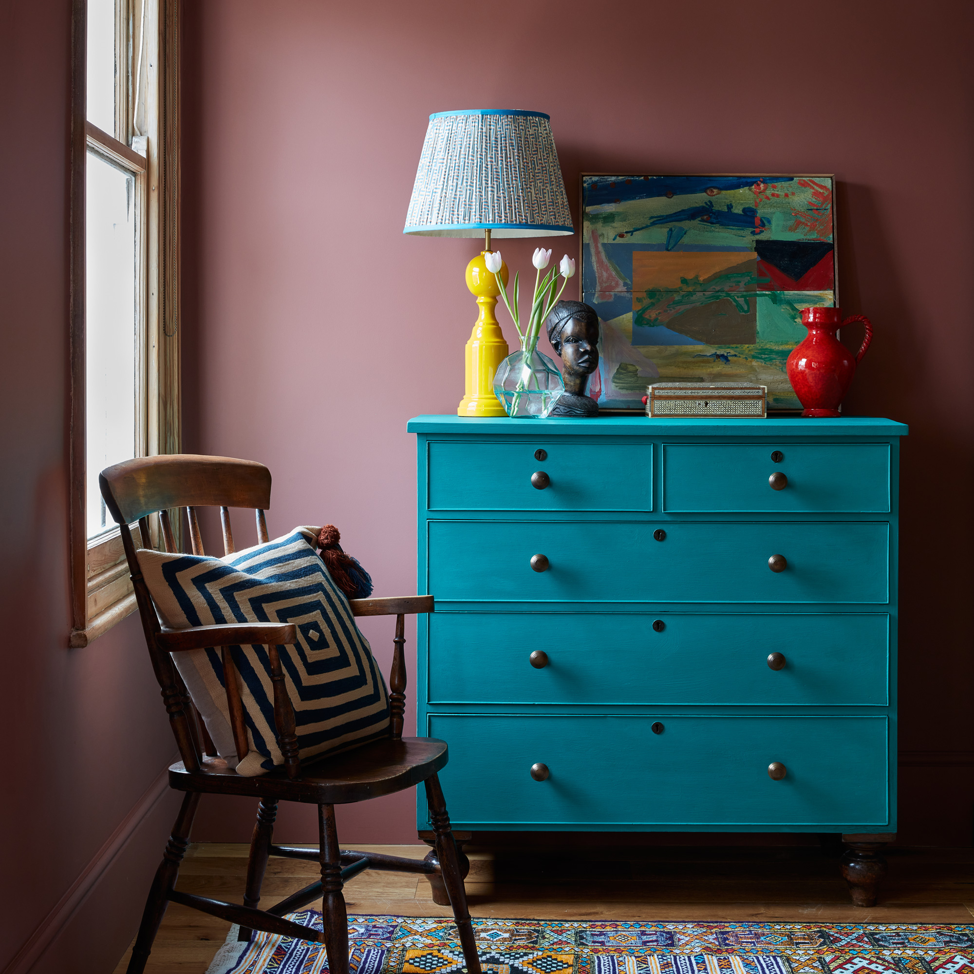
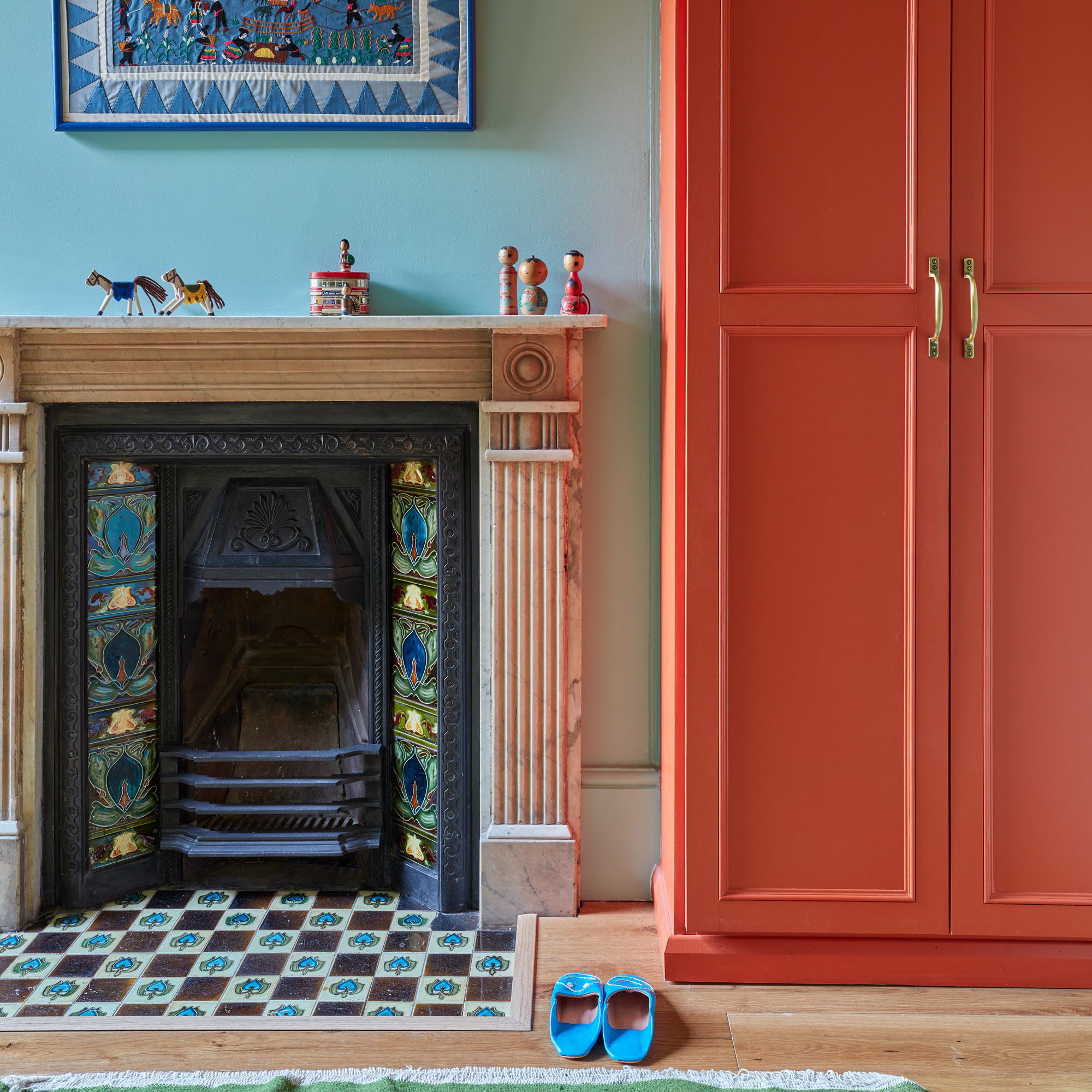
Throughout the house, there are plenty of unexpected pops of red on accessories and furniture, and for good reason: 'I spent part of my childhood in Thailand and Singapore,' explains the owner, 'so I feel naturally drawn to red colours - particularly in textiles and objects.'
The colourful en suite
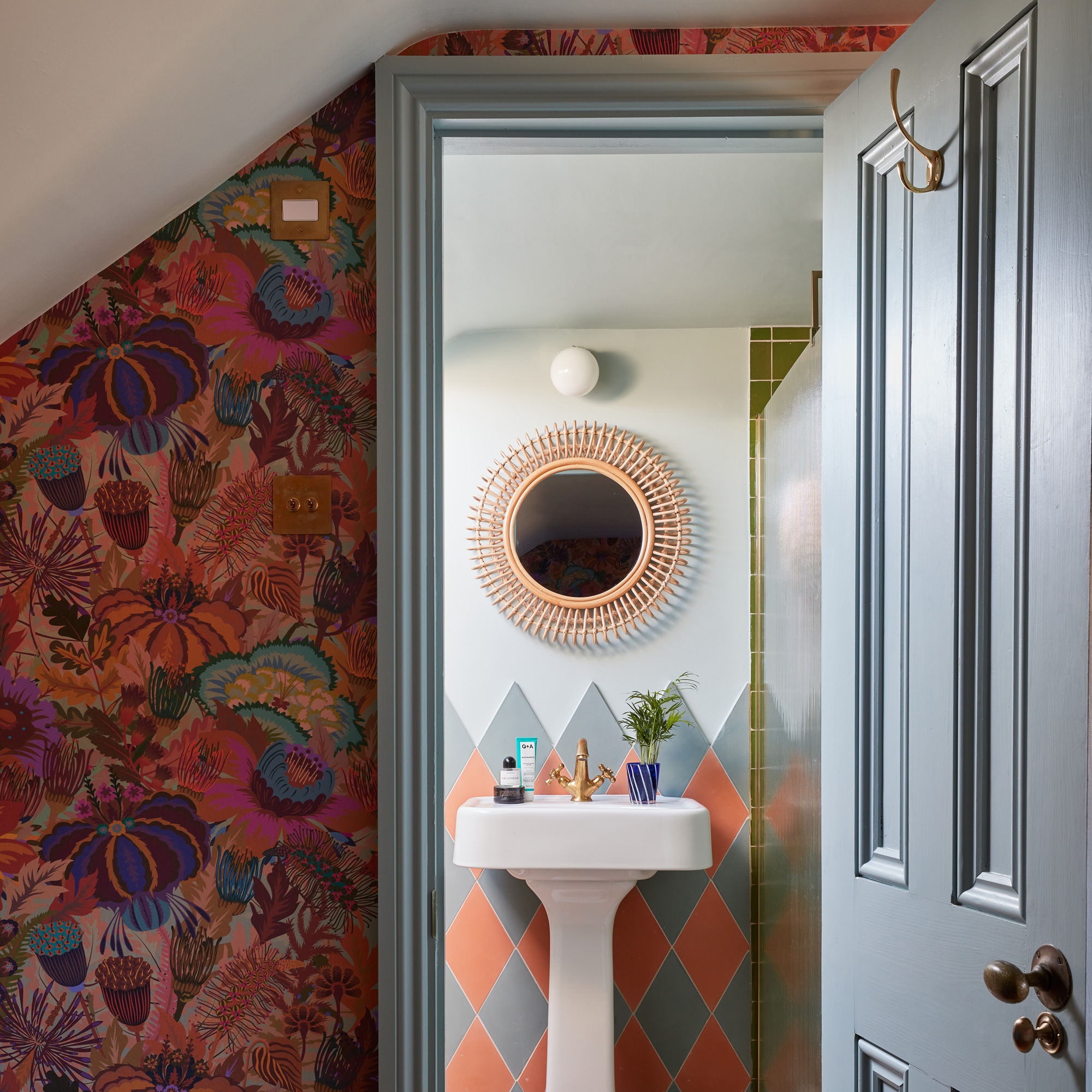
'I love checkerboard designs,' says the owner, 'it’s a pattern we’ve used throughout the house. This time we did it as a diamond instead of square. As we didn’t need a bath up here, we could include a really big shower with a lovely reeded glass screen.'
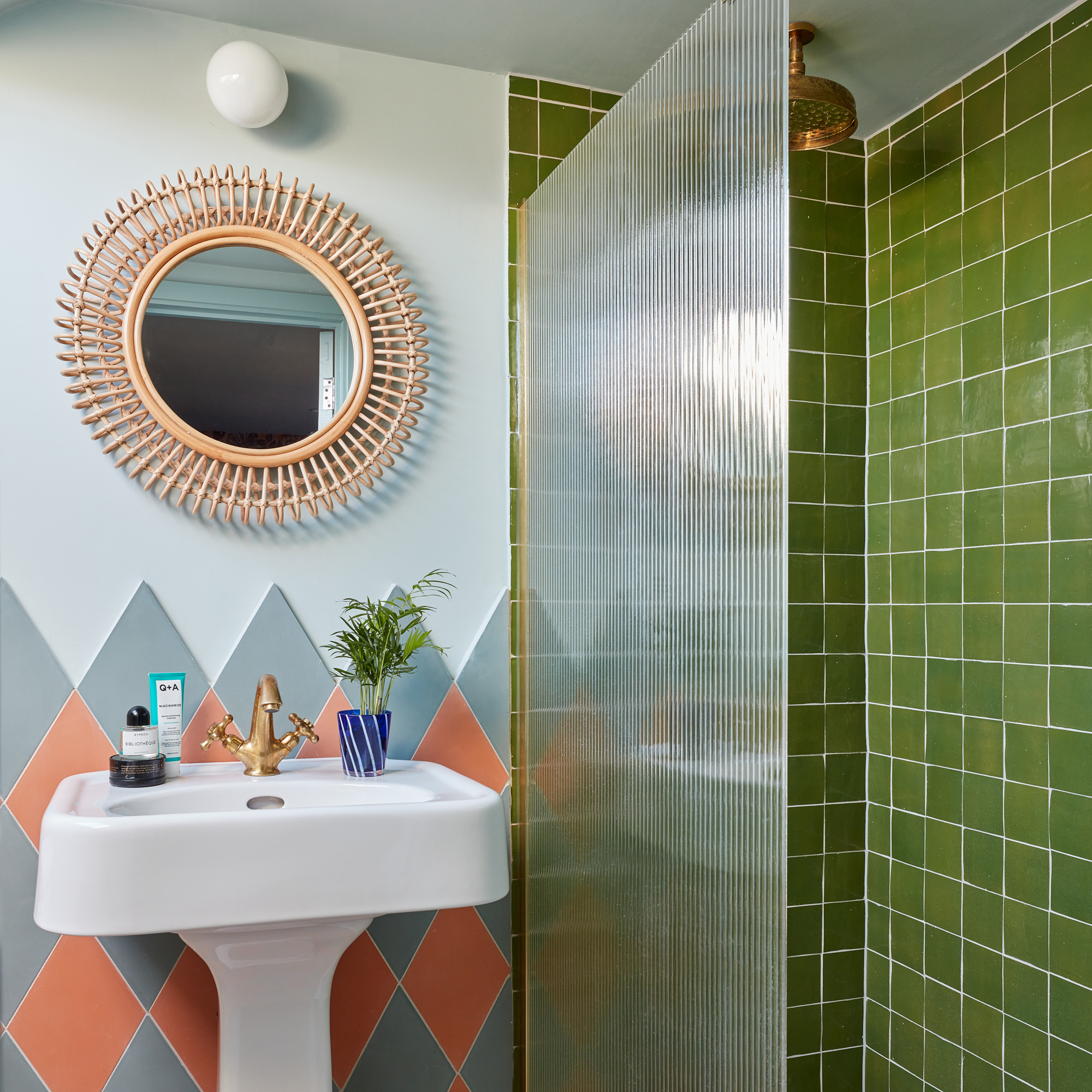
The cement tiles are bespoke from The Mosaic Factory, while the statement mirror is an inexpensive design from La Redoute.
The home office
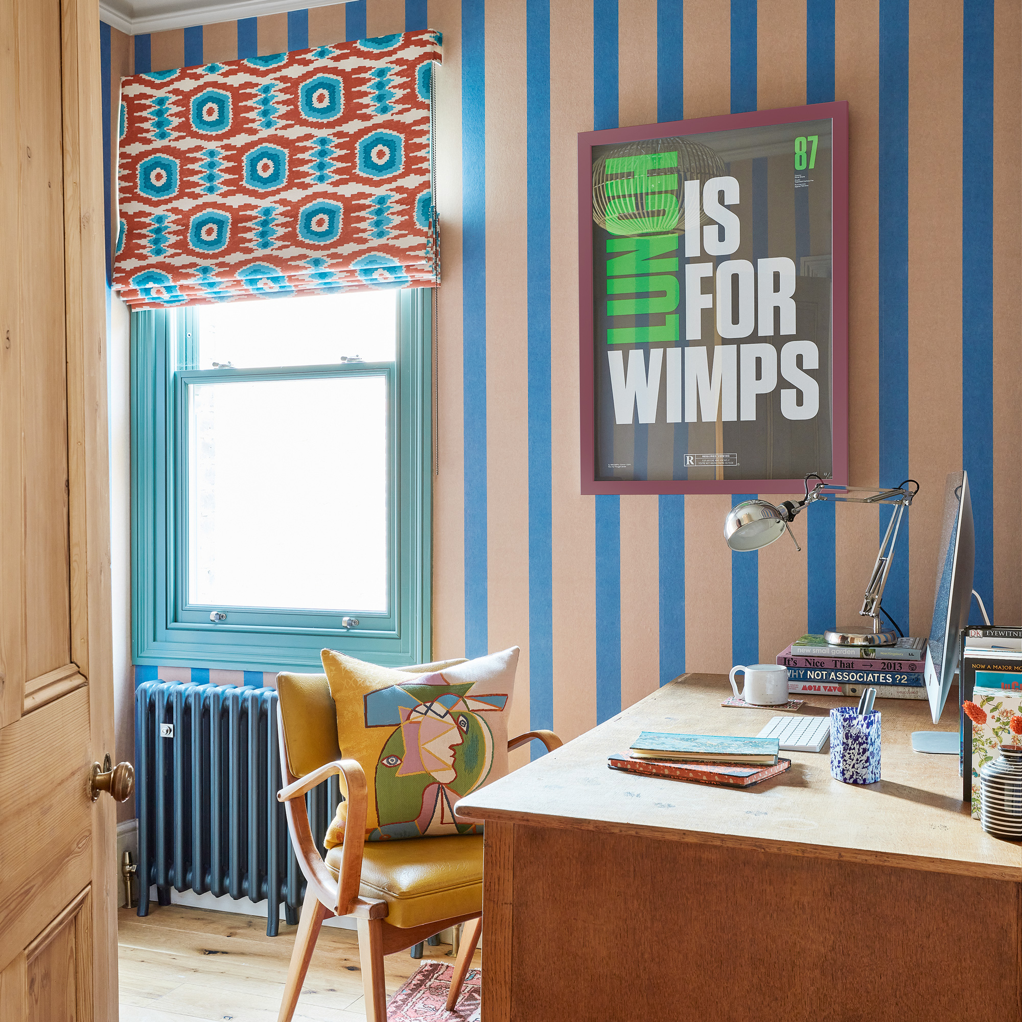
'The office room was another space where I thought we could afford to be a bit braver because no one has to live in it. We played around with lots of fabric choices and patterns. The wallpaper feels like brown packaging paper - it’s really matt and textured and the perfect addition to an office.'
‘We’re very happy living here,' says the owner. 'We love what we’ve achieved and the house brings us peace. It’s perfect for our family as there are spaces to be alone, as well as together. The only thing that might tempt us to move is a driveway!’
Focus on… Installing reclaimed doors
- Adding vintage details makes a real difference when renovating a period property, here’s what you need to think about when choosing internal doors…
- Buying a reclaimed door can be a bit overwhelming - there’s a huge choice of conditions, colours, sizes and styles. Have a look at the doors elsewhere in your house or along your road - is there a design that’s more common? It’s likely to be the original door design and will give you a good starting point - adding a design which is from the wrong period might not give a cohesive result.
- Try visiting a reclamation yard in person to get an idea of what you like and how much it will cost. Stained glass designs will be more expensive. Ebay or facebook marketplace have lots of options so it’s helpful to know what you’re looking for before starting - watch out for any broken glass, cracks or rotting wood as they could be warped.
- Try to choose replacement doors in the same size, including depth. Small details like the side the door hangs on will help keep installation costs down as it won’t require a carpenter to move hinges and fill gaps.
- If you’re adding a new doorway, buy the door before the frames are put in - you’ll have a much wider choice of doors. Always get a carpenter to fit internal doors unless you are a real DIY expert - a badly hung door will be annoying for years to come!


