Wall-to-wall carpet is making a return to schemes as we see it welcomed into the works of interior designers around the globe, and we can see why it might be back in favor. A soft welcome awaits your feet each time you come home and the need for a rug is reduced if you opt for a higher pile height.
Whilst lighter carpets are praised for their ability to reflect light and echo the airiness of a room, darker carpets offer a sense of drama and depth to your scheme. From a practical standpoint, they also hide stains and spills better making them a more desirable design choice for families.
Depending on the deep shade you choose, your carpet can help create a rich and encompassing interior that seamlessly flows from the ceiling to the floor. For those seeking inspiration, this list takes a look at how the dark wall-to-wall carpet trend is being used by the experts. From an endless ocean blue to elegant grey, interior designers present their take on this trend and why it's here to stay.
1. Opt for an ocean blue carpet

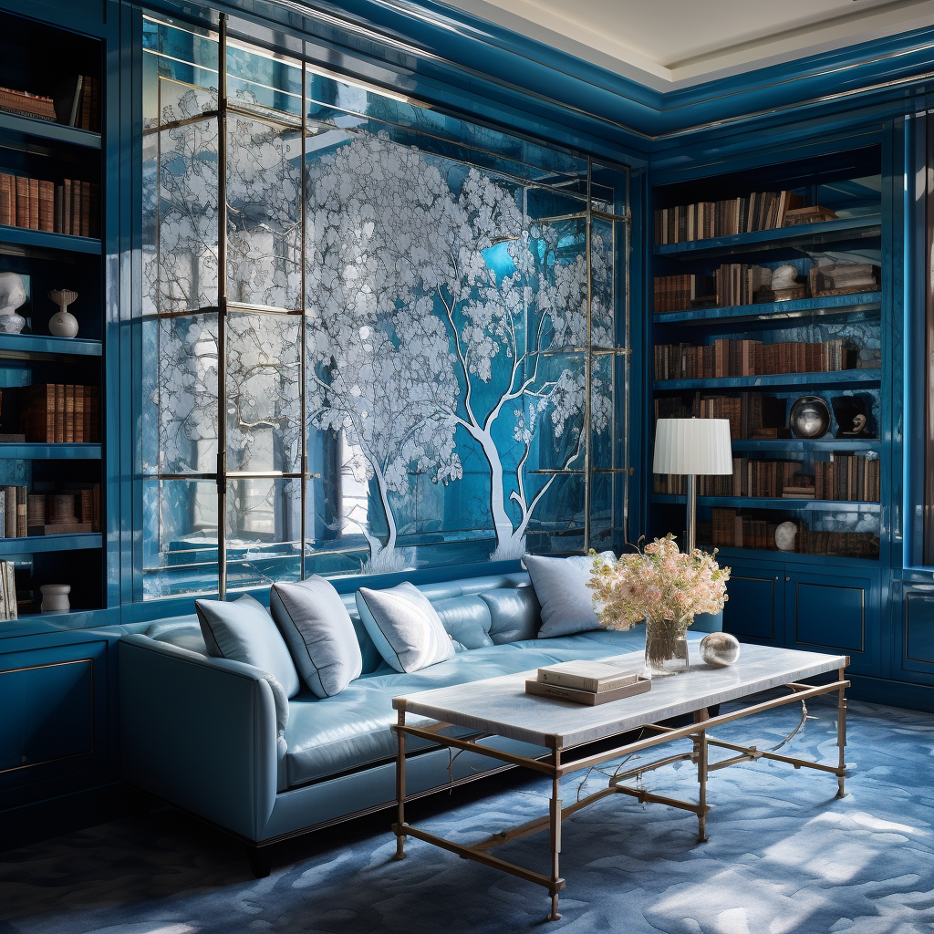
This ethereal scheme was designed by Kati Curtis Design, a studio based in LA and New York that exemplifies the enveloping nature of a darker wall-to-wall carpet. As the dappled carpet flows, tones of blue are both softened and intensified in the intricate paneling that surrounds this space. Touches of white and brass add to the undeniable glamour of the room.
'Dark wall-to-wall carpets, preferably ones with patterns, have seen a notable increase in popularity recently (at least in my office!),' says says Kati Curtis, founder of Kati Curtis Design. 'I’m particularly drawn to their ability to add depth, sophistication, and a certain dramatic flair to any space. These carpets, often adorned with abstract or geometric patterns, can serve as a statement piece, pulling together an array of room elements into a cohesive design. Their dark hues are not only practical - hiding stains and wearing well - but also contribute to creating a warm, cozy ambiance. This trend reflects a shift towards more bold, individualistic, and practical interior design choices, and away from boring grey and white.'
2. Choose an elegant grey carpet

This decadent interior designed by Greg Natale shows how darker wall-to-wall carpets can play with pattern and materiality to reflect light around the room and create a sense of movement within the space. The grey feels sophisticated but not safe and works well with the muted tones of pink within the room as well as the metallic brass detailing.
'In general, darker, more colorful interiors are making a come-back, which is something I’ve always been drawn to and have done across my work,' says interior designer Greg Natale. 'I find it’s best to use silk carpets, as they can still be black or charcoal without being flat. They have a stippling that creates additional texture and light reflectivity to brighten them while still emulating that dark, sexy look.'
The designer highlights how your choice of carpet material is another key factor in the success of your carpet color, this along with the sources of light within your room should be taken into account when choosing your dark carpet color.
3. Go for a dark denim blue

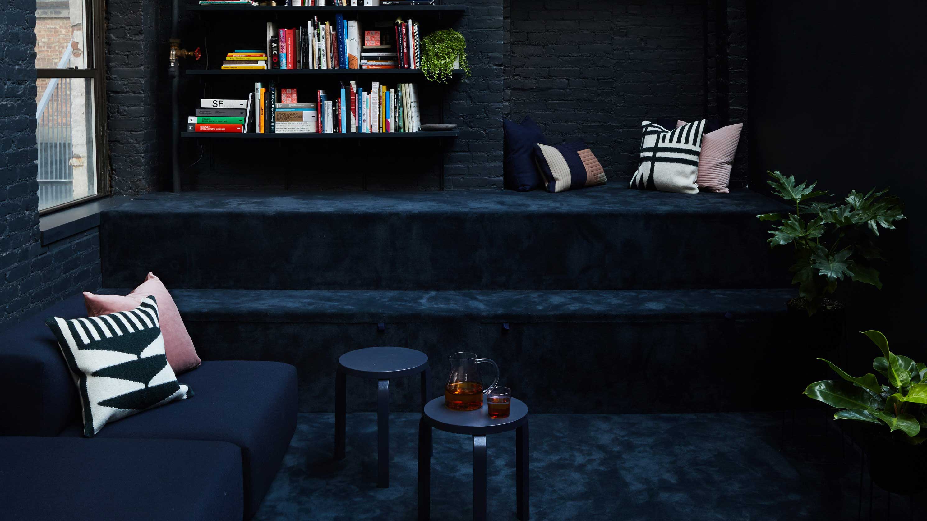
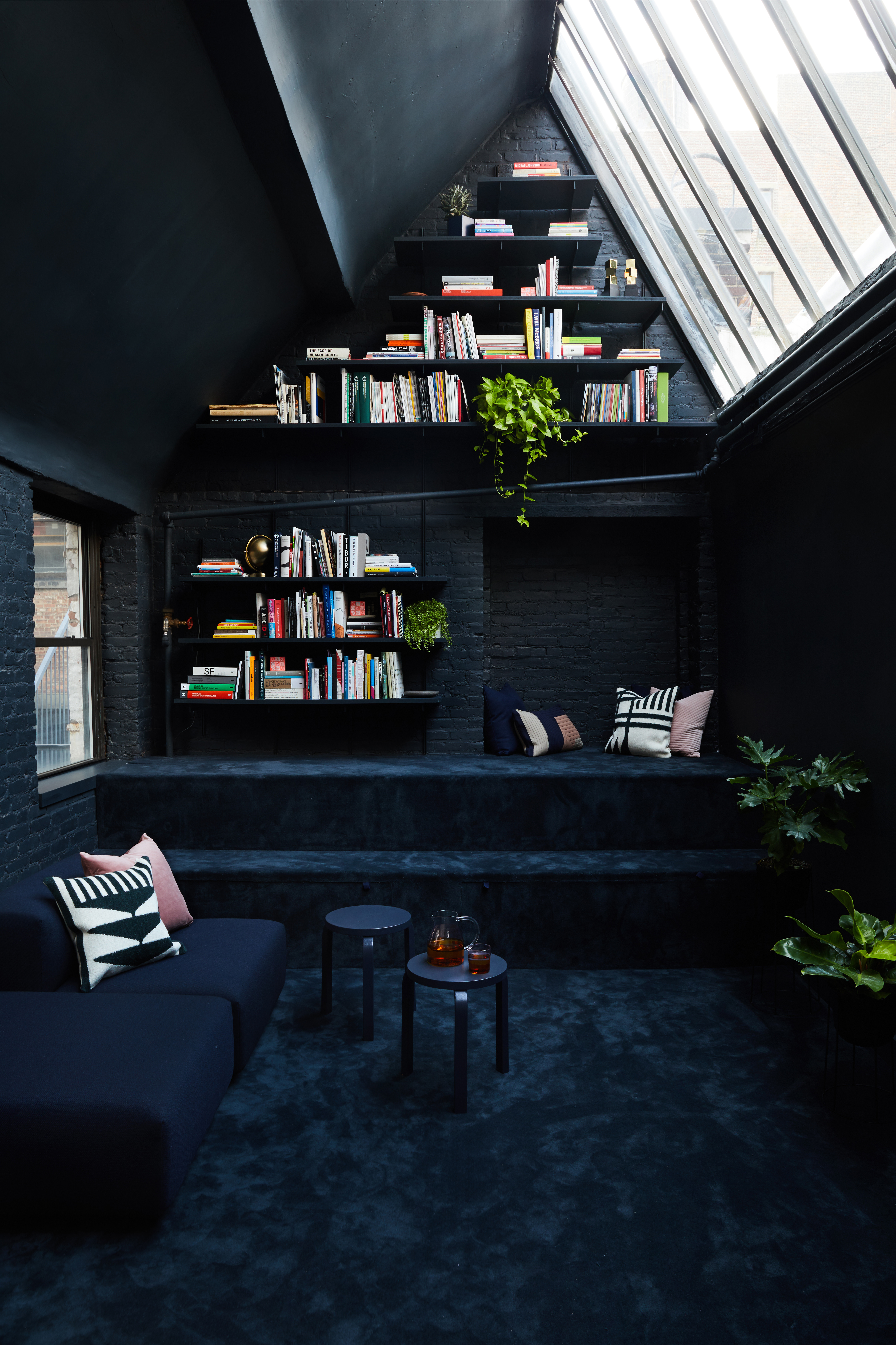
This inky blue loft space designed by GRT Architects is made that much cozier with its wall-to-wall carpet. The color drench approach with coordinating sofa, shelving, and stools give the space a coordinated and clean look whilst the books, cushions, and plants soften things by introducing a bit of color.
When asked about their approach to using dark wall-to-wall carpets, the founders emphasized the role that darker colors play in evoking emotion within spaces. 'We used it to create a mood, in contrast to the brighter work and gathering spaces in the office, and for the change in acoustic ambiance,' says Tal Schori, co-founder of GRT Architects. A good tip to bear in mind when creating a similar aesthetic for your interior is to create a color palette that brings together similar tones of the same shade. That way your interior feels layered and luxurious rather than one note.


