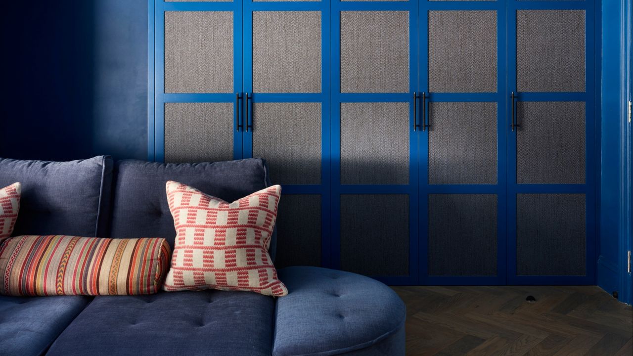
When it comes to color, there’s an instinct to ‘play it safe’ in smaller spaces. A fear of overwhelming the senses or creating a closed-in feel often leads to plain palettes and a cautious, understated approach to decorating, which, sadly, does these rooms a disservice. Before you embrace a full-on technicolor vision, though, take heed of the mistakes interior designers and color professionals regularly see in small spaces — they have an outsize effect in compact spots.
Of course, there are some paint colors designers avoid in small spaces altogether. A shade with the wrong undertone can dull the light and make a room feel even tighter, while one that’s too bright can have you reaching for a pair of sunglasses. But the color mistakes often found in small spaces go beyond these decorating no-nos into forgotten basics and missed opportunities.