I was initially skeptical when I heard a college had ditched its traditional script logo because of readability issues. Despite other recent victims of the digital age, like the Johnson & Johnson logo, I'm still not convinced that Gen Z is simply unable to read cursives. Next thing we know, someone will suggest replacing the Coca-Cola logo with a sans serif typeface.
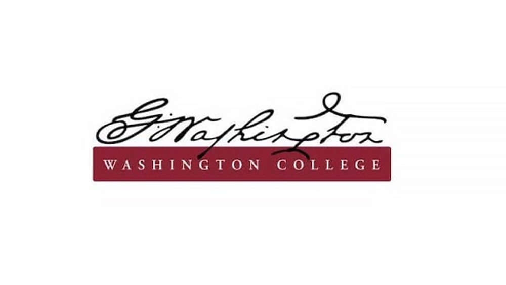
But on closer inspection, I have to admit that Washington College has a point. Its logo really was hard to read, but not just because it was a cursive design.

Surprisingly, Washington College only introduced its cursive logo in 2013. The Maryland institution took the design directly from George Washington’s own signature with no modifications, hence the difficult 18th century handwriting.
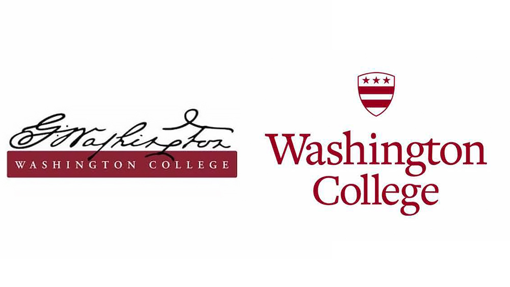
The link with the US founding father George Washington will be preserved in the new logo design, which features the Washington family crest combined with a serif wordmark that's easier to read while still feeling traditional. Meanwhile, Washington's own script will continue to be used as part of identity system as a complementary visual to give "materials a more dynamic look".
The college's vice president for marketing and communication Brian Speer said in a press release: “Because cursive writing is no longer taught universally in K-12 education, the script, especially this highly stylized version, was difficult to read and not immediately recognizable for many prospective students. This was counterproductive when it came to name recognition and identity,”
That's caused a minor outcry about children no longer being taught to write. Some even question whether legibility was the cause for the rebrand. One parent writing on X described it as a "lame excuse" and "an attempt to distance itself from any overt association with its namesake.
I can understand the controversy. Washington College was the first to be chartered after US independence, and it even received a donation of 50 guinea coins from the country's first president. But it has a point – not about cursives in general, since there are plenty of great cursive logos out there that are highly legible and recognisable. But more because a signature is not a logo design.
George Washington was not concerned about whether his handwriting would create a solid brand identity when printed on college stationery or at the top of a website. Even script logos that are based on real signatures tend to be modified to ensure their adaptability, and Washington's signature is particularly difficult with its long 's' and the ligature between the 'G' and the looping 'W'. While some seem to think that unreadable logos are on trend right now (see the new IDW Publishing logo and Katarzyna Konieczka's wild logo design, it's best for moth brands to follow some basic logo design rules).


