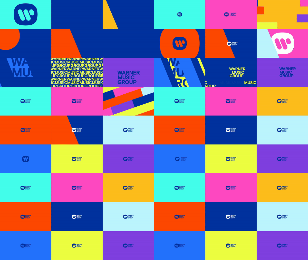
Since its conception, Warner Music Group (WMG) has grown into a multifaceted music entertainment company, supporting streaming, recording and more. Partnering with leading design agency Pentagram, WMG has undergone a slick and modern brand identity refresh to synergise its diverse brands into one unified identity.
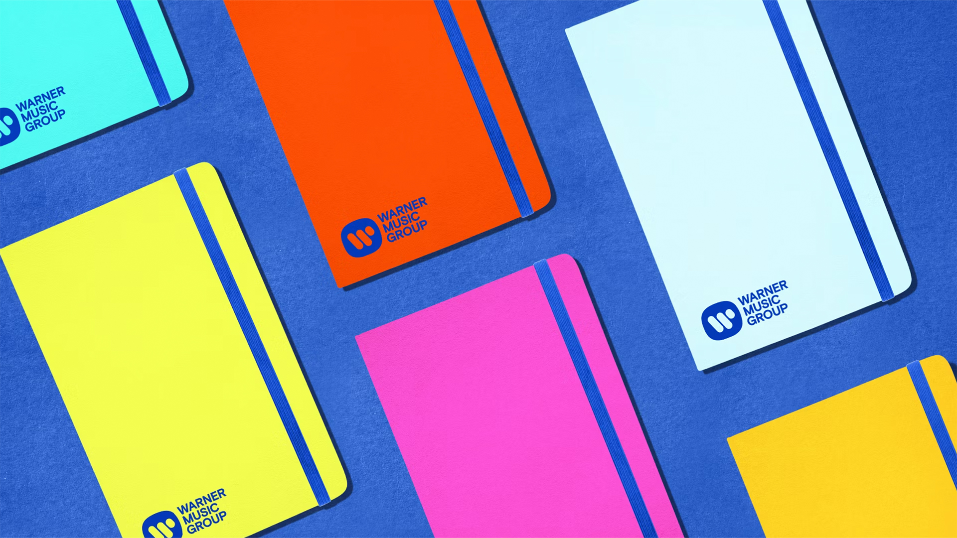
With strong brand identifiers already in place – such as WMG's iconic logo – the new design aims to create a palette of flexible brand motifs that can transfer across the company's internal brands and platforms. The rebrand expertly captures the brand's heritage with a modern playful spirit with a refreshed colour story, contemporary typography and a strong sense of identity.
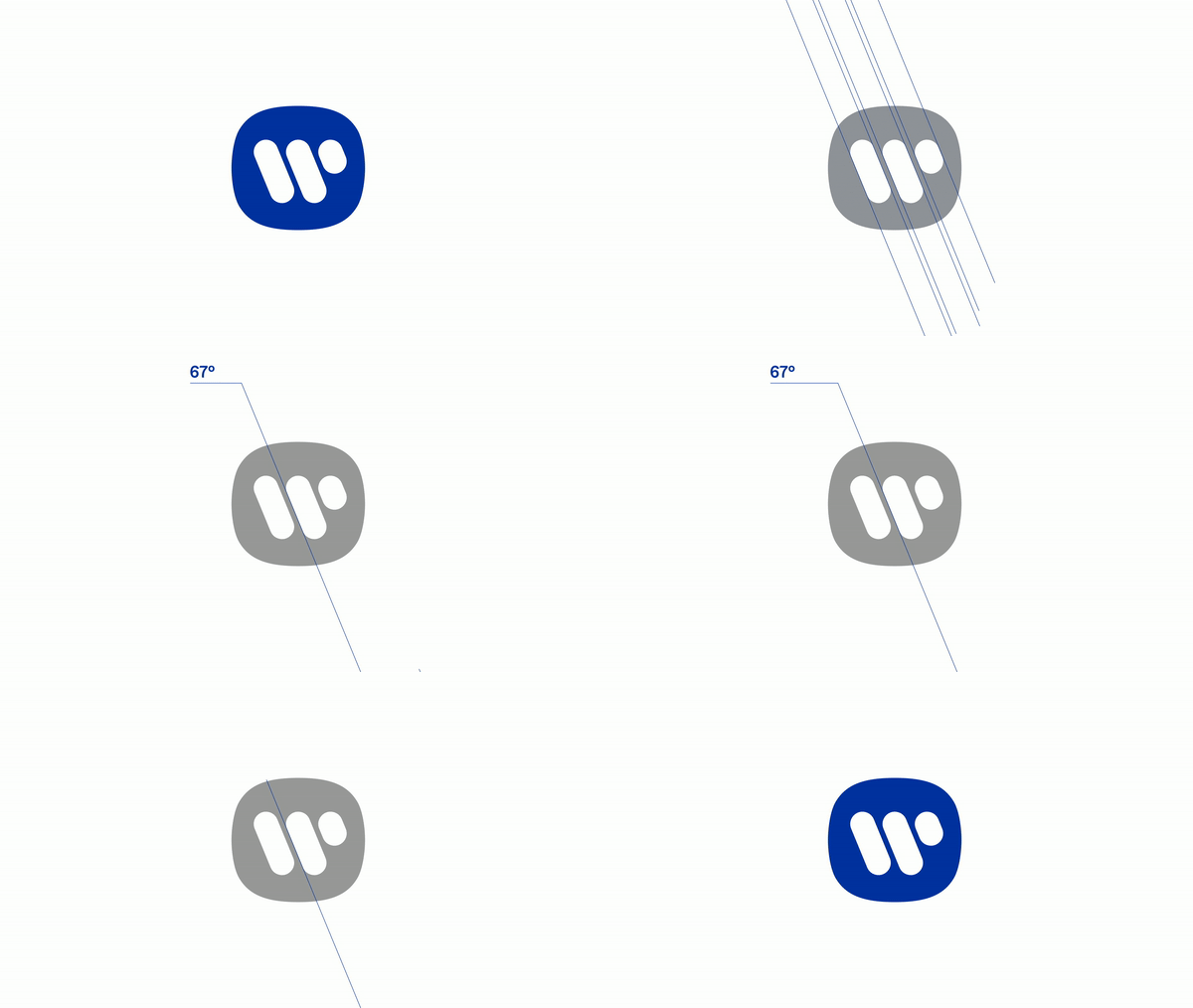
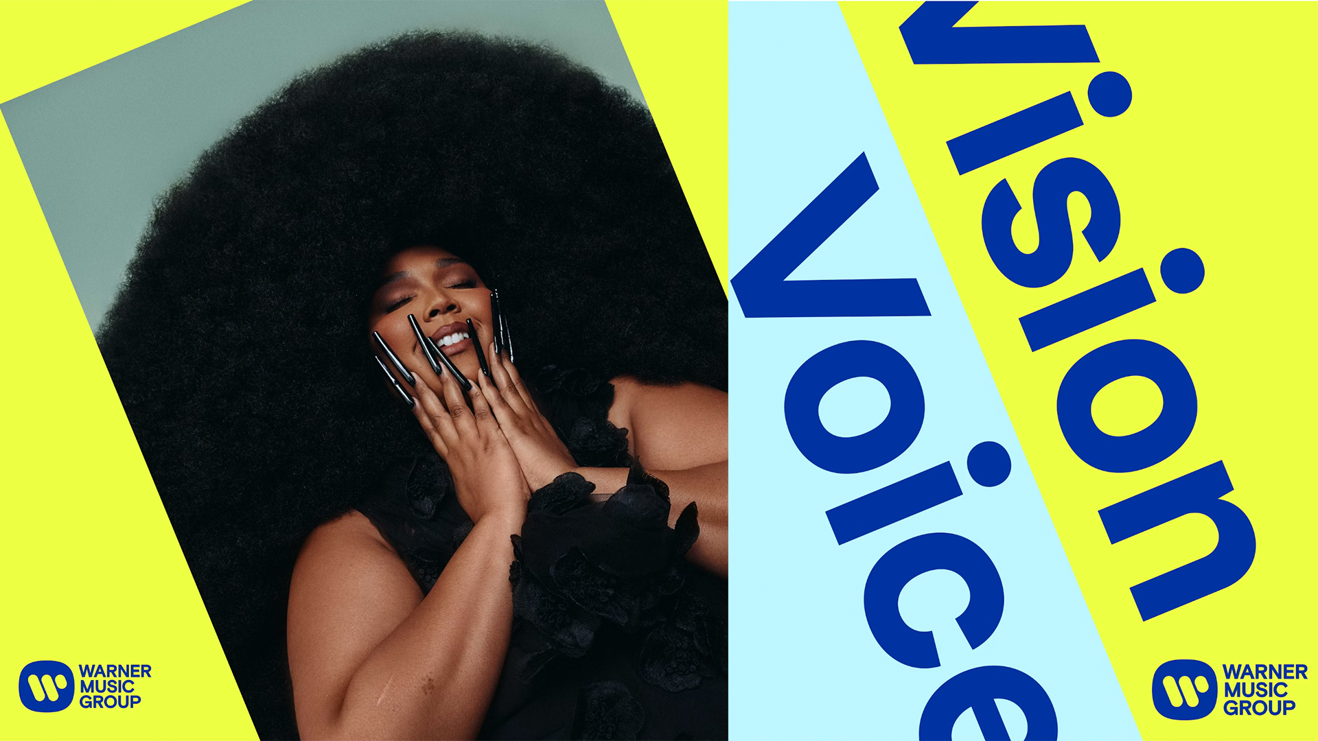
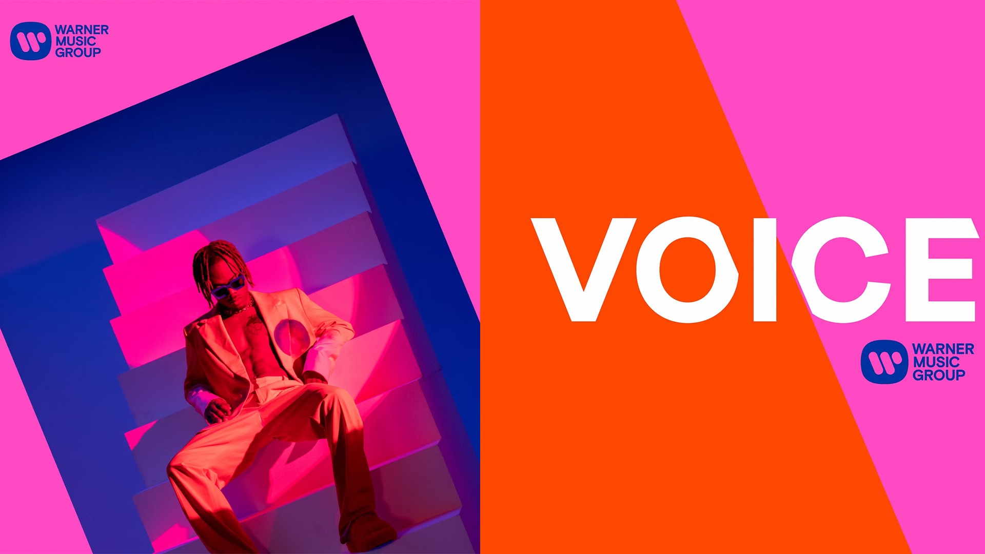
Creatives at Pentagram began the project by defining WMG's brand identity in words. Settling on the powerful phrase "Vision and Voice" it laid the foundations for the new identity. Beginning with the existing logo, the design team identified the 67-degree angle of the 'W" – a symbol of WMG's 'vision' and ability to "see things from a different angle" according to Pentagram's Instagram story.
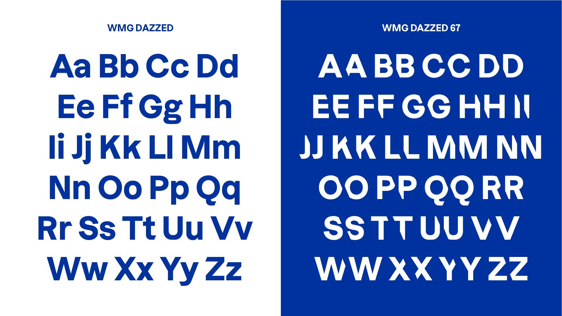
This angled motif continues across the brand's platforms, creating a dynamic visual that embraces the 21st-century edge of modern music. Alongside the new visual motif is a pair of elevated typefaces: WMG Dazzed and WMG Dazzed 67. Partnering with the type foundry Displaay, WMG Dazzed 67 continues the 67-degree motif, slicing the ends off of individual letters for a graphic modern typographical feel.
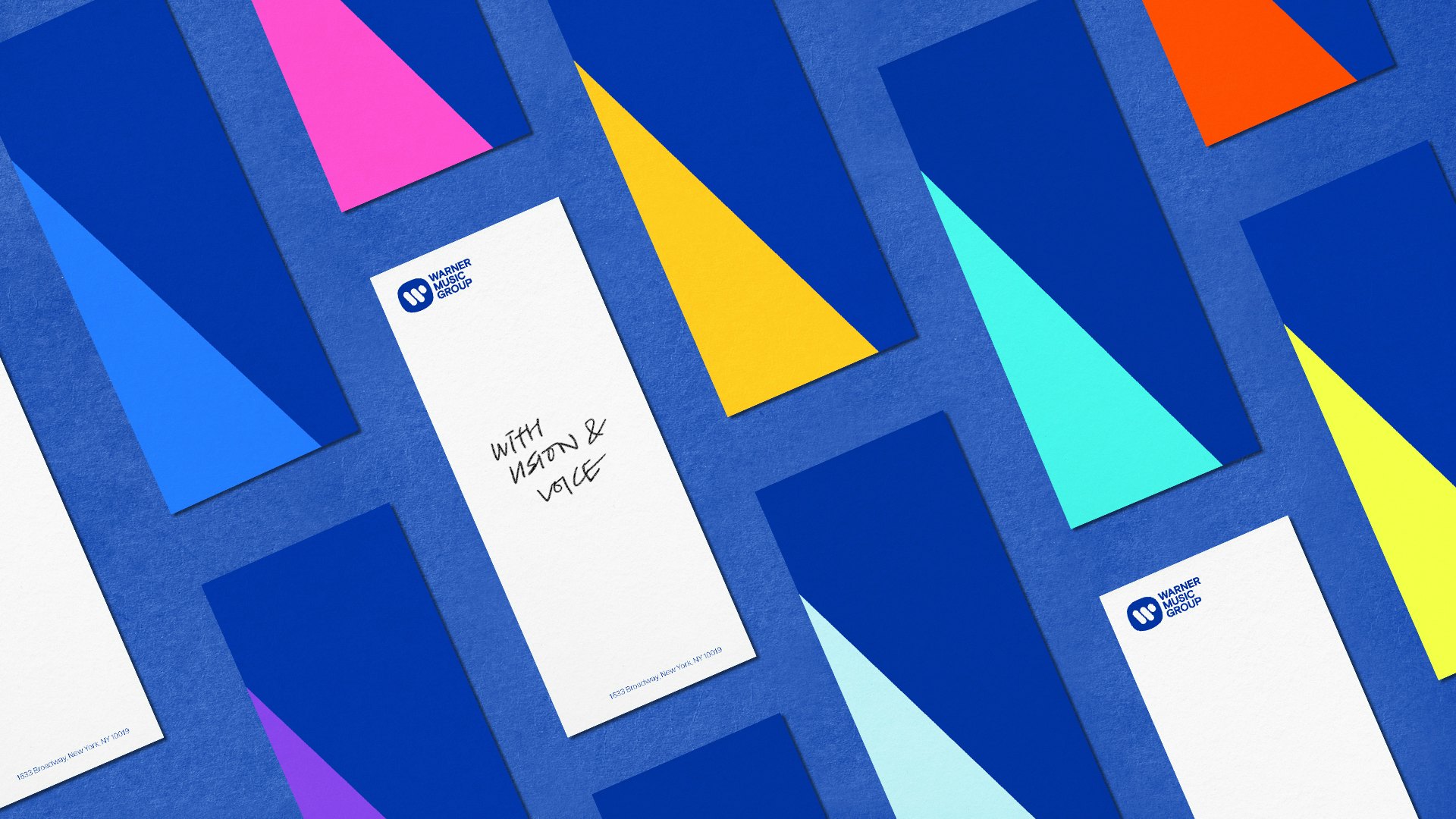
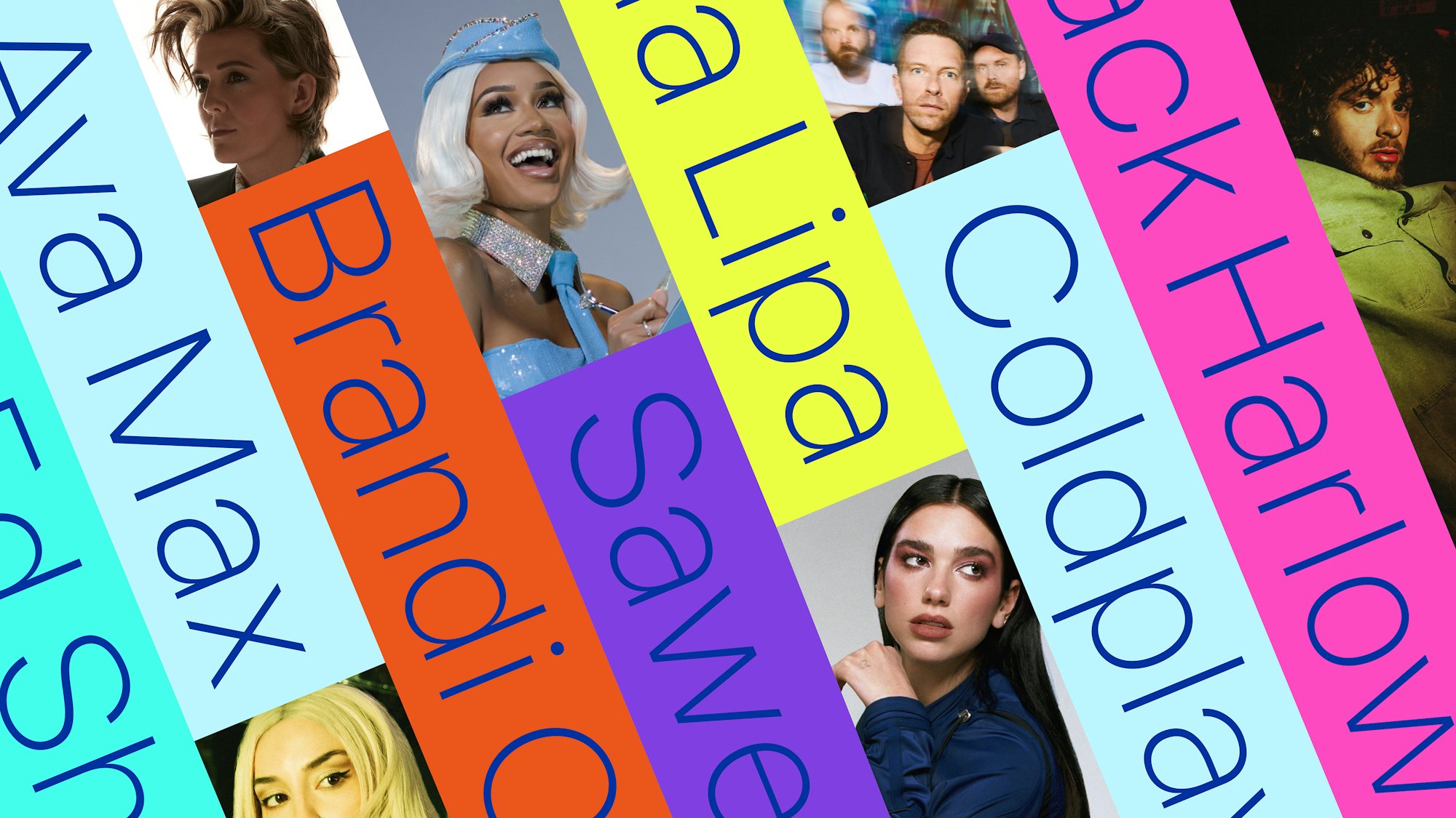
Paired with a bright, music-inspired colour palette of diverse blues and sunny yellows, the brand feels harmonious and delightfully modern. With the continuity of the 67-degree angles throughout the design as well as layering effects in the visuals, it's a rebrand that feels multidimensional – speaking to a modern audience while celebrating the brand's musical legacy.
To learn more about the Warner Music Group rebrand, visit the Pentagram website. For more ingenious design, check our interview with Natasha Jen about Pentagram's Reddit Rebrand, or take a look at DixonBaxi's stunning new identity for British Land.
