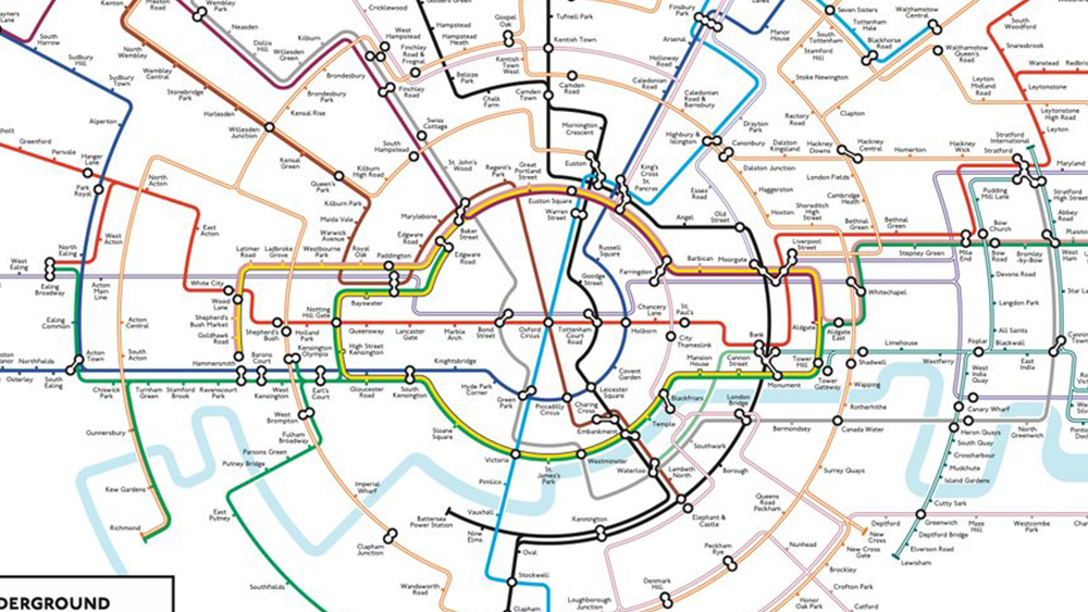
The London Tube map is so iconic we included it in our pick of the best map designs. But is it the right shape? One cartographer thinks it isn't, and he might have a point. Max Roberts' circular Tube map already went viral once several years ago, and a new improved version is now repeating that success.
The circular underground map rearranges the Tube lines with their traditional colours to form spokes emanating from the centre. The result is a design that's less cluttered, making it easier to read. It's also more geographically accurate that the current official Tube map, which is built on Harry Beck's design from 1933. And no that optical illusion formed by the circle line isn't intentional.