For one New York City family, a fifth-floor, full-size basketball court sealed the deal. A brownstone on the Upper West Side had served as a lovely home for the family of five for years. But as their offices, schools, and friends were all centered on the Upper East Side, they began to crave a change. With three boys 17 and under and the high school years quickly slipping away, the family wanted to move, and soon.
That's when they stumbled upon this gorgeous seven-floor 1888 townhouse, clad in neoclassical-style limestone. 'We were working around the clock and I engaged my most trusted builder from the Hamptons to come to Manhattan to make it happen,' says Christin Farrar, founder and principal of C. Farrar Design, who was called in to help. 'Knowing that he and his team could deliver was the saving grace.'
Keeping in mind the father's obsession with '90s hip hop and the family's sprawling art collection (including everything from Damien Hirst to commissioned Mark Whatson), Christin injected this home with elegance and poise. Blending calming colors with bold, expressive accents, she ensured each detail was ready to support the family's busy lifestyle. To hear more about the space, H&G spoke with Christin Farrar. Here's all she had to say about the expansive family home.
Take a tour of the Upper East Side getaway


'Family-centric values' informed many of Christin and the team's decisions about this space. With plenty of space for the busy family to gather with friends and areas to display an impressive collection of characterful art, this home is bespoke and personally tailored. It's an expressive oasis within New York City's non-stop hustle, both high-end and homey.
'The majority of decisions were made with family and friends in mind, and the design reflects it,' she says. 'Additionally, the clients are passionate art collectors who delight in discovering emerging artists while also sourcing pieces from beloved artists they have followed and collected for years. I knew that art would play a significant role in the design, adding depth and personality to their home.'

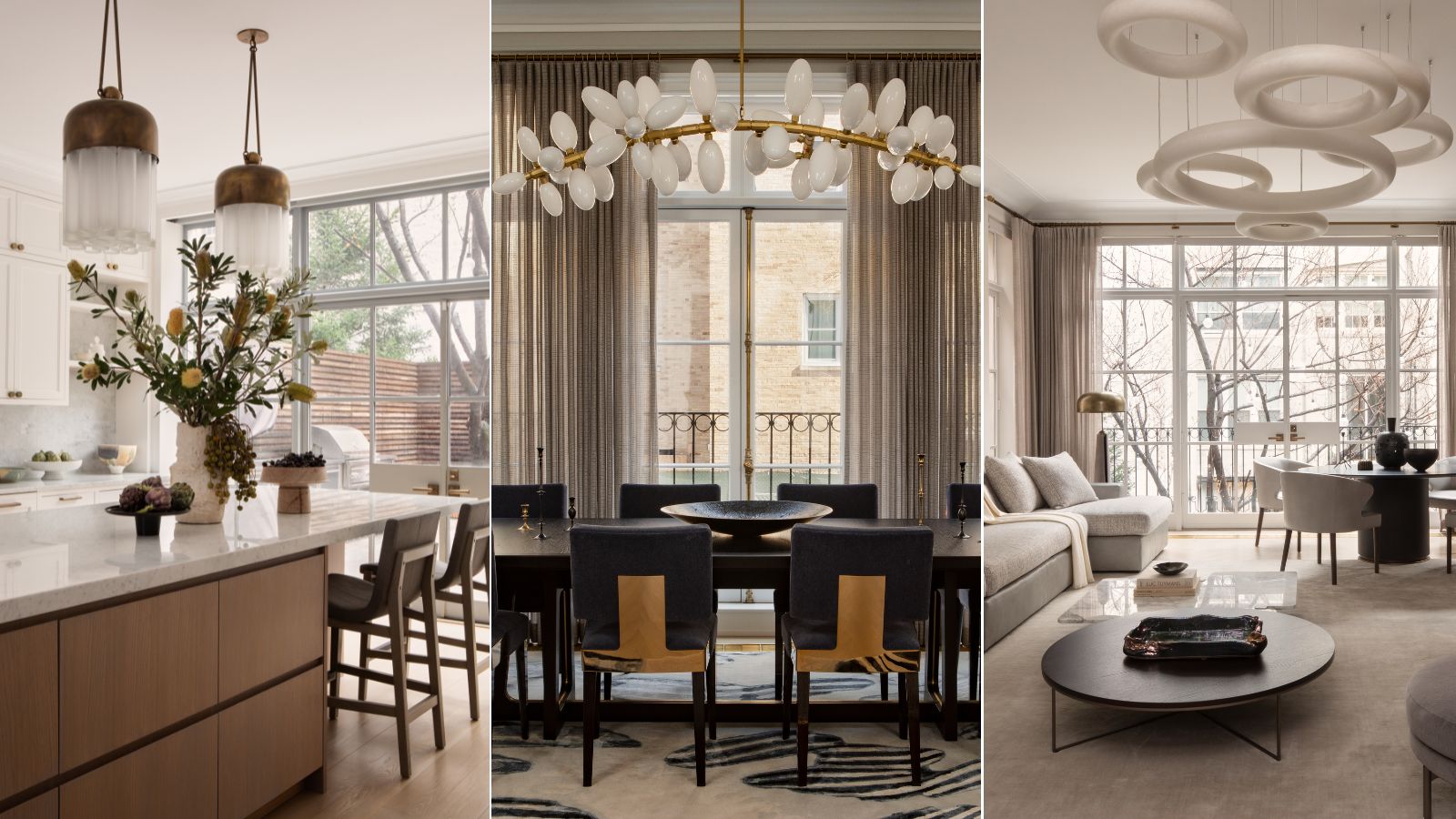
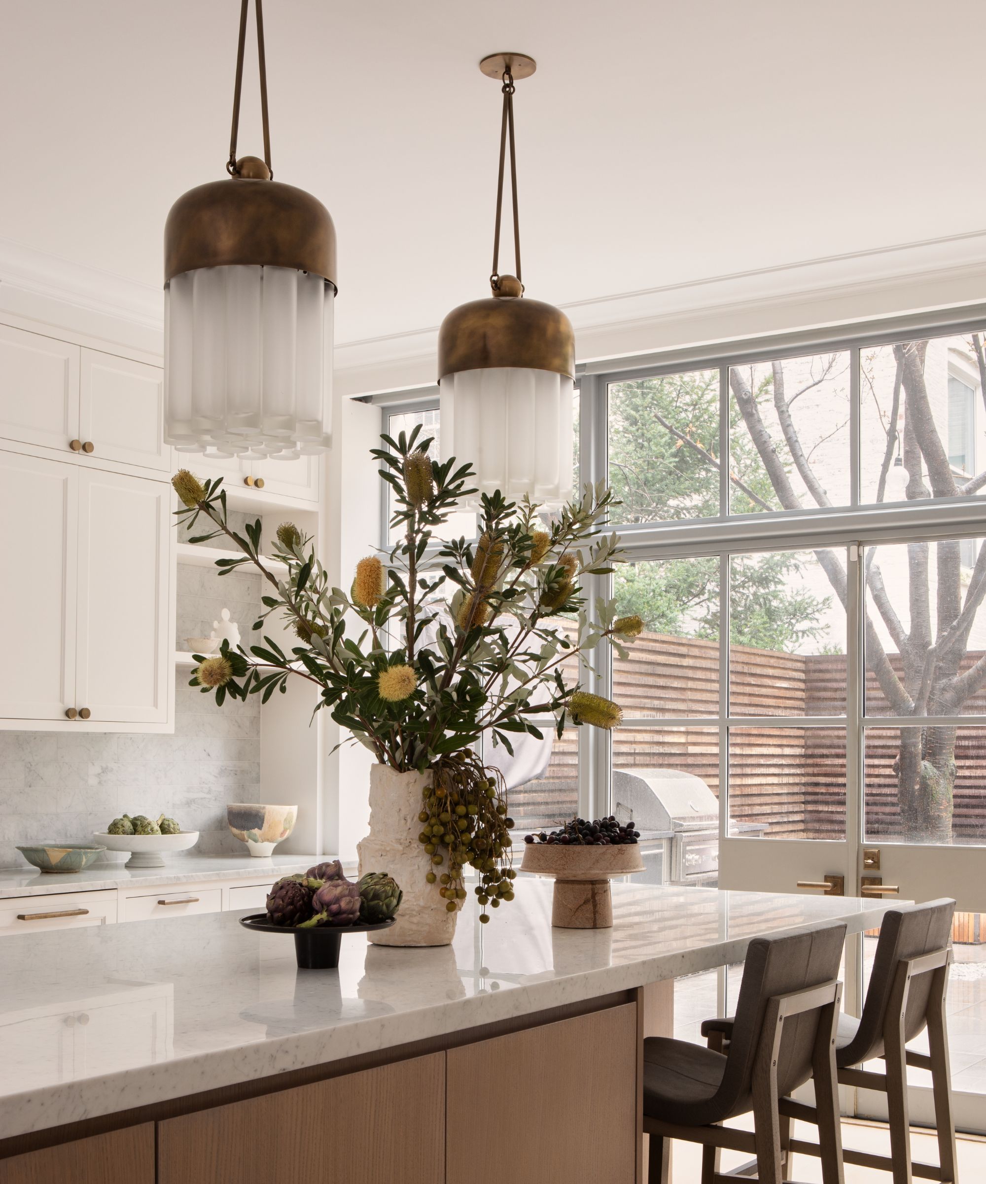
Larger-than-life lighting graces nearly every room of this home, from the industrial-inspired pendants hanging above the kitchen island to the ring-shaped sculpture defining the living room space. Blending classic charm with modern sophistication, each and every piece is a conversation starter, fitting perfectly within its surroundings. Christin shares that the jumping-off point was a gold, cage-like fixture that she knew would fit perfectly in the home's entryway.
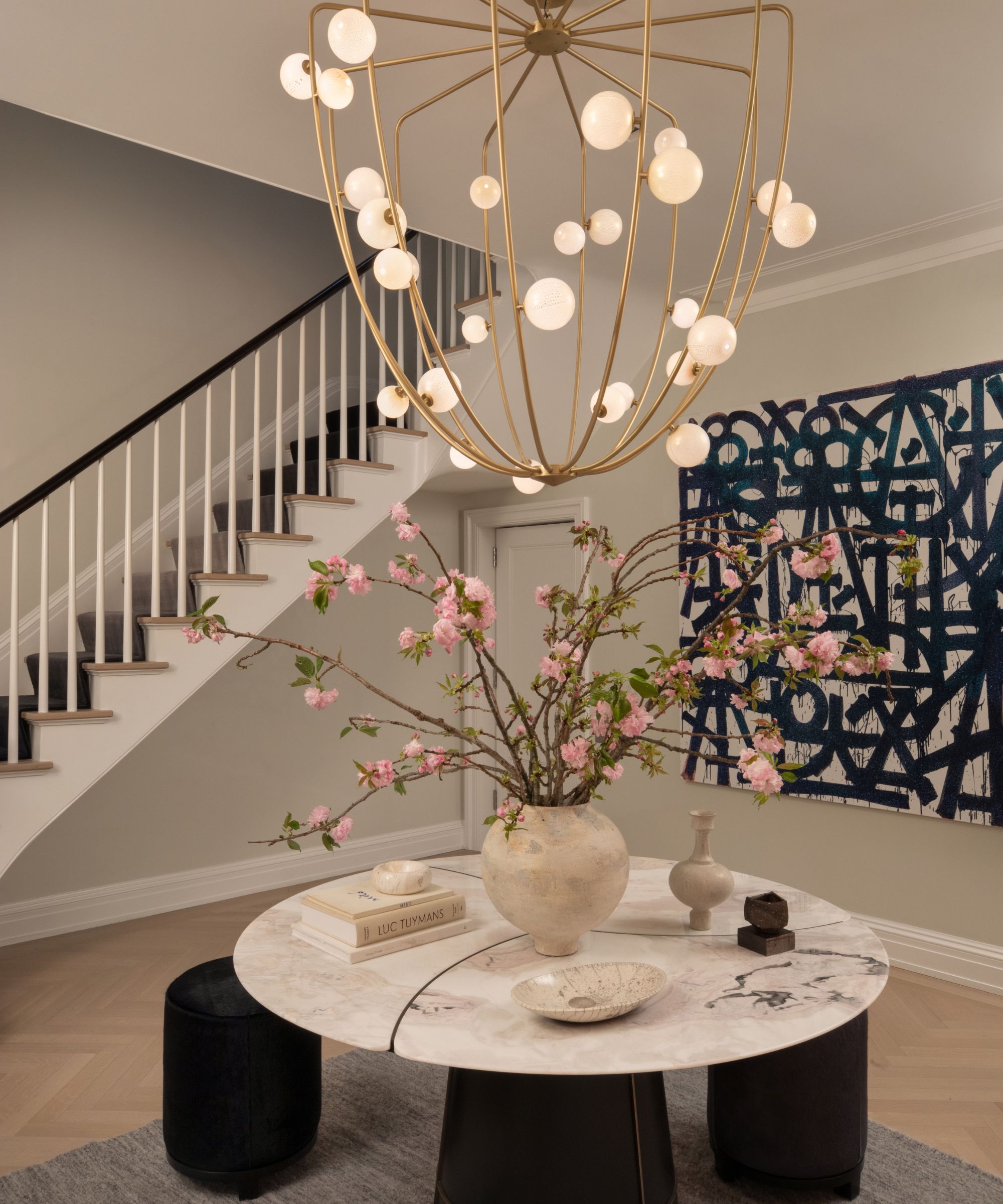
'The decorative lighting throughout the home is one of its most commented-on features,' she says. 'I knew I would start with Lindsey Adelman, whose work I've adored and sourced since discovering her in 2008. I envisioned her Cherry Bomb chandelier above a round table in the far foyer from the moment I first saw the home. The previous owners had left a pretty silk drum light, but I knew we needed a bigger statement, and luckily, my clients were on board.'


'My client's fearless selections of artwork in this home reveal their vibrant personality,' says Christin. 'Their excitement over discovering new emerging artists, commissioning sculptures that bring them joy and remind them of their children, or hosting artists at their home is a testament to their true appreciation for art.'
The family's art collection is featured center stage throughout the home, and ranges from sleek and elegant to exciting and surprising. In this bedroom, pictured above, everything from a basketball jersey to skateboards assemble to form an eye-catching gallery wall. Each piece conveys loads about the family, telling a story in every room of the house. Christin shares that the collection helped to guide her during the design process.
'The clients' art collection served as a significant inspiration during the design process. I often compared the silhouettes of tables and sofas to the art that would inhabit each room to ensure harmony. My goal was to create a space that is both sophisticated and approachable, blending the elegance of bespoke pieces with the inviting comfort of a family home,' she says.


In nearly every room of this home, wallpaper plays a starring role, 'adding layers of texture and pattern to create cozy, inviting spaces despite the grand scale,' says Christin. In the foyer, for example, de Gournay wallcovering in an eye-catching design makes quite the statement – and she shares that the pattern very nearly didn't make the cut.
'I envisioned a dramatic contrast with a darker entry opening to lighter, glossy lacquered walls in the far foyer, where the ceiling opens up to reveal the staircase winding up seven floors,' she says. 'My clients were initially hesitant, concerned about light and preferring more lacquer. I assured them that the de Gournay wallpaper would only enhance the lacquered walls, creating a warmer and more dynamic transition between the two foyers. In the end, they approved it at the last minute, and my team was thrilled.'


The primary bedroom, pictured above, also adopted a bold wallpaper, but with very different results. Here, a delicate floral design melds beautifully with Aux Abris silk panels, a combination that 'transforms the space into a romantic retreat.' In a nearby guest bedroom, too, Lori Weitzner wallcovering 'introduces a touch of femininity, balancing the predominantly male household.'
'The French brand Elitis, along with Aesthetics and Carlisle & Co., provided exceptional vinyl options for the boys’ lounges, the lower-level rec room, and the elevator,' Christin continues. 'For the home office, I chose a charcoal wool felt windowpane from Phillip Jeffries that evokes the sophistication of a men's haberdashery. This choice contrasts beautifully with the striking oak built-ins, offering a modern twist on a classic pairing.'

A cohesive color scheme is everything when working with a large space, and Christin was up to the task. She started with 'soothing neutrals' to counteract the bold impact of the clients' artwork, and introduced textures like wool, felt, mohair, leather, shearling, boucle, natural stone, and oak for a lush, luxurious final look.
'While the home exudes glamour, I aimed for a luxuriously organic feel,' she says. 'Knowing the art would be large-scale and vibrant, I used restraint in the overall color palette to maintain personality without overwhelming the spaces.'
With 'bold and moody elements like the foyer's de Gournay wallpaper and a 'seven-story ombre custom runner in blues and grays' for the staircase, Christin carved out room for statements in the most unexpected places. 'These choices quickly became key color moments, weaving a cohesive thread throughout the home as we moved into each new space and floor,' she says.

'The formal center hall foyer was divided into two distinct vignettes. In the far foyer, I placed a stunning round marble-top table from Italy, serving as a focal point as you enter the home, centered directly beneath the seven-story stairwell winding above,' Christin shares of the above space.
'In contrast, the darker blue mudroom, most often used as the main entryway for the family, offers an elegant take on the casual mudrooms you often see,' she continues. 'We installed a beautiful black marble floor and a custom bench upholstered with leather and mohair. Custom casework cabinetry houses all of the boys' sports equipment, shoes, and coats. While these two spaces are connected, each serves its own unique purpose.'


Because the family loves to host, making space for all sorts of gatherings was key. That's why Christin decided to include not one, but two home bars, one off the formal living room and dining room, and another in a top-floor game room. Each has its own character, but ties in with the overall elegance of the home.
'Both bars are elegant and serve their respective spaces, catering to a family that loves to host and entertain,' she says. 'They needed spaces versatile enough to accommodate everything from formal dinner parties to Notre Dame football viewing parties. The game room, in particular, served as a relaxed, informal space for friends and family gatherings.'


With plenty of room for play, this home also needed a designated workspace, so Christin designed a dark, moody, and oh-so-cozy home office for her clients who work 'almost non-stop' and travel internationally nearly monthly. Her goal was to carve out a space that felt 'handsome and smart while remaining comfortable,' and the final reveal fits the bill.
'The oak custom casework with tambour detailing aligns with the other casework throughout the home, and the windowpane felt wallcovering evokes the sophistication of a men's haberdashery,' she says. 'Wool felt, a fabric I chose several times in the home for upholstery and custom pillows, seamlessly integrates into this space as wallpaper. I also appreciate creating contrasts within a home, and darker rooms can be especially cozy and warm.'
With seven floors, six bedrooms, and 10,000 square feet to work with, transforming this New York City home was no easy task. But by leaning into her clients' personalities and creating space for both fun and functionality, she crafted a true oasis on the Upper East Side.


