I’ve been driving the Mini Cooper electric for the last few weeks now and I just have to call out something on the infotainment system – or rather the Mini OS – that makes it a little bit special.
One of the biggest factors when buying a new car is now whether it has CarPlay or Android Auto compatibility. The ease of being able to connect your phone to the car’s entertainment system and get your contacts, music and maps straight on the central screen is something that most drivers now demand.
Manufacturers are putting increased efforts into their own operating systems though, providing everything from mapping through to games and movies for those times when you’re parked up or charging. Drivers overriding this hard work in favour of a mirror of their mobile phone can seem like a disservice to all the hard work they’ve put in.

Mini’s new OS 9 is unique for a couple of reasons. Firstly, it’s designed to run on a circular display. The 24cm diameter Samsung OLED display is the centrepiece of the car and contains all of the driving dynamics and entertainment options that the new car offers.
The display is based on the original speedometer that sat in a similar position in the first Mini models. Creating a display that makes efficient use of this space is a little different than just showing the speed though. This screen has to show maps, climate controls, music and vehicle settings in addition to the main speed and power gauges.
Managing its own features is one thing, but then displaying CarPlay is something else. Firstly, Apple’s CarPlay display is rectangular and so doesn’t naturally fit in a circular screen without losing a lot of real estate.

Most auto manufacturers also separate the CarPlay features, so they feel like a very separate system to the OEM offering. This usually requires you to exit the CarPlay features to return to the on-board features, and vice versa.
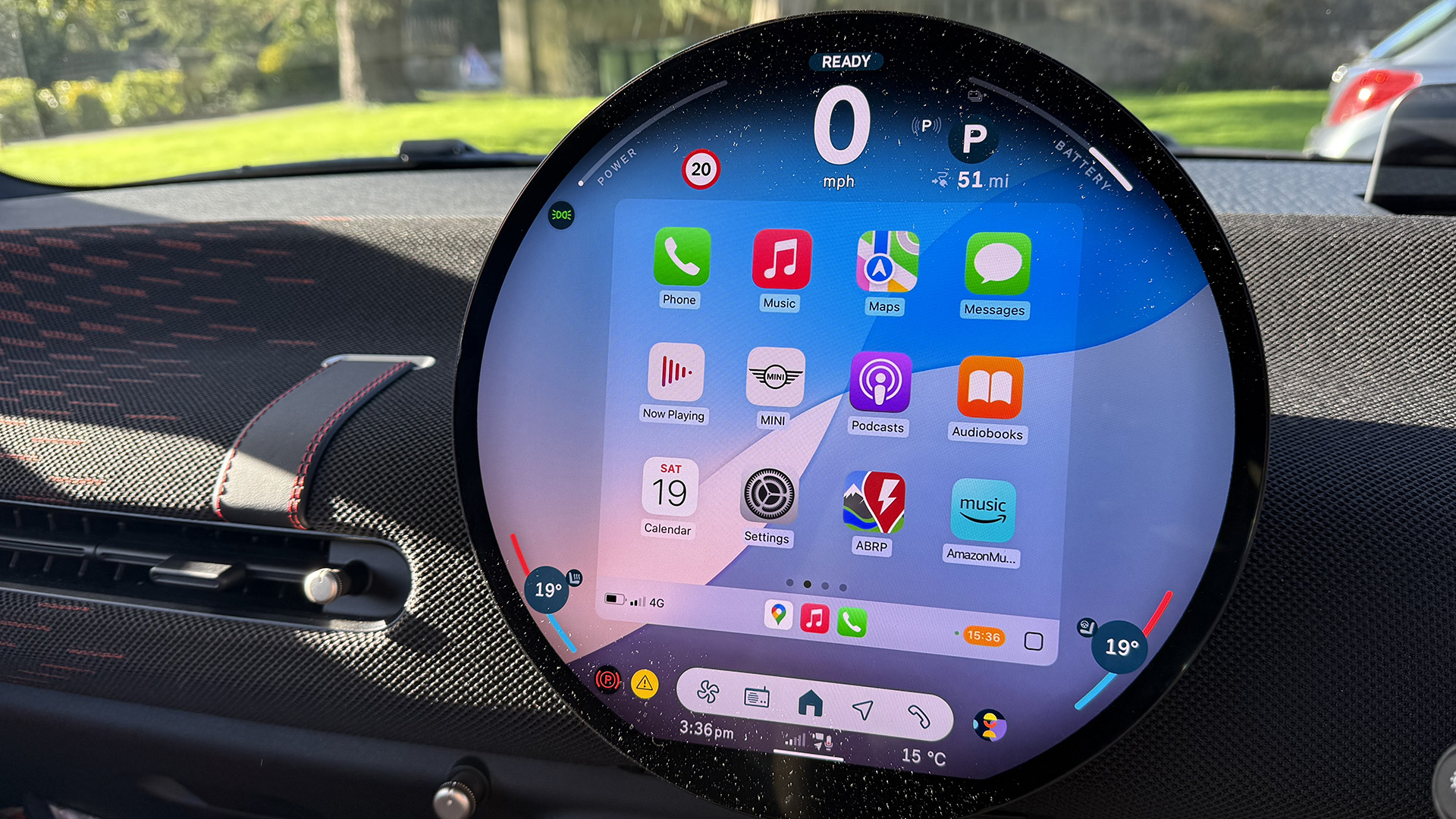
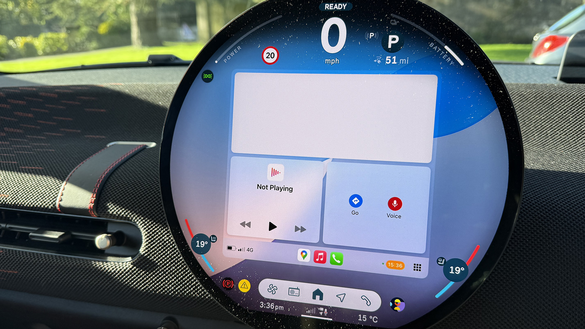
Both CarPlay and Android Auto behave similarly on the Mini OS, connecting wirelessly. Once connected there is a small box that appears just above the main menu to get access into the mirrored system. The CarPlay menu appears in a square box, however ,the background remains transparent, allowing you to still see the Mini wallpaper behind.
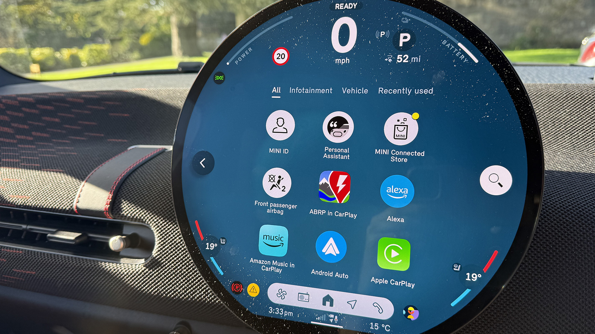
This small concession makes the CarPlay menu feel more at home and a part of the Mini OS. However, it goes one further than that. When you access the main menu of functions on the Mini OS, it displays all of your CarPlay apps among the on-board features. Each one simply has ‘in CarPlay’ added to the app name, so you know where it’s come from.

In this way, the extra features from CarPlay don’t take away from the Mini OS, they simply add to it. Two systems working together. It’s an acknowledgement to the fact that users want to use these apps, but also want some of Mini’s own features.
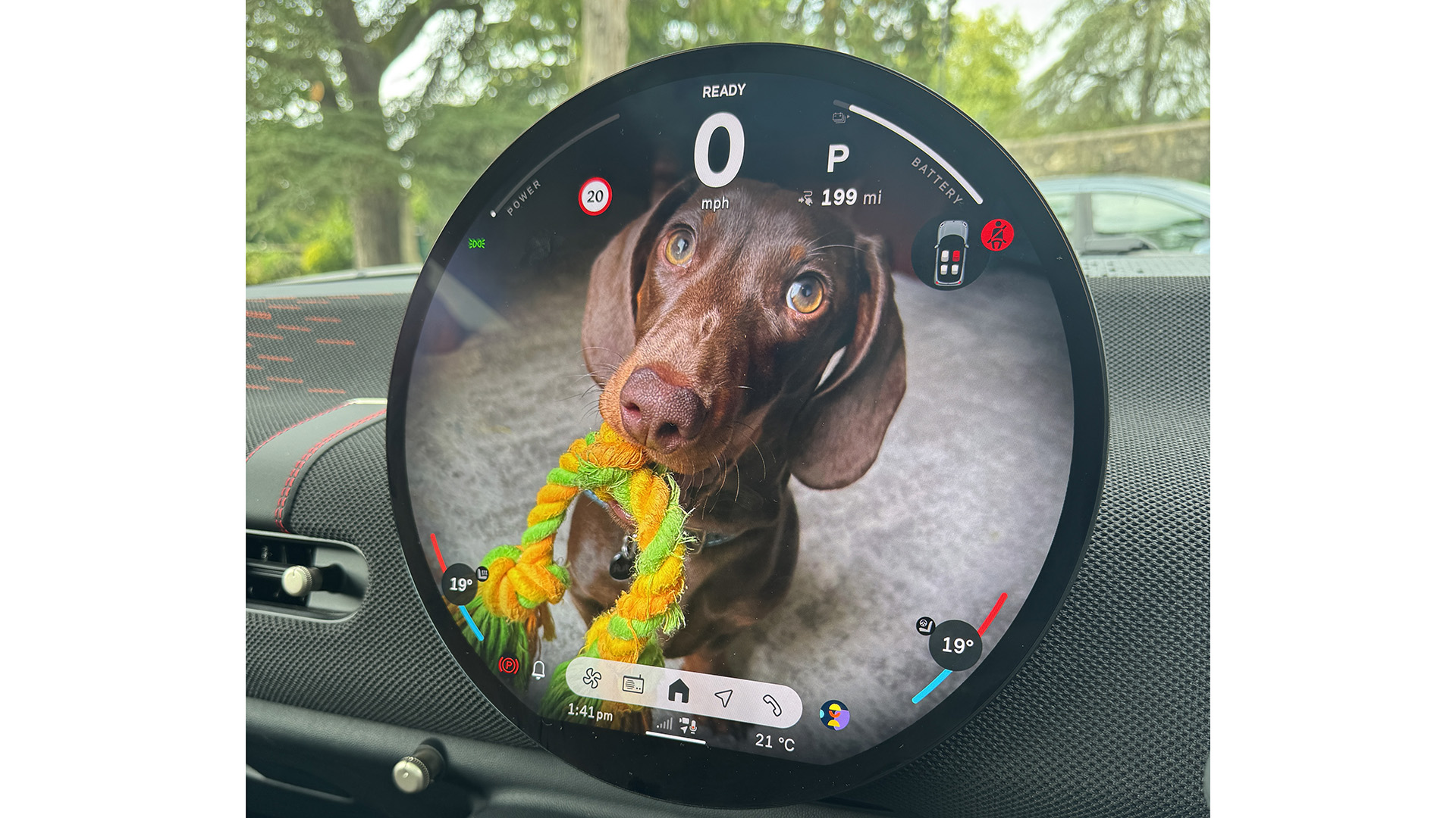
My favourite feature on the Mini OS display is the fact that you can add your own wallpaper to the screen – uploading pictures via a QR code, or via the car’s app. It’s a really nice way to personalise the screen, and is much nicer to look at than your typical CarPlay menu.
I hope more car manufacturers take this inclusive route with their CarPlay and Android Auto dealings. It’s certainly the more sensible way to get drivers to interact with their car’s OS rather than phone’s.


