‘With a very bold, colorful painting, you can go one of two ways,’ muses Sophie Ashby of interior design firm Studio Ashby. ‘You can make everything in the space pale and neutral and let it sit as a pop of color on the wall; or you can use it as a diving-off point for the entire color palette of the room. My preferred approach is obviously the latter.’Happily, Sophie’s clients – a New Zealand-American couple who had recently returned to London from Geneva with their young family – were wholeheartedly aligned with her way of thinking.
‘They already had a real love of decorating with art and a few key pieces,’ she recalls, ‘including an enormous oil painting by Karl Maughan and a photographic print by Fiona Pardington.' 'Those works were there from the very beginning and helped set the tone for the whole house design,' Sophie adds.
The house in question is an Arts and Crafts home in Hampstead, London, originally designed by Sir Guy Dawber, the RIBA Royal Gold Medal-winning architect celebrated for his emphasis on craftsmanship, proportion, and a close relationship with nature. A contemporary kitchen extension and basement conversion had been added a few years ago, but the interiors had dated quickly. ‘All the bones were there,’ says Sophie, ‘but it felt a bit closed-in and fusty.’
What the clients craved was light, openness, and a stronger connection to the garden. ‘Being half South African,’ Sophie adds, ‘I think we shared that Southern Hemisphere instinct – the desperate need to fling open a window wherever you go.’Building on the existing extension and basement, Sophie and her team made some discreet alterations – turning windows into doors and replacing internal ones with black-framed versions – to improve flow and strengthen the connection to the garden.
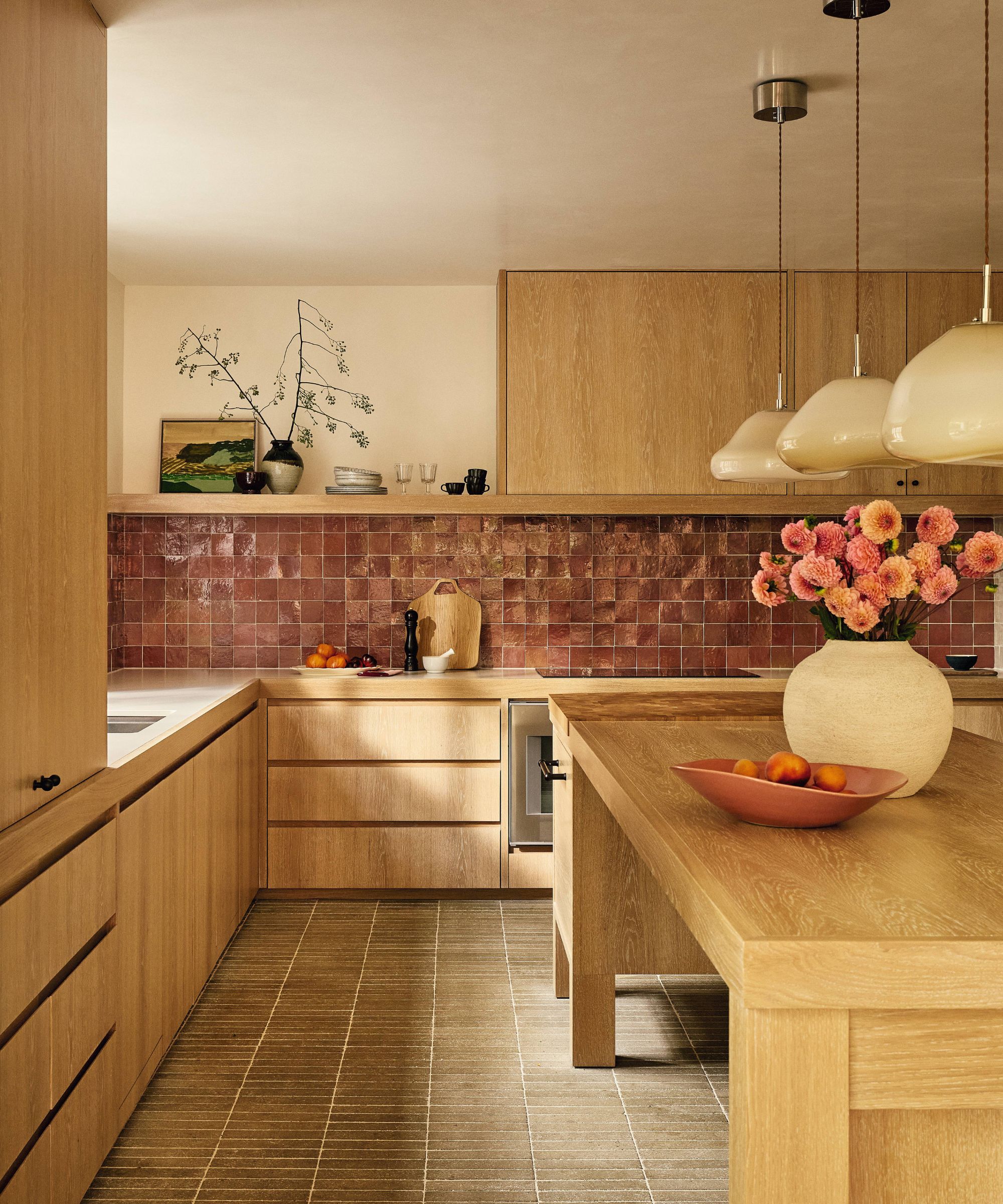
The clunky kitchen layout was reworked, replacing an awkward peninsula unit with a generous central workbench and a hard-working pantry tucked to one side. Cabinetry in limewashed oak, zellige wall tiles, and slender, tumbled composite stone floor tiles in a soft moss hue create a mood that is grounded, tactile, and unfussy.

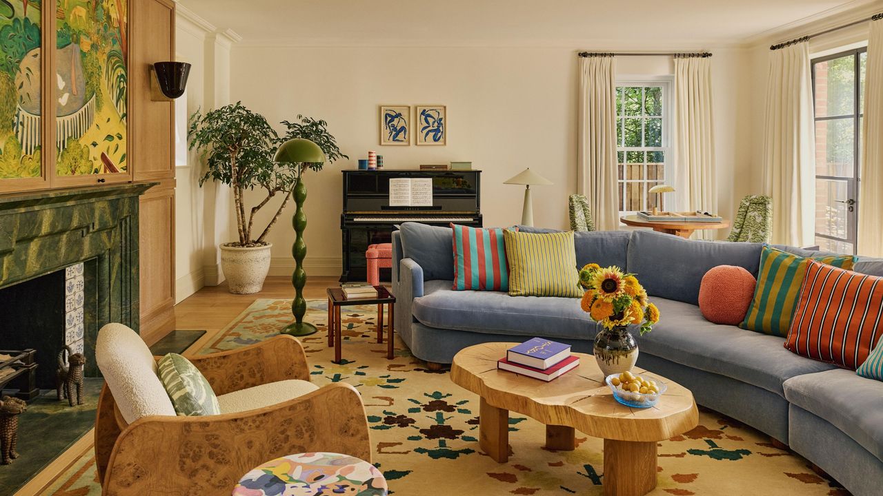
In the living room, an incongruous Art Deco-style fireplace was replaced with one more in keeping with the house’s Arts and Crafts heritage, complete with Delft-style tiles and oak paneling. Above it, a mural by Christabel Forbes depicts Golders Hill Park, a favorite family haunt, and cleverly conceals the TV – one of the studio’s signature tricks. Rather than a classic arrangement of two sofas, a sweeping, sculpted sofa encourages a very different way of living. ‘It says: we’re a young family, we’re casual, we pile on together,’ says Sophie. ‘It completely changes the pace of the room.’
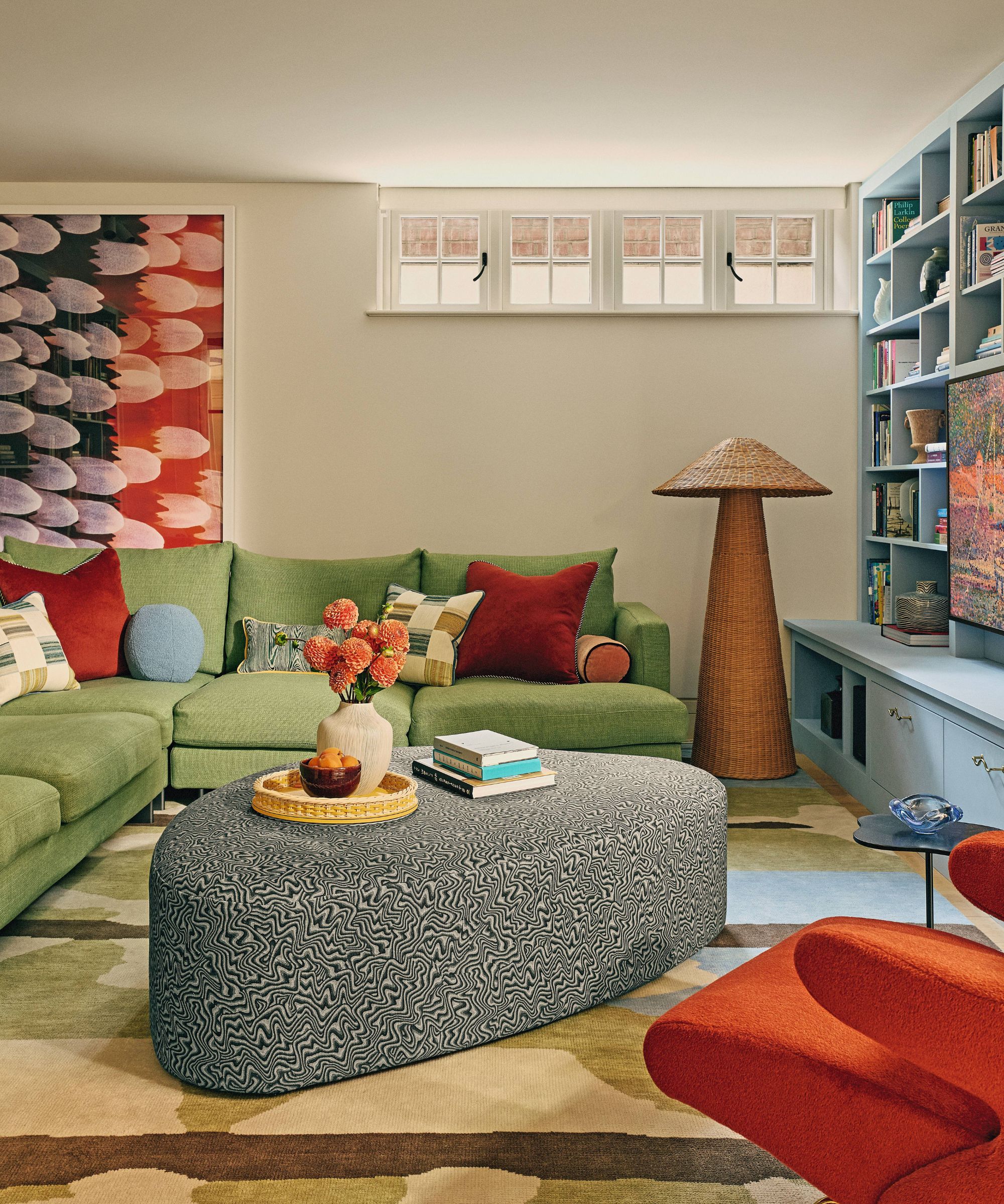
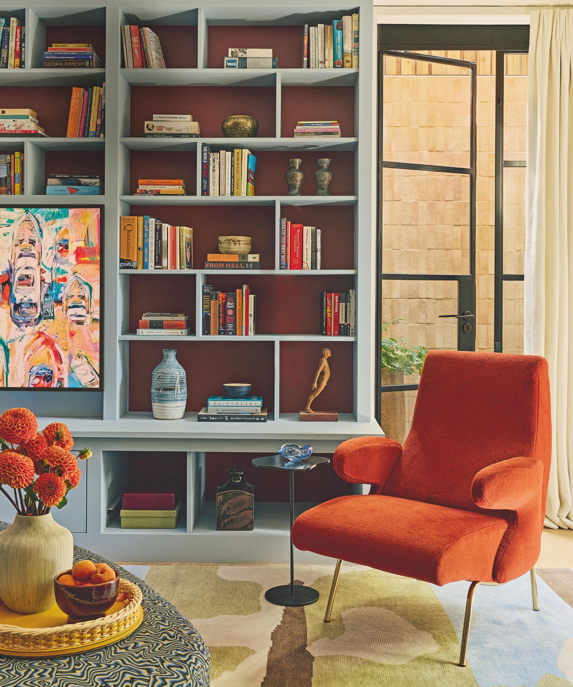
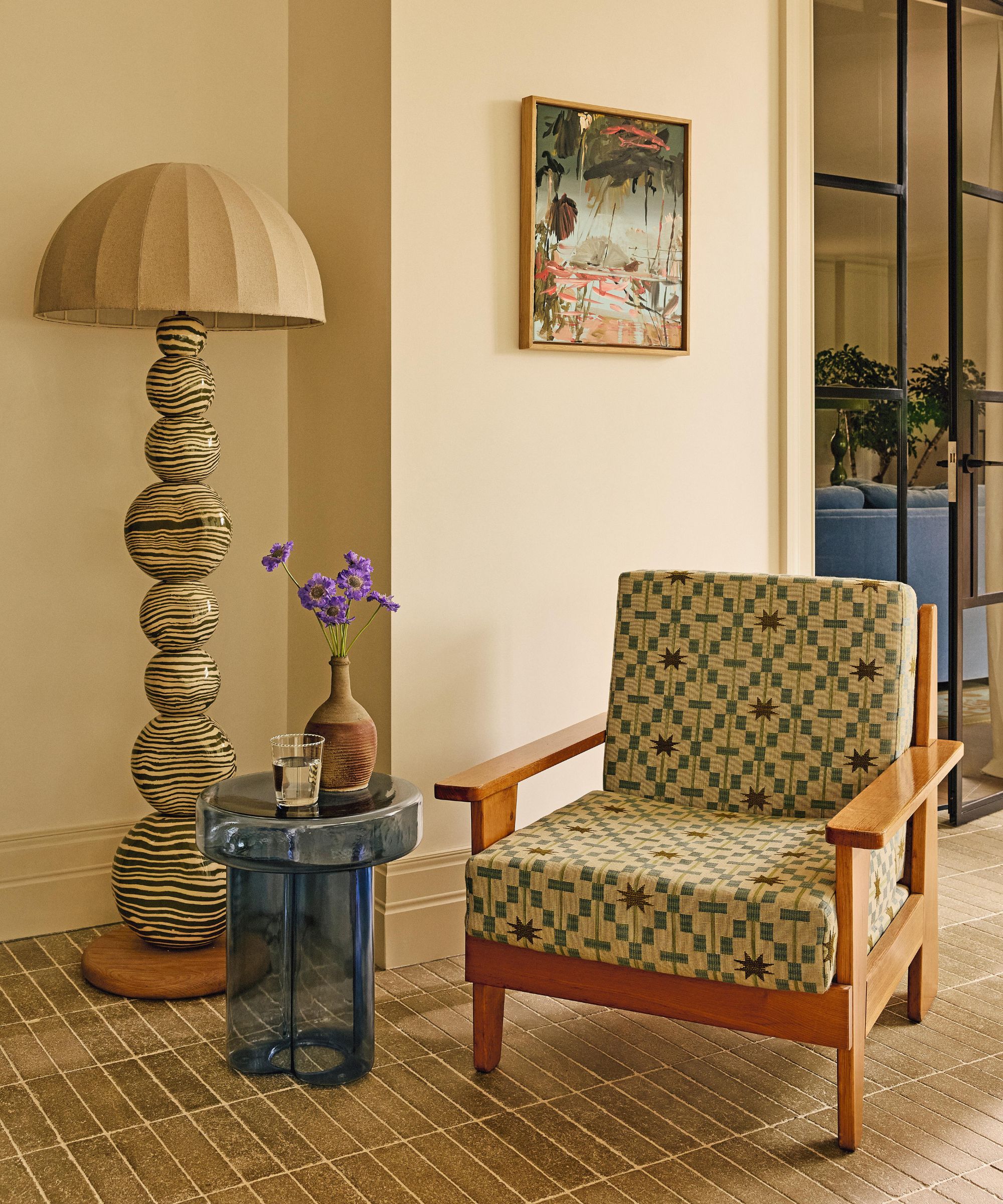
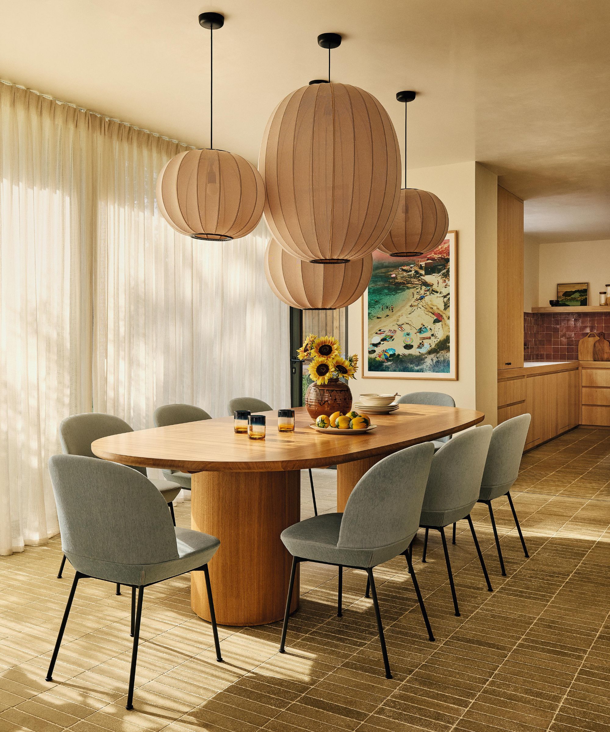
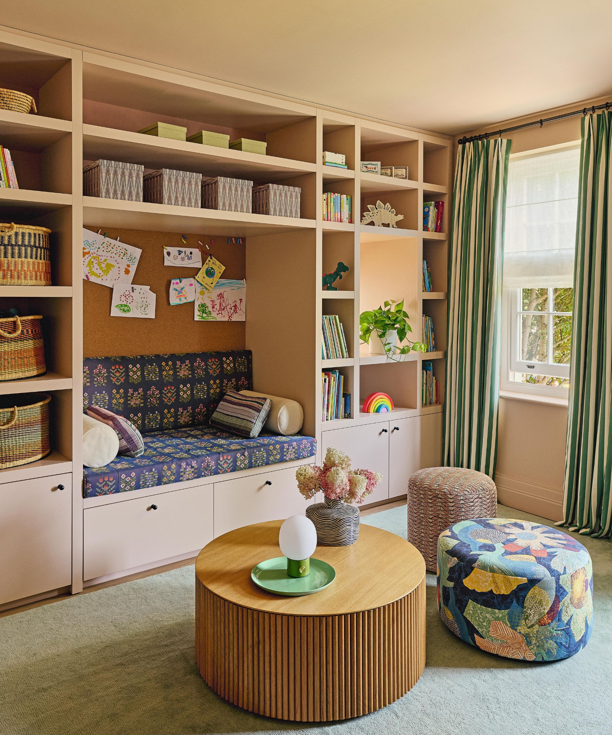
In the family room and playroom, soft ottomans and poufs can be easily scooted around to offer extra perches, while large, plush rugs provide a forgiving landing and help the modestly sized spaces feel more expansive. ‘All the rooms were rectangles or squares, so it was important to introduce organic shapes and an element of surprise into the schemes,’ notes Sophie, referencing the curvaceous armchairs and sculptural lighting, including a cluster of rounded, tactile pendant lights that anchor the dining table in the extension.
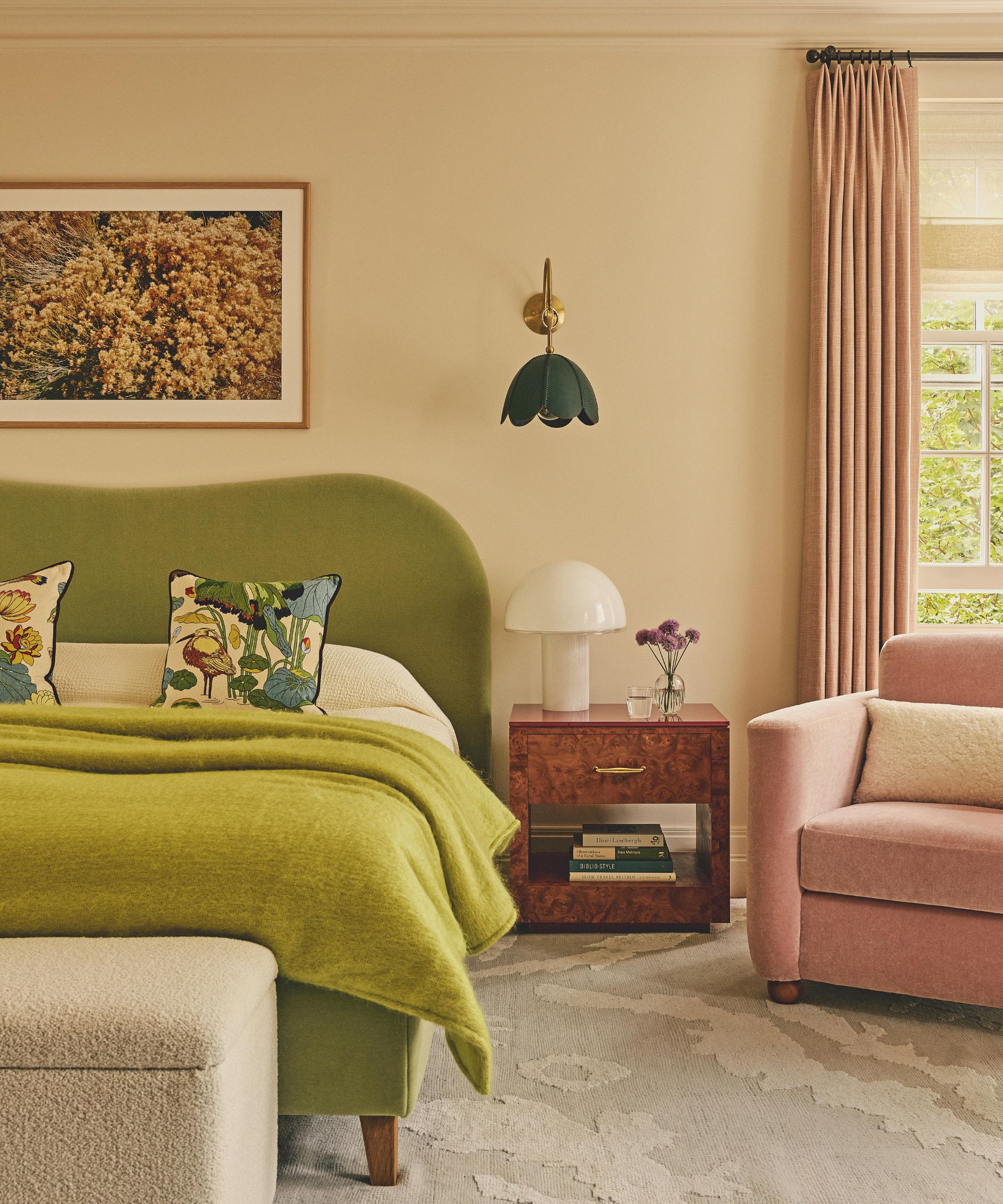
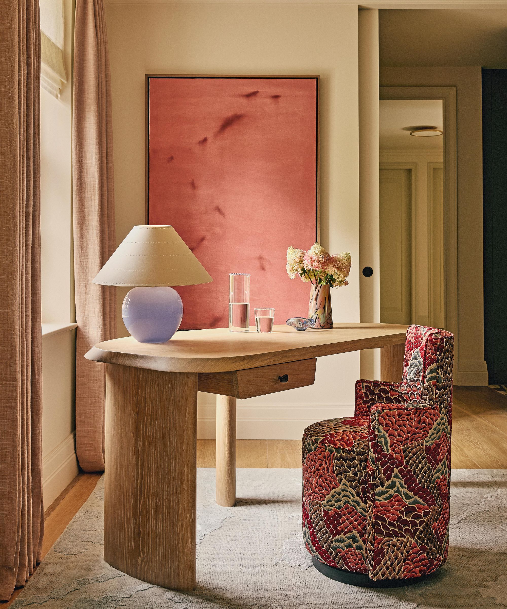
The color palette, meanwhile, takes its cues both from the artwork and the setting. Soft blues, greens, and earthy tones echo the landscape of nearby Hampstead Heath, while rich reds and berry shades nod to the deep red brick of the facade. Patterned textiles and rugs quietly pick up on the shapes and hues found in the art, weaving together an interior that feels layered, joyful, and cohesive. ‘We helped expand the owners’ art collection, and all of these pieces were on the mood boards from the start,’ says Sophie. ‘If art is an afterthought, it never quite ties a space together.’
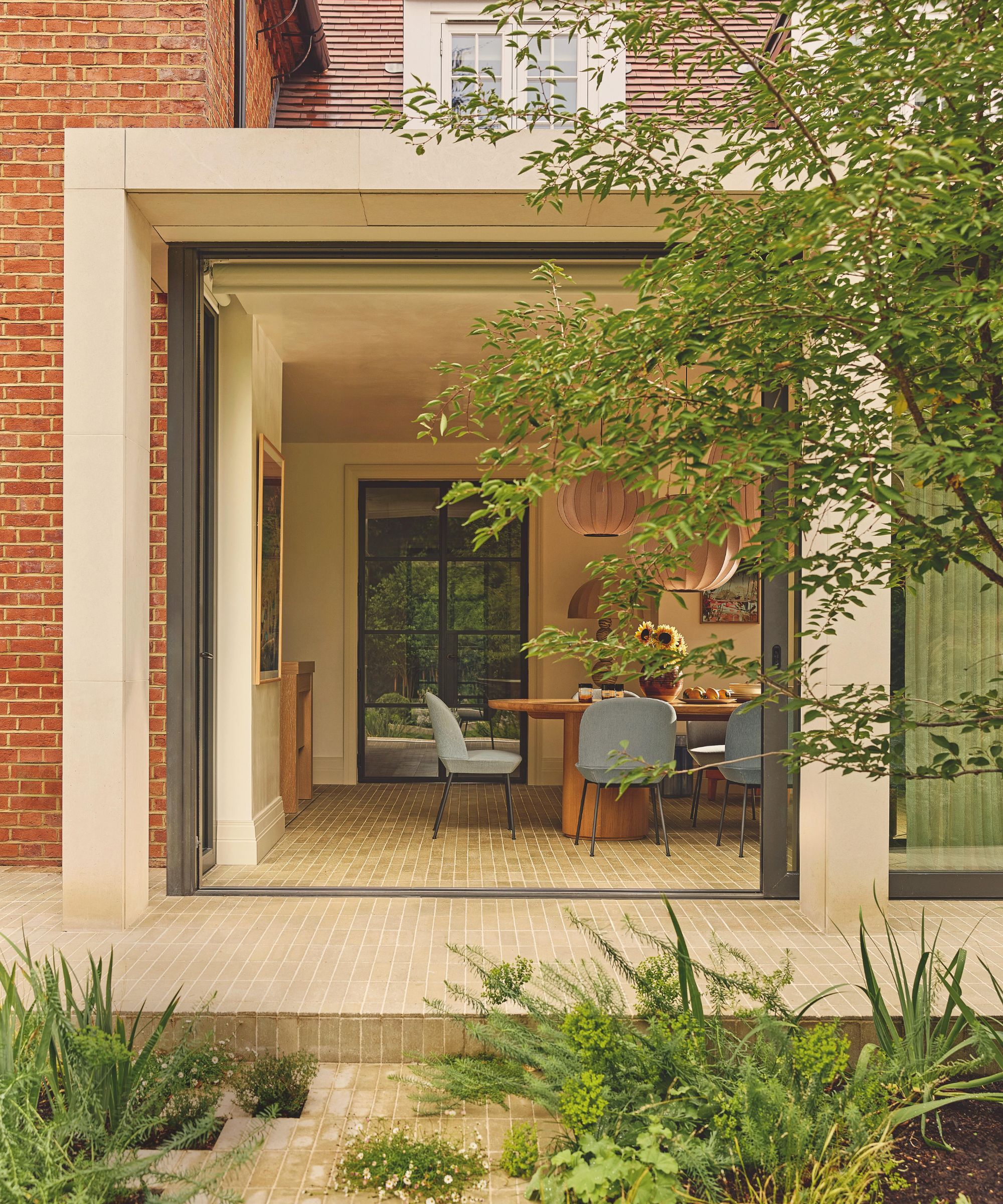
The sense of openness is most apparent in the kitchen and dining space, where vast glazed doors slide back to reveal the garden redesigned by Elizabeth Tyler, with floor tiles continuing from the extension to create a natural, flowing transition. It’s a space designed for everyday family life – generous, flexible, and welcoming – and it perfectly captures the spirit of the home.
Grounded yet joyful, art-led yet entirely practical, this is an Arts and Crafts house refreshed for modern living – and made all the richer for it.
Sophie Ashby's 4 Rules for Choosing Art
- Start with what you love. Trust your instincts and choose art that genuinely speaks to you. Splurge on one piece that moves you, then balance costs by framing postcards, prints or smaller works.
- Think big. Don’t be afraid of scale. A large artwork can anchor a room instantly, lending focus, confidence, and a sense of intention.
- Let color lead the way. Pick out four or five key tones from the artwork and echo them throughout the space. When art leads the palette, design decisions tend to fall into place naturally.
- Follow the feeling. Art doesn’t just inform color; it can shape the entire mood of a room. Pieces with memory, emotion or personal resonance create interiors that feel lived-in and individual.
Love beautiful design ideas, expert advice, and inspiring decor trends? Sign up for our newsletter and get the latest features delivered straight to your inbox.