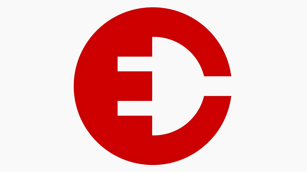
We love a nice use of negative space here at Creative Bloq, and the technique has been used for such timeless logo design secrets as the hidden symbol in the FedEx logo. These days even DJs have logos, and DJ Étienne de Crécy's is plugged into the design trend.
The French electronic music DJ and producer, also known as Superdiscount, EDC, Minos Pour Main Basse, uses a sharp minimalist emblem that manages to include both his initials and a nod to the style of music he makes.

Recently receiving a lot of acclaim on a design subreddit, Étienne de Crécy's EDC logo features the three initial letters of his name: The 'E' sits inside the 'C' but the absence of any border makes the two letters appear as a single shape in red. The 'D' is formed by the negative space that's left, but there's another side to the logo, because the negative space also forms the shape of the two-pronged electric plug used in much of Europe (EDC makes electronic music)
Sometimes attempts to put an Easter egg like this in a logo design feel forced and end up being confusing. Or sometimes they take too long to get and people don't even realise that they're there. But this design is wonderfully executed in its simplicity, and both interpretations of the design are immediate.
For more recent logo design news, see the new Loewe x On hybrid logo and the new Asda logo.


