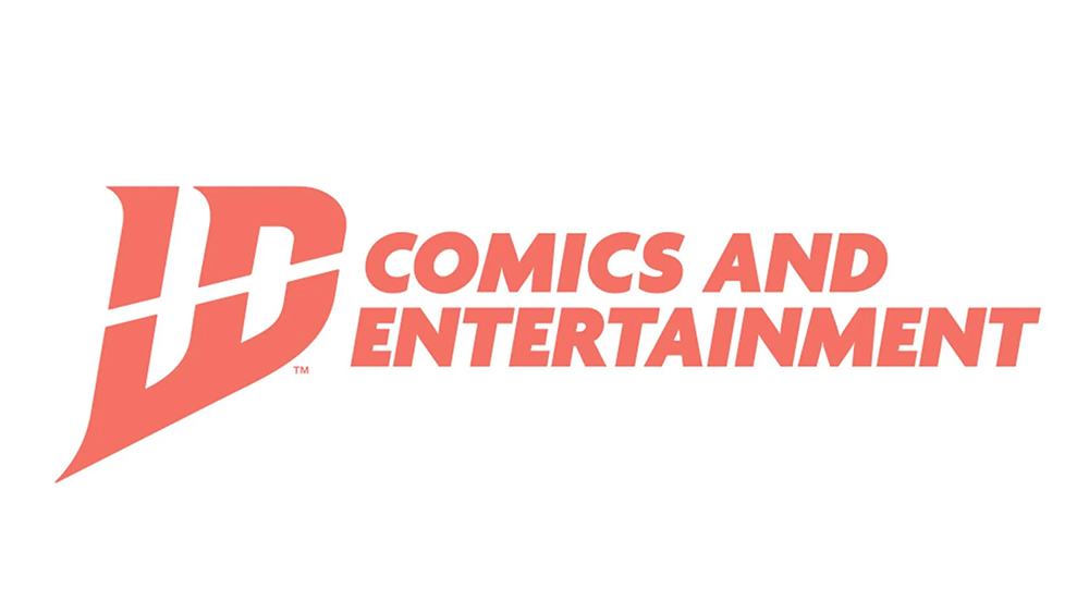
IDW Publishing has revealed a new logo at New York Comic Con as its marks its 26th anniversary in the industry, but fans are confused – and so am I. Is this a straight rebranding, or has IDW also changed its name? I wrote recently about the emerging trend of unreadable typography in logo design, but this isn't what I meant.
IDW is best known for its successful relaunch of the Teenage Mutant Ninja Turtles series as well as a wide range of comics based on TV series, including Doctor Who and Star Trek. However, it's been through a difficult period, implementing heavy staff cuts last year as it delisted from the New York Stock Exchange.
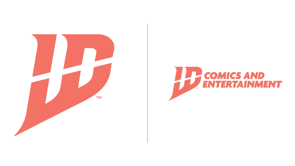
The new logo is intended to cleverly combine the initials IDW, taking the tops of the letters 'ID' and the bottom of a 'W'. IDW Publishing describes the design as a bold and celebratory, and inspired by the company's history. But it bears no resemblance to the brand's classic lightbulb logo design.
"As we turn the page to a new chapter at IDW Publishing, our rebrand is more than a new look—it's a signal of our renewed commitment to creativity and storytelling. With this bold new logo, we are not just revisiting our roots but pushing forward to redefine what a comic book publisher can be," says director of marketing Aub Driver.
The new design does have a certain dynamism and energy, but key to a successful logo is immediacy. Recognition and interpretation should be instant. That applies to the best 3-letter logos even more so since they have to do a lot with limited forms.
This is a logo design rule that can be broken when there's good reason, but IDW logo doesn't have a good reason. It isn't hard to read exactly: it just looks like it says something else: LD. Perhaps ID, or even INW at a push, but it takes a prolonged glance to see 'IDW'.
Colour could perhaps make it easier to interpret, although I'm still not convinced it would work. Others seem to feel the same way. "Holy hell, I would never guess that's supposed to say IDW," was one comment on the former Twitter.
Oh my gods the new IDW logo is the most amateurish terrible piece of design I’ve seen in a long time.But it really does match the share price. Give me my rights back to wormwood freely please. & don’t let creators find out their involvement in media projects via press release pic.twitter.com/Lga1zkPUIYOctober 16, 2024
IDW is due to announce more plans for its future at New York Comic Con at 2.15pm on Friday (October 18) in a panel entitled the panel IDW Publishing: The Next 25 Years Fears. It isn't the only big comic publisher to rebrand lately. The DC Comics logo has been updated – or rather it went back to its old logo to tap into its legacy value.


