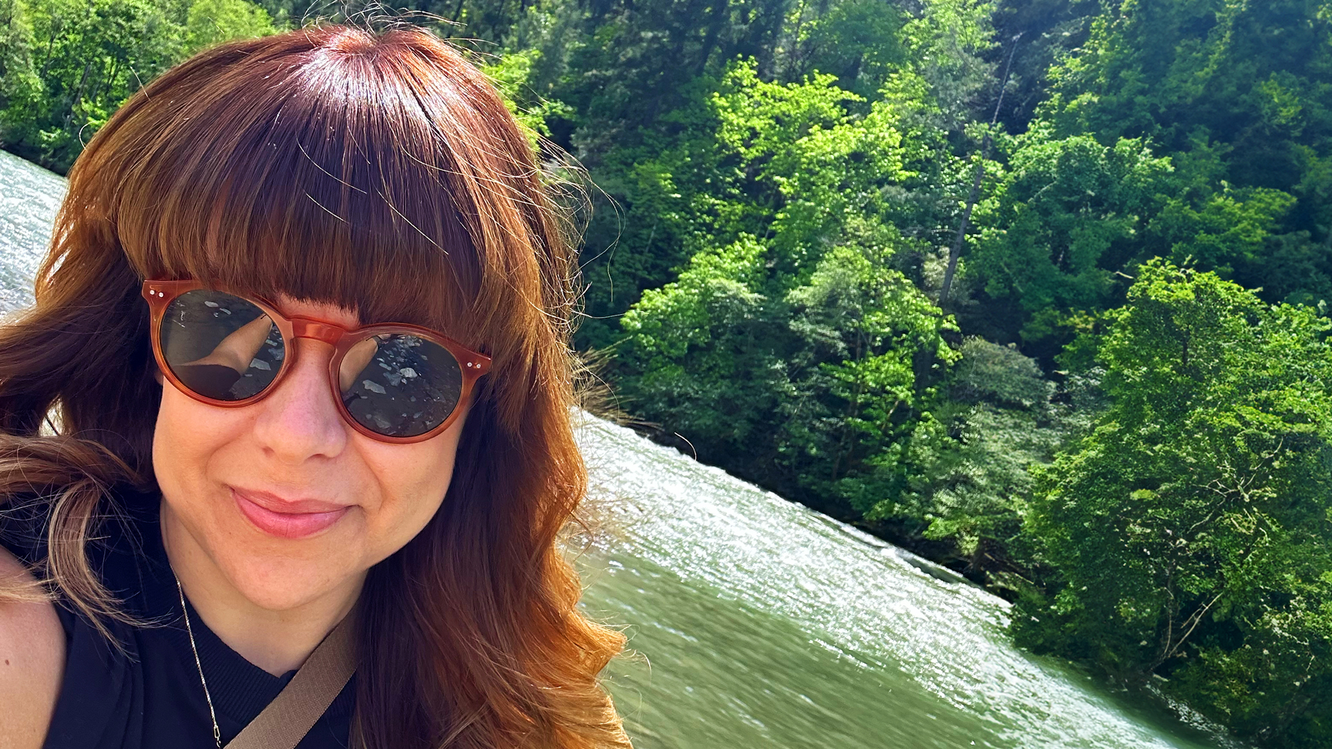
Stacey Bates-McCue's career began with what she describes as "confusion". After starting a Fine Art degree, she ended up doing a work placement at a graphic design consultancy, leading her to drop out of uni, and she hasn't looked back since.
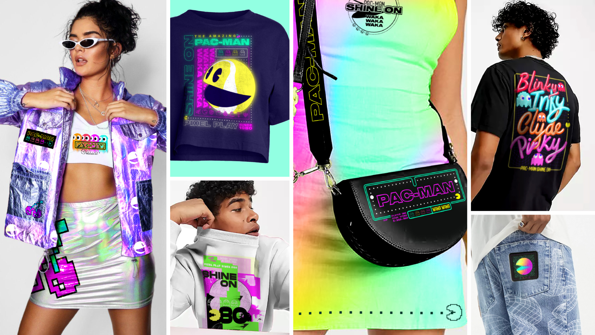
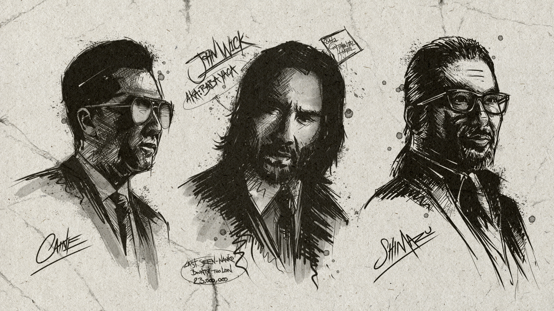
She now heads up Fluid's Licensing team, and delivers innovative and engaging design solutions for global entertainment across film, gaming, sports and TV. She's worked with well-loved brands including John Wick, Pac-Man, Capcom, SpongeBob, Tetris and more, and her Pac-Man Shine On campaign recently won at the Global Entertainment Awards.
As part of our regular Day in the life series, where we lift the lid on creative's careers, I chatted to her about the importance of a good style guide, inclusivity when it comes to toys and how fans of a game can help bring its graphics to life.
Tell me about a typical day in your role
Every day is so varied, some days I am back to back on calls and others I get to be creative and build creative direction for a new project for us at Fluid.
My day tends to start around 9:15am after dropping my two sons to school and pre-school, so it already feels like lunchtime for me. I check in with my team on Discord, normally a silly GIF of a tired cat, and then plan my day around my meeting schedules. The wonderful Rosemary (PM) will normally shout of anything that's come in overnight from our US clients and then we run through all the live jobs together.
The one thing that has kept me so happy at Fluid for the past 8 years is the variety the role brings. One morning I am looking at pre-school CG renders, the next working on John Wick! It’s always full of variety.
I tend to stop work at 2:30pm to collect my children and then hop back onto work from 4pm until the evening. I do a lot of client calls with people in the US, which I love as the evening is when I relax into my creative space and wind down for the evening.
I am really lucky that my role allows flexibility to still be a mum too, so although it’s a daily juggle, it’s one I wouldn’t swap for the world.
What drew you to working in licensing creative?
It was a natural path for me. Even at the age of 40, I am such a kid at heart, so working in kids licensing early on in my career was a passion and a dream come true for me. I love the fact that consumer products touch so many parts of everyday life and allows us to celebrate our love of TV, film, gaming and the general entertainment space. It’s inclusive for people who might not be into sports for example, this is our version of a team shirt!
What was your early career like?
It started off with confusion really, as I was doing a Fine Art Degree and after my first year I questioned what on earth I was going to do for a job at the end of it all. I knew I loved painting and general creative, but I just couldn’t put that into a career plan.
My brother said I should try some free work placements to test out some career options, and my first was a Graphic Design Consultancy called Chameleon Design. They worked on Thomas cook brochures, technical drawings and did some really cool photography in-house. I spent three days there, fell in love and they offered me a full time position as their junior! I jumped at the chance, and ditched out at Uni! I was there for two years and loved every second. I was taught on the job as well as lots of self learning courses at home as my passion for the industry grew.
I moved on to being a graphic designer in-house for a UK Hotel chain. The variety and fast moving pace was great to enhance my newfound design skills as a graphic designer. I ended up being tasked to create a four page menu, comic, and activity sheet across the 12 hotels. For the comic they asked me to create bespoke cartoon characters and build out a story where the characters went from hotel to hotel, but made fun. I ended up building out Marston Mike (a monkey) and his jungle pals. I designed, wrote and built the entire comic and loved every second, it’s then I realised I wanted to work in the kids entertainment space.
A couple of years later, I went for my first role in London at MTV networks as a kids publishing designer. I was praised for my comic, and it just confirmed that was what I was meant to do. From there my love for licensing and the entertainment industry grew. I worked at MTV for 6 years, then moved on to Cartoon Network, and then SEGA video games looking after the little blue Hedgehog among other properties!
Which project are you the most proud of and why?
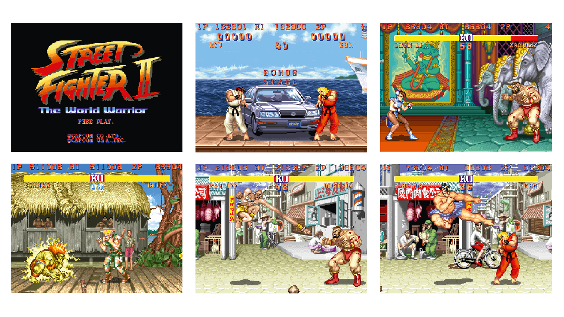
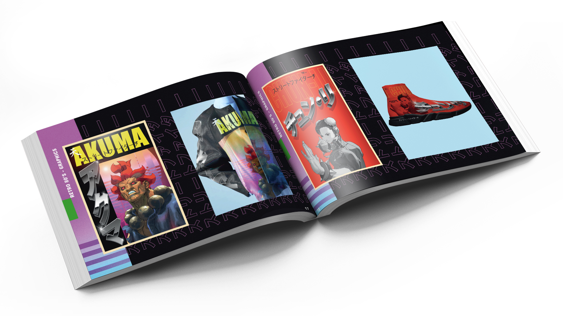
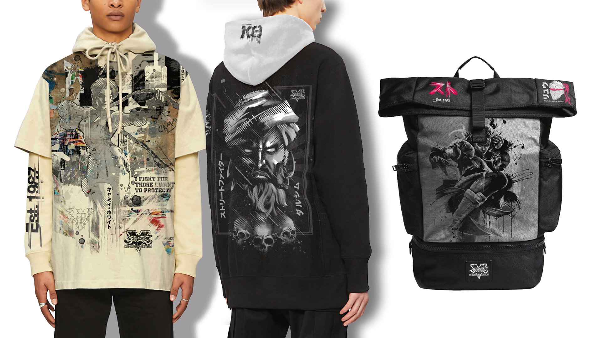
That’s a tough one! Still to this day what we did on Street Fighter for Capcom is an awesome project I look back on and think, 'wow that’s so cool!' Getting to celebrate such an iconic gaming brand that I grew up with was a pure fangirl moment. We recreated pixel by pixel key game scenes, characters, fight scenes and those super cool Easter egg moments I know fans like me were eager to see across the products. That’s the thing with gaming, it’s so easy to fall into the ‘promotional merch’ bucket, but it takes real fans of the game to bring the graphics to life in a cool and trendy way!
You’ve worked on a lot of big brands, which one was most surprising to work on?
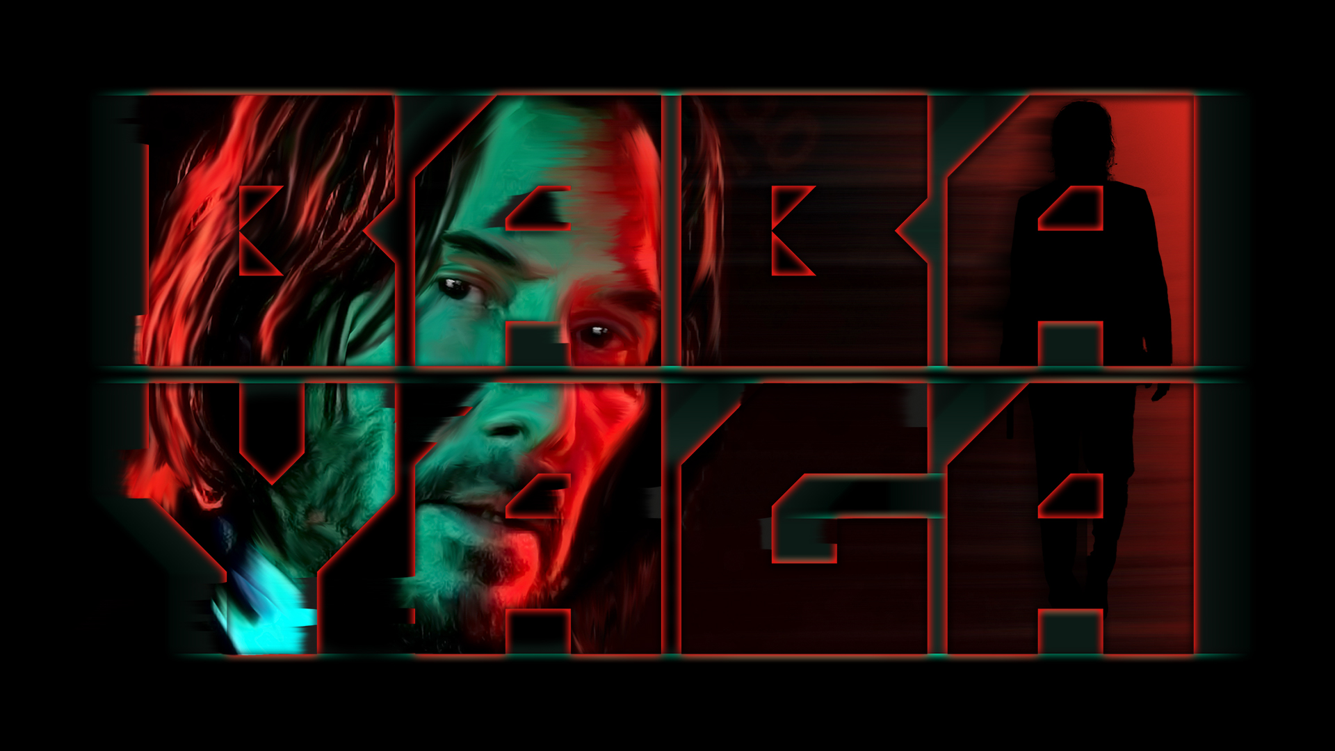
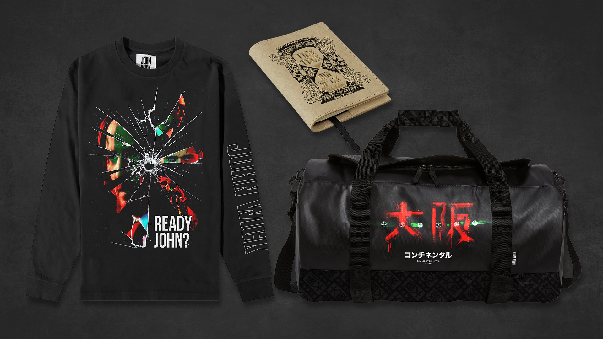
I think John Wick surprised me a lot. I thought working with so much talent, approvals and amends of likeness might have been a strain on the creativity within the project and it was the total opposite. The guide for John Wick 4 was a pure joy to work on for the team and I. The approvals on talent was so easy, and we even got to see a smiling Keanu Reeves in the Lionsgate office holding up our designs in awe! What a moment to treasure!
Tell me about a tricky work-related challenge and how you approached it
I think when a brand has such tight guidelines, you could see it as creativity being wrapped in red tape, but we don’t look at it that way. We think 'ok, so where can we push the box walls down and show new creative things that other agencies haven't been able to do before?' It’s a challenge that we accept rather than see as a hindrance.
What do you do when you get stuck for ideas?
Walk away… It will come eventually. I allow myself and my team to take some time out if the ideas don’t come naturally. No one wants to see a style guide that has been shoehorned into something, that’s just nasty design.
I remember my days as a designer sometimes staring at a blank screen and thinking 'come on Stace', but nothing! A creative mind should have the space to breathe, and although we work on multiple projects and deadlines can be tight, we are not doctors and nurses saving the world. So chill out, move on to something else, reengage with the core creative process and allow another path to open up to you. It really sounds cheesy, but it works!
What makes a good style guide?
Now this is easy, it has to be usable! So many years as a designer I would open up a new guide excited to create something bespoke and feel utterly deflated when the graphics were locked, flattened and dare I say it somewhat ‘samey’. It’s so important to think of a guide like a kit of parts. Some designs should be print and go, but of course layered, and some should be there to inspire building your own! I want all our guides to have a longevity to them that can be elevated, aged up or down, move direction, added to and of course feel true to the IP. If the graphics don’t ooze DNA in everything from editorial to a simple icon, then we haven't done our job correctly.
How important is brand voice to a style guide?
It should be the loudest voice heard. I think working in video games has taught me that more than any other job. Gamer fans are so dedicated and will seek out the finest of details in every aspect you do. I will say, rightly so! If you're a fan, you want to see details done right.
We really geek out here at Fluid on the core DNA of every IP whether it be a brand new IP, or one that had over 40 years of nostalgia attached to it. Researching a brand before we prepare to build out creative is a really important and lengthy first phase for us. It shows our clients we want to be ambassadors too, and means the creative we set has guts to it and means something to the consumer.
When working on well-known and loved brands, how do you balance respecting the brand yet moving things forward?
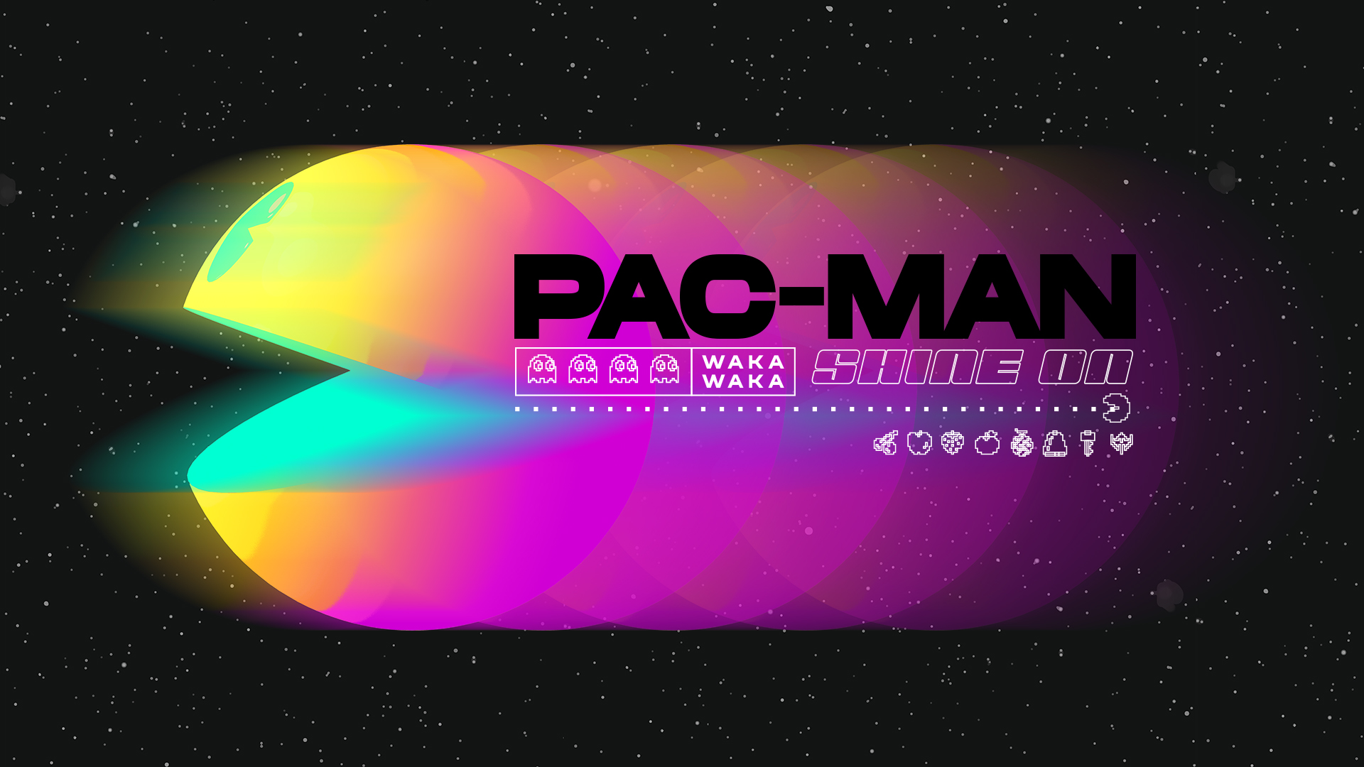
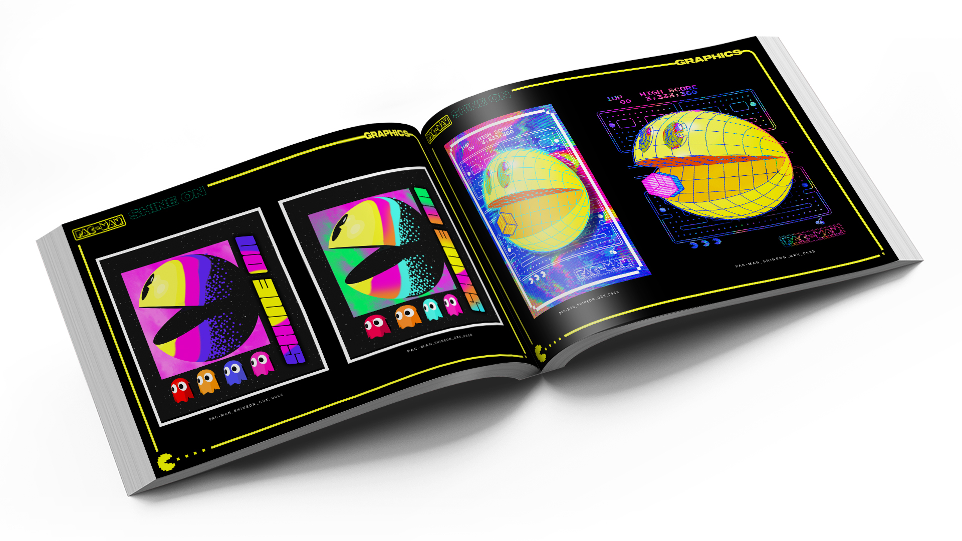
The balance is more of a celebration. For example when we were tasked to work on the Pac-Man Shine on campaign, we had to focus on the future of where and who Pac-Man could reach, but not forget about where the game started and the core fans that have been dedicated since day dot.
A gentle balance of the two creative styles with a modern product design helps blend and merge the two aspects of the IP and shows fans new and old how cool the game has been and where it’s heading. We focused on the neon aspect of the gameplay to tie the two together. It helped act as a bridge to allow the new, current and future work well together keeping the DNA of Pac-Man strong!
How inclusive is the design industry?
It’s quite rare these days that we get a brief that is gender or even target age specific anymore, and I love that! I hope one day we can see the back of the blue and pink aisle at the toy store and merge our love of characters across the globe. We try to make all our guides inclusive across mass and specialty consumer tiers. This means core, simple, but clever designs, right through to in-ya-face let’s go crazy and celebrate why we love design!
Who’s your dream client?
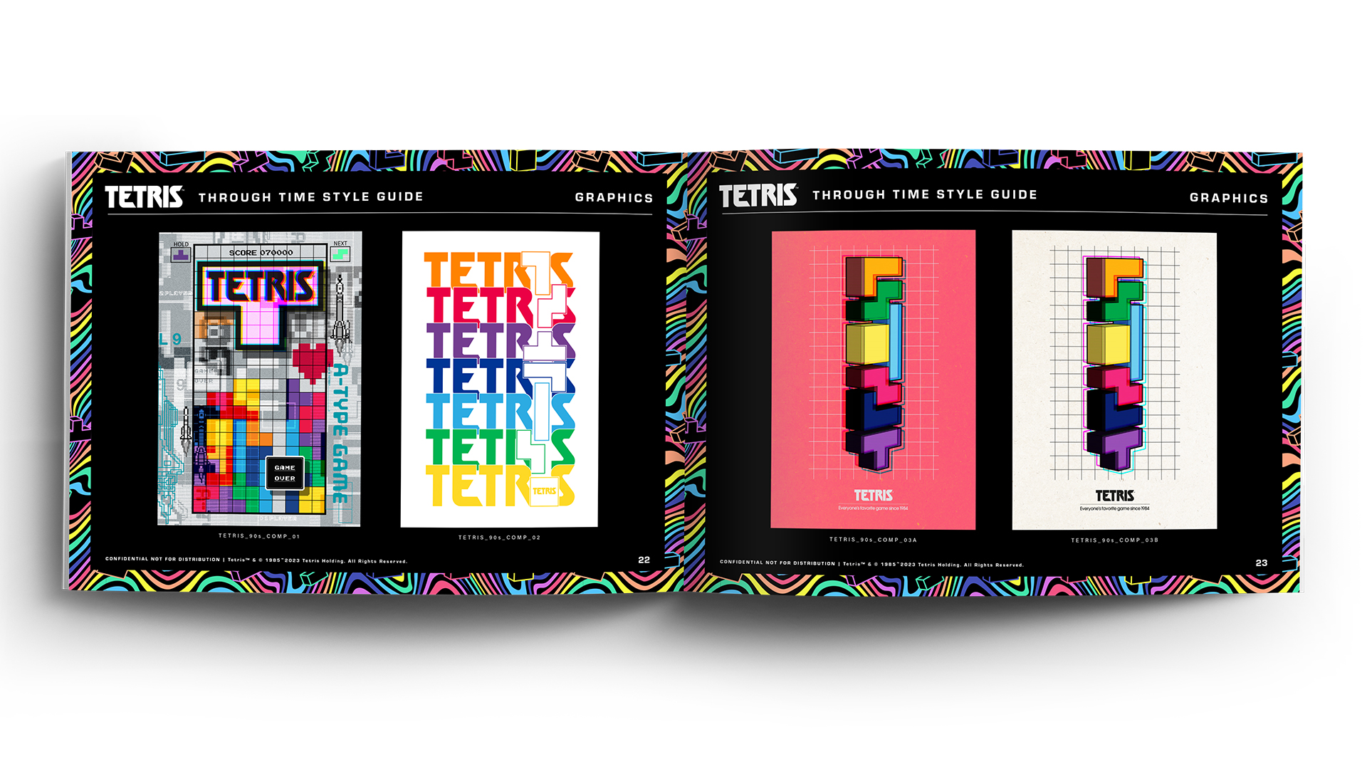
I am already working with them! I’m a fan of film and retro gaming so working on the projects I have over the past eight years at Fluid has totally fed my appetite! A highlight for me was meeting Henk Rogers and Alexey Pagitnov, who co-created Tetris. I mean they were looking at our style guide with such awe and inspiration, it was a pleasure to be seen and be a part of making the Tetris through Time style guide. Celebrating 40 years of such an iconic game, reminding the world what is so special about the brand and allowing the creative boundaries to widen with the Tetris team was an incredible achievement for me.
What career advice would you give your younger self?
Enjoy what you do! The day you don’t, move on and find something new to enhance and challenge your creativity! Also, see challenges and hurdles in the workplace as nothing but positive learning, it’s always so hard to see at the time. All these things build the structure of you, and build your skills in so many aspects of what you do.
Find out more about Fluid.


