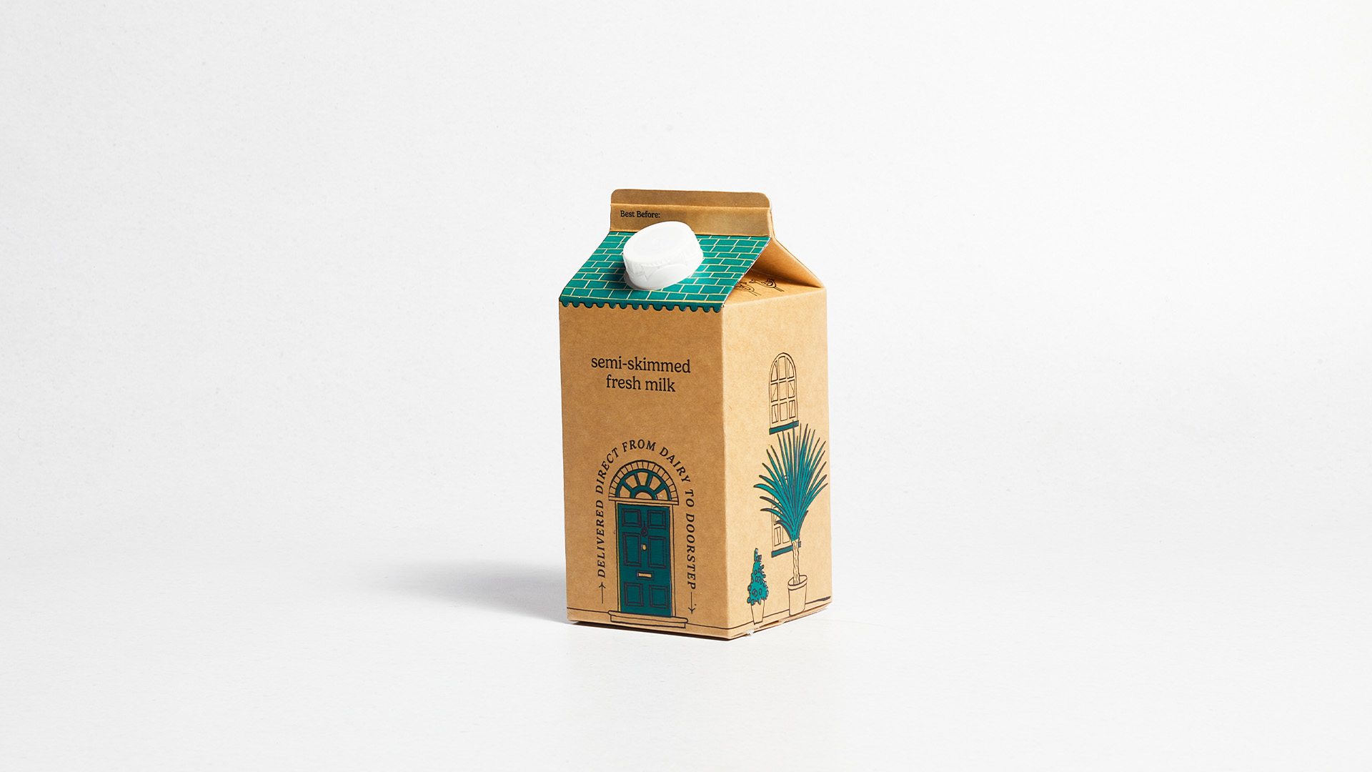
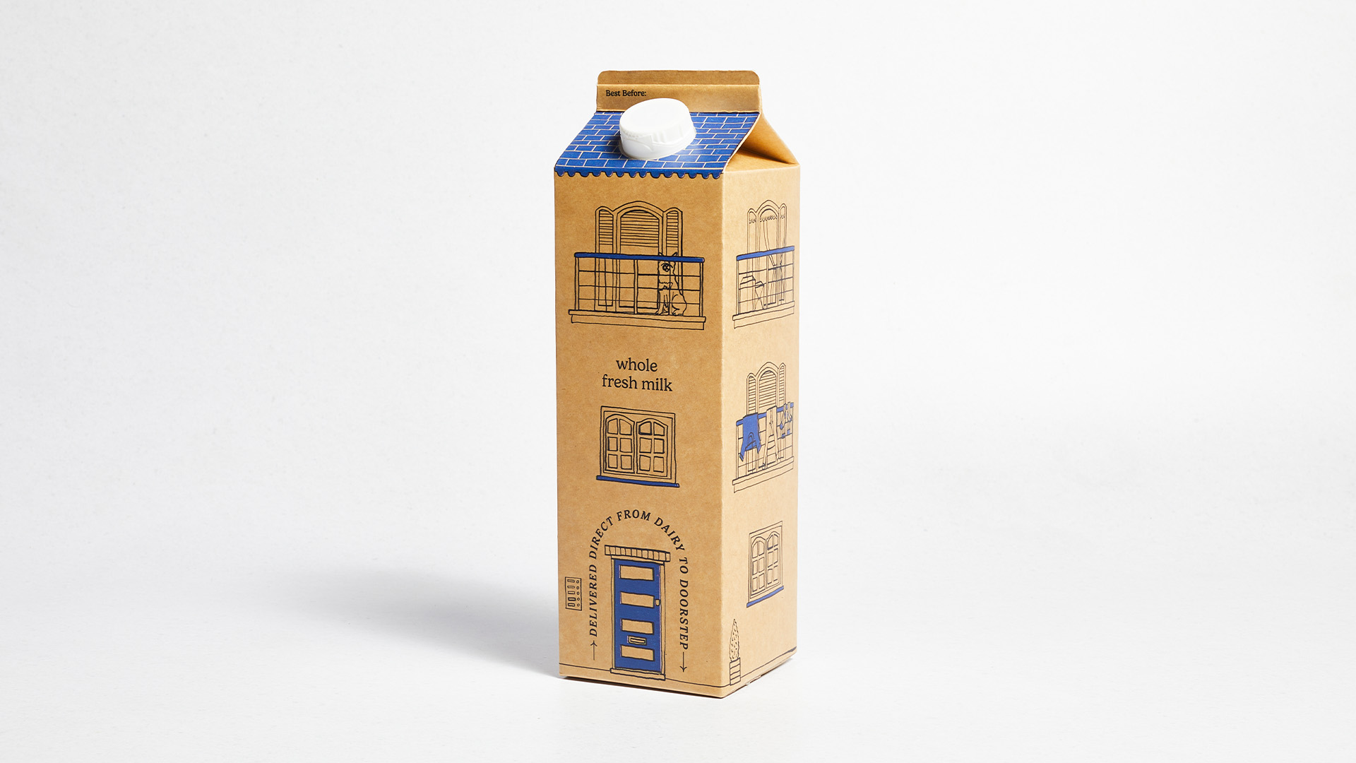
Dairy manufacturers Milk & More has unveiled a cute collection of custom milk cartons, blending delightful design with interactive play. Adorable architecture-inspired packaging isn't all the brand brings to the breakfast table, as each carton features custom QR codes that extend the joy – from exclusive offers to competitions.
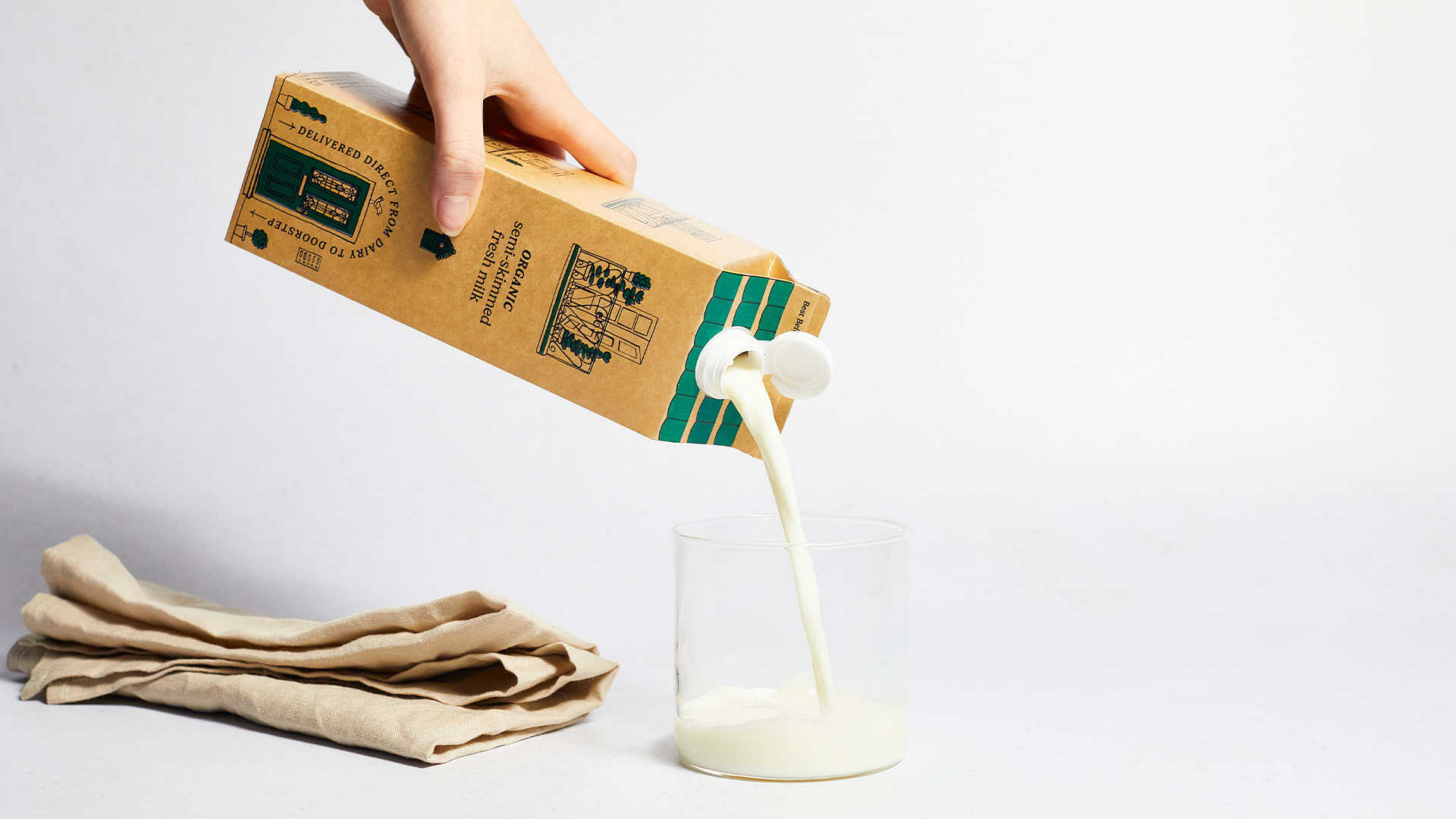
Packaging design can be a difficult thing to master, but Milk & More has expertly captured the style and playfulness needed to stand out against the competition. It's not all about aesthetics, as each carton uses recyclable paperboard, giving each design a delightfully bespoke feel that perfectly matches the whimsical illustrations.
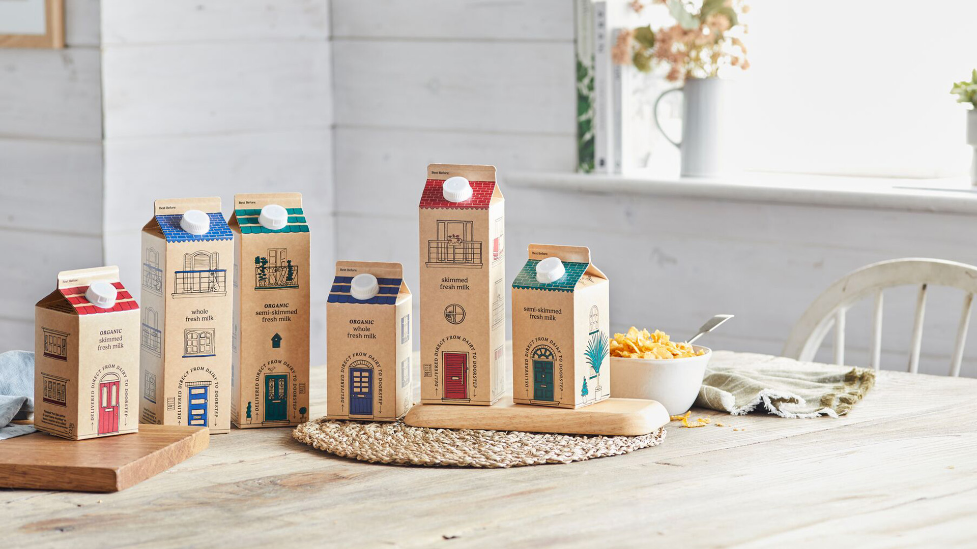
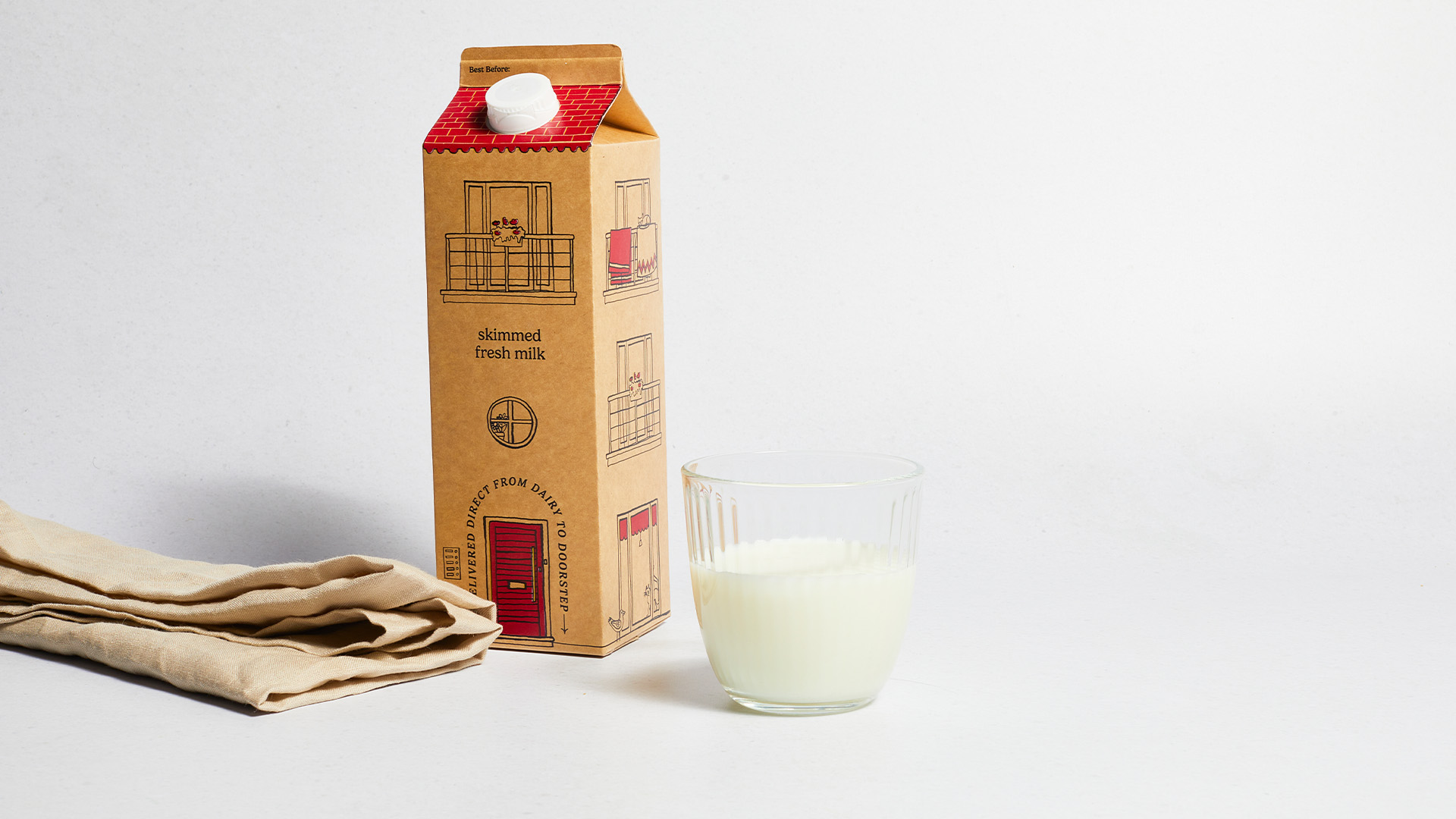
Milk & More's selection of organic products features six distinct designs that combine to make a mini row of houses. The storybook illustrations each have a unique look that bursts with character, creating an immersive narrative through their intricate details. From ornate balconies to ivy-clad windows, each design is a cosy microcosm crafted in a tastefully contemporary art style.
I've always been a fan of cute illustrations so naturally, Milk & More's packaging is right up my street (pun intended). With alternative milk brands like Oatly and Hidden Figures paving the way for quirky illustrated packaging, it's refreshing to see this design trend spreading to more brands, proving that packaging design doesn't have to be an afterthought.
For more design inspiration check out this classy food packaging design that's deliciously retro. If you're a designer you'll want to check out Adobe's new tool that's set to revolutionise packaging design.

