If there's one thing we could all use more of in this busy modern world, it's sleep. Yes, we could go to bed earlier, cut back on screens, and skip the caffeine after midday, but our sleep environment actually has a far greater influence on our sleep quality than we give it credit for — and color plays a particularly important role. And, as you might expect, the colors that are best for sleep are soft — think beiges, taupes, off-whites, and blues, but some more dramatic colors also sneak into the mix.
Time and again, interior designers are asked to create bedrooms that actively promote better sleep, and the conversation almost always begins with color. The shades that surround us set the emotional tone of a space and shape how we feel, which is why calming, restorative hues are key in the bedroom — a space that needs to soothe, rather than stimulate.
The good news is that discovering how to sleep better could be as simple as rethinking the color of your bedroom walls, swapping out vibrant, invigorating tones for something more relaxing. Here, designers share the six colors they turn to when sleep is the brief.
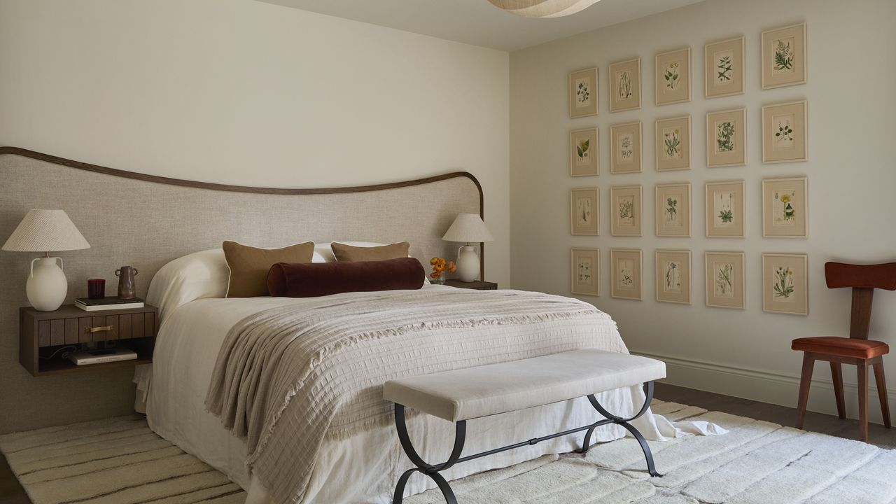
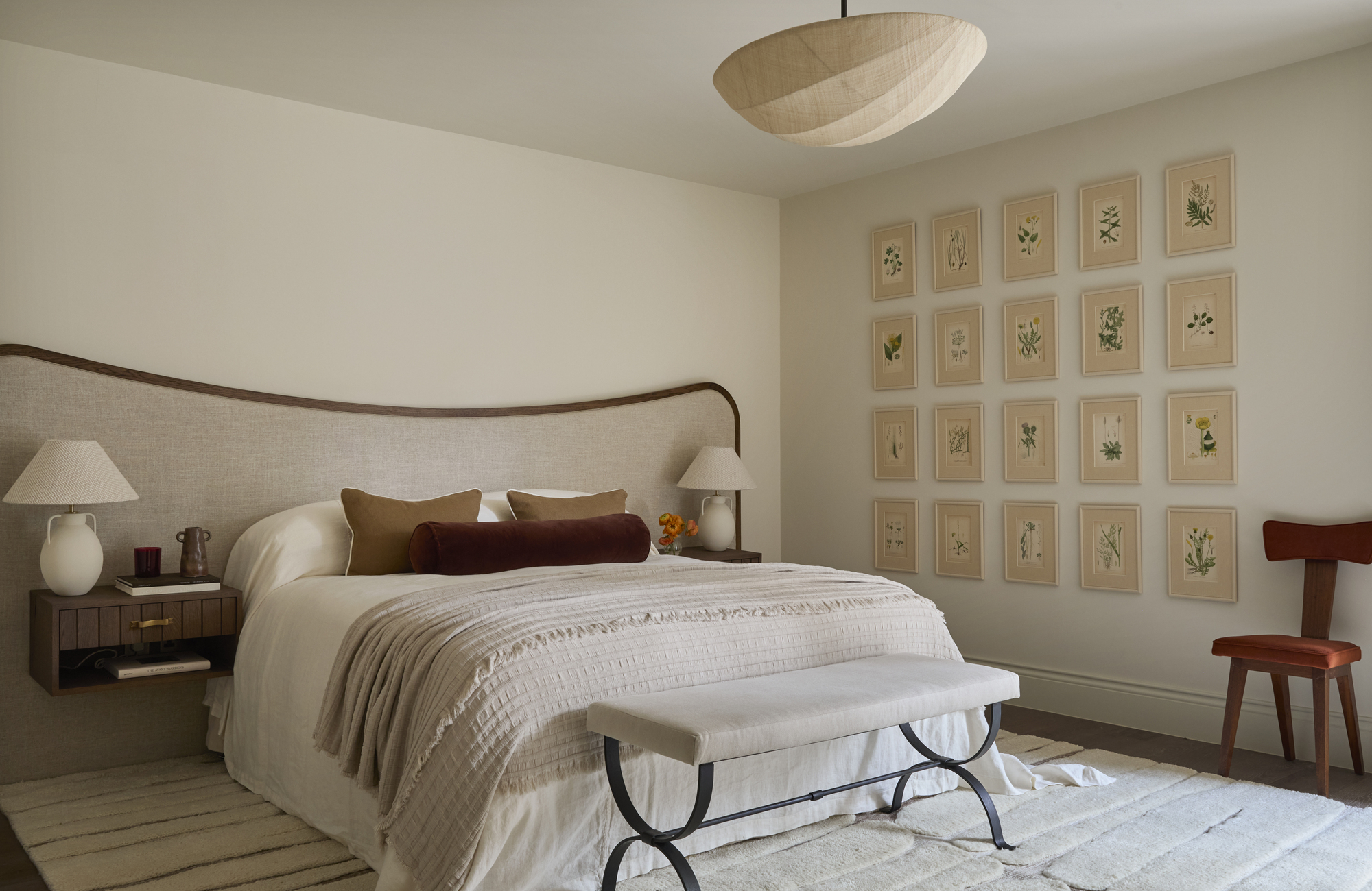
1. Soft Off-White
Not everyone was impressed when Pantone announced Cloud Dancer, a bright white hue, as its Color of the Year for 2026, but there is a time and place for white tones. And it turns out, the bedroom is one of them. We're not talking stark, bright whites on this occasion; instead, the vibe is warm off-whites that feel soft and creamy.
"A warm off-white creates a calm, breathable backdrop without feeling stark," explains Ginger Curtis of Urbanology Designs. "It reflects light gently, helping the room feel open and serene while avoiding visual stimulation before rest."
If a white color picker induces anxiety for you (don't worry, we get it), lean more towards a limestone shade instead. This bedroom color idea will naturally have more warmth, which, as Ginger notes, is key for creating a bedroom that's cocooning and grounded. "They’re especially effective for clients who want calm without leaning too cool," she says.
Walls aren't the only way to introduce color in the bedroom. This oatmeal bedding isn't quite as deep as a beige or taupe, but more of an off-white, offering a subtle, flexible way to introduce the shade to your bedroom.
2. Light Blue
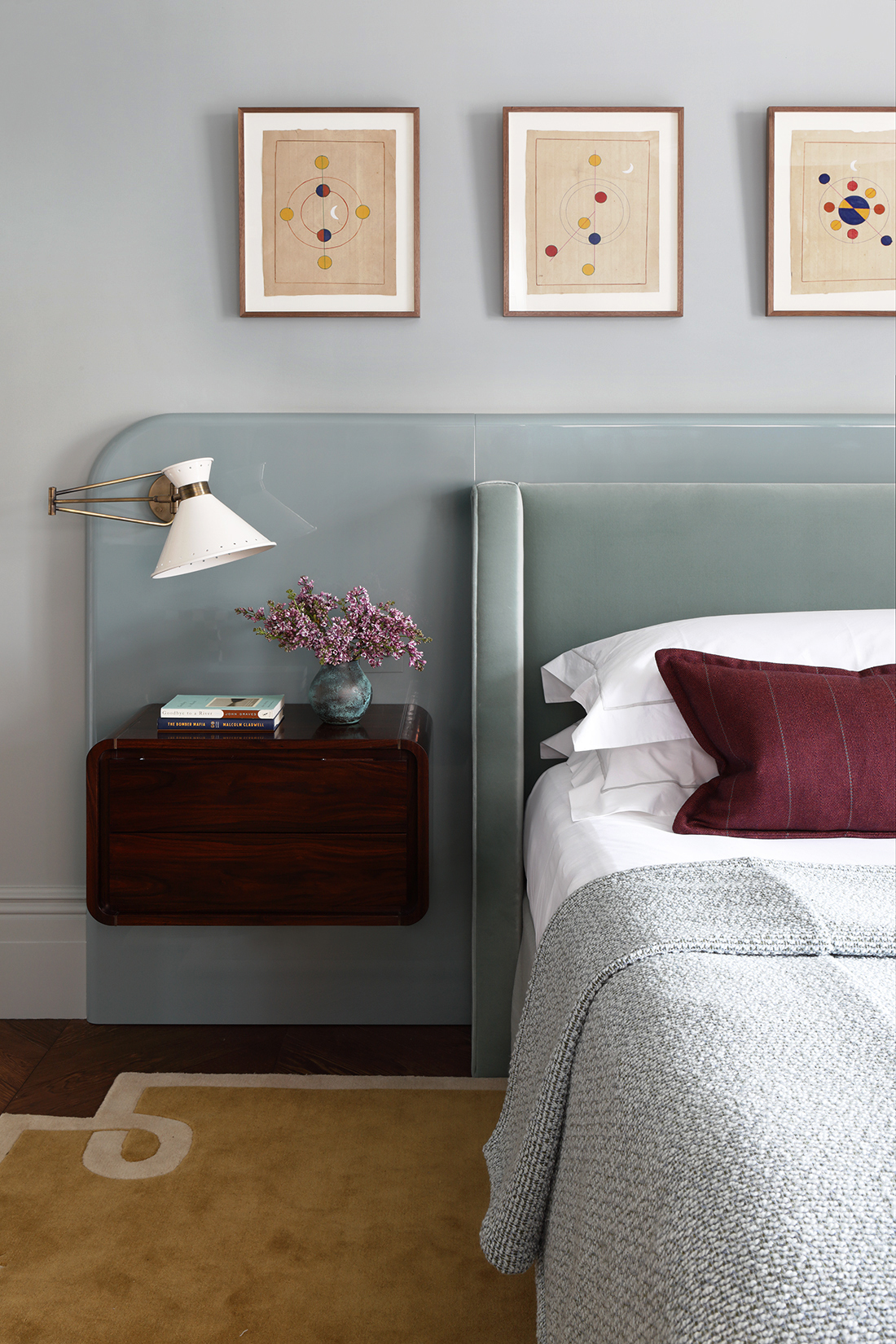
Cool and fresh, light blue might not be your first thought for a bedroom, but it's a shade designers often rely on when designing a space for better sleep. Saturation is key here. Smoky or pastel shades are always preferable as they're more muted, reducing visual stimulation and calming the nervous system, while more intense blues will have the opposite effect.
"I always view blue as a calming and serene color that is perfect for winding down at the end of the day," says interior designer Rebecca Hughes, founder of Rebecca Hughes Interiors. With its associations with the sea and sky, she says blue feels extremely calm and serene when used intentionally in a bedroom.
It's not just about aesthetics, either. "Soft, desaturated blues are consistently associated with tranquility and slower heart rates," explains Isy Jackson of Chelt Interiors. "A dusty blue feels airy yet grounded, offering a sense of emotional spaciousness without overstimulation, which is particularly effective in bedrooms with lots of natural light."
Take the space above, which makes a great case for blue bedroom ideas. The walls are such a muted blue that they verge on grey. The glossy backboard helps to draw out the tone, which is aided by the velvet headboard in front. The result is a beautiful gradient of light blues that creates a gentle and relaxing environment; the perfect setting for sleep.
Soft and delicate blues are perfect for a bedroom. Subtle and sleep-friendly, they feel enveloping and restorative despite their cool undertone.
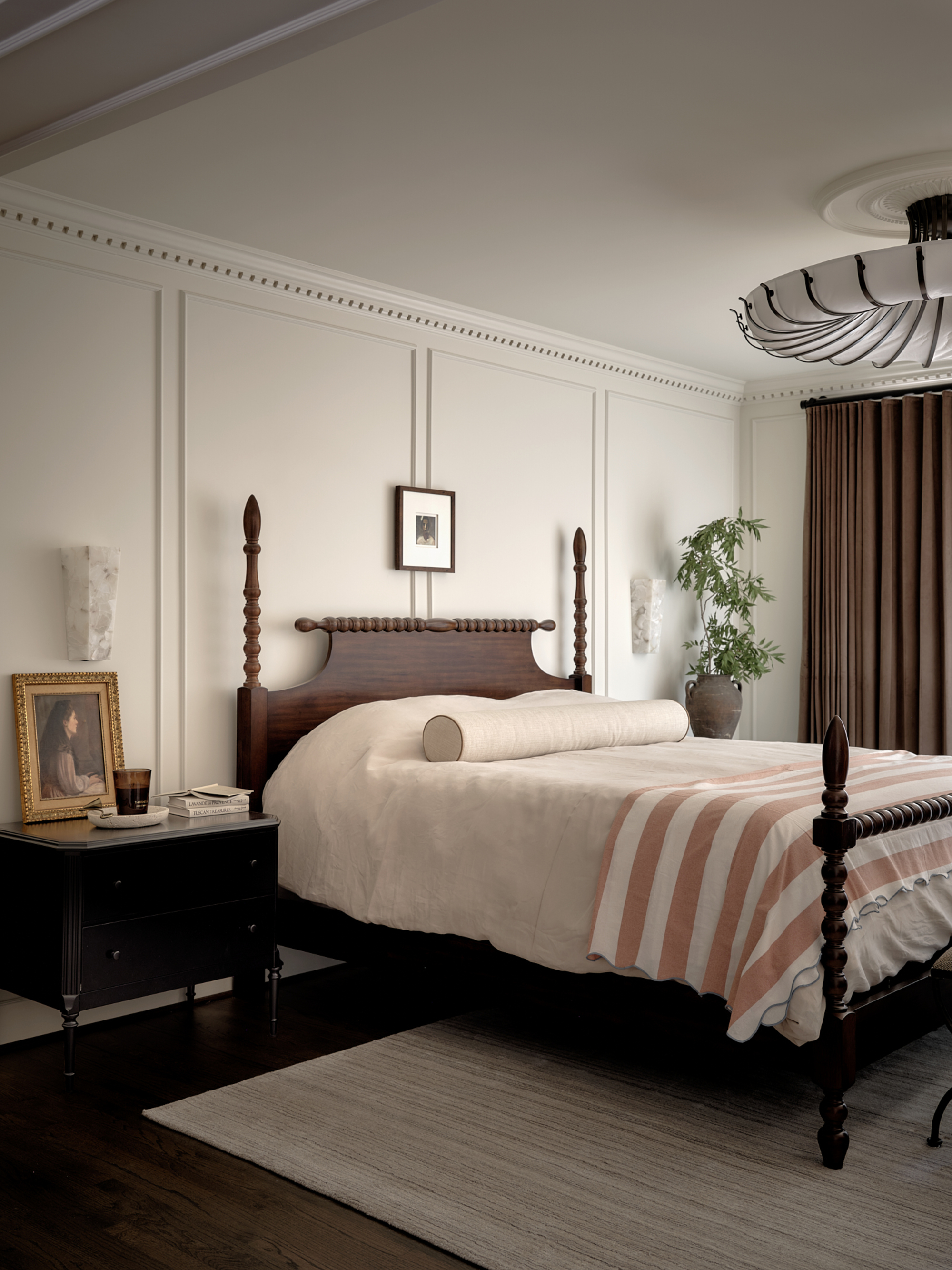
3. Beige or Muted Taupe
Neutral bedrooms are always a great choice, but especially so if better sleep is your priority. Far from boring, designers often rely on a palette of earthy, sandy tones to help calm the body and still the mind.
For Ginger, taupe is a reliable shade to fall back on for promoting better sleep. "A balanced neutral with both warm and cool notes, taupe promotes relaxation by feeling steady and unobtrusive, ideal for clients sensitive to color overstimulation," she says.
Yet, while taupe is a great foundational tone, Ginger says she favors layered neutrals for a bedroom instead of a flat, monotone color. Think taupe walls mixed with beige accents, wooden furniture, and an earthy rug underfoot, much like the room pictured above. "This creates a timeless, soothing environment that supports both sleep and long-term livability," she says.
Throw pillows offer a great way to introduce both color and texture. Woven neutrals, for example, often add a subtlety and nuance to a shade like taupe that can't be reproduced through paint or furniture.
4. Soft Charcoal
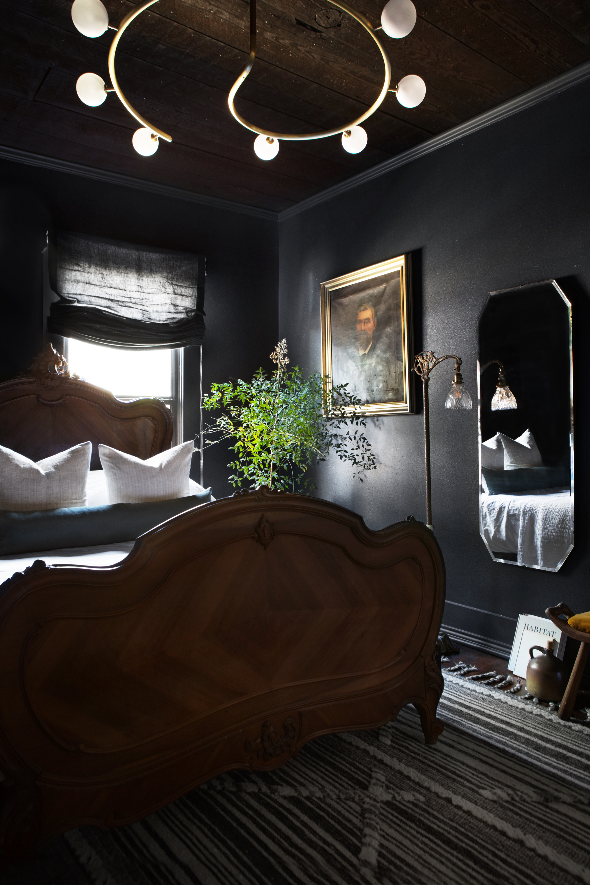
Until now, we've only discussed lighter shades, but dark tones do have their place in the bedroom, and they can indeed promote rest. Dark, inky walls have such a cocooning effect, removing visual stimulation and signaling nighttime to the brain, so consider a soft charcoal or deep navy if you want to sleep better.
Anthracite tones are a favorite of Ginger's when her clients request a space designed for sleep. "Used thoughtfully, deeper tones can feel incredibly restful," she says. "A soft black or charcoal adds a sense of enclosure and quiet, helping signal the body that it’s time to slow down and rest."
Like light blue, the trick here is choosing the right intensity level when designing dark bedroom ideas. Anything too saturated or glossy will feel dramatic, rather than restful, whereas mattified, muted hues will have the opposite effect.
Grey throws are so grounding when draped across a bed, or use this anthracite tone as an accent color to complement (and punctuate) a palette of neutrals.
5. Warm Clays
Earthy tones are without a doubt some of the best paint colors for sleep, and warm clays will always be a designer favorite. Raw plaster walls or clay-toned bedding both offer excellent ways to introduce a wash of warmth that helps promote relaxation, or adopt both design ideas for maximum effect.
"A washed, clay-inspired terracotta brings warmth without intensity," explains Isy. "It feels nurturing and earthy, echoing natural pigments that help create a sense of safety and calm, and is especially effective in north-facing or minimalist bedrooms."
"These earth-adjacent hues subtly reference nature, which we find instinctively calming," adds Ginger. "They bring warmth without visual noise and pair beautifully with natural textures." In the space above, for example, limewash walls complement the wooden built-in headboard beautifully, while a light blue throw (another designer-approved tone for sleep) adds a cool accent. It's a thoughtful sleep space that's at once dynamic and relaxing.
Want a color akin to the warmth of the Mediterranean? Choose warm clay tones to decorate your bedroom and bask in the relaxing properties of this earthy shade.
6. Sage Green
Sage green may have been around the block a few times, but there's no denying the benefits of this shade in the bedroom. Calming without feeling cold, it echoes tones found in nature, consequently lowering stress and inducing a sense of calm.
"A muted sage green is one of the most reliable sleep-enhancing colors," says Isy. "It draws from nature, which has a proven calming effect on the nervous system, and it also reads as a gentle neutral, making it easy to layer with natural woods and soft textiles."
"When clients approach us to create a better sleep and wellbeing environment, we always emphasise the importance of using soft, muted tones," adds Laura Hammett, interior designer and founder of luxury homeware brand Laura Hammett Living. She says she's particularly drawn to colors like sage green that evoke a sense of restfulness rather than stimulation. "We always utilize soft, calming palettes which foster an environment where the mind can truly unwind," she says.
If you're looking to embrace sage green bedroom ideas, don't just look to the walls. In a bedroom, bedding is a great way to introduce an accent color, plus there's the benefit that it can be interchanged depending on your mood or the season.
Ground your bed with a sage green headboard. This biophilic tone helps to lower stress and create a sense of calm vital to better sleep.
Interior designers understand that better sleep is highly influenced by our surroundings, and color plays a central role. Whether you gravitate towards warm neutrals or prefer a more expressive use of color, there are plenty of shades that help create the sort of calm, relaxing tone needed for sleep.
Ready to turn your bedroom into a true sleep sanctuary? Pair the tones above with tips for designing a low cortisol bedroom and you'll have a bedroom that's as supportive for rest as it is stylish.