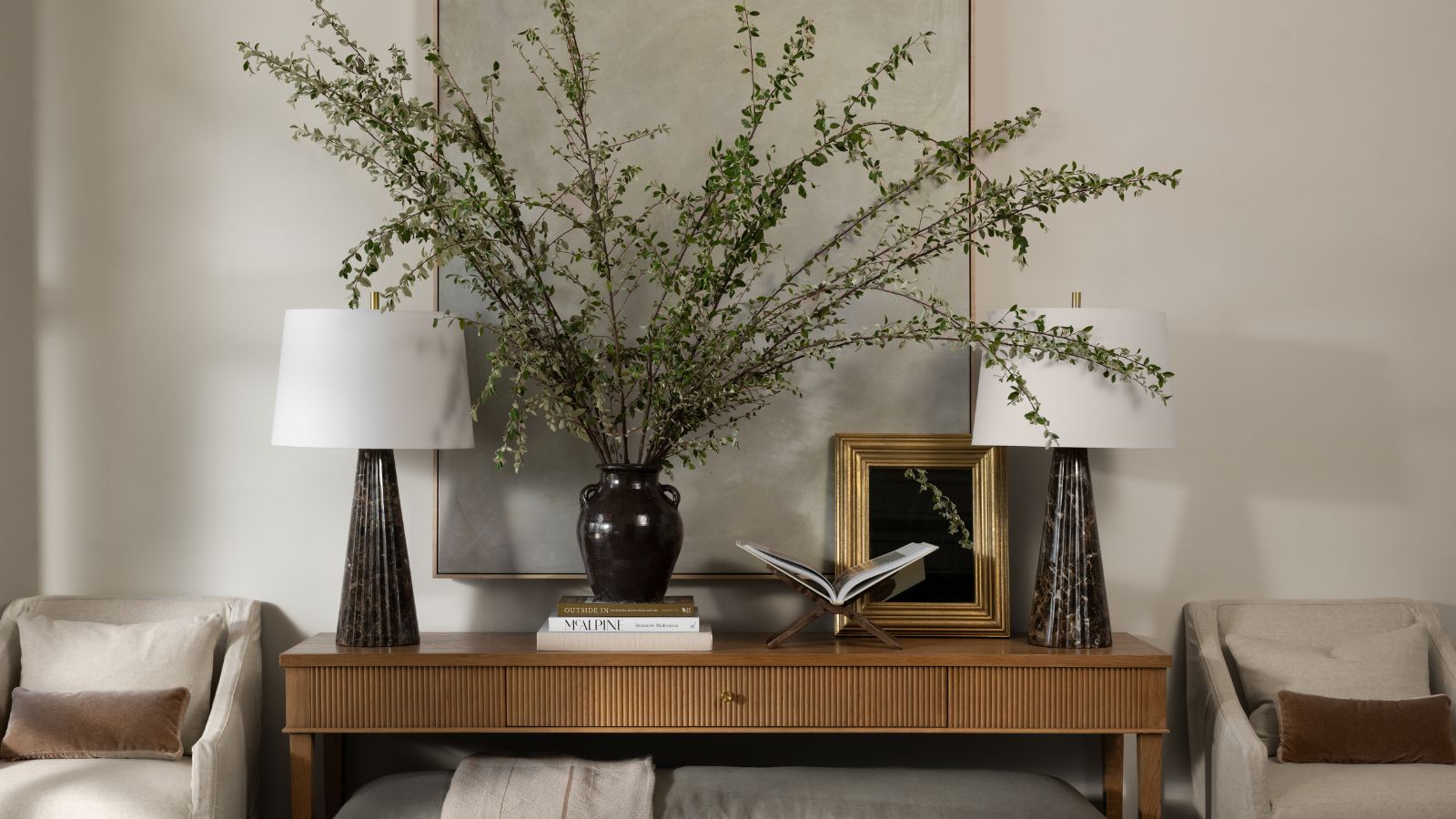
Fall is the start of hosting season, so it's the perfect time to start preparing your home. First impressions are everything, and the entryway will do much of your home's heavy lifting. One of the most important spaces to get down, the area just beyond your front door should be ready to welcome guests with open arms. That's where Shea McGee comes in.
As the days grow shorter and temperatures drop, you'll want a warm and cozy space to invite guests inside. And the founder of McGee & Co. and Studio McGee just released a stunning fall collection that's set to make designing an entryway easier than ever. Whether you love Shea's signature style or prefer something a bit more bold, these are the designer's top tips for designing a welcoming space that's perfect for fall.
'Fall is such a key season because we're transitioning from spending all of our time outdoors to dressing up our home for holidays, entertaining, and house guests,' says Shea in a YouTube video touring the full fall collection. 'I am so excited to walk you through every room, decked out in head-to-toe McGee & Co.'
Shea's top fall entryway tips
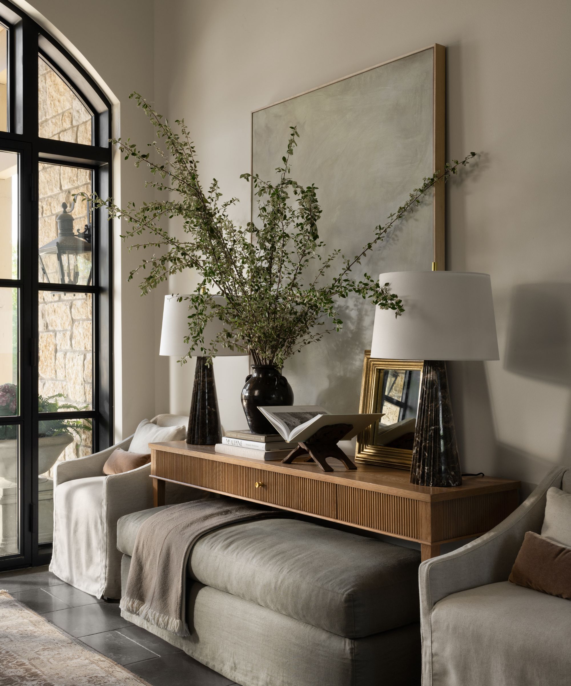
'In true fall fashion, we have wreaths on the front door that speak to the season,' says Shea, with a gorgeous arched front door decked out with two moody wreaths behind her. 'Then, you walk in, and you are greeted by this gorgeous entryway vignette that is very timeless and it has a lot of classic details and elegant simplicity.'
The entryway features the transitional Pieter Console, complete with intricate fluted details and a natural wood finish. And in true Shea McGee fashion, the piece is perfectly styled with a considered mix of artwork, greenery, and decorative accessories. A charming, vintage-inspired area rug grounds the entire earthy look.
'As we build a look, we start with a foundation of the largest pieces first, and in this space, it's the rug and the console. So, this rug is our Concetta Rug. You have seen me style this in many different types of spaces, and it sets the tone with a vintage-inspired pattern and some grounding deep tones that tie in with pretty much every color that you pair it with.'
Underneath the styled console table, Shea's stowed a slipcovered Macy Bench in a light gray, lush fabric finish. 'You often see consoles with two ottomans tucked underneath, or two baskets,' she says. 'But it's also a really great look to do one long bench.'
She says this decision helps to break up the symmetry built by two armchairs and two lamps sitting at either side of the long table. 'My recommendation here is that if your console has four legs like this does, then pick something that goes all the way to the floor so it doesn't become overly leggy,' she continues.
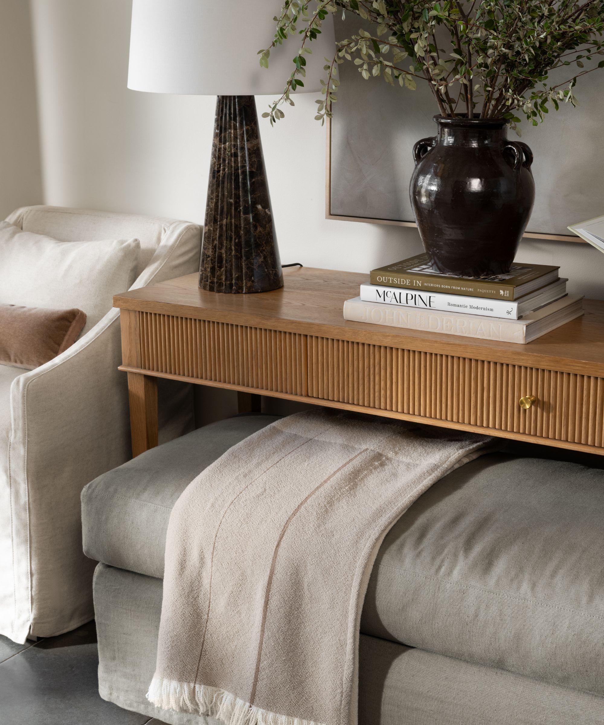
'We've used this gorgeous lamp that has a dark brown marble,' adds Shea. 'I love that that ties into the Concetta Rug but then adds some saturation to this vignette.' The entire space is muted yet moody, reminiscent of standout Shea spaces like the entryway of her recent Summit Estate reveal.
Plus, it features a regular McGee actor – an oversized, foraged branch in a timeless, characterful vase. 'This moment is all about these awesome foraged branches. They are just cut from the backyard and that's one of my very favorite looks in design,' says Shea.
Another piece that defines the vignette is a large, textured, gray piece of art that provides a sophisticated slate for the rest of the look. 'I think one of the signs of a thoughtfully designed home is a mix of sizes of artwork,' she continues.
'I will often see homes where they feel a bit more novice in their decorating style and everything is a small picture frame. I love a small photo, I love a small art piece, but mix the scale throughout your home for more impact 'Here, we have this piece that is an abstract neutral, and it has this really nice texture throughout it. You can see it just creates this really calming backdrop to the entire vignette. And then we built forward,' she says.
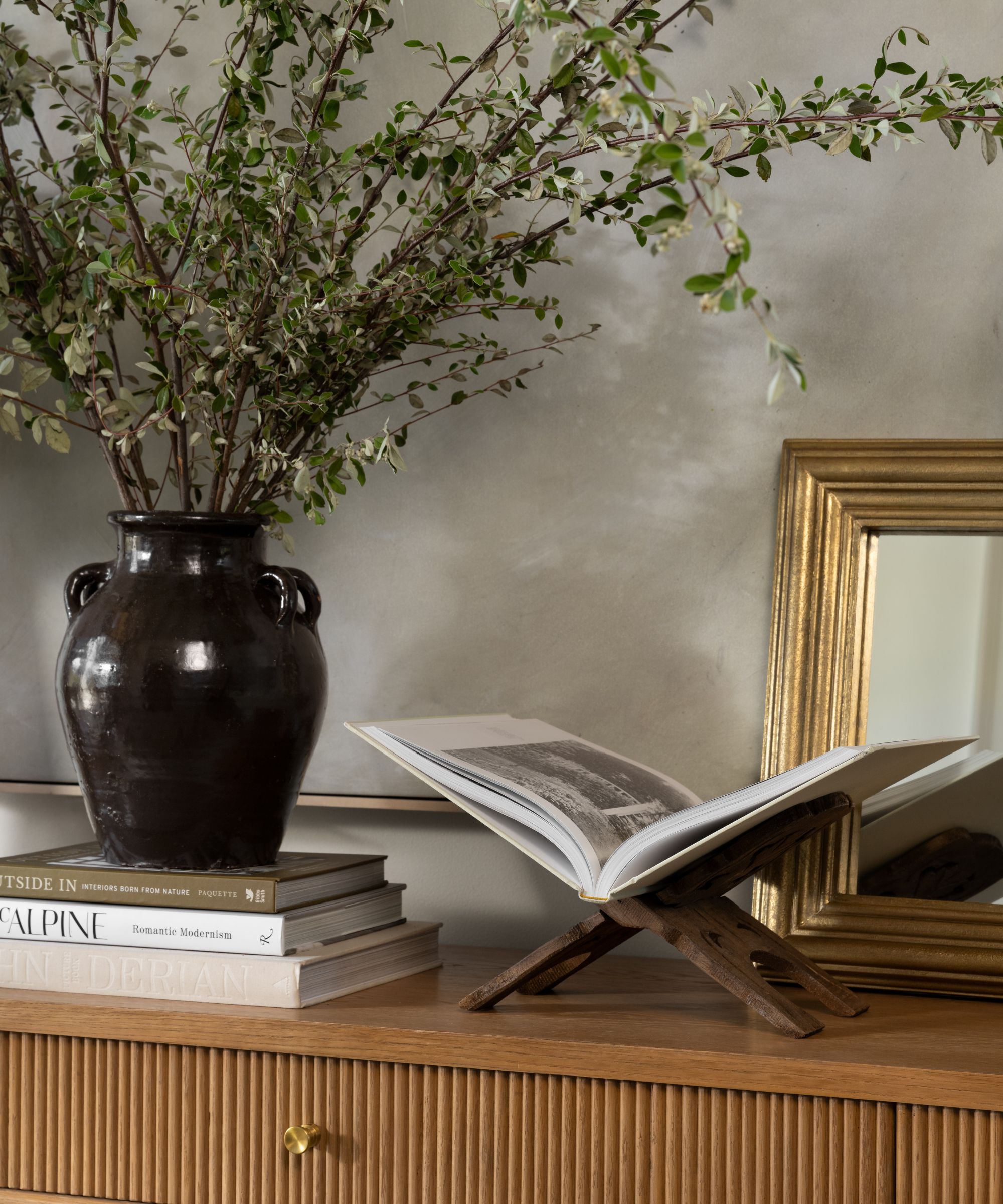
The Suzanne Mirror from McGee & Co.'s fall collection adds a touch of eye-catching shine to the vignette, leaned against the larger piece of artwork. 'It has the prettiest molding around the outside,' says Shea. 'I could see it leaned in an entry over a piece of artwork, I could see it leaned on a kitchen shelf, I think it would look great in a vignette with stacked artwork below.'
If you'd like to replicate the 'relaxed, traditional' look displayed in this entryway vignette, Shea recommends starting with symmetry. This ensures that the entire look is sturdy and grounded before you start to build out. 'We mixed in the bench and this artwork – those are big pieces that break up the symmetry,' Shea says. 'And then also, adding in a collected mix of things that aren't perfect helps you give that more lived-in look.'
Shop the look
The Concetta Rug provides an earthy, characterful base for any transitional design scheme.
This one-of-a-kind lamp is a must, bringing organic pattern and deep, moody hues to the entryway.
Layer in a soothing, serene backdrop with the Faded Stone piece from McGee & Co.
With ornate detailing and a sleek, modern form, this console table is an excellent starting point for the entry.
Give your guests a cozy place to rest their feet with this comfort-forward, upholstered bench.
With Shea's tried-and-true entryway tips in mind, you'll have a warm and welcoming first impression to show off in no time. Start to build your vignette now so it's locked and loaded when temperatures start to drop.
