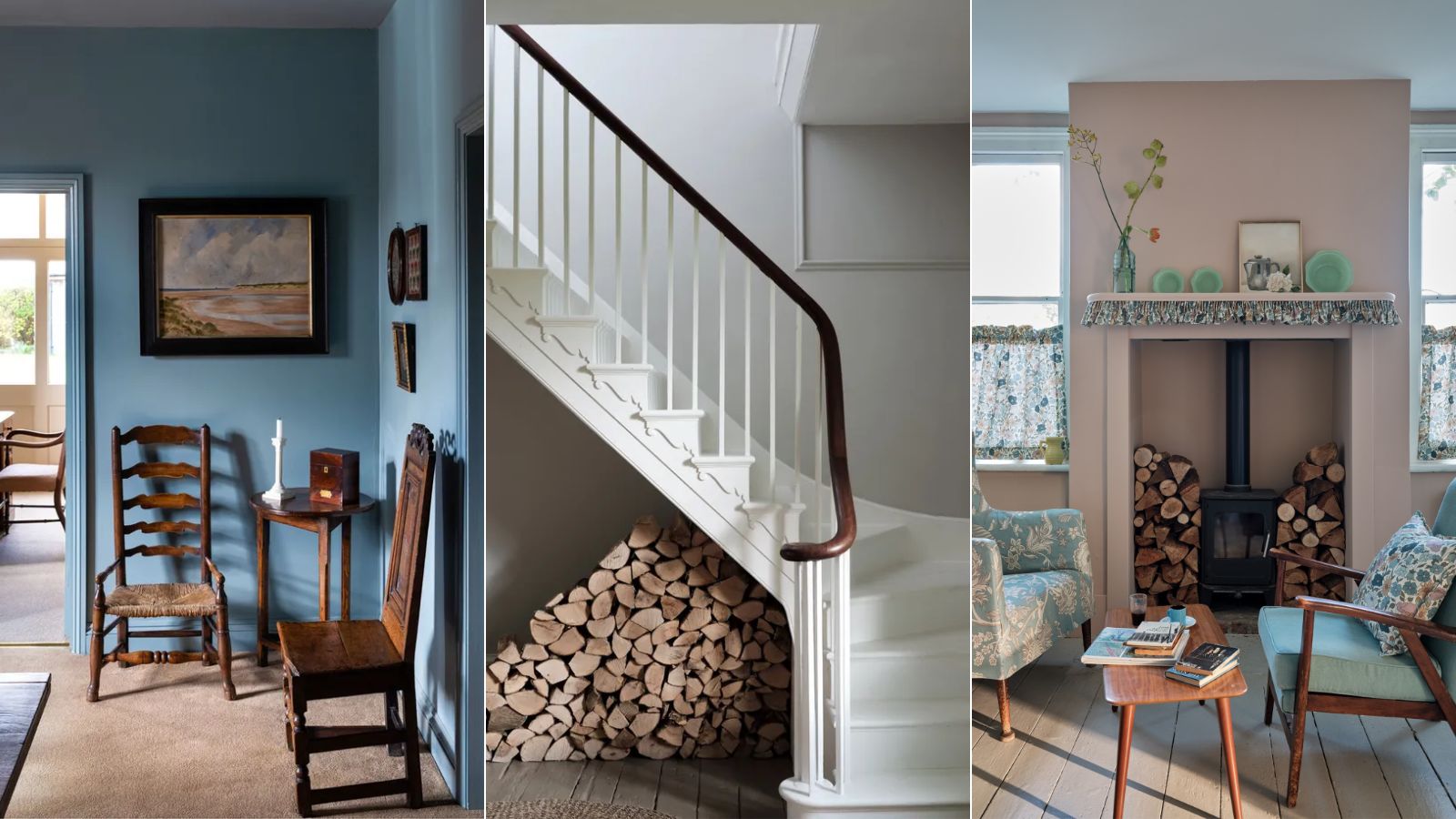
When it comes to decorating with paint, Farrow & Ball is a go-to brand. Known for its liveable colors and pigmented paint formulas, Farrow & Ball is recommended by interior designers time after time.
But with so many colors to swoon over, it's not always so easy to know which Farrow & Ball paint to incorporate into your home decor. To help make the paint-choosing process slightly easier, we asked interior designers what their favorite and most reached-for colors are.
From moody variations of blue to pared-back and calming neutrals that work in pretty much any home, we've rounded up seven of the most popular Farrow & Ball paints amongst interior designers.
Interior designers' favorite Farrow & Ball paints
If you're looking for some inspiration for your paint ideas, you'll no doubt find some among the colors suggested below. Whether you're drawn to muted colors or decorating with neutrals, these ideas will have you covered.
1. Middle Ground
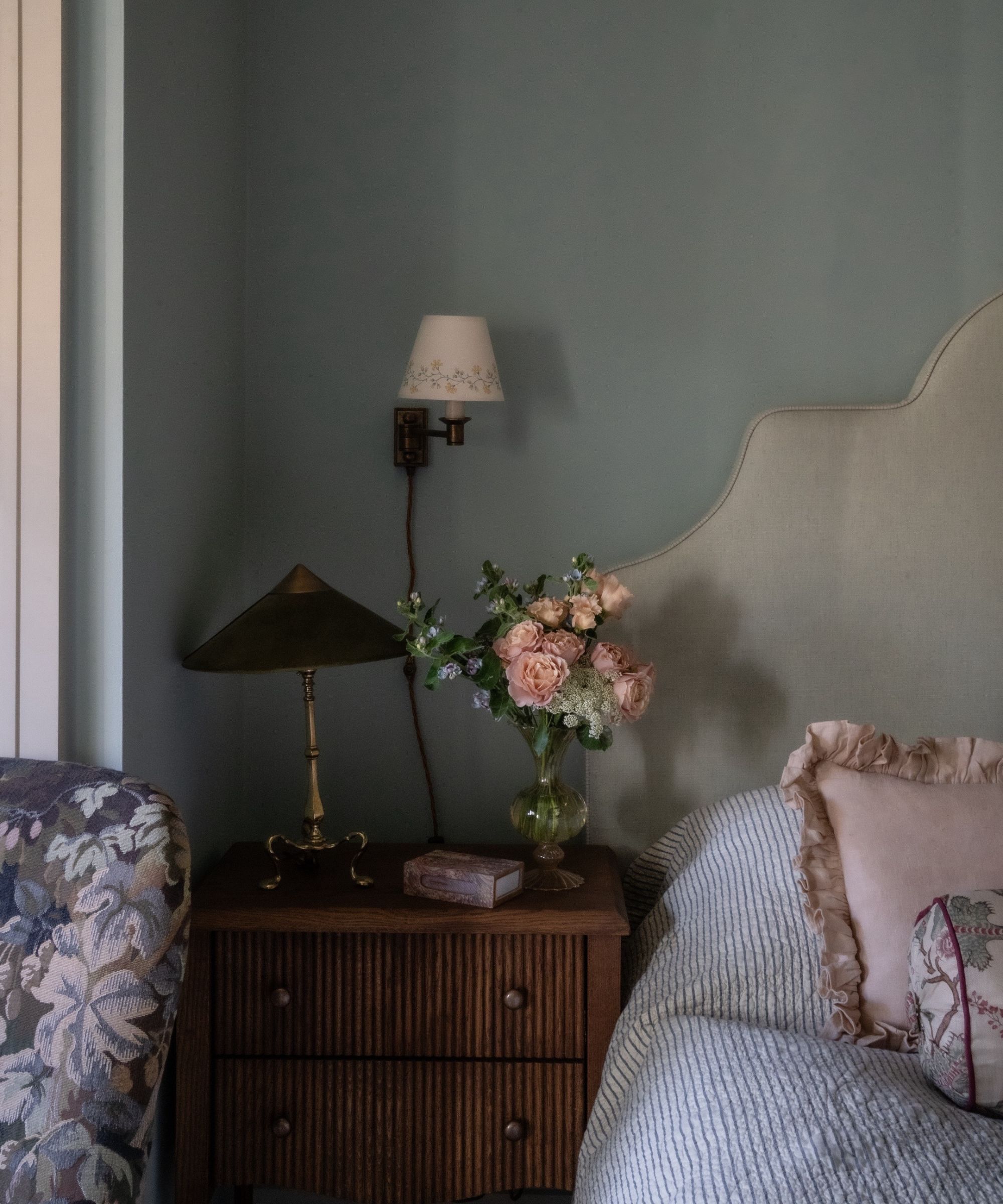
'One of my favorite colors at the moment is Farrow & Ball's Middle Ground – an archive color that is a beautiful warm blue perfect for this calming bedroom,' shares interior designer Alice Gaskell, owner and creative director at Alice Grace Interiors.
Referencing the bedroom pictured above, she explains how Middle Ground made the perfect color choice for the south-facing space: 'We wanted something more blue than green for this south-facing room that also provided a beautiful backdrop to the warm wooden tones of our furniture. I also love how it is slightly unusual and does that gorgeous thing that Farrow & Ball is known for where it changes beautifully throughout the day. I always have time for blue somewhere in a scheme.'
2. Mizzle & Down Pipe
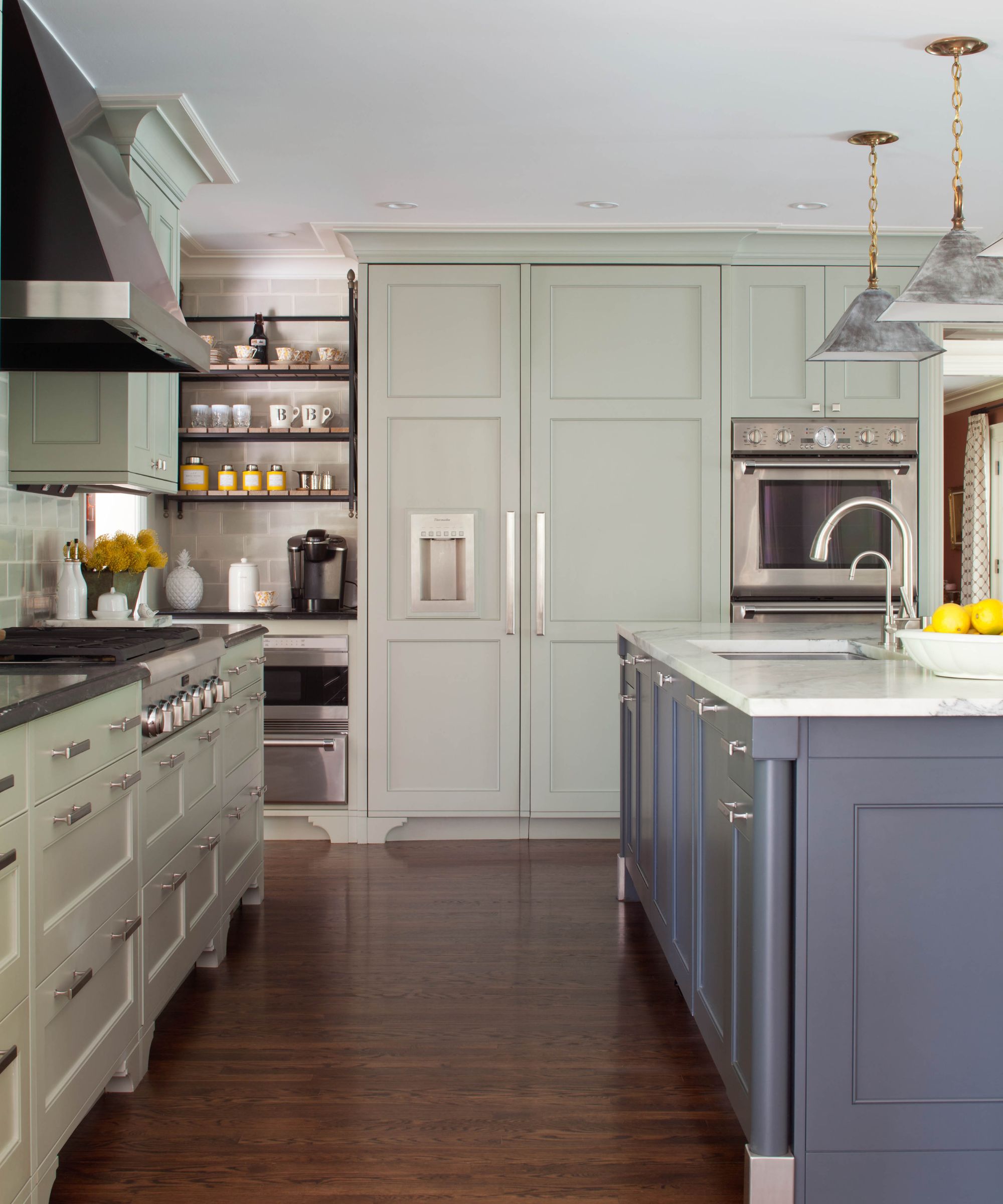
Teaming up Farrow & Ball's Mizzle and Down Pipe is a failsafe color combination for Denver-based interior designer Nadia Watts. In the kitchen shown above, Nadia used Mizzle as the main color choice across the kitchen cabinet ideas, adding contrast with Down Pipe for the kitchen island ideas.
'It's hard to choose just one favorite from Farrow & Ball,' she begins. 'I love the combination of Mizzle and Down Pipe. These in-between colors are almost like a neutral, they work well with so many other colors and patterns. Mizzle is a soft gray-green reminiscent of a misty drizzle, hence the name. The gray undertones work well with Down Pipe, which also has gray undertones. Down Pipe has a deep blue hue which brings complexity and richness. These two colors work great for cabinetry as well as walls. Because they are in between colors, they play well with others and will withstand trends.'
3. Elephant's Breath
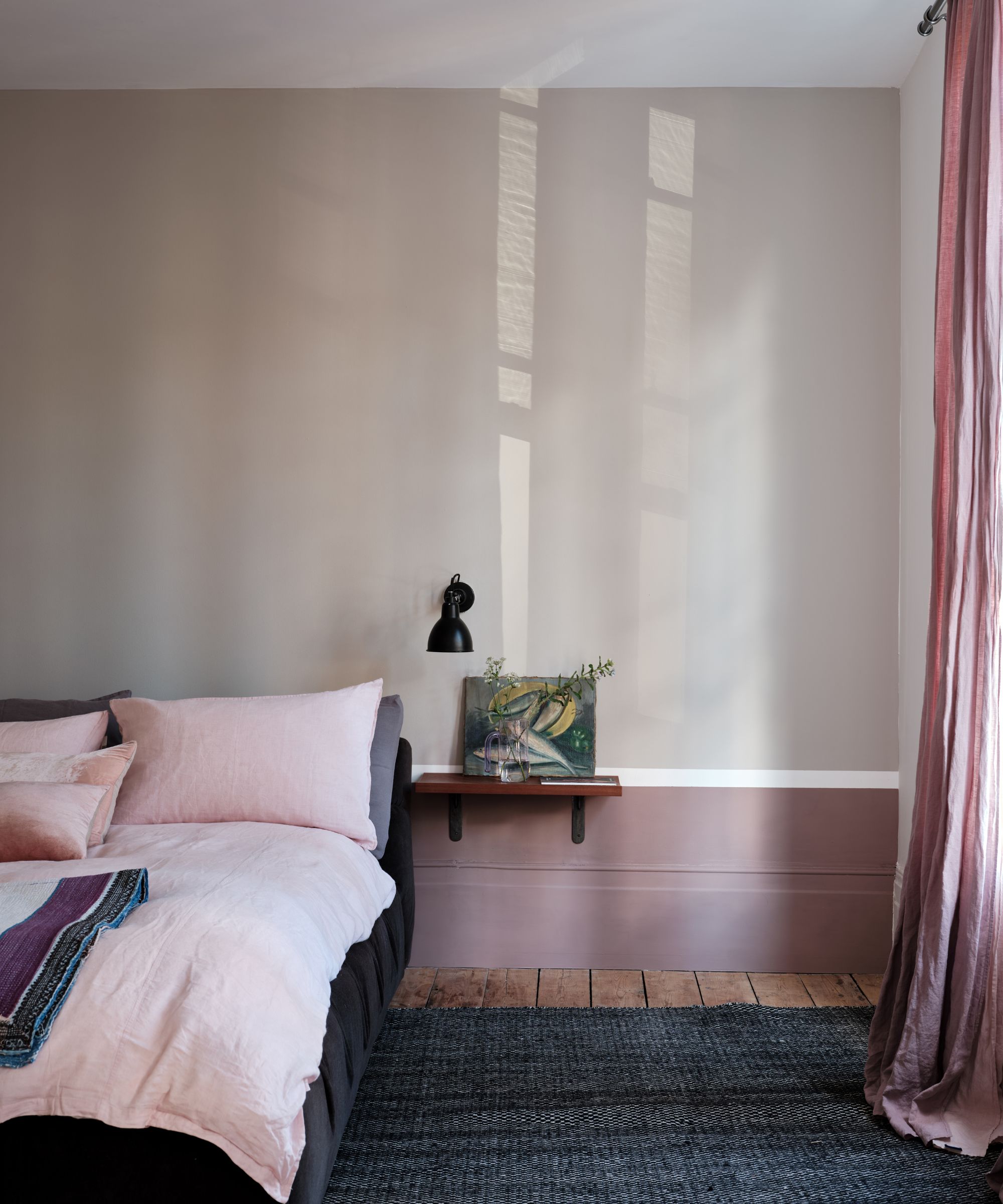
For design studio Kristen Elizabeth Design, Farrow & Ball's Elephant's Breath is a standout paint, amongst other gentle neutrals.
'We love using Farrow & Ball paints because the pigments in the hues and tones are deep and rich, no matter if you are working with a soft yellow, a taupe gray, or inky blue,' says studio owner and principal designer Kristen Fiore. 'Our favorites from Farrow & Ball are Elephant's Breath, Dove Tale, and Worsted.'
'I recommend using them on cabinets as a nice deviation away from the solid black that you often see,' continues Kristen. 'It is a great way to bring depth into the cabinet color without feeling like you are surrounded by black. We also like to use lighter color grays in trim and baseboard moldings.'
4. Oval Room Blue
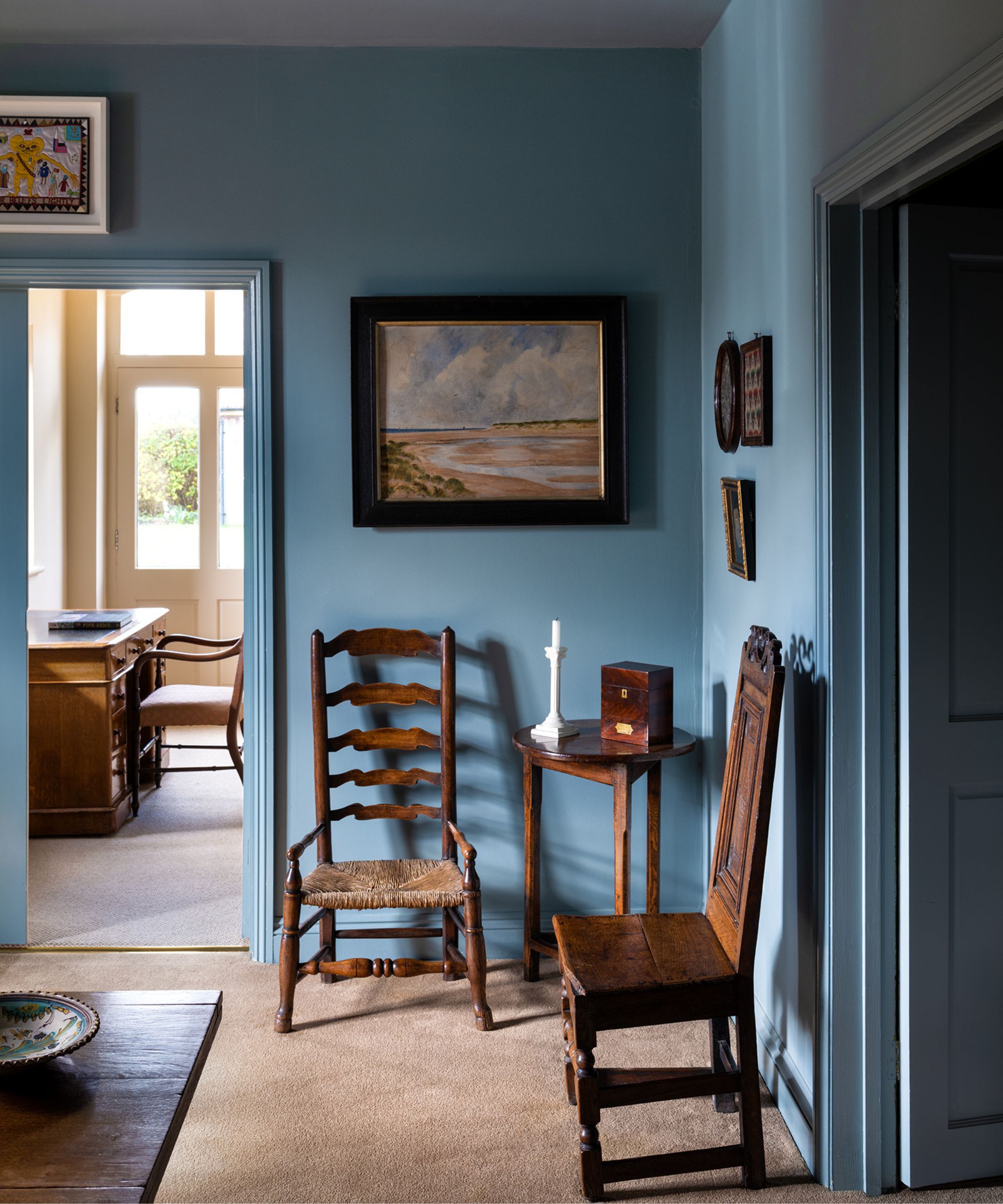
Interior designer Lucy Currell, creative director and founder at Studio Iro, points to Farrow & Ball's Oval Room Blue as a firm favorite.
Pictured in the entryway above, Lucy explained why she loved decorating with this unique shade of blue: 'I have used Farrow & Ball's Oval Room Blue in the entrance hallway of this old pub. I chose to color-drench it as it was a big space with a lot of ceiling. It has a very relaxing feel when the walls, woodwork, and ceiling are all the same color. Oval Room Blue is the perfectly balanced blue with the right amount of color depth and tone.'
5. Potted Shrimp
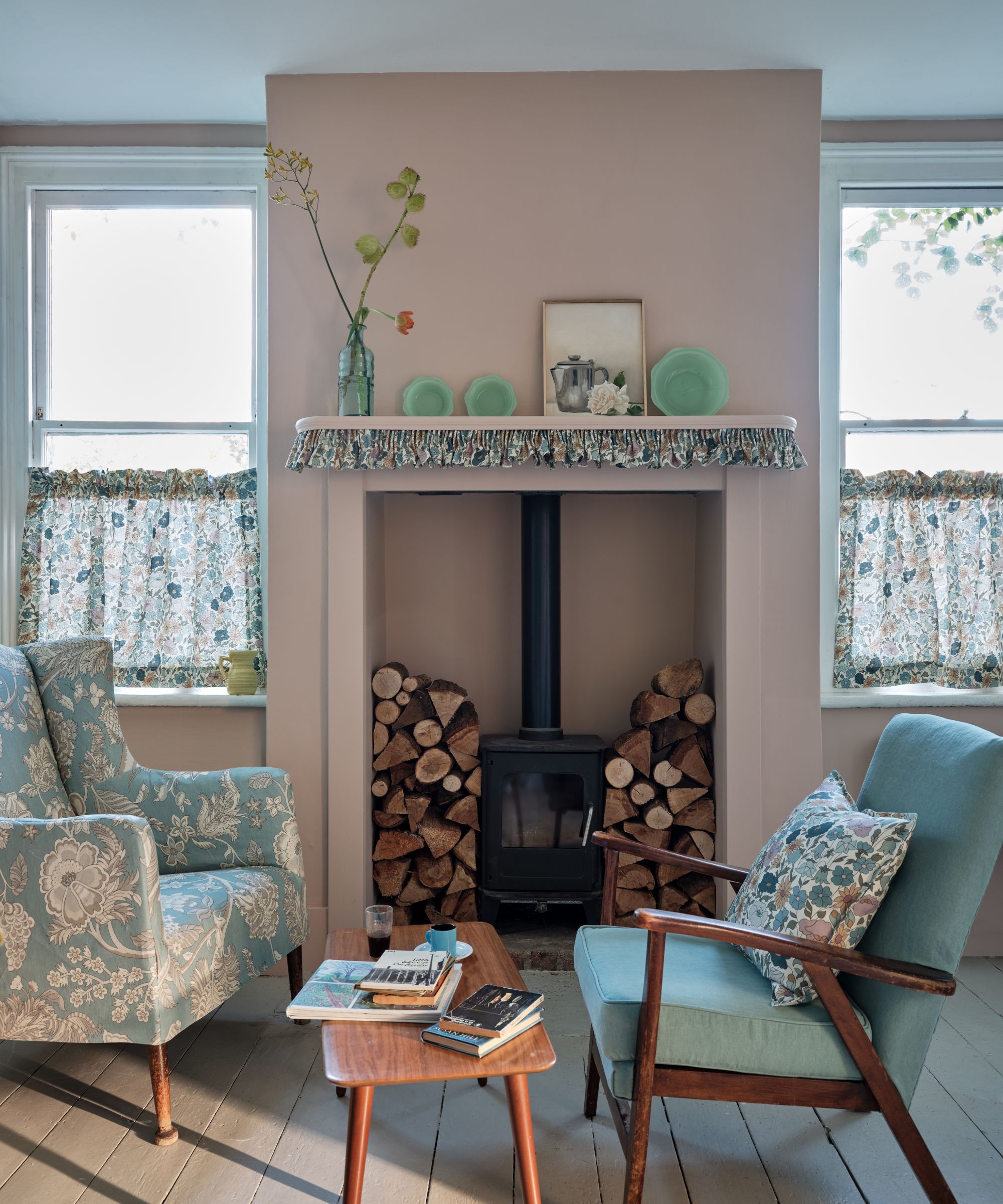
'Choosing a favorite paint color for a designer is something akin to being asked to choose your favorite child,' says interior designer Nicola Sanders, founder of Studio Sanders. 'Much as I love every iteration of Farrow & Ball's color card, I tend to turn to the archive collection for favorite shades as it's a little more under the radar – which in today's social media world is never a bad thing.'
But it's Farrow & Ball's Potted Shrimp that stands out as a favorite, a gentle blush pink. 'Potted Shrimp is an excellent pink, neither too fresh and powdery nor too cloying, and the slightly yellow undertone gives it a lovely, glowing warmth,' says Nicola. 'I used it on a client's front door, but I've seen it recently used to great effect as a color drench in a sitting room.'
6. Skimming Stone
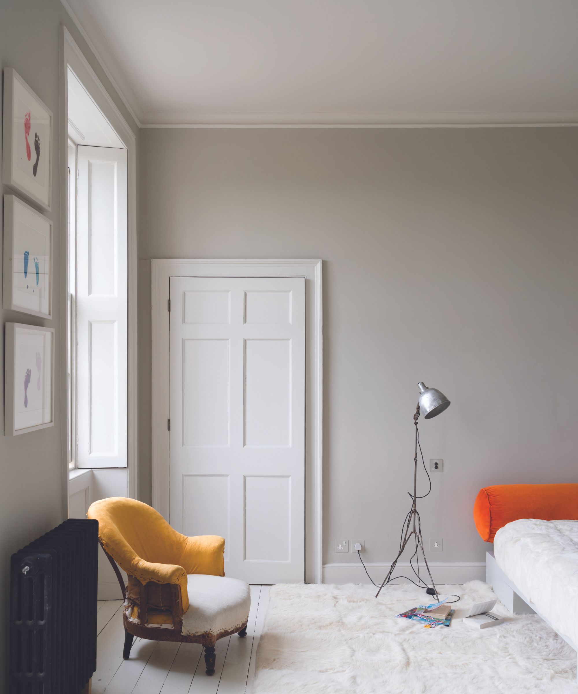
For interior designer Melissa Read, creative director at Studio Burntwood, Skimming Stone is a winning color: 'A conservative choice but one that is extremely versatile and can be used for almost every interior space is Farrow and Ball's Skimming Stone.'
'It's often a challenge to find a gray with warm undertones that doesn't have a yellow tone to it, but this color strikes the perfect balance of warmth,' adds Melissa. 'Skimming Stone creates the ideal calming backdrop color which can then be elevated with rich accent colors.'
7. Cornforth White
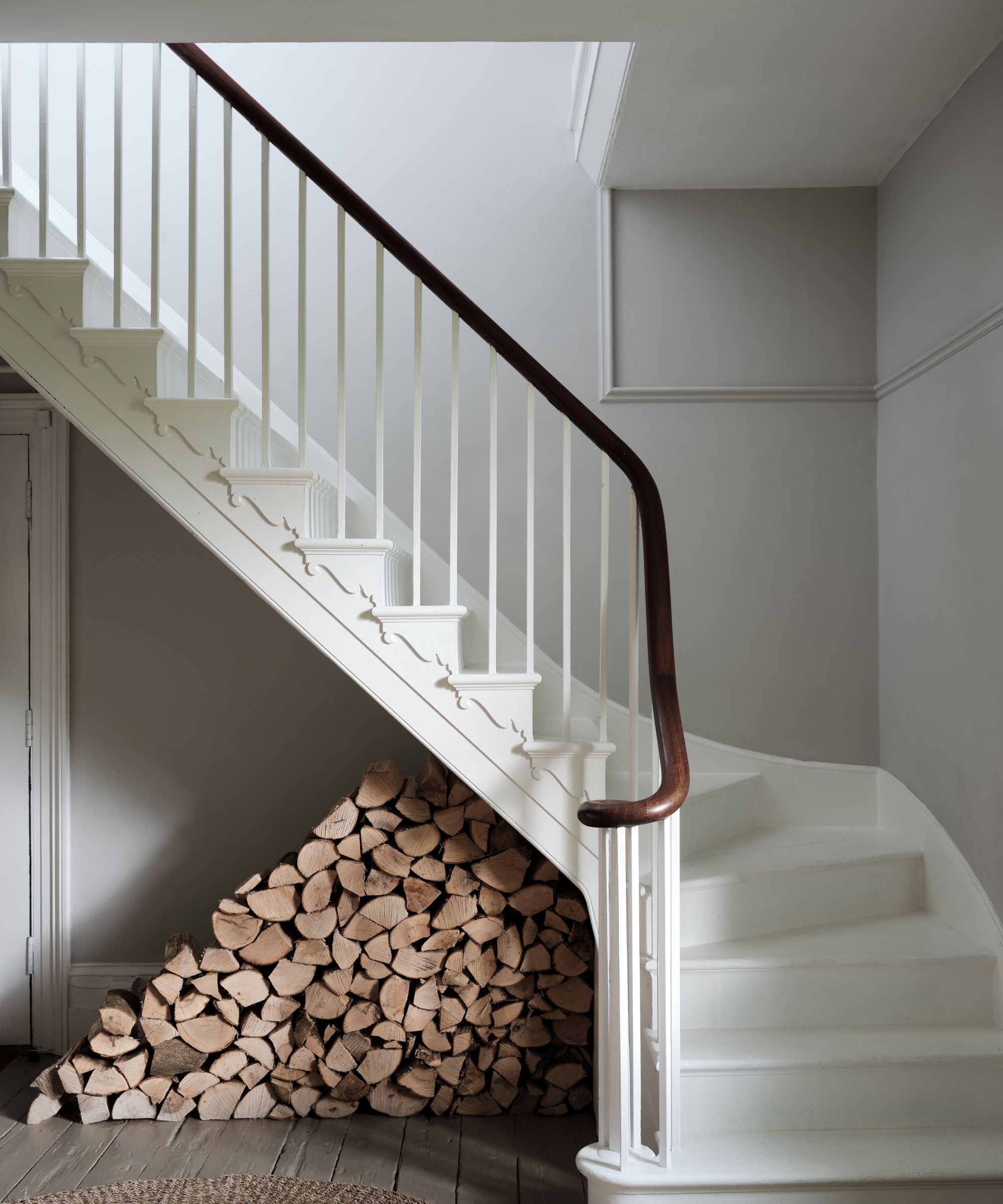
Farrow & Ball's Cornforth White is a subtle shade of gray that creates a pared-back look, making it an excellent alternative to stark white or cream. Interior designer Rina Patel, Director of Vastu Interior Design notes that this is a go-to shade for clients who want to decorate with gray.
'Those who invested in the gray trend are now finding that they want to introduce warmer tones to their homes,' says Rina. 'The movement began as a modern alternative to creams and I always say that gray can be introduced to a color scheme like pebbles on a beach, with different shades all working together. Gray makes other colors stand out when used in combination and the Farrow & Ball shades I tend to use in my designs are Cormforth White and Salt.'
When choosing the best Farrow & Ball paint for your home, it's not just about getting the color right, but the finish too. We explore paint finishes in lots more detail here, but essentially, Farrow & Ball paints range from Dead Flat for a matte look, all the way up to Full Gloss for a high shine look, with Eggshell somewhere in the middle for a finish with a mid amount of sheen.


