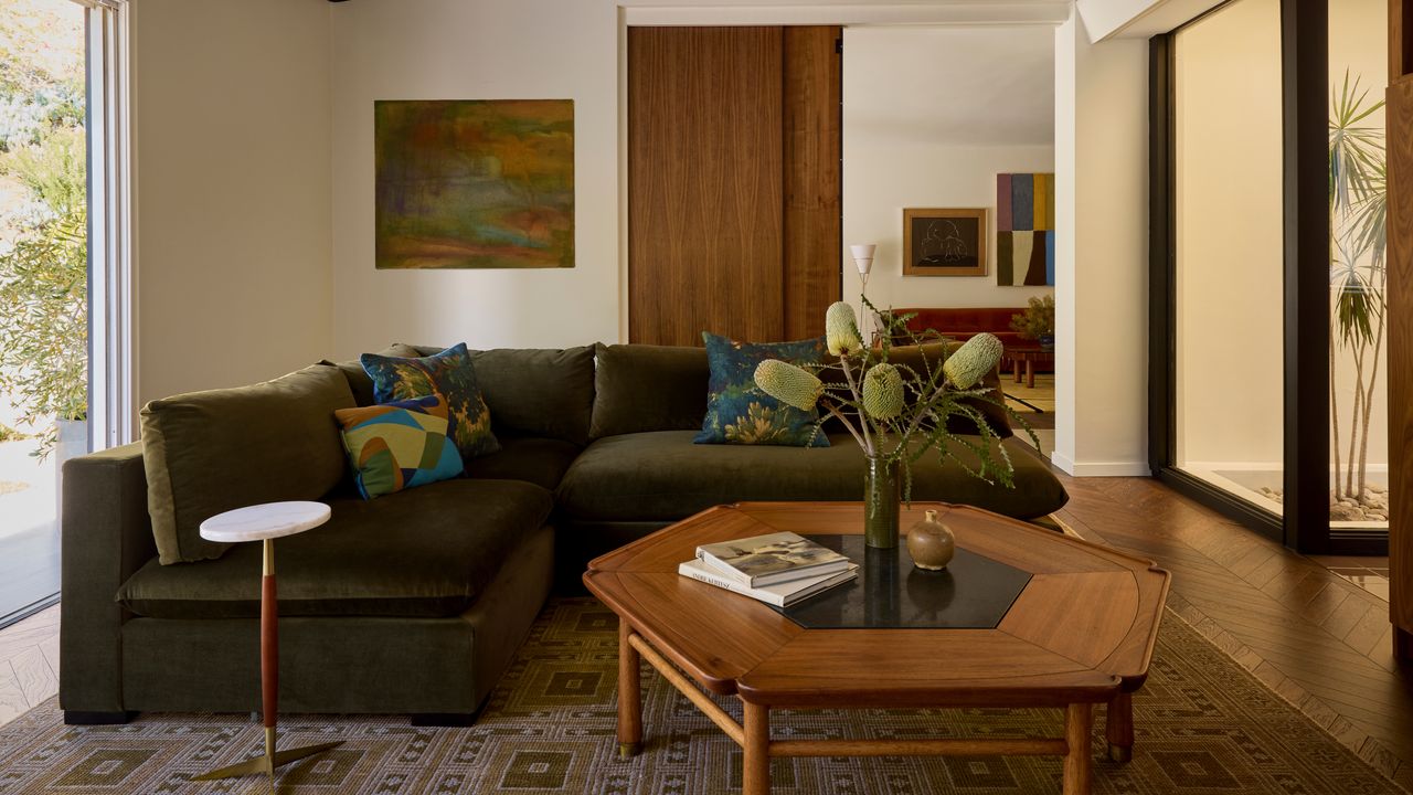
A fresh pair of eyes can be handy for spotting things that can go underappreciated. Having only lived in LA for three years, interior designer Coco Greenblum was still excited by the city's mid-century design legacy. Indeed, this project was an important 1970s house, though prior to her intervention, the interior "was basically a white box," she says.
For her research, Coco did a deep dive into LA's most iconic homes — namely, Frank Lloyd Wright's Hollyhock House in East Hollywood, the Eames House in Pacific Palisades, and the Stahl House in the Hollywood Hills. What she noticed was that the palettes were in the same muted tonal family. "They all had similar olive, amber, and gold tones that didn't feel overwhelming."

Coco wanted to harness that for her clients, but also to "translate it — so it would relate to a modern home for a Hollywood couple today".

Six Dots Design's magazine rack plays a chic supporting role in this modern living room.
The result was that mid-century got a glow-up. To those muted tones, Coco Greenblum added a dose of Hollywood luxe — gold details, saturated velvets, graphic patterns: "It's mid-century, but also very glam." What's more, by sticking to the same tonal palette (the various colors — russet, cocoa, ochre, olive — are all at "the same saturation"), she could avoid everything feeling too busy. "I wanted it to still feel serene."
That understated elevation also helps avoid pastiche — some 80% of the furniture pieces here are actually mid-century antiques, but by enhancing them with modern upholstery and adding contemporary companion designs, the home doesn't resemble a museum piece. But more than mid-century or Hollywood, Coco's biggest muse was the owners themselves — her main aim, she explains, is helping clients bring their personality into their interiors.

Bring in a jolt of textured color with this stool and side table from La Redoute.
The couple had been living in the house for a year and felt the house didn't connect with them. Chloe explains that Coco "helped me to find my taste. I was very clear about what I don't like, but had a hard time describing what I did like. She was able to translate it and present me with things that I never would have thought of."

A paper ceiling light is a perennially chic option — and this HAY option is a great way to recreate the look of the dining space above.
For Coco, it's about "taking the time to ask questions about who they are so that the client feels very comfortable with me — there's an 'aha' moment where they fully trust you to make a beautiful space."
Before Coco's renovation, Chloe and Jeremy had restricted themselves to decorating with neutrals in order to keep it calm. "I'm a sensitive soul," explains Chloe. "I couldn't have bright colors or images, but it felt boring — and not actually what I like." Now, however, "there's color and texture everywhere, but it never overwhelms me."
This is what Coco calls "warm minimalism". Others, she explains, may think of minimalism "as being very modern with no color. That's not what it means to me — it's very clean, very liveable, very structured and uncluttered, while also being very warm-toned".

A super-large bouclé cushion at a great price? We're snapping up this Westwing version of the bolster one used in the scheme above.
The result is not only far removed from the original white box, it's also, says Chloe, proving impossible to tire of — "which is amazing for someone who primarily works from home". That's because, she explains, "Nothing is trendy, everything is timeless, but it all feels vibrant and alive".
For more house tours from Livingetc, sign up to our newsletter.