Get all your news in one place.
100's of premium titles.
One app.
Start reading
Creative Bloq
Creative Bloq
Technology
Joe Foley

There's time to stop the Apple-inspired obsession with glass UI before it starts

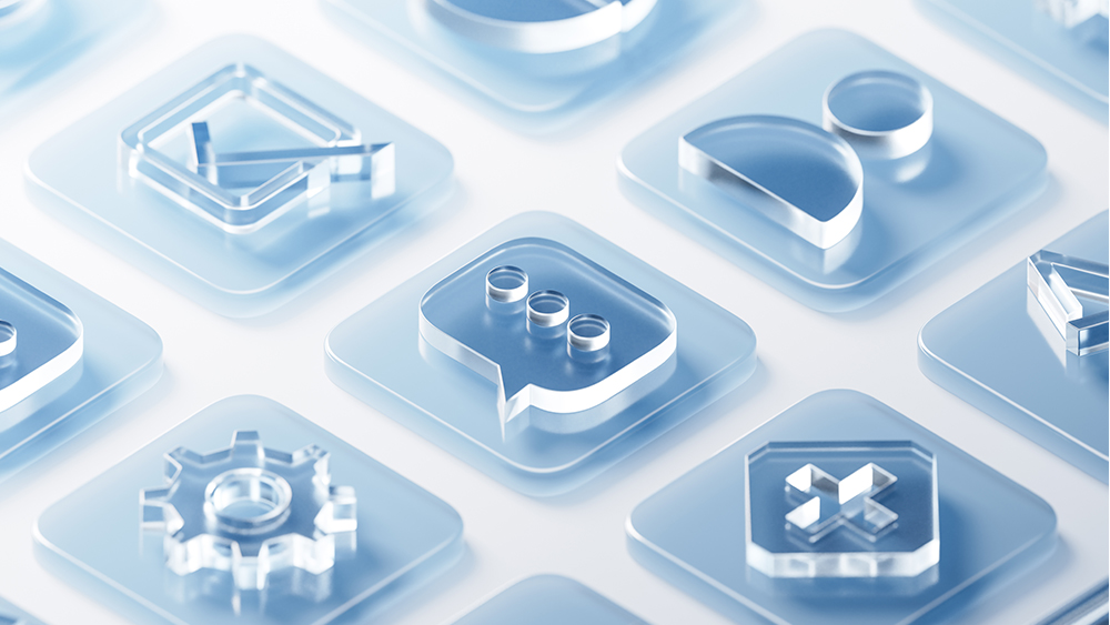
Glass buttons in a UI design.

After the flat design revolution in user interfaces, going back to skeuomorphism would feel so old and outdated. But 'glassmorphism'? Glass looks clean and shiny. Maybe it could disguise a step backwards?

This week, glass has become as ubiquitous in UI design concepts on social media as it is in urban architecture. After Apple's launch of its new Liquid Glass design language for its rebranded operating systems, including iOS 26 and MacOS Tahoe 26, everyone's mocking up translucent buttons, typically frosted, with blur, transparency and lighting effects.

Sign up to read this article
Read news from 100's of titles, curated specifically for you.
Already a member? Sign in here
Related Stories
Top stories on inkl right now
One subscription that gives you access to news from hundreds of sites
Already a member? Sign in here
Our Picks
Fourteen days free
Download the app
One app. One membership.
100+ trusted global sources.