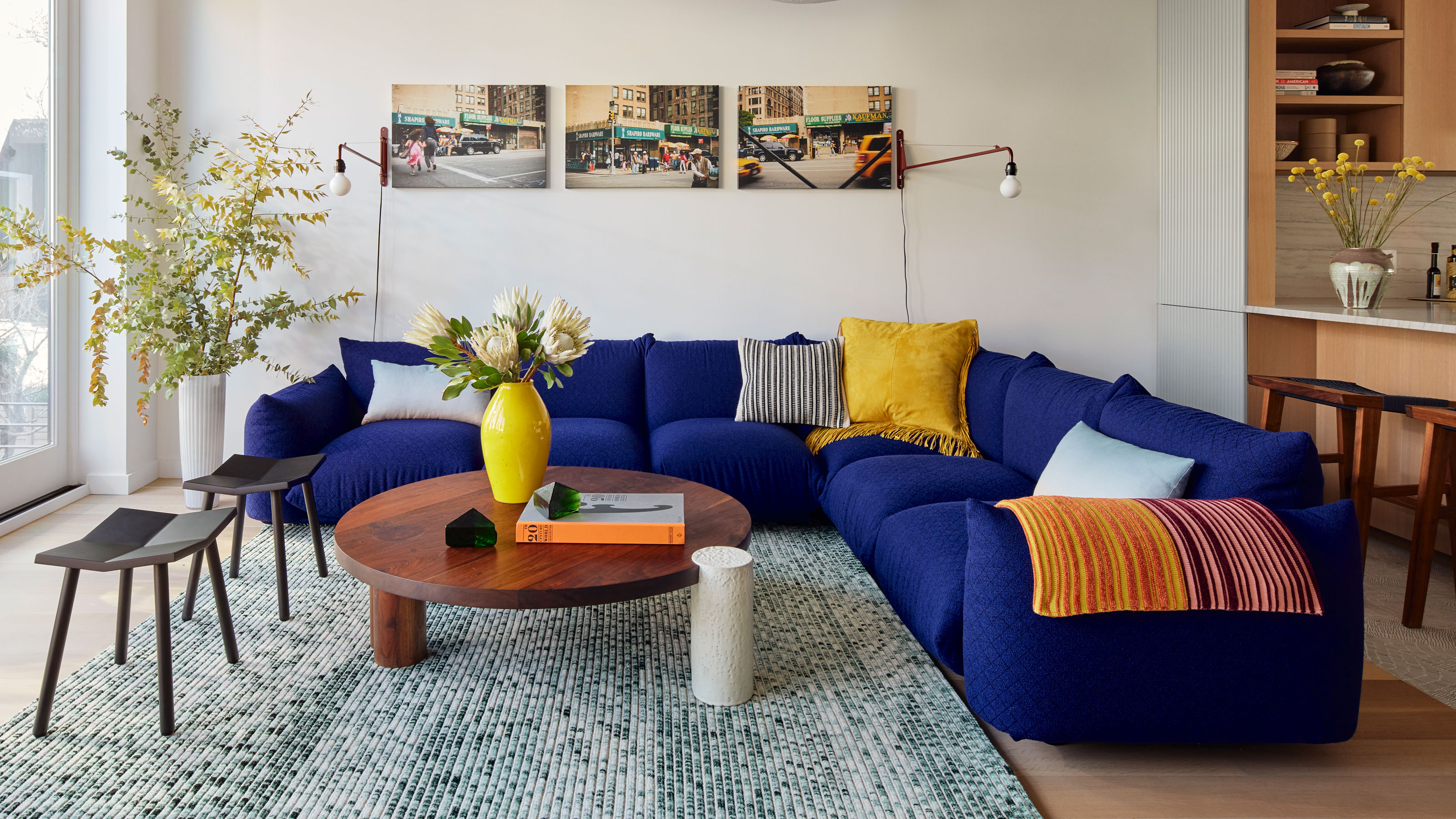
Some rooms are meticulously put together yet somehow still look and feel flat, and they often suffer from the same problem: they haven't considered how critical contrast in interior design is. Cohesiveness is a desirable goal, but matchy-matchy, not so much.
Think of plain versus pattern, sleek versus rough, curves versus straight lines, and color combinations such as black and white or blue and yellow, and you’ll understand why a room that offers contrast is more pleasing to the sense of touch and sight.